![Hickman On ‘The Manhattan Projects,’ ‘Secret’ And Graphic Design [Interview]](http://townsquare.media/site/622/files/http://dl.dropbox.com/u/168568/Hickman_Images/JPEGS/Einstein.jpg?w=980&q=75)
Hickman On ‘The Manhattan Projects,’ ‘Secret’ And Graphic Design [Interview]

If you've been keeping up, we here at ComicsAlliance have been running some specially made teaser posters for the new Image Comics series The Manhattan Projects from writer (and Marvel Comics Architect) Jonathan Hickman and his collaborator on last year's The Red Wing, artist Nick Pitarra. (You can view those images here and here.) The ongoing series features such real-life scientific giants as Albert Einstein, Robert Oppenheimer, Yuri Gagarin, and Enrico Fermi engaged in what can best be described as "bad science." The atomic bomb, it appears, was the tame stuff. It's a bold idea that is sure to please fans of Hickman's work on Marvel titles like Fantastic Four and S.H.I.E.L.D., as well as his earlier creator-owned books like Pax Romana, Transhuman and The Nightly News.
On top of an impressive writing pedigree, Hickman also has some prodigious design chops from a past working in advertising and graphic design. His bold use of white space, his eye for organization of information and his clean and consistent aesthetic all make his books stand out on the shelves and demand to be read.
We recently spoke with Hickman about his upcoming projects, his love of subverting history and his philosophy on design in comics.ComicsAlliance: You've got a lot of projects going on right now: The Manhattan Projects and Secret coming from Image, plus over at Marvel you have Fantastic Four, FF, S.H.I.E.L.D., Ultimate Comics: Ultimates, and you have a role as a Marvel Architect. Am I missing anything? So, my first question is: When do you sleep?
Jonathan Hickman: When I can. Not enough. Efficiency is the new sexytalk around my house.
CA: We've seen the previews over the last few days and know that it's sort of an alternate-history story about, for lack of a better term, mad science. What else can you tell us about The Manhattan Projects?
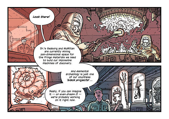
JH: The Manhattan Projects asks, what if the research and development department created to produce the first atomic bomb was a front for a series of other, more unusual, programs? It's about smart guys being bad. The comic book pitch is: "The Thunderbolts of Science."
CA: The Manhattan Projects has you working with Nick Pitarra again, your first collaboration since last year's The Red Wing. What's that working relationship like?
JH: Oh, working with Nick is great. First off, he's a unique talent. His personality really comes through in his art, he's clearly proficient technically, and, this is probably the most interesting thing for me, he's an evolving artist. I think over the next couple of years he's going to really grow and visually do some fairly significant things.
He's a one-look, high ceiling guy.
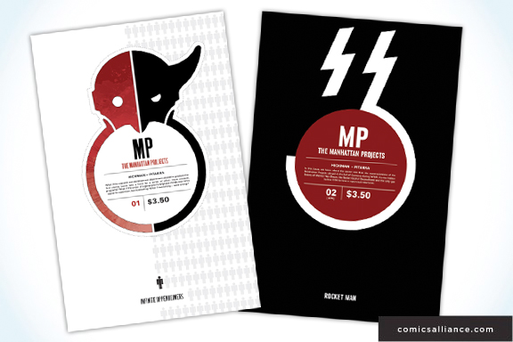
CA: Let's talk about the design for The Manhattan Projects covers. Can you walk us through how you landed on the look for that book?
JH: Well, the design parameters for both this book (as well as Secret which I'm doing with Ryan Bodenheim) are twofold. One, they need to exist within the family of other Image books I've done (no real problems there, I certainly have a type). Two, I wanted the individual issues of each book to reflect what I have been doing in the collected volumes of my previous miniseries. By that I mean a holistic (is that the right word in this sense, maybe homogeneous would be more accurate, I dunno?) design that permeates the entire experience. So, even though these are ongoings, the design you see in issue one is expected to continue through to the title page, to the next issue, to the first trade, and to the very end.
The specific "rule" for The Manhattan Projects is that everything radiates from the center. In relation to the cover, this would be the Manhattan Projects "badge."
CA: I especially love that there's a explanatory blurb in that central circular element. I saw that and immediately wished I'd thought of it. How'd that idea come about?
JH: A couple places. I really hate all the garbage we're normally expected to put on the cover, so I've been playing around with the idea of a "container" for a while.
I'm also a big proponent of disinformation, or skewed data -- a unique secondary take on what is being presented. So that's the purpose of what that text area is for: Yes, this is what the issue is about, but it's also may be commentary.
Now, I should add, the text that has been seen in Previews and press will not actually be what's released. In the teaser's case it's intentional. But honestly, I tinker with this sh*t up until the last minute. I generally reserve the right to not publish what's been publicly seen.
CA: A lot of your books – like The Mahnattan Projects, Pax Romana, S.H.I.E.L.D. – deal with the "real story" history. What did history ever do to you, Mr. Hickman, that you feel the need to rewrite it? But seriously, what is it about rewriting history that interests you?
JH: I'd like to believe it's smart world building. Start with something that everyone is familiar with, twist it, then pull the entire floor out from under the reader.
As for personally why I do it, I wish it was more complicated than this, but it's just one of the things I like.
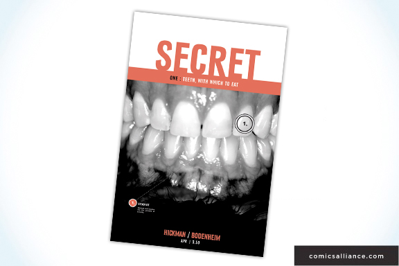
CA: I can't tell you how much I love that you used photography on the cover for the first issue of Secret. Are we going to see more photo covers like that for that series?
JH: That's how every cover (title page, trade design, etc.) will be for the entire run -- however long that is -- of Secret. Hopefully, it's quite a long time.
CA: Your books are meticulously plotted. What's that look like? Are there big, plotted out diagrams pinned to the walls, a bunch of notecards?
JH: Every time I have a idea or concept for a new story or book, I write that on a note card and stick it up on the wall. Beyond that, I don't really use them. I do a lot of whiteboarding. In fact, I'm getting ready to use this product to make it so I can use an entire wall as one.
I do a lot of radial diagramming (Look at something like TheyRule.net for an example of this) showing how things are connected, be that people, or events, or even story arcs.
I honestly don't know if all the stuff I do is actually the best way to do things, at this point I've just accepted it as my process. It is what it is.
CA: How do you get away with the designer-y stuff at Marvel, a company with what one would assume are many layers of approvals? Has there ever been push-back against your more ambitious layout choices?
JH: Well, a few misconceptions there. Marvel doesn't have many layers of corporate approval. Sure, I guess if you're talking about wanting do a story where Spider-Woman's aborted fetus, after a religious conversion spurred on by drug use, decides to kill the President of the United States... yeah, there will be lawyers. But design of a book? That's pretty much an editorial decision, which usually means one person. Also, and I've said this before, Marvel hired me to be me. For better or worse, this is kind of what you get.
Actually, most of the push-back I've gotten has been from well-meaning, but uninformed fans. Instances of confusion whenever I've been able to talk Marvel into dropping ads so that I can do a design or title spread. The argument seems to be hubris -- that I have stolen pages that could have gone to story so I can see my name in bigger type or something. All I'm actually guilty of is saving them from another sh*tty Big Bang Theory advert.
We should all agree that's Karma positive.
CA: A while back, you spoke with CA Editor-in-Chief Laura Hudson and you said, talking about design, "That stuff matters. It matters, it matters, it matters." I'm wondering if you can elaborate on that idea; what do you feel the benefit of good design is for comics?
JH: It shows you care. Actually, I take that back as it's really not strong enough. What I should have said was: Good design shows you believe. Like a soul, it permeates the product (I'm not really talking about just covers here - we are actually blessed with overabundance of very talented people in this area), it goes all the way through -- good design adds unaccounted weight.
And, look, I certainly don't hold myself up as the paragon of "getting it right." I'm pretty terrible at logo design, generally weak with typography, and I have some pretty predictable tendencies; but I don't think anyone would question, when looking at my books, whether or not I believe in them. Which, I think, is all that really matters.
Of course, I'm also leaving out the obvious benefits of good design making things easier to use, to read, to sell, to buy...
And not for nothing, Michio Kaku posted on Twitter today that we found a planet with water 22 light years away. Do we really want to show up in crap space ships?
The Manhattan Projects #1 goes on sale March 7. It can be pre-ordered now at your local comics shop or from online retailers like Things From Another World.
More From ComicsAlliance

![The Early Turtle Gets The Wyrm In ‘Teenage Mutant Ninja Turtles Universe’ #6 [Exclusive Preview]](http://townsquare.media/site/622/files/2017/01/TMNT_Universe_06-pr-0.png?w=980&q=75)