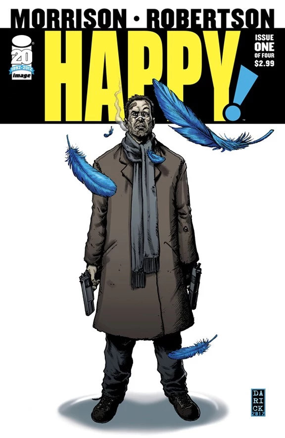
![Getting ‘Happy!’ With Grant Morrison And Darick Robertson [Interview]](http://townsquare.media/site/622/files/2012/09/happy1-1348684393-1348687357.jpg?w=980&q=75)
Getting ‘Happy!’ With Grant Morrison And Darick Robertson [Interview]

Unleashed on the world today from Grant Morrison, Darick Robertson, colorist Richard P. Clark and letterer Simon Bowland, is Happy!#1, Morrison's first Image Comics release since Spawn #18 in 1994. Morrison's spent the past few years working almost exclusively with DC Comics superheroes while Robertson's been deep in collaboration with Garth Ennis on Dynamite's The Boys, but now the two have united to bring readers the touching story of a young girl's imaginary, magical, feathery blue horse and the disgraced hitman who's working with it on trying to save the girl from a pedophiliac Santa Claus. If that actually reminds you of Batman and Bat-Mite from Morrison's "Batman R.I.P.," that's no coincidence. Happy #1 kicks off the four-issue miniseries with a vulgar, malignant, but frequently hilarious verve.
ComicsAlliance spoke with Morrison and Robertson about the new project, ugly flying horses, the true meaning of Christmas, and the future of "clawhammers": the hot new rage in marijuana consumption.
WARNING: Some of the following imagery contains acts of sex and violence that may be considered not-safe-for-work.
ComicsAlliance: In terms of graphic content, Happy! is definitely the dirtiest thing you've had come out since The Filth. Other than a few brief snippets of cursing in the second volume of Seaguy. Did it feel good to be "unleashed" again and creatively free in that way?
Grant Morrison: Calling it "creative" might be giving it too much credit, but it was great just to swear! I've been holding that back for a long time, since Superman and Batman don't say "f**k." I wanted it to sound the way working-class people speak in Jersey. Jersey-speak is very close to the way people speak in Scotland, where "f**k" is used almost as a punctuation. I wanted to write it back, and I was really pleased -- the first time I read it back, I was exhausted with the word "f**k" by page two, and there's 22 more pages to go! It's kind of malignantly sweary, and that's what I like it about it. I wanted the world to be really degraded when the comic began.
Note: the actual comic is uncensored.

CA: You can definitely see a Jersey mobster influence here. I'm guessing the fact that the two mobsters are named Paulie and Tony is not a coincidence?
GM: I'm guessing that's something to do with The Sopranos, but believe it or not, I've never seen an episode of The Sopranos. I'm kind of aware of it through cultural osmosis, but actually the other two guys, Mikey and Jerry, are both named after Mikey Way and Gerard Way (from My Chemical Romance), who are both Jersey boys.
CA: Besides playing with mobster clichés, the book also centers thematically around Christmas -- what it means, how society interacts with it, the stereotypical Christmas story, etc. Where did you get the idea to do a Christmas comic?
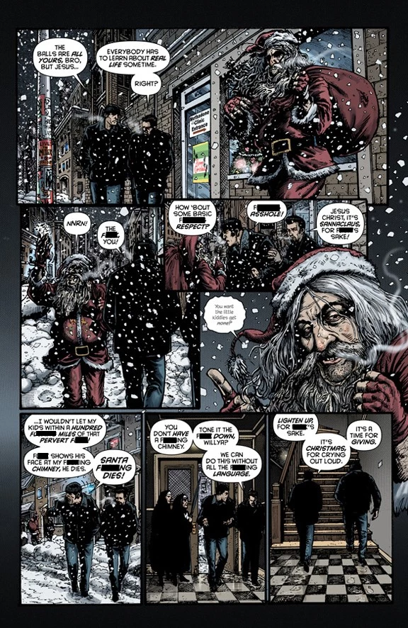
GM: If you think about it, the place of Christmas in Americana -- the kind of Norman Rockwell thing, with the Coca-Cola Santa Claus -- it's a symbol, to a certain extent, of American commercialism and "Bad America" and "Corporate America," which is an interest of mine right now as I'm sure you may have noticed! I wanted to take those images, the ones that have been used in a heartwarming, ostensibly "family" way -- again, Santa's image was created by the Coca-Cola company -- and place them in a degraded, fallen world, where even things that should be happy or friendly or family-based, is subjected to the same cruel corrosion.
CA: What about the character of Nick Sax? There's definitely a Santa Claus analogue going on from the name alone, down to the fact that he essentially says "Merry Christmas" the first time he shoots a guy in the back of the head. How does he relate to the Santa Claus figure? Is he more like Krampus with a gun?
GM: It's a weird thing. I wasn't sure what I was doing there [with naming Nick Sax], because it sounded like a Mickey Spillane-esque classic antihero name, and then I realized it was so obviously "Nicholas Sacks." Well, that's very Christmas-y. I hadn't even noticed until you pointed it out that his first words there when he kills someone are pretty much "Merry Christmas," so for all he's the antihero and he's a messed up guy, he's the true Santa Claus figure in the book. If anyone eventually stands for the true meaning of Christmas, if there is one, I guess it's gonna be him, because the actual Santa Claus figure we have in it is a monstrous pedophile. He's the worst possible corruption of the Santa Claus image and idea that we could imagine. You're right, with Nick, there's a lot of stuff in here that I hadn't even noticed, so it's quite interesting to see stuff when other people point it out. I always like that best, when you realize that the intrinsic structure of something and the characters that you've built start to naturally follow the themes, and I think it means that the work is on a solid foundation.
Darick Robertson: He just appeared the way I imagined him. That cover to issue #1 is probably the first drawing I did of Nick. He's inspired by a few different actors I like that dominate the genre, but I wanted him to be different from characters I've designed in the past. I wanted him to be really human. He's paunchy rather than sleek and cool (John C. Reilly as opposed to Colin Farrell type). Nick's big and mean, New York tough. A guy with a terrible diet and a heart condition. But he's strong and good at killing. I also want the contrast between Nick and Happy to be vibrant and entertaining, so the sweeter Happy is, the meaner Nick has to be. [With regards to Nick's band-aid,] Grant's not really dictating specifics, but fully describes the world he imagines. He just said Nick is a human wreck, so I imagined the band-aid and the nose bandage. He collapses face first into the street and I figured that's where he gets banged up.
CA: I'm guessing the pedophile Santa Claus is the guy we see in the first scene that the Fratelli brothers run into?
GM: Yeah, we had to show him up front but he makes his true debut at the end of issue two, and it's a pretty good scene, I think.
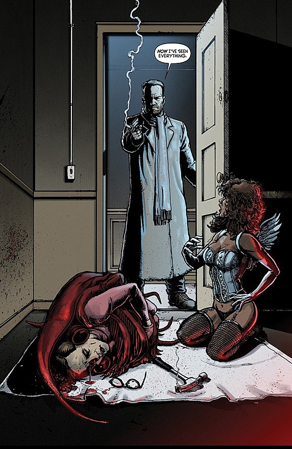
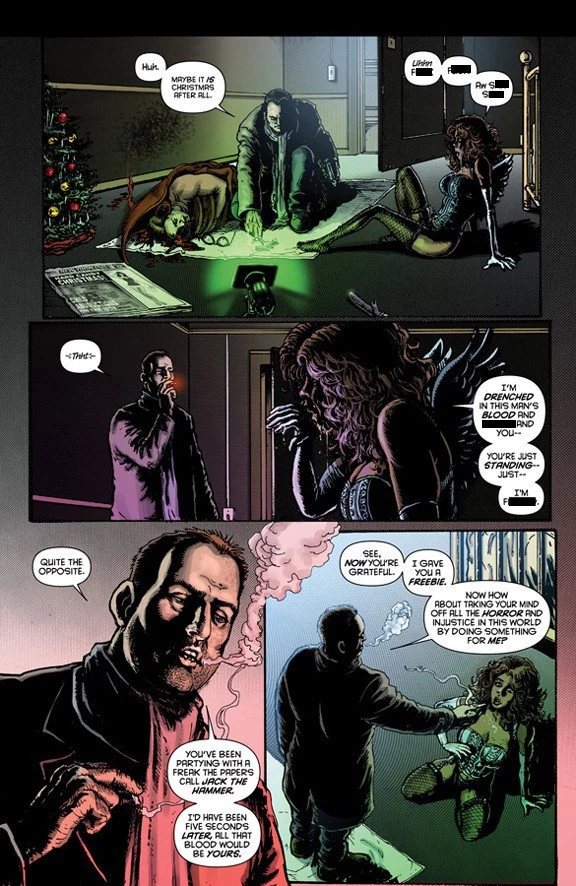
CA: What's the origin story of the Jack the Hammer character in issue #1? He's only alive for about a page but it's a very memorable scene.
GM: I wanted to start with this guy dressed as a prawn with no explanation, with a hooker dressed as an angel giving him a b***job -- it seemed to sum up the themes of this grotesque world of exploitation. Once we got him in the prawn outfit, the idea was that since he was a serial killer, I gave him a hammer, and I also wanted to have him smoking a spliff. Darick quite reasonably pointed out that he can't have the hammer and be smoking the spliff, so it was Darick who came up with this beautiful image of a spliff in a clawhammer, so the guy could have a smoke and then smash some girl's brains in with the joint still held within. So he came up with the image, which is one of the great images of the book. I hope it catches on in the drug underworld!

DR: The scene with the Prawn Man required both a hammer, a joint and a hand to hold the woman's head while she did her business, so I thought to put the joint in the hammer claw to free up a hand action... Grant really liked that, and we kept it, and it inspired the variant cover for MorrisonCon.
CA: Let's talk about Happy the Horse. Grant, what art direction did you give Darick? Was it just "draw the most ridiculous thing you possibly can?"
GM: No, we started off with the notion that it was a little blue horse. Every attempt we made to draw it looked like My Little Pony or a Disney horse in Fantasia, and we didn't want to make the book quite as cute as that. The big breakthrough came when we weren't really getting the image we wanted and I thought, "Well, let's make him ugly." I suggested it to Darick, and he came back with the finished sketch and it was complete. Once we decided Happy should be goofy and ugly and not even aware of his own ugliness and stupidity, then that's what made the character. That was where [the idea] came from, to make him not cute but to have a sort of annoying, spunky attitude.
DR: I don't think Happy's ugly. I love him. He may be my favorite thing that I've ever designed. My son Owen gave him a species name, a "Unipixiesis (Yoo-nee-pix-ee-sis)." And it's kind of shame the book is as dark and nasty as it is, because my kids are crazy about the character, but I can't let them read the comic! But being that it's supposed to be a kid's imaginary friend, I feel I hit the mark when I see them respond to the drawings of Happy the way that they do.
Happy has been sort of magic in my own reality, in the way he enters into Nick's, he similarly entered my reality at a time when I was pretty down and unsure about my next move. So when Grant and I first discussed Happy, Grant had a different vision of him than I did. Grant's initial idea was Happy would be the size of a medium sized dog, and then came around to him being the size of a parrot. We then thought Happy would have big wings, then we agreed ridiculously small wings would be better. I drew out the My Little Pony-inspired design, and liked it OK, but something was missing for me, and simultaneously for Grant as well. So I thought a donkey and he was right on it also. Like serendipity! This is a kid's imaginary friend, so it wouldn't know it wasn't a horse. Kid's miss that kind of detail when they're using their imaginations.
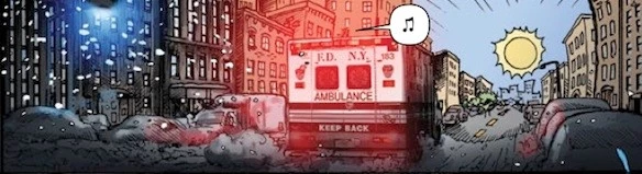
CA: One panel that really stood out for me was the top of the page where Happy first starts approaching the ambulance, and the perspective shows that off in the distance the awful, grimy city turns into this happy, sunny place. The fact that it coincides with the start of the morphine drip seems important, too. Obviously don't spoil anything if this ties into the plot later, but what was the idea behind the creative decisions on this panel and page?
CA: Maybe it's just me, but I saw a bit of a parallel between the grim avenger/goofy cartoon sidekick relationship between Nick Sax and Happy and the Zur-En-Arrh Batman and Bat-Mite's relationship from "Batman R.I.P."
GM: Oh yeah, all the stuff I do flows [from project to project]. When I was doing Batman and Bat-Mite, something stuck in my mind about the relationship between a fantastical little pixie figure who I suppose represents the last vestige of childhood for Batman, and for Nick it represents the last vestige of a world where things made sense for him. So yeah, they're very similar. You'll notice that in a lot of the new creator-owned stuff I've got coming out in the next six months, they take thematic strands of things I've been interested in -- particularly during the Batman work -- that blows them out in a different direction. Which is kind of what I've always done; JLA shared a lot with The Invisibles, and The Filth shared a lot with [New] X-Men. There's been cross-pollination; little things that come up become much more developed in the creator-owned stuff.
CA: Are we going to see more creator-owned stuff announced this weekend at MorrisonCon?
GM: Probably not this weekend, but certainly I'd like to think there'll be some stuff to see over the next few weeks.
CA: Finally, what's it been like working at Image with no editorial process? Most of your previous creator-owned stuff has been at Vertigo, so you still had an editor. Who puts Happy! together?
GM: It's actually been us putting it together, which is interesting because it's quite DIY and punk. I haven't done this for a long time, since I was doing my own fanzines way back in the day. It's been a completely different way of working and a very interesting one, but it's stressful to make sure everybody's on time and keeping to schedules. It's giving [the project] that clubhouse feel and the sense that we're building something.
DR: Grant has been a wonderful collaborator and this process has been very simpatico. He respects and appreciates my input and ideas and I love what he's going for, so we're very much in tune.
Happy #1 is on sale now in comics shops and digitally from comiXology. You can read a six-page preview below.


More From ComicsAlliance