Artist’s Commentary: Alan Quah Talks ‘Dark Souls’ #1
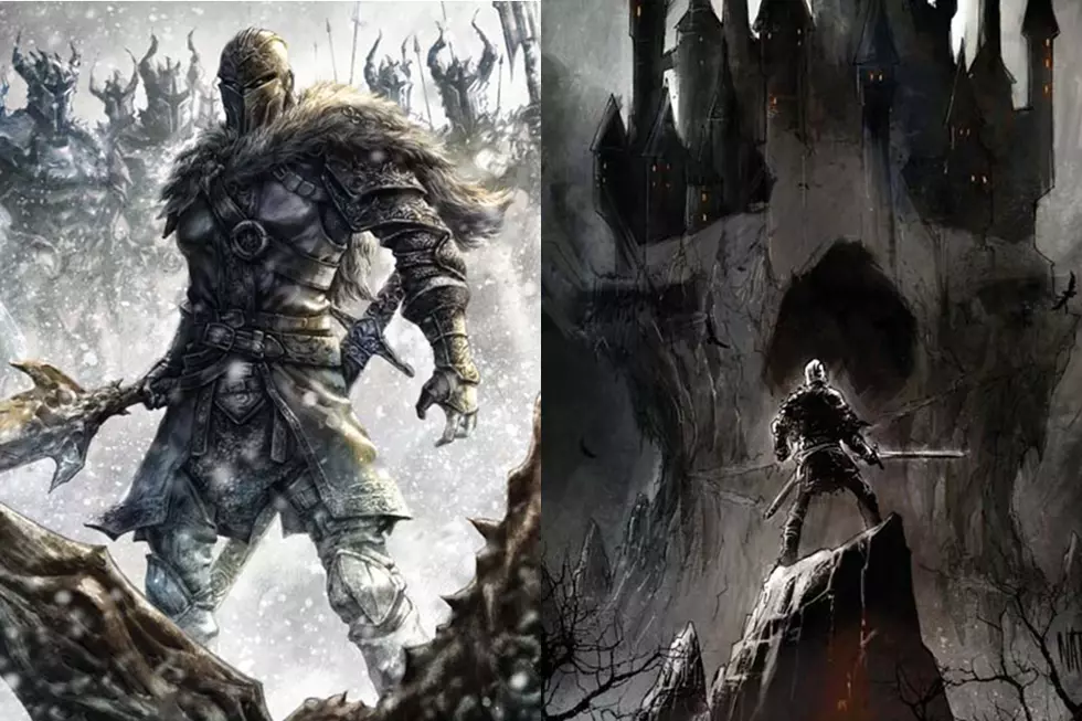
Earlier this month we shared writer George Mann's commentary for the first issue of the Titan Comics series Dark Souls, based on the hit action role-playing game set in a a primeval world of dragons, witches, and warriors.
With the second issue arriving in stores this week, we've asked series artist Alan Quah to offer his insights on the creative process for the issue, and to share a few of his pencilled pages. So grab your copy of Dark Souls #1 and read along as Alan details his biggest challenges, his preferred storytelling methods, and the rewards of working on such an epic story!
Page One
The first time I read George Mann's script, I knew this would be a great collaboration. He has a solid idea of how he want to approach the story in a dramatic manner. His words are enough to give me "visuals" on how I want to layout the whole book, the mood, and camera angle is pretty much a dead giveaway. It all came naturally. Though I decided to make a slight tweak on the size of the panels for this page. I thought it will have a better impact if I could somehow vary the size and zoom in slowly to reveal the third "money shot."
I also knew that when I started on this book, I needed to get the mood spot on. So each panel is rendered in a manner where the color guys will instinctly see where I want the light source and textures to use. It also help that the publisher is keen to give my studio, Komikaki Studio a try on this book which also means I have full control on how I want it to look. Couldn't be happier.
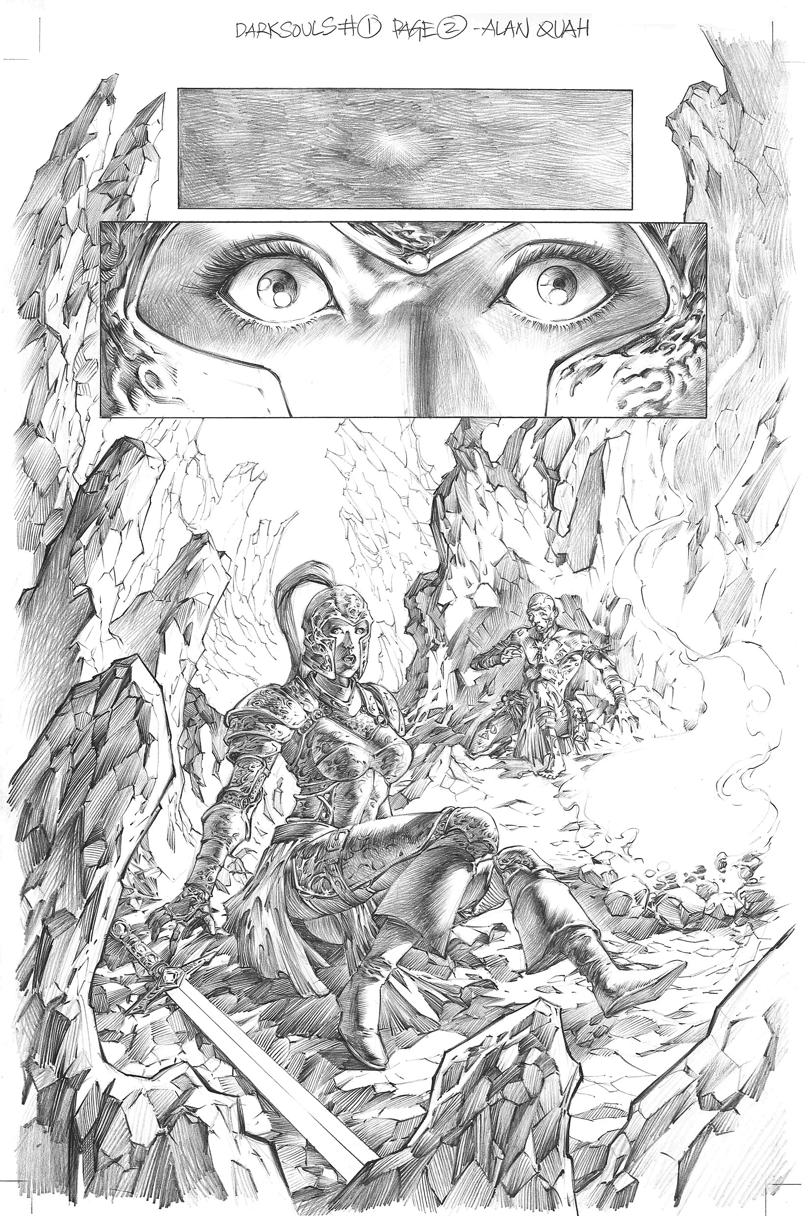
Page Two
To me this is the pressure cooker page. The first reveal of our heroes is the most important pages in my opinion. I knew I had to get this spot on, the characters' body language and the environment. And that campfire, a key element of Dark Souls game.
I also knew right from the get-go, I wanted to do something with how we should approach the eyes. I decided to go for the more painterly style for this project and page two is the best way to solidify that. I actually made a mistake on the shadows on panel two, which we addressed in colours. Light source should be from left. But overall, I'm quite happy with this page. I managed to get the textures I want for the armour and the environment. The tricky part is probably Aldrich's tattoo; they have to stay consistent throughout. I bet I missed a few along the way if someone decided to nit-pick and started to look out for the flaws!
Page Three
From an artist's perspective, I will probably call this a talking heads page. The environment has already been established from page two, so this is more an exercise to create an interesting layout that can convey George's message across.
My trick for a comic page that works visually is using a simple formula. Always have three "camera angles" in every page if I can help it: "the full close-up”, "the medium shot or half body shot", and "the tiny human shot: to re-establish to the reader where they are." You will probably find all three camera shot in my pages throughout.
Page Four
Talking heads page again (George will hate me for using this term). But to be honest I enjoyed drawing this page, pushing myself to how many variations of angles and perspective I can play with to make the page interesting. I used pov shots of hands, the sword and rocks to tell my story here. Top angles, side view and worm view. Fun page.
Page Five
I used a larger panel and space for the first panel to show more environment and introduce the crystalline cave. Hopefully I managed to portray the grandeur of it. I am also required to show the emotion of Aldrich on panel three, to "confuse" the reader. Is he a good or bad person? You will have to find out in future issues. The last two panels, drawing skeletons and creepy space are my fun moments, yes I am a weird person, I love drawing creepy scenes.
Page Six
Action page! My kind of page, think I nailed this in one sitting without a break; I was having too much fun!
Page Seven
This is a page to the next big reveal and I decided to play with space for the next overly complicated double page spread.
Page Eight & Nine
I died twice drawing this page. So many story to tell in two pages. But once I solved the riddle on placement of the timelines of each panel it was a matter of sitting down for the next 18-20 hours to get the right amount of integrity right. Using panels of crystals breaking up was quite fun. I had a lot of fun drawing the details on Fira's armour.
Page Ten
In each issue I try not to use the same panelling style, and page 10 is perfect for me to try this panelling design. Hope it works for you too.
Page Eleven
The first appearance of SUNBRO! I know I may get some flak for this. I knew that Solaire is not as buffed as how he was interpreted in the game, but I figure since this is the figment of Fira's imagination I can get away with it. Furthermore, George's vision is the reversed mirror version of the original. I decided to go for the “super buffed” version, more intimidating and badass.
Pages Twelve & Thirteen
Another double page spread; this is what I love about this project. George seemed to have this great idea that an exciting comic book should have a few double page spreads and maybe two splash pages. I couldn't agree more! It makes the whole book look so in your face and it's fun to draw! I had a lot of fun figuring out how to cramp in the fight scenes right down to Solaire's "death".
Page Fourteen
Again using my three-camera angle trick to full effect. Varying the angles.
Page Fifteen
This is a dramatic page to the reveal of the Dragon Augerer's Lair. For this page I rely a lot on coloring to get the mood right here.
Page Sixteen
Splash page, see what George is doing? Told ya he knows what he's doing. This was so cool to draw.
Page Seventeen
The credit of this page goes to my editor Tom Williams, he suggested on the panel flow of how Aldrich should be "killed" and this is definitely way cooler than how I layout it originally.
Page Eighteen & Nineteen
This is probably the toughest double-page-spread I have to draw, getting the fight sequences right and not helping when I have not slept for the last 24 hours. I managed to get this done working all the way till 7am the next day. Taking a short cut by minimising the detail is out of the question and I kept soldiering on.
Page Twenty
The final page and I wished it were longer; I'm having too much fun working on this page. After working on a double page the other day, this page seems like a walk in the park. I hope you enjoyed issue 1 as much as I did drawing for you. Promise I will put in more for future issues, and at press time we have already concluded issue #2 and all I can say is it’s really cool! See you in issue #2!
Dark Souls #2 goes on sale this week, Wednesday 1 June.
More From ComicsAlliance
![Prepare To Die: Titan Announces New Anthology Miniseries ‘Dark Souls: Tales of Ember’ [Exclusive]](http://townsquare.media/site/622/files/2017/01/DarkSouls1_TOE_Cover-C.png?w=980&q=75)
![Get Ready For All Skulls, All The Time In ‘Warhammer 40,000′ #1 [Preview]](http://townsquare.media/site/622/files/2016/09/WH40K.jpg?w=980&q=75)