The Artist’s Spider-Man: Todd McFarlane’s Transformative Dynamism
Ask anyone who was alive and reading comics in the late 1980s and early 1990s to name a Spider-Man artist, and nine times out of 10, you'll always get the same name: Todd McFarlane.
Plenty of artists in the 1970s and '80s did great work on the character, and the black costume put a new coat of paint on him, but nobody since John Romita transformed the character like McFarlane did. The character was still instantly recognizable as Spider-Man, but lots of the details changed to pull the character into the 1990s, and all the while, there was an undeniable, unmistakable energy to the art.
Like Steve Ditko before him, McFarlane's Spider-Man was a contortionist. McFarlane seemingly delighted in putting Spidey in as many odd upside-down, squished-together, bones-don't-do-that positions as he could, but he wouldn't just leave it at that. He'd add some other detail --- like Spidey hanging upside down while chomping on donuts --- that would add even more to the page.
And that was just one element of the crackling energy of McFarlane's art. One of the big changes to Spidey that he's often credited for is what became known as "spaghetti webbing" --- a take on the webs that Spider-Man would shoot from his wrists that went beyond the simple lines that many previous artists had stuck with. McFarlane's webs twirled and twisted into intricate designs that often filled negative spaces in the page with yet another visual element and gave the sense that Spider-Man was constantly moving, working, reacting, shooting webs, and doing other Spidery stuff.
The straight lines of previous artists made sense. After all, look at a real spider web. They're thin strands assembled into patterns. But McFarlane was pretty clearly throwing the idea of realism out the window. Certainly his art was meticulously detailed with so much activity crammed into the page, but it was also highly exaggerated.
Ditko and McFarlane had some interesting similarities in their takes --- contortions, a thinner build than many other artists' --- and McFarlane clearly admired Ditko, homaging his work in places. Yet McFarlane's work diverged in some major ways. Where Ditko's original take on the character was grounded, weird and sometimes ugly, McFarlane's went larger than life.
For proof of that, look no further than the eyes. Over the decades, Spider-Man's eyes had gotten continually bigger, but they were always more or less in the arena where eyes go. Under McFarlane, they essentially took over the mask, extending up past his hairline and down to where Peter's mouth would be. The eyes' size made for some very interesting visuals any time Spider-Man's mask would get distressed and readers would see where they actually corresponded to Peter's face.
Again, the change was seemingly all about energy, dynamism, and what you might call an in-your-face '90s attitude that McFarlane and his peers were often described as having.
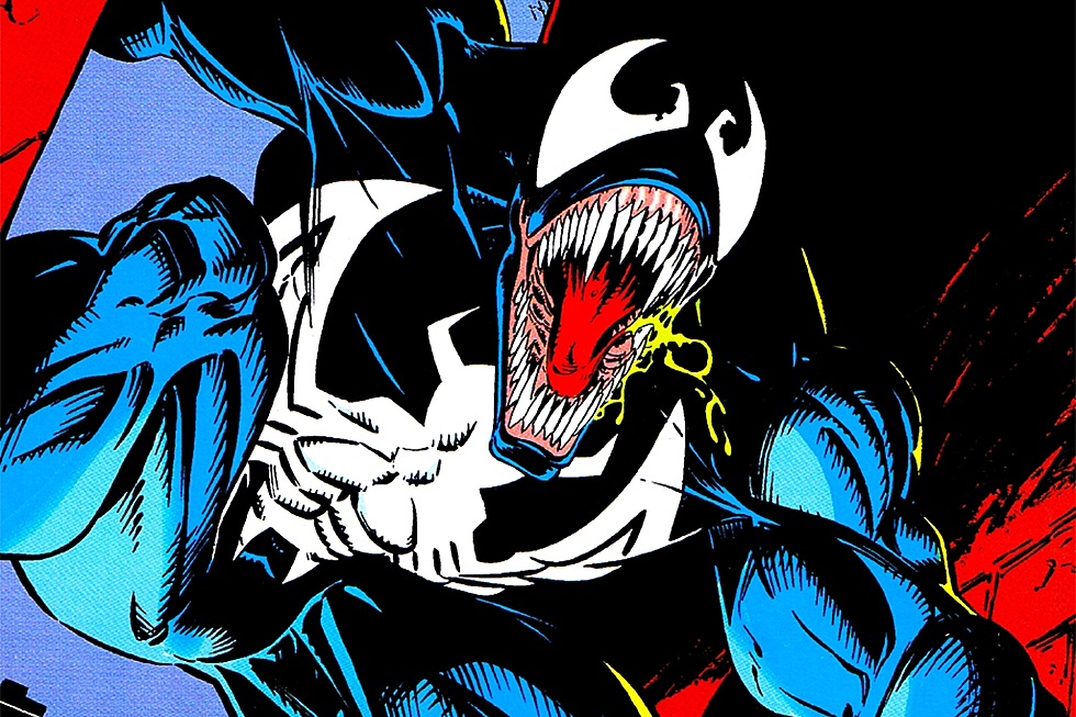
Another supporting argument that McFarlane was driven by that attitude involves the supervillain with whom he is most associated: Venom.
There's some dispute over whether McFarlane played a role in creating the character. In a letter to Wizard magazine in 1993, writer David Michelinie said he was the sole creator of Venom, who debuted in full in 1988's Amazing Spider-Man #300. McFarlane pushed back that it was his idea to give the character monster-like features like an open mouth. Other writers and artists claim to have devised pieces of Venom's character as welll.
Regardless, it was McFarlane who first drew the character and who unquestionably popularized him. Though later artists would add even more extreme elements, such as the long, wild tongue and ubiquitous drool, McFarlane made Venom physically imposing, unhinged, violent, and bloodthirsty in ways that went beyond previous villains.
McFarlane's bigger-is-better approach even applied to the non-superhero parts of the books.
By the time McFarlane was drawing Spider-Man comics, the soap opera parts had largely faded away because Peter Parker and Mary-Jane Watson had married in 1987's Amazing Spider-Man Annual #21.
McFarlane seemed pretty committed to keeping things spicy, though, drawing even fairly innocuous bedroom conversation scenes between the couple is the sexiest ways he could get away with in a Comics Code-approved comic in the late '80s. Mary Jane was often in lingerie, and Peter was often shirtless. Quite a few of the other scenes were much more than innocuous, depicting the couple's active sex life. It got to the point that McFarlane's depiction of Mary Jane (who was by this point a famous model and aspiring actress) was sometimes called "sexpot" Mary Jane, for better or worse.
Also, he would draw both her and Peter's hair as absolutely huge. Look at that hair.
It's also worth noting that, in terms of sales, McFarlane is probably the most popular Spider-Man artist of all time. He was such a success on Amazing Spider-Man that when he threatened to leave because he didn't want to draw someone else's stories anymore, editor Jim Salicrup offered him his own book, the adjectiveless Spider-Man, to write and draw. The first issue, released in 1990, sold 2.5 million copies, making it the fourth best-selling single issue of the modern era.
Partially, it was the era. The early '90s were a boom time for comics. But don't discount the artist. For many folks still reading comics today, McFarlane is the Spider-Man artist.
More From ComicsAlliance


![Eddie Brock Is Back In Black In Costa And Sandoval’s ‘Venom’ #6 [Preview]](http://townsquare.media/site/622/files/2017/03/Venom_6_Feat.png?w=980&q=75)