
Best Comic Book Covers Ever (This Month) – August 2012

A great comic book cover is both an advertisement and a work of art. It is both a statement and an invitation. Sometimes a great cover conveys character, sometimes mood, sometimes moment. Great covers can pastiche the classics or pay tribute to the past, or they can strive to show us something new. Great covers always show us a glimpse of somewhere else, on a canvas no bigger than a window pane. In Best Comic Book Covers Ever (This Month), we look back at some of the most eye-catching, original and exceptional covers of the month that was.
August was a fantastic month for eye-catching covers, with some of the best work of the year from David Aja, Fiona Staples and Rafael Grampá. Marcos Martin and Chris Samnee produced superb Amazing Spider-Man covers, and there were impressive variant covers for Batman, Gambit and, yes, Battle Beasts.

Avenging Spider-Man #11 (Marvel), cover by Chris Samnee
Normally I prefer "clean" covers -- covers without a logo or indicia. This is a rare example of a cover with a huge logo that feels wholly part of the image. It's a lovely nostalgic depiction of the relationship between Peter Parker and Aunt May, with Spider-Man looming over them like a watermark on their lives. And speaking of Spider-Man...


Amazing Spider-Man #692 (Marvel), variant covers by Marcos Martin
Marcos Martin produced five monochromatic alternative covers for this book to mark the 50th anniversary of Spider-Man -- one cover for each decade. All five covers were great, but these two were my favorites. The red 1970s cover captures the most important, most tragic moment in the history of the character. The blue 1990s cover showcases a less prestigious story, the Clone Saga, but elevates it considerably!

Spaceman #9 (DC Vertigo), cover by Dave Johnson
Another cover with an integrated logo. It works well, but I'd like to see a clean version to see to what extent the trade dress is a required element of Johnson's composition.

Before Watchmen: Ozymandias #2 (DC), cover by Jae Lee
While we're on the subject of logos and indicia; the Before Watchmen covers have a very strong brand identity with a whole lot of logo going on. This is what it looks like scrubbed clean. This cover makes great use of the Watchmen colors and the narrowed canvas.

Captain America #16 (Marvel), cover by Steve Epting
The logo and indicia for this cover were all tilted to the same angle as the laser beams, off-kilter to the central line of action. It was very effective in throwing the world into a chaotic tilt, but this is also a dynamic image without the logo.
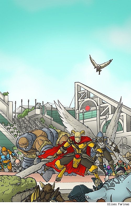
Battle Beasts #2 (IDW), San Diego Comic-Con variant cover by Ulises Farinas
Yes, Battle Beasts #2! Yes, the SDCC variant cover! It seems like an unlikely choice, but I didn't pick this cover because it's Battle Beasts or because I have a strange affection for the San Diego convention center. (I don't.) I picked it because I like the clean lines and simple color and the use of wide open sky to reframe the image. I appreciate artists who don't try to clutter every inch of the page.

Rex Mundi Omnibus Volume 1 (Dark Horse), cover by Juan Ferreyra
I think this image has been around for a while now, but it's the first time I've had an excuse to write about it here, and it's a favorite of mine. Stark, striking and beautifully horrid.

Planetoid #3 (Image), cover by Ken Garing
I can't help wonder how much time Garing spent debating how much space the creature should take up in this image. I think he was bold to make it as small as it is, but the use of just three colors on the cover makes the figure pop.

New Deadwardians #6 (DC Vertigo), cover by I.N.J. Culbard
A cover that communicates setting and moment and tells a story with a single image. Really cleverly done.

Gambit #1 (Marvel), variant cover by Chris Bachalo
Bachalo takes Gambit's red-and-black eyes and paints the world in those colors. Dramatic and dangerous with a dash of James Bond.

Avengers Academy #35 (Marvel), cover by Giuseppe Camuncoli
This is strange composition but I think it's very deliberate. Nothing is centered. Everything is meant to feel slightly off. With the sickly green color and the distressing subject matter, the overall effect creates a sense of unease in the viewer.

Beasts of Burden: Neighbourhood Watch (Dark Horse), cover by Jill Thompson
Beasts of Burden is one of the best books I've read in years. If you've not read it, this cover gives you the pitch; animal occult detectives dabbling with deadly forces, gorgeously painted by Jill Thompson.

Batman #12 (DC), variant cover by Greg Capullo
This variant cover for this issue inverts the colors of the standard cover. Both versions look great, but I think this one has the edge because it creates negative space that gives the action punch.

Hawkeye #1 (Marvel), cover by David Aja
The last three covers this month may all be serious contenders for cover of the year. First up is David Aja's spectacular cover for his new Hawkeye series, which is as bold and distinctive inside as out. Marvel has given the impression that it wants to shake up cover design with its Marvel NOW relaunch. Hopefully this is an example of the sort of direction the publisher will take things in.

The Massive #3 (Dark Horse), variant cover by Rafael Grampá
Rafael Grampá has a spooky gift for color and composition. So far, every one of his variant covers for The Massive have made my list. Every one has been too compelling to overlook, and I would hang any one of them on my wall.

Saga #6 (Image), cover by Fiona Staples
A breathtaking image of microcosm and macrocosm. A very original cover concept, brilliantly realized.
More From ComicsAlliance


![101 Halloween Comic Book Covers [Art]](http://townsquare.media/site/622/files/2013/10/101-Halloween-Comic-Book-covers.png?w=980&q=75)

