
Moebius On The ‘Monstrous’ Role Of Comic Book Letterers
 In the most recent edition of his Where The Hell Am I? column for Comic Book Resources, Scalped and Wolverine writer Jason Aaron conducted a brief but fascinating interview with Jared Fletcher about his craft: comic book lettering, easily the most unsung discipline in the business. The first thing Aaron mentioned about the art of lettering comics is that the results are meant to feel "invisible" in that they don't pull the reader out of the world of the story, and Fletcher elaborated on the painstaking process required to achieve that kind of work.
Within a few days of reading Aaron's interview with Fletcher, I happened to reread the collected edition of The Silver Surfer: Parable, the classic 1988 story written by Stan Lee and illustrated by Moebius, the French comics master whose work has been frequently discussed here at ComicsAlliance. The book contains an uncommonly in-depth "making-of" section in which Moebius (aka Jean Giraud) discusses the challenges of illustrating the singularly gorgeous story, including a portion dedicated to his lettering. In that material, Moebius wrote that he was dismayed by his American counterparts' "toleration" of "outsiders" determining the looks of their pages, even in part.
You can read more from Fletcher and Moebius after the cut.Jared Fletcher is an Eisner-nominated letterer whose work is being spotlighted in a major way in the form of the new logos seen across the X-Men line of Marvel Comics. He described his working life to Aaron:
I am always working on a bunch of different projects at the same time. Right now, my biggest thing is redesigning the new X-Men logos that are going to be used after "Schism" wraps up. I have been living inside of that project the past few weeks, and it is far from over. But I love it. It's easily one of the biggest projects of my career so far. Nick Lowe continues to be a champion for me and my design work at Marvel. His whole crew is solid. I am also lettering all of "Schism" and designing the covers and variant covers too. I design the recap and Cutting Edge pages for four of the Wolverine books and "Uncanny X-Force" every month. I am lettering a handful of the new #1's at DC, including Cliff's "Wonder Woman" (great stuff). I am finishing lettering on "DMZ," and a few other Vertigo graphic novels, too.
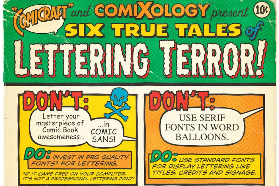
Fletcher's dedication is not unusual for letterers, and while their work is as a matter of course more "invisible" than that of writers, pencillers, inkers and colorists, letterers have been recognized for their skills for quite a long time. Indeed, talents like Todd Klein, Richard Starkings, Ken Bruzenak, John Workman and Gaspar Saladino are as much "household names" to dedicated comics readers as practically any writer or artist you can think of.
However, that is not the case in Europe -- at least according to Moebius, or at least the Moebius of 1988, when lettering talents like those mentioned above were still working by hand and not with computers. While he seemed to acknowledge the professional skills of a letterer, he was unequivocal in his belief that the words on a page are as integral to the artist's work as the pictures themselves, regardless of whatever illegibilities or other mistakes might occur. It's an intriguing viewpoint from an accomplished authority, and Moebius' complete remarks are as follows:
To me, the lettering is a form graphology. It reflects your own style and personality. A page of comics without text has its own personality. But when you add the balloons, it suddenly takes up a whole, new different look. For example, I was quite disappointed about the look of my pages The Silver Surfer at first. Without the balloons, I thought they looked too dull, too drab. Then, I lettered them and they changed completely. It became something complete, dynamic. The lettering brought it together.
That's why I don't really understand how an artist can entrust something that is important to a hired hand, no matter how good he may be. A letterer may a professional, but he's very likely someone who has stopped to see lettering as something amusing, but just as another job. To me, it's monstrous to have an important part of the look of a page determined by an outsider.
If an artist's lettering style is truly not legible, then he should learn. I learned my own lettering from Jije, who himself was very influenced by the American masters, like Caniff. I do the best I can. My letter is alive, it dances on the paper. It reflects my personality. To me, the only rule is that lettering should be consistent within its style, that is, all your "s"'s should look the same, etc.
In the case of The Silver Surfer, my lettering on some of the pages is not always as good as I'd like it to be. Some days, I felt tired, less able to concentrate. Also, I was a little bit handicapped by the fact that English isn't my mother tongue, and maybe I rushed a little too much in places. But, in spite of all these problems, I'd still rather have my own letters than the intrusion of someone else's style on my page. I really fail to understand how artists can tolerate this.
The excuse of legibility is, I think, a very poor one. It is something that must be done away with. The reader can be educated to read any style of lettering. Comic strips prove it every day. The Underground proved it years ago. Some of those people's lettering was terrible -- barely legible -- but the readers followed it. We got rid of this attitude in Europe in the early nineteen-seventies. Now, every artist does his own lettering, which is coherent with the art, and it looks much better.

Along similar lines, it's difficult to imagine the high contrast world of Sin City without the stark raving "BLAM!"'s of Frank Miller or the majesty of Cerebus' second movement without the variously angry, erudite and even drunken hyper-expressive letters of Dave Sim, both of whom also drew their comics.
But is it possible that Astro City could possibly look any better without the lettering and design of the Comicraft team? What about The Sandman, whose Todd Klein created iconic dialogue styles for numerous characters including Dream and Lucifer that stay with them as they traverse titles and even publishing imprints? Certainly there are few illustrators with visions as idiosyncratic as that of Howard Chaykin, whose most enduring work, American Flagg!, was lettered to groundbreaking effect by Ken Bruzanek. And of course it's obvious at a glance how John Workman only enhanced the work of Walt Simonson in Thor. These talents were as integral to the work as the colorists, surely?
The younger Moebius made those remarks during a time when lettering was done by hand and a letterer's personal style could be more easily identified as distinct from that of the artist. Moebius' concerns about another person's vision intruding upon the purity of his own might have been made moot by the advent of computer-based lettering along the lines Fletcher described in his interview, but possibly not. In any case, it's a fascinating opinion from an endlessly fascinating creator.
More From ComicsAlliance


![Brilliant Art, Tremendous Stories and Daring Creators: The 2016 Eisner Award Winners [SDCC 2016]](http://townsquare.media/site/622/files/2016/07/eisner2016.jpg?w=980&q=75)

