
Superhero Color Theory, Part III: Darkness And Light
What do the colors of your favourite superhero tell you about them? We're applying traditional color theory to iconic comic characters, to see what we can learn about them. Our focus this time is on darker colors, and how they define both heroes and villains. Black and red are colors for dark passion.
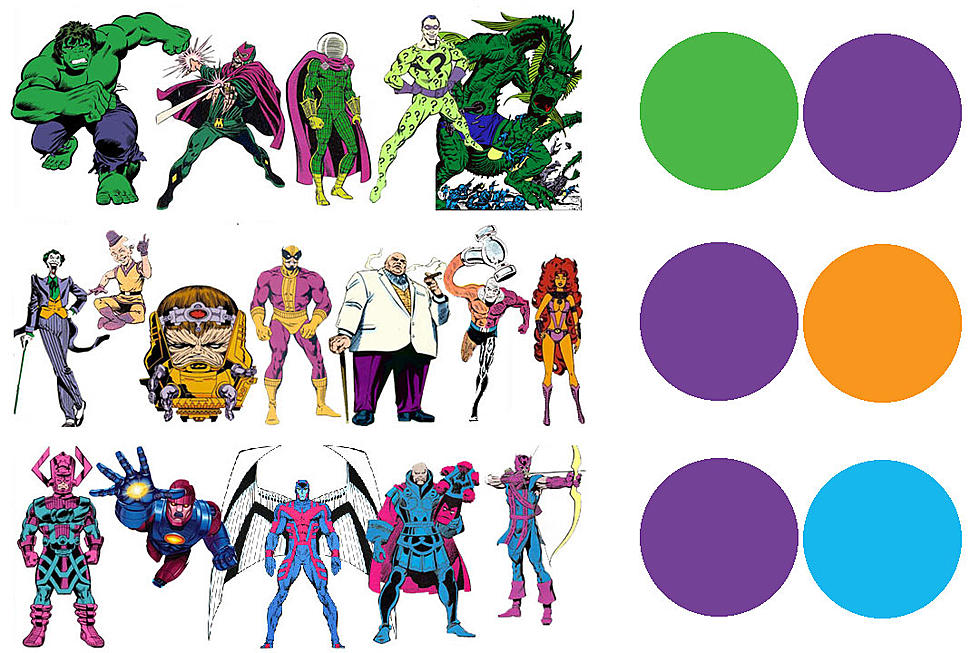
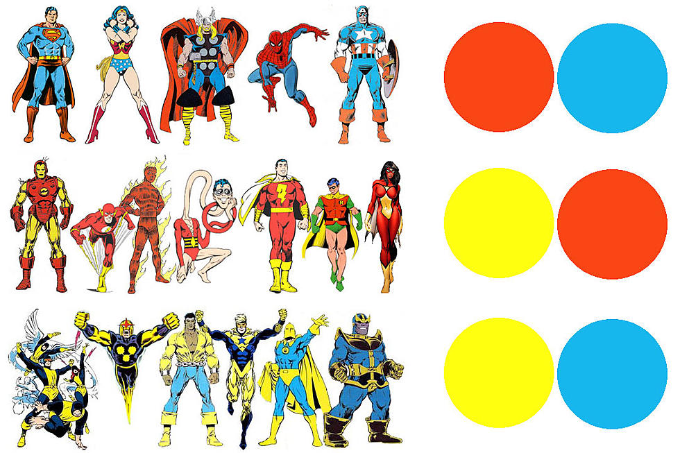

![Good Versus Evil in the Superhero Comic Color Palette [Infographic]](http://townsquare.media/site/622/files/2011/09/comiccolorsinfographicmain.jpg?w=980&q=75)