![Reinvention Is Vital: Tom Muller Goes All In On Comics Design [Interview]](http://townsquare.media/site/622/files/2017/03/muller-feat.jpg?w=630&h=420&zc=1&s=0&a=t&q=89&w=980&q=75)
Reinvention Is Vital: Tom Muller Goes All In On Comics Design [Interview]
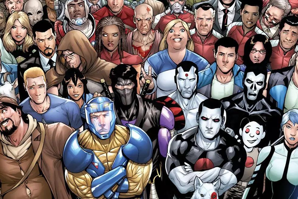
If you've looked at a line-up of comics stacked across the shelves, either in a comics shop or in digital stores like Comixology, then you've almost certainly seen the work of designer Tom Muller. From Motor Crush to Unfollow to Wolf to the new X-O Manowar series at Valiant, Muller's work has graced the covers --- and interiors --- of some of the most interesting and visually experimental comics of the last decade.
Now running his own design studio in the UK, Muller's work is bold and strident, and shows a complete commitment to the premise and tone of each comic he works on. Whether it's horror or romance, you'll see that genre reflected through every choice he makes as designer.
With the increasing attention and awareness that surrounds the art of design in comics, the work of people like Muller bears investigating. ComicsAlliance spoke to Muller about his entry into comics, his current work for publishers including Valiant and Image Comics, and how he approaches each project he takes on.
ComicsAlliance: I know that you studied graphic design at college, but how (and when) did you first get involved in comics?
Tom Muller: I got into comics as a fan and reader when I was around seven years old, thanks to my dad buying me a copy of Amazing Spider-Man #172, and that's how that started.
As a designer I got into comics through collaborating with artist Ashley Wood, back in 2001. An email exchange led to me designing his websites, which led to designing logos and book covers for his Popbot series and art books. From there on, I started to design more and more comics and hang out on comics forums and message boards.
CA: Along with seemingly half of comics, you were a member of the Warren Ellis forums [a succession of message board that were popular in the '00s]. Has that community proved to be important for you, as your career has moved forward and you’ve taken on more projects?
TM: So around 2003-2004, I hung out on Mark Millar’s forum a lot, at a time when quite a few comic pros would post as well. That’s how I bumped into Liam Sharp and was brought on to design and art direct the majority of Mam Tor Publishing’s books (the UK publisher Liam had founded with his wife Christina McCormack-Sharp).
With all that under my belt, I started hanging out on Warren Ellis' The Engine forum, which he’d set up for comic creators to hang out and meet. That’s where I met Ivan Brandon, Rantz Hoseley, Matt Fraction, Kelly Sue DeConnick, [Kieron] Gillen and [Jamie] McKelvie, Fabio Moon and Gabriel Bá, Jonathan Hickman, etc.
Out of The Engine came a lot of good friends like Ivan Brandon, whom I’ve been working with regularly ever since, and my design on the award-winning Tori Amos GN Comic Book Tattoo, edited by Rantz Hoseley --- which up to that point was the biggest comic project I’d taken on, and landed me an Eisner nomination.
After The Engine was closed, I migrated for a short time to Warren’s Whitechapel forum, where I bumped into Ales Kot --- this must’ve been around 2010 I think. Only after we started working on Zero in 2013, I found an old email from him I’d never replied to where he said he’d one day wanted to collaborate. Good thing that turned out okay!
Up to the launch of Zero I’d only worked on self contained projects --- a GN here, a mini-series there --- but with Zero being an ongoing, my work became much more visible, and things just started to snowball from there.
CA: What’s the most important part of your process when you start on a new title? Where do you begin, and how do you put ideas and motifs together for use in the design?
TM: A lot of my work is at Image, working with creators on their own series, who usually get to bring me in very early, which allows me to get really under the skin of the book and work closely with the creative team to create a design language and tone of voice around the comic.
I’ll read the scripts (or synopses), and spend a lot of time talking (sometimes arguing) with the creators while we create what the series will look like. Out of that comes the usual process of sketching ideas, creating mockups, design concepts etc… until we arrive at the final result.
CA: How involved do you like to get with the rest of the creative team? Do you try to have back and forth with as many people as possible --- writer, artist, colorist, letterer?
TM: Yeah, its an ongoing process. Especially on creator-owned series, I’m part of the creative team, throughout the life cycle of the series. I bring more to the table than, “Here’s your logo!”, because I design the whole thing front to back.
Zero is a good example of reinventing the design of the series one issue at a time, while on Drifter I’ve been evolving the design of the issues every arc --- so for me, design is a living thing made by many hands.
Motor Crush --- and the upcoming VS, by Ivan Brandon and Esad Ribic --- is a bit of a level up for me, because beyond the publication design of the series, I’ve started to do in-story graphics and captions alongside letterer Aditya Bidikar --- adding another layer to the design language of the series, that then seeps back into everything else I design.
CA: Your comics tend to really stand out because, as you say, your approach is to go 100% in on every comic you make. The covers for Wolf were wild and changed every month in layout; Unfollow put an attention-seeking giant button right in the middle. To what extent do you look to commit to the concept of a comic within the design?
TM: I like to go all in on the projects I take on, and help make a series stand out. Design is a key ingredient in publishing in general, and I like to inject as much of that into comics, so yes --- if there’s a way to push things --- from changing cover layouts every month and designing something that calls attention to itself, then I’ve done my job, I hope.
The Unfollow logo was commissioned by the amazing Shelly Bond, and she brought a lot of great ideas to the table, especially the whole idea of referencing mobile apps, and the idea of the button.
CA: Is there ever a danger in going too far, committing too hard?
TM: No, never. It’s better to push it as far as you can to begin with, then you have the room to adapt and potentially dial it down. I’ve started many logo designs for Valiant that were “too far,” but then through the design and editing process ended up much stronger.
CA: You tend to go bold, as well. X-O Manowar’s new cover design, for example, is a giant yellow header with big, bold black font over it, punctuated by a slight note of red. What’s the effect of using such stark, strident colors on a cover? What kind of reaction are you looking to get from a reader when they see that on the shelf?
TM: The X-O brief was pretty straightforward. Valiant was looking for something very bold and impactful, which really spoke to my own sensibilities as a designer.
CA: Valiant seems to be a company that specifically want strong design --- bringing in Rian Hughes to start the line off, and then coming to people like yourself. For your work on X-O Manowar, did you come to the project seeking to create something very different, and make this something different from Rian’s prior work?
TM: Valiant have been incredibly smart in the way they’ve approached their brand and design language --- especially with having Rian design a consistent, unified system of brand marks and logos when Valiant relaunched; and the last few years they’ve been organically evolving the design, and bringing other designers to the table (including me) who build on that.
The reason the X-O logo and cover dress is so vastly different from Rian’s fantastic logo is mainly driven by the editorial team. The story is completely different from the previous run, so it called for a different tone of voice.
CA: How important is it to have that sense of reinvention in comics, to your mind? Marvel just brought back those little X-Men heads in the corner of the covers, but updated. Is there benefit to reminding readers of the past, but doing so in an updated, contemporary style?
TM: Reinvention is vital to comics. I’ve been saying this for a very long time (and will probably continue to harp on about it). The thing with comics is that it's this amazing melting pot of creative disciplines and ideas and stories and art and design; but it somehow got stuck in a self-referential loop when it comes to publication design where nothing really changes, and almost everyone is looking inward for ideas.
The new X-Men covers are a good example of that. With a few exceptions, every X-Men logo will always be based on Jim Steranko’s design, and within those limits you have to keep that design relevant over the years.
I’m always approaching comics from the viewpoint of it being a speciality/niche publication, much like (independent) magazine publishing --- an area where a lot of design invention happens, because design is a major selling point --- and try to inject as much of that thinking into the comics I design. There’s no reason that a comic needs to have its logo in the top 1/3rd of the cover anymore, since most shops display comics in full on shelves (not even going to mention digital comics); yet it's a model that persists because it's baked into the habits of readers
CA: Do you think there is a noticeable difference when working in direct artistic collaboration and when working by yourself? Do you think it’s useful to mix both styles of working, to help you continue to expand and diversify your approach and thought process?
TM: All of the projects I work on are an artistic collaboration. Obviously working with DC and Valiant is a much more linear process, where editors commission me, rather than helping shape a creator-owned book. For those titles I do most of the work by myself, but in the end I’m part of a bigger puzzle.
CA: How do you decide what comics you want to work on? Are you in a position now where you can pick and choose?
TM: I’ve always been able to pick and choose what comics I collaborate on. No one is forcing me to design comics!
Mainly I’m looking for interesting stories, creators I admire. Obviously there needs to be a good chemistry, a shared sensibility as to what we’re doing, and a feeling that I can do something interesting with it. And if I have the time to do it. That’s becoming a deciding factor more often than not recently, especially because I do a lot of work outside of comics. I’d rather be forced to be selective, so I can commit fully to the projects I choose, and do a good job. Quality over quantity, always.
CA: Now... I wanted to end with an incredibly general question, because this is something I’ve heard a lot of people talk about recently, but that I don’t understand myself. What is a bleed? What is bleeding, and why is it important for the design of a comic?
TM: That’s an amazing, and really random question! In printing, the bleed is printing that goes right to the edge of the paper sheet, before the comic pages get trimmed to size. Your average comic page is 6.625in x 10.187in edge to edge. The bleed is the extra bit of space, usually 0.125in around the page before the printed sheets get cut down to size. The 0.125in bleed makes sure that any art, design, colors, etc that run all the way to the edge isn’t cut off, and there aren’t any unprinted areas on the page.
I hope that explains it!
Tom Muller's work can be seen on several current comics series, including X-O Manowar, Motor Crush and Unfollow; and he work with frequent collaborator Ales Kot for the upcoming titles The New World and Generation Gone at Image Comics. To see more of his work, you can find his website here, and follow him on Twitter here!
More From ComicsAlliance
![Battle Lines Are Drawn In ‘Divinity III: Stalinverse’ Finale [Preview]](http://townsquare.media/site/622/files/2017/03/DIVINITY-III_004_FEATURED.jpg?w=980&q=75)
![Aric Is Having A Bad Day In ‘X-O Manowar’ #1 [Preview]](http://townsquare.media/site/622/files/2017/03/XO00.jpg?w=980&q=75)
![‘Black Cloud’ Goes Super Cute In Greg Hinkle’s Fried Pie Con Variant [Exclusive]](http://townsquare.media/site/622/files/2017/03/Black-Cloud-Featured.png?w=980&q=75)
![All The Image Comics Announcements From Emerald City Comic Con [ECCC ’17]](http://townsquare.media/site/622/files/2017/03/Image-Featured.png?w=980&q=75)


![Aric Fights His Way To The Top In ‘X-O Manowar’ #2 [Preview]](http://townsquare.media/site/622/files/2017/01/XO00.jpg?w=980&q=75)