![Darwyn Cooke Takes Down ‘The Outfit’ [Interview]](http://townsquare.media/site/622/files/2010/10/theoutfit1.jpg?w=980&q=75)
Darwyn Cooke Takes Down ‘The Outfit’ [Interview]

Following on the heels of Darwyn Cooke's bestselling adaptation of "The Hunter," this week sees the release of "The Outfit," the third book in Donald Westlake's legendary Parker series of crime novels. A whirlwind book that sees the inscrutable criminal facing off against the organized crime of 1963, Cooke's "Outfit" picks up right where "The Hunter" left off. Cooke's iconic interpretations of Parker run riot across the page, maintaining the same visual blunt force trauma the series is known for, and his experiments in layout and design choices will startle even the most seasoned veteran of the man's work.
In this 18,000-word interview with ComicsAlliance, Cooke talks at length about the inspiration behind his startling visual choices, the influences that bring his Parker to life, the difficulty inherent in adapting the work of a personal hero, his response to the "retro-guy" criticisms, his future comics projects, and, yes, even more.

Tucker Stone: Let's start things off by talking about the look of the book. Are you sticking with the same watercolor and brush methods you were using for the color in "The Hunter"?
Darwyn Cooke: Yeah, I don't intend to try and reinvent the wheel. I want the look for these books to remain consistent across all four of them. That's why it took so long before I first set brush to paper, because I wanted it to be something that would last through all of them. You know how you can look at something like the first twenty issues of "Madman," and you can see [Mike] Allred's evolution as an artist? You can see when he gets hot for Dave Stevens, you can see when he's really grooving on [Alex] Toth or [Dan] DeCarlo, and that's really cool, a fun journey. But the alternative could be something like Ho Che Anderson's "King," which, while it's a f*cking great book, it took a long time for him to get it done. And there were so many long gaps in between that it ends resulting in a lot of stylistic disparity. I think that detracts from the book somewhat.
You have to be confident, but you have to be consistent. And the Parker books aren't about me finding a new way to draw a f*cking revolver. It's about designing a visual shorthand that best tells this type of story.
TS: I'd like to talk about the point in "The Outfit" where you start to break it up into the different styles, to tell the various heist stories, like the crime magazine, the men-in-suits, and the -- is it okay to call it the "art deco" part for the horse racing stuff? I know you utilized a few different styles when you did "The Hunter," but I felt like this was far more drastic.
DC: Sure. It's the kind of approach that I never would have thought I could have applied. But I realized when I was going into that part of the book that the the stuff outside of the Parker narrative, the parts with all of the robberies -- it was all the same thing. You know? Guys show up and steal shit. That was going to become incredibly repetitive, over the course of the four or five robberies. There's good things in them, but what made each one of them unique was Westlake's love of process. He was really into the way the rackets themselves worked. That's what was fascinating. He spends all that time, breaking down how the New York numbers racket actually worked. The robbery isn't really that important, because we already know how that works: the guys use cunning, daring, weapons and psychology to steal a bunch of money. Where the money came from--that's way more interesting.
TS: Chasing that dime, from the housewife all the way to the outfit's backroom.
DC: It's pure Westlake. That's how that chapter opens up: "You take one dime." Besides that, he explains the whole bookie system, how layoff bookies worked. Once it occurred to me that this, these explanations, were what was fascinating about the jobs, I started thinking that it would be nice to distinguish each job.

I hate to try and give people the impression that I pulled things out of thin air. Here goes: My favorite comic book of this century was probably "Ice Haven." I've got a lot of admiration for the way that Daniel Clowes pulled that story together, using all those different approaches. Using that as a jumping off point, I thought about what I could do, stylistically, to approach each of the heists differently. And when I looked at the way Westlake broke down all of the scams, I started thinking about charts and numbers, graphics that put all of that narrative across, so that people could really understand it in simple terms.
At first I thought that I'd just tweak the style I was using. I'll do this one with an open line. I'll do this one in pencil. But when I sat down and started screwing around, and I realized that it was still going to be the same shapes, it was still going to be the same thing. That's when I made the move to take things towards what you see there now. The inspiration behind the individual heists were sources and artists that were popular at the time... Noel Sickles spot illustrations for Reader's Digest for the illustrated text portion, and a take-off on UPA animation and the Hanna Barbera house style for the airport/suitcoat scam.
I knew I'd taken it as far as I could go when I got to the men in the suits, as drawn by Hanna-Barbera. It was like -- wow, this is as far as you can push something like this.
TS: Oh yeah, the nose on that guy. Those noses come straight from the little guys who would show up as the comic foil against those fruit characters. Even the way they walk, with their little kneeless legs.
DC: Hell yeah. Hanna-Barbera is just a commercial distillation of the UPA style from the 50's. So it was stylistically appropriate for the book.
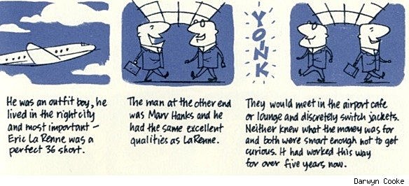
On top of that, it's probably the funniest and most absurd of the heists. The idea of these guys, with suits full of money and a big guy just getting on a plane with a gun... It just felt like, "What the hell. Go for it." And then, by the next one, I made a decision to pull right back, to get closer to the style I used for the book so that the reader doesn't get too uncomfortable.
TS: And lead them right back into the Parker narrative. I do have to say, if I had a complaint, that last heist has my only one. That's the part of the book where Westlake has that line, "They believed in machine guns." I love that line.
DC: Hey man, a lot of good lines end up on the floor! For what it's worth, I spent hundreds of hours with this prose, and losing any of it can be really heartbreaking. It's very difficult in that aspect, because he didn't waste words. It's not like there's a lot to cut. But when it's a scene involving physical action, you know, I have to step away from the narrative. I figure it's my job to visually translate the narrative, and let his dialogue shine through. But in the scenes where I set up the narrative to carry a flashback, or carry a sequence... There's not a lot of adaptation to be done. A little prudent editing, but his prose is perfect.
TS: What was it like performing plastic surgery on Parker visually so soon after coming up with him? Did Donald ever mention anybody besides Jack Palance, any ideas for what a post-chop Parker should look like?
DC: Palance was Westlake's only visual reference. When I changed Parker, the idea was always to use plastic surgery as a metaphor for his emotional regression. He's meant to look like a rawer, more stripped down version of himself. There was no one specific in mind here -- it was more an exercise in imagining what could be done to alter the face I'd already designed. I thought about the surgical procedure back in 1962. Chemical peeling and less nuanced procedures just took my imagination to a more cut up, severe looking version of the man from "The Hunter." His jaw, and most importantly, his eyes, are the same. The rest is meant to reflect a man drained of things like remorse and compassion. A loveless, unadorned man.
More From ComicsAlliance


![Darwyn Cooke Adapts A Masterpiece in ‘Richard Stark’s Parker: Slayground’ [14 Page Preview]](http://townsquare.media/site/622/files/2013/12/Parker-top.jpg?w=980&q=75)
![IDW To Publish ‘Parker’ Prose Novels Illustrated By Darwyn Cooke [NYCC 2013]](http://townsquare.media/site/622/files/2013/10/Parker-Illustrated-Novel-top3.jpg?w=980&q=75)