Judging a Book By Its Cover: 3 Comics We Loved at First Sight

Contrary to popular belief, you should judge books by their covers. These days, covers are a marketing tool meant to sell you a comic. Since companies want you to buy their books, their job is to come up with the most appropriate, or attractive, cover to get the job done. Companies want you to judge books by their covers. The problem is that covers for comics, and particularly superhero comics, tend to be a little lackluster. You get an action pose, a logo, and that's about it.
So what makes a comic book cover good or bad, and what makes the best ones great? After the jump, we're taking a look at three series that got it right: Invincible Iron Man, 7 Billion Needles, and Sin City.A "good" cover can come in a wide variety of styles, designs, and types. If a cover makes you interested enough in a book to want to buy it for non-ironic reasons, that's probably a good cover. If the art is ugly, for whatever value of "ugly" you subscribe to, then it's probably a bad cover. If a cover fills you with questions unrelated to the content of the book ("How does her back bend like that?"), then it's also probably a bad cover. There are precious few hard and fast rules for covers, and a few of the greatest covers of all time have undoubtedly broken all of those rules.
These three series experimented with the format and expectations of their stories and genres and managed to come up with something that is striking, interesting, and notable on the shelves. They showed a foresight and willingness to take chances that can depressingly rare at times.

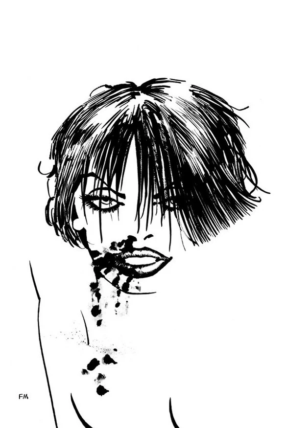


Generally, when comics covers are released online, you get the raw image before the company's production team has a chance to add a logo, issue number, and UPC over the art. When these redesigned covers for Sin City were solicited, my first thought was, "Wow, what a weird choice. I don't know if I like these at all." They look almost unfinished, somehow. The last wave of Sin City trades were perhaps over-designed, but these seem like a step too far in the other direction.
Viewed in print and in their proper context, though, these covers are striking. There is no logo, no issue number, and no title on the cover, just a splash of Miller's art on a perfectly white canvas. The name and volume number have been left on the spine, of course, but the plain cover is stark and captivating. The lack of trade dress actually works in the favor of these covers, as they are forced to live and die by their art alone.
The contents of the books aren't immediately obvious, but not in a way that makes you not want to look inside. The cover to A Dame to Kill For, featuring a bruised and bloody Ava, is haunting and interesting, with the barest of lines suggesting the outline of her body. The cover to Booze, Broads, and Bullets breaks with the stiff black and white of the other covers to add an eye-catching splash of red in the shape of Plastic Man's tunic.
These covers work by going against conventional wisdom. Rather than dedicating an entire cover to high-octane figure work, a fancy design, or even just the name of the book, the covers are selling Miller's art. The interiors are just as black and white as the exterior, and the depictions of the characters is more or less how they are treated in the books.


Superhero comics are a tough area to experiment in. The fans have certain expectations when it comes to long-running series, and the publishers are primarily interested in profits first. Cape comics are not really where you go to do the comic book equivalent of a thirty minute improvisational jazz solo.
Despite this, an arc of Invincible Iron Man centered around the rebirth of a more classic version of the character featured covers that went against tradition. While there were other covers that followed tradition (featuring scenes such as "Hero Laying On A Bed," "Hero Flying Through the Sky," "Villain Posing," and "Heroes Teaming Up To Do Something"), the great covers were the ones that didn't.
These covers jettisoned the Iron Man logo, which was about to be plastered in front of several million eyes thanks to Iron Man 2, and anything even resembling bootjets. Instead, they went for something a little more abstract. The covers relate to the story inside the comic, but generally in a figurative way. The unified trade dress, bold use of a single color, and grouped concentric circles gave the story arc a fascinating look and elevated these covers beyond the run-of-the-mill "Iron Man Shooting Lasers" type of cover. While it was made specifically for this story arc, rather than being a full replacement, it was beautiful while it lasted.

Salvador Larocca and Rian Hughes, designers of the Invincible Iron Man covers, focused on a design that didn't look like anything else on the shelves. For 7 Billion Needles, Vertical Inc. went in a different direction. Science fiction has a rich history, and 7 Billion Needles is an adaptation of a classic story. Rather than working up a cover with a cool pose or an explanatory image, designer Peter Mendelsund embraced an aesthetic that once represented the finest of paperback fiction.
Around eighty years ago, Penguin Books was making a huge name for itself with its cheaply priced paperback novels. They used a distinctive design to build their brand. They used one color (decided by the genre or type of book), bold text, and a unified design across the line. You can view several Penguin Group covers over the years on this informative history of the franchise.
For 7 Billion Needles, Vertical contracted a cover that was reminiscent of those classic novel covers. It's an homage that is designed to tickle the part of your brain that may be familiar with Penguin's books and attract the part of your brain that isn't familiar. Even without knowledge of the history of book publishing, the covers look good. By emulating a strong design, but adding their own twist with the cover images, Vertical created a fresh cover.
The back cover, not pictured, is similarly striking. Rather than being crammed with quotes from critics or a detailed plot summary, the back cover features six sentences in large text. One sentence is a catchphrase ("The hunt is on!"). Three sentences are plot summary. Another sentence explains the history of the book, and the final sentence gives you the high concept of the series: "7 Billion Needles is emotionally intelligent science fiction in a compact four volumes." The same economy of space that informs the design of the cover also informs the back of the book, which is spartan almost to a fault.
All of these covers look good, and are testaments to originality and experimentation in the modern comics industry. They work with nontraditional themes, explore new ways to use cover space, or make references to the past to create a connection that otherwise may not have been made. Rather than being judged as good covers or bad covers, it is perhaps more effective to term these effective covers. They get the job done, and admirably so.
What comics in your collection had cover art that made you feel like you had to look inside?
More From ComicsAlliance
![Ironheart Shares The Sky In ‘Invincible Iron Man’ #2 [Preview]](http://townsquare.media/site/622/files/2016/11/Invincible_Iron_Man_2_Featured.jpg?w=980&q=75)

![Riri Williams Flies High In ‘Invincible Iron Man’ #1 [Preview]](http://townsquare.media/site/622/files/2016/10/Invincible_Iron_Man_1_Featured.jpg?w=980&q=75)


![Google Play’s Bubble Zoom Feature Hopes To Change How You Read Comics [SDCC 2016]](http://townsquare.media/site/622/files/2016/07/Bubble-Zoom-Featured.png?w=980&q=75)