
Duet On ‘Solo’, Part Eight: Teddy Kristiansen

Published between 2004 and 2006, Solo was a DC Comics anthology series with an innovative twist: each issue was created from the ground up by a single cartoonist and collaborators of his own choosing. Edited by DC's head art director Mark Chiarello (Wednesday Comics, DC: The New Frontier), the series offered artists a platform to control their visions completely in the form of original stories, unfettered access to DC's library of characters, and without regard to continuity or other publishing concerns that affect the creation of a typical DC superhero book. Although Solo spotlighted the work of such talented and popular creators as Darwyn Cooke, Tim Sale, Paul Pope and Michael Allred, the series was cancelled after just 12 issues.
Even in a time when the superhero comics were experimenting wildly with structure and style, Solo stood apart and remains one of the best and most interesting mainstream series to emerge from the early years of this century. In this installment of Duet on Solo -- which is really a Trio on Solo -- writers Sean Witzke, Matt Seneca and Joe McCulloch take an extremely close look at the eighth issue of Solo, created by Teddy Kristiansen.Matt Seneca: And now we come to the comic I've always previously thought of as the "mid-album slow jam" issue of Solo, but which upon my most recent rereading I feel more inclined to refer to as the "black metal" issue. Not the "early guitar-grind goblin-y black metal" issue, though, the "weird neo-classicist European symphonic black metal" issue. Thoughts, boys? Because wow, this is a very dark and very refined piece of comics that really does stick out a bit from the rest of the stuff DC published under the Solo banner.
Sean Witzke: I'd say it's the adult contemporary issue? Maybe the smarter variation on that where it's actually listenable like those Tallest Man on Earth albums Marty Brown likes so much that I never listen to more than once. It's very much a low-key thing. The black metal I can definitely see because it's the absolute bleakest issue if we're ranking.
Joe McCulloch: You know what? I'm gonna go out on a limb here and declare this the most radical issue of Solo. And the reason for that is because every other issue sports at least some material potentially applicable to the DC superhero milieu that the series as a whole kinda-sorta hews to. Like, the Damion Scott issue might employ a more vividly graffiti-influenced style than you'll typically find in action comics stuff, but that stuff's still applicable to running-zooming bang! pow! superhero comics. The Richard Corben issue is totally in line with his underground stuff, but it also implicates the old post-Comics Code mystery and horror comics DC used to run -- that's where Neil Gaiman copped some of the Sandman cast, after all. And guys like Howard Chaykin have made whole careers out of stuffing their interests into crevices upon a superhero-dominated landscape; thus, he still seems to "fit."
But where, I ask, is the "depressive Scandinavian literary comics" tradition in the DC publishing suite? Nowhere -- but that's exactly what Teddy Kristiansen is serving up.
MS: Ah, you're forgetting the upcoming release of the comics-form version of The Girl With The Dragon Tattoo from the fine folks at 1700 Broadway! But yeah, I think it even goes farther than you're suggesting. This is the issue of Solo that goes lightest in the "genre bulls**t" category. The two shorts that edge closest to classic adventure comics territory are both done with a very determinedly literary style to them, one that de-emphasizes shock and awe and goes for timbre and tone. Even though the previous issues run a fairly wide gamut of non-superhero subject matter, this issue feels like a much different reading experience, and makes all the others feel more similar to each other by contrast.

JM: It definitely takes the prize for Most Grudging Incorporation of Superhero Content, yeah. But there's another key difference: almost every other issue of Solo either catches some artist at the cusp of (or early on in) some transitional period -- your Corben, Chaykin, McCarthy issues, all three of those guys working their way into steadier mainline comic shop genre work -- or it sees a fairly experienced hand doing what they've done for a while, usually to DC's benefit; even Sergio Aragones had Plop!, y'know.
For Kristiansen, though, this was sort of a last hurrah in a scene I'm not sure had much to offer him anymore, having already gone through Vertigo horror stuff like House of Secrets and Sandman Midnight Theatre, and finally walloped his head against the outer contours of "superhero" comics with It's a Bird... After his Solo came out in 2006, the dude never did a longform comics job for the North American market again -- compare that to Jordi Bernet, who did a lot more. Moreover, this was the first time anyone in North America really saw Kristiansen working as a writer; his near-total rejection of the dominant mode of storytelling in DC publishing feels almost a kiss-off. I know he's made a few small appearances here and there, but it's clear that his energies are now focused toward the European market... and, I guess, the slow, slow, slooow progress of Genius, his Steven T. Seagle collaboration advertised in the back of this issue, which is still apparently forthcoming. But from First Second, not anyone in the front of Previews.
SW: I don't know... "Love Story" could be argued as Jimmy Olsen and Lois Lane meet in a Jason comic, so there's some touches of the superhero universe in even the most respectable work here, but there is a restraint that you really don't see in these Solo issues. It's not Kristiansen going hard in the paint the way you even see people that couldn't go hard if they wanted to attempt (like Hampton and Sale). It's got a deft touch that the other issues aren't even shooting for.
MS: Elegance, yeah. Not common at all in comics of any kind. Man, I'm always gonna wonder what kind of paintings Jimmy Olsen makes in his spare time now. I dig that reading a lot. Honestly, I feel like this issue is Kristiansen succeeding in doing what Hampton fails at next issue. It's actually kind of astounding how well he acquits himself as a writer in this issue -- like, that's the thing he pulls off here that most impresses me, even in a comic full of lovely art. Dude has no track record, and yet here he is completely upstaging million-selling novelist Neil Gaiman. I think if anything, comparing the writing in this issue to the other ones provides a pretty good object lesson in where Solo as a whole tended to go wrong when it went wrong -- nothing Kristiansen writes here is either cute or knowing, it's all very plainly stated, privileging a buildup of smaller details over "big moments," neatly structured with allowances made for satisfying dramatic payoffs. Basic "short story 101" stuff, but the affect of comics is taken right out of it, and that's enough to make it feel pretty bracing. Especially in a DC comic. The reader's enjoyment isn't assumed from the outset the way it is in a "Oh My God Tim Sale Drawing Batman" comic or whatever, it's actually earned in the buildup of the stories themselves.
SW: I think he really outshines his collaborators, because the Gaiman story is cute and the Seagle story, I think, is trying to be cute? His own stories seem to have that quality that good Mike Mignola stories have in American comics, where it actually seems he's read some short fiction instead of just anthology comics, and gets the story 101 beats as needed rather than as flourishes. It's not in the tradition of any kind of EC or DC anthology work at all, which is great to see in Solo which is really a "pick Showcase or Creepy" as a model and run with it format.
JM: What pretty much knocked me out when I first read this issue -- and it's one of the more vividly-remembered issues for me in the whole run -- was how both of the collaborations were pushed right up front, like a pair of aperitifs. Two lead-ins, which nonetheless compliment the main course very well; and there's no doubt whatsoever that the solo pieces are the important bits, which cannot be said for every issue of... uh, Solo.

MS: We may as well do the grunt work first and go through this thing in order, starting with the Neil Gaiman-penned Deadman short that kicks it off. I think the collabs-first structure of the issue is almost like a carrot on a stick for the "typical DC reader" as imagined by the guys in charge? The whole story is basically a short-form, hasty rehash of one of Gaiman's best-remembered comics, "The Sound of Her Wings" in issue #8 of Sandman, with Deadman replacing the Gaiman-created Death in the role of guide to the realm between life and afterlife. It's as though Gaiman was just asked to "be Neil Gaiman" and make the comic a little more palatable for people, and the solution he came up with given whatever time constraints and meager paycheck DC offered was just redoing a story he knew his fanbase was into. I dunno, I don't care for Sandman #8 at all, and I think this story is pretty obviously an inferior rehash of that comic... nice art, though!
SW: This is one of the issues that make you wonder if there was a lot of rejected work that got replaced with collaborations in the back half of Solo, which is the odder half. I can definitely see the Gaiman story as a "well, we need to change these pages" situation. With the story at hand, it really seems like something that Gaiman goes back to a lot which is the mythical spectre of death sitting with someone mortal and relatively innocent as they discuss their life/death. It's in "Sound of Her Wings", the Death miniseries, Smoke and Mirrors and American Gods. That's also most Deadman stories as well. Actually, you kind of can see that they had this story commissioned just so they could get that Deadman cover. It seems like there's a discarded cover on the inside by the table of contents, as in the Allred issue.
MS: Which is about ten times more badass as a picture.
JM: Amusingly, Gaiman's contribution comes off as probably the most cliché North American indie-ish comic of the lot, with poor ol' Deadman harumphing over his damned luck with the ladies -- cue half-cutesy aaaaww ending! I did sort of like how comparatively formless it is, though, compared with Gaiman's Sandman stuff. Like, it's mostly Deadman just rambling on and on to this girl about inhabiting undersea creatures and using a dude's body to have sex and stuff. Not much more than a glob of vaguely sinister quasi-enchantment, but it does quite deftly establish the ongoing concerns of the issue as a whole: the ephemerality of sensation, the futility of supernatural faith, and the inevitability of death.
MS: That's an interesting point, but the heaviness of those concepts isn't established in the least -- death, inertia, sensuality, all feel distinctly without stakes as handled by Gaiman here. Which actually ends up being pretty effective once Kristiansen plunges readers into the cold bath of actually having to deal with more fully realized, deeply considered iterations of the same feelings and ideas. Deadman striking out at the end, man, I knew that was coming so much that I thought it wasn't coming. It was so cliché it surprised me.
SW: Way better than the Seagle script, but that's saved by Kristiansen really just taking apart the style he was using for Deadman.
MS: Gary Panter influence in the house!
SW: Werner Herzog influence in the house!
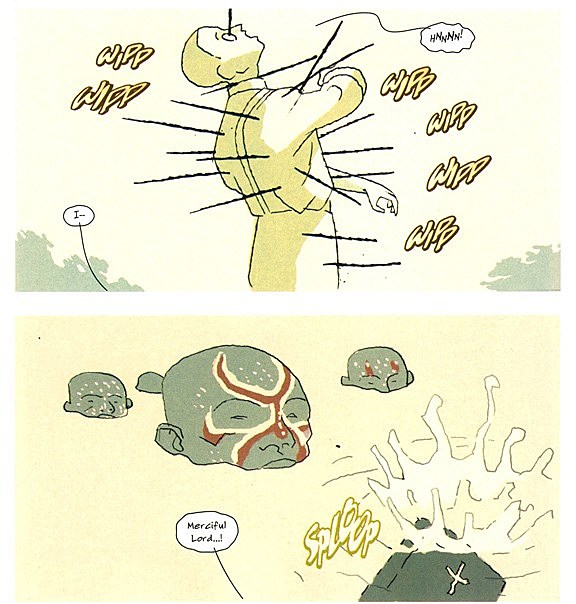
JM: That leads me to a very important point: what the f**k happened with the sound effects in the Seagle story!? Like, you look at Aguirre -- when people shoot arrows at the guys on the raft, you don't see or hear anything, it's just projectiles silently accumulating on dudes until they're dead. It's eerie, and thematically apt. Here we've got lovely, austere panels cluttered with these horrible "WIPP WIPP" sound effects that look so out of place I'm presuming letterer Rob Leigh either ran out of time and imported fonts from Infinite Crisis or the editors got panicked that nobody would understand what was happening so they asked him for last-second changes.
MS: Well, "SPLOOP" is a pretty good representation of something being dropped into water, that one rings true for me, at least. But yeah, we need to talk about how poorly the lettering in this comic fits with Kristiansen's art. Some of the worst mid-2000s attempts at trying to make computerized fonts look like hand-lettering and just failing hard. The frontispiece to "Ruins," such a great story, leaves the immediate and lasting impression of an Olive Garden menu circa 1997, and I've thought that ever since I first read this comic. It's distractingly bad, especially since Kristiansen's approach leaves a lot more evidence of human hands and analog tools at work than anyone else's Solo issue does.
SW: I didn't have any real problem with the actual lettering except in this story, where it felt completely out-of-sync with the rest of the book, and the story itself. In the stories further into the issue I really didn't feel the noticeable "oh god what were they thinking?" in this section. Of course in the scheme of garbage Solo lettering it's actually okay? I guess. Of course it's the story where the printed and read word is of the utmost importance, because Bronte sisters soothe the savage... wait.. no, great English literature works for even non-English speaking... no... attractive white women reading is... no, I'll get it...
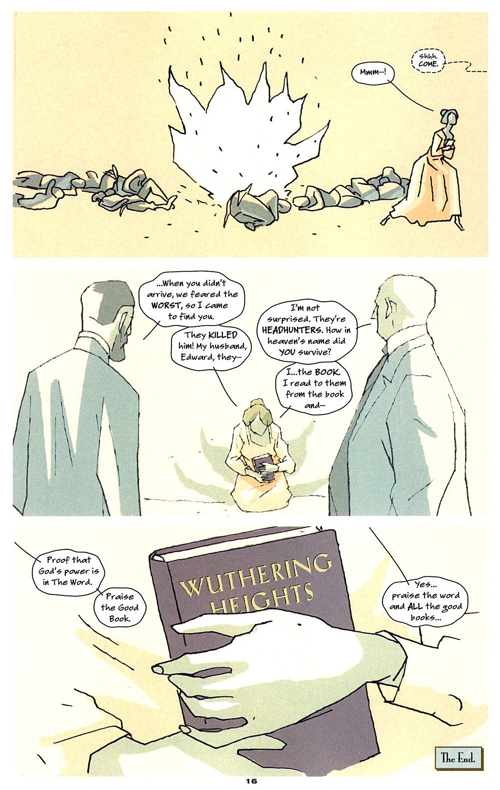
JM: I get the impression that the natives are only actually responding to the gestural and tonal values the woman was giving off -- the idea being that the scriptural value of the literature is irrelevant in the face of some obscure human empathy... or the everlasting value of diversion. Hard to tell. Anyway, religion totally can't protect you from death, conversion experiences are arbitrary and capricious, and the only certainty is the cold embrace of the grave. Excelsior!
MS: SO BLACK METAL. This thing feels like pure folly on Seagle's part -- putting together a terrible story which operates on the pretext that words and narrative hold undreamed of powers, only to be completely shown up by some of the best looking comics art I can think of. The only thing really worthwhile about this comic is the pictures, which see Kristiansen cutting out probably 95% of the amount of linework that make up typical comic book pictures, implying light and shade with beautifully vague bits of spotted peach and ochre tones, and shooting what lines do remain on the page through with zigzagging Panter-style modulation. It's stunning stuff, a kind of cartooned version of high Impressionism that really doesn't look like anything else out there -- breathtakingly subtle and precise artwork that still carries a big sense of the childlike about it. All the comics need to look like this, guys. I'd rather look at the warpaint patterns on the African natives' heads in this as they chopped me into pieces with an axe than listen to Steven Seagle read me Wuthering Heights by a roaring campfire any day, or read Wuthering Heights at all for that matter. There's no doubt where real power lies by the end of this thing, and it isn't where the dude writing the comic thinks.
SW: I think calling it Black Metal is pretty much just Scandinavian disposition. Hell, did you see Troll Hunter?
MS: Ha! You got me. And now before we get too far off track, care to talk about some actual good comics?
SW: "Love Story" is really where everything clicks, and it ironically starts off as less abstract than the narrative that follows or the artistic style that precedes it. It is more of a traditional "painted Vertigo comic" than the flat blue geometric shapes in the earlier story, and the story is the kind of melancholy almost-love story that is done a lot in comics, just maybe not with the sensitivity that Kristiansen is bringing to this character who looks a whole lot like Jimmy Olsen. I've read this kind of story in a few autobio books, but none of them really worked this well as stories.
JM: The best part of this one is the shadow play on the dude's face, as if the bags under his sleepless eyes have grown to devour his very features. Also, it took me something like three readings before I figured out the shadows form the shape of... a heart! It takes skill to be that subtle with such an obvious-sounding move.

SW: There's some great, really simple but effective work with his hair too -- which works the way that stubble would usually be the visual signifier go-to for the average comics artist.
MS: The faces in this thing are amazing, just because of how much Kristiansen communicates with such a limited set of tools to work with: dot eyes, tiny little mouth, the crusty texture of paint frosting over everything. These are Modigliani faces for sure, cartooned pretty much in exact accordance with that guy's stylistic gestures, but you get the sense that Kristiansen went way past where Modigliani ever got the chance to and actually figured out a kind of ratio that allows heads and features that look alike to operate in sequence, in something that comes closer to the action of real life than a completely still single painting on canvas can.
JM: It's also maybe the most writerly story in here, with text descriptions carrying all the burden of establishing the central motif of the woman as a source of radiating heat; interestingly, Kristiansen underplays this aspect in the visuals, just backgrounding the (indoor) woman with warmer colors than the outdoor scenes. In this way his story and art work in tandem, complementing one another without quite feeling like information is being repeated.
SW: He's a shockingly solid and expressive writer with that stuff as well.
MS: I think it's really nice how literal all the pictures here are too. In a story that's basically about two abstract concepts with no concrete visual identity at all (love and heat) I feel like the immediate instinct is to come up with some kind of cartoon system for showing how they wax and wane -- but the restraint here is really admirable, just tracking the male lead's meandering from his house to his obsession's window and back, and all without ever creating a panel that fails to hold visual interest. Even in the classic John Romita, Sr. romance comics there's always some panel with a girl swooning into a fantasyland, surrounded by hearts or whatever; none of that here.
The super-subtle thing I failed to catch here is the one where the guy is backgrounded by the subtlest blue tracery of the contours of his girl's face -- but yeah, blink and you'll miss it, and it doesn't upset the sense that these are real events occurring in real space at all.

JM: Yeah, it's very "comics fundamentals." Steve Ditko has written about the interplay of words and pictures as a mingling of abstract, conceptual stuff (writing) and the imposition of necessarily concrete icons (art). Funny, coming from as potentially abstract an artist as Ditko -- and he'd have totally meant "concrete icons" to include hearts floating around too, that's OK! -- but anyway, even stripping away the decoration, that's the classical setup.
SW: The absolute hardest thing to do in comics is just clear storytelling of mundane things. Even artists who aren't particularly good that can do that work well earn a lot of respect. I think that's why Steve Dillon has a career despite no one really loving his style but loving his clarity.
MS: I think it's actually good to mention all three of those guys, because Dillon, Ditko, Romita, they've all done more or less conventional readings of the romance comics tropes that Kristiansen leaves by the wayside here before he goes on to do a better romance comic than those tropes can provide. Romance as a genre's been pretty much completely dead in comics since the early '70s, but "Love Story" feels to me like something created in a world where that genre had just as robust a development in the years since then as anything else in comics. I don't think it's exaggerating too much to call this little short a vindication of romance comics -- an acknowledgement that yeah, this much-maligned genre can pull off depth and beauty and sustained interest as well as any of comics' more popular idioms.
JM: In contrast, the next one, "Ruins," reminds me so much of the work of the very particular French comics artist Jacques de Loustal that I wonder if Kristiansen isn't shooting for some deliberate homage -- maybe also intending a harsh contrast between the typical panelization of "Love Story" and the wide tableaux we've got here -- complete with exactly the sort of aloof and/or distended narration that a Loustal collaborator like Philippe Paringaux would set on top.
SW: There is a pretty direct connection between those two stories as they both are relying on the two-tier format, which is the same rhythms as "Love Story" but without any of the narrative movement. It's paintings in a gallery, even down to the historicized and semi-narrative captions.
JM: Yes, it's an extension in every way. Extended in the way the scenes "hold" the reader, extended in the size of the panels themselves, and extended in terms of the very similar theme: where "Love Story" saw ardor as a passing heat wave, perhaps nothing to soak in for too long, "Ruins" studies a consummated affair's similar cooling, an inevitable one, analogized to the crumbling of artistic endeavor. Dude in "Love Story" never even finished his painting. Slacker.
MS: I think what really makes this story stand out for me, both in comparison to Loustal's work -- which, yeah, it's definitely shoulder-brushingly close to -- and also to the legions of inferior painted comics is just how successful the pictures in it are on that paintings-in-a-gallery level. The technique's great, just like it is with everything else in this book, but there's no attempt at the sequential even being made here. It's more the rhythm of illustrated children's literature than anything else. The best single paintings, the best figurative single-image compositions in any medium, both tell a more or less complete story and also force the observer to ask an unanswerable question about what's going on in the pictures -- think the Mona Lisa's smile or the mute observers in so many classical depictions of the Passion Play.
Kristiansen's doing the same thing here, creating images that very ably propel the content of his minimalist script, but that also suggest further, probably unknowable depths with their compositions, their shadows, the attitudes of the figures in them. The panel of the painter watching his benefactor crying from a great distance is almost unspeakably grotesque; the shot of him standing alone in a wood, far off to the side of the image, is both gorgeous and incredibly foreboding. The distance created by Kristiansen's choosing to paint a portrait of a portrait of a woman allows him to take much more serious and daring license in cartooning her face than just painting her would.
This is a master class in pure image-making, kids. The comics stuff is only a small part of it. And it's actually striking to me just how close to the breaking point Kristiansen stretches the mechanism of "comics" itself in "Ruins" -- there's no direct relation between the images from panel to panel, no continuous action, no speech balloons, no sense of time passing in the imagery -- it's like a completely literal reading of the equation "words + pictures = comics." So many "formalist" comics are taken up in trying to bridge that gap -- it's both refreshing and a little unsettling to see Kristiansen creating a story that spends so much time looking down into the cold, cold chasm between those two mediums for presenting information.
SW: This is the story where the shadows on faces blew me away. The contrast between the benefactor's harsh angled shading to the soft and rounded effect on the narrator's face. It's so immediate a way to see these people without being especially loud or even having a specific effect -- there's a tragic quality in both. And then the figures disappear halfway through and we're left with the space. I don't know Loustal all that well but I think there's a little bit of Alan Resnais in there for me, where the objects and places take on the narrative of the characters' presence. More than a little bit of Gorey's The Doubtful Guest as well.
JM: Very old-time gothic, but also a little South American? Maybe some Borges creeping in? Raul Ruiz? I dunno, it's six years later and I'm still stewing over the time a DC comic with Deadman on the cover started dropping Loustal riffs like it's nothing.
MS: And "Ruins" is also wonderfully put together as a story, a narrative -- diary fragments, which we learn by the end have never been recovered, and historical notes are the only words we're given. Everything's suggested rather than stated in both the words and the images. The total effect creates just this massive hole of misery that you understand the characters are feeling, but you never actually glimpse. Which is far more effective than a more literal narrative would be, I think.
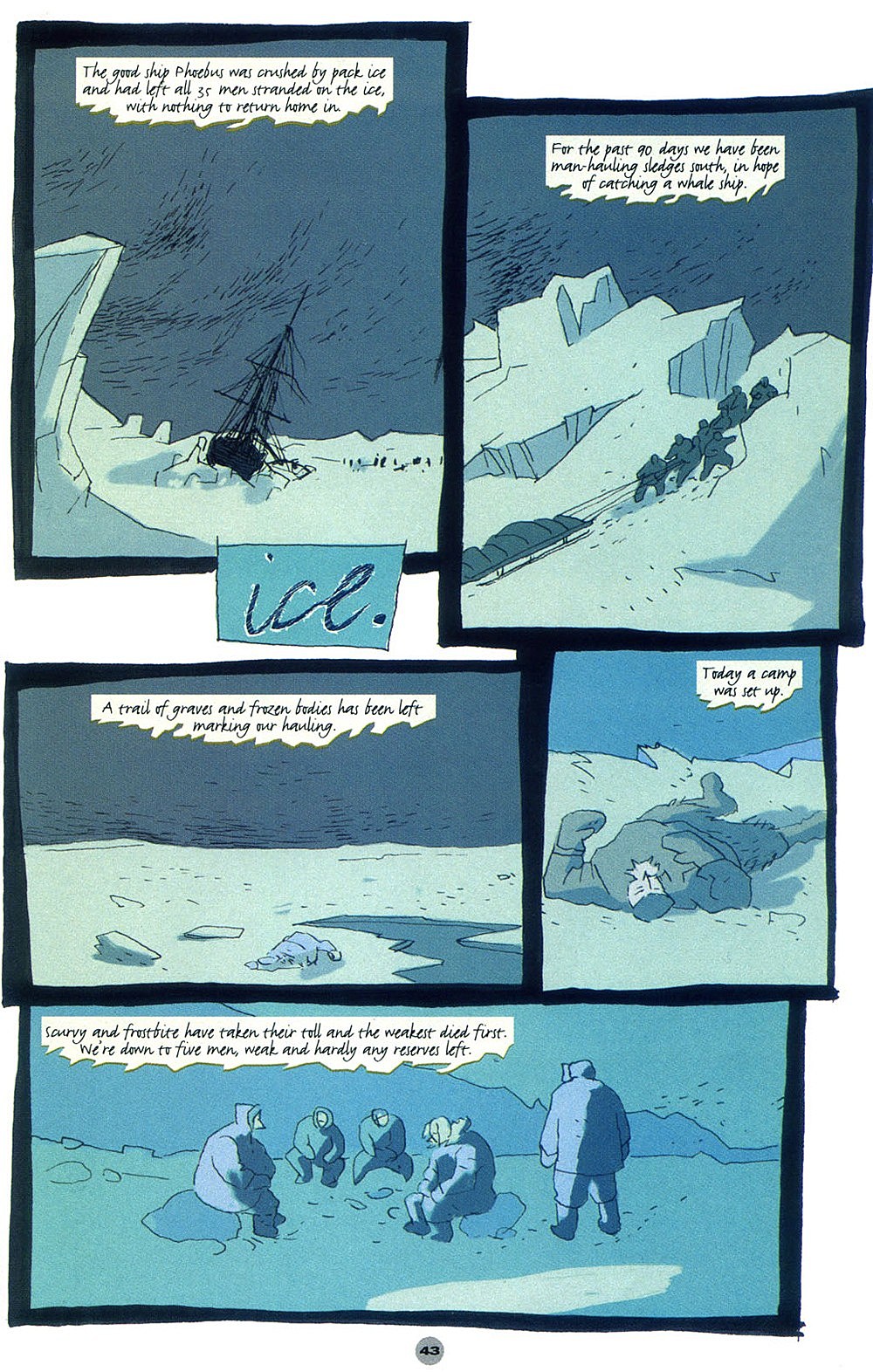
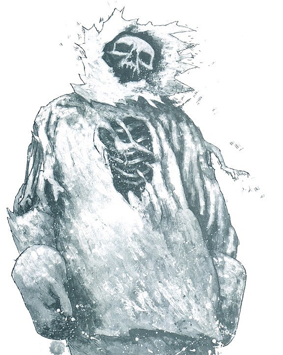
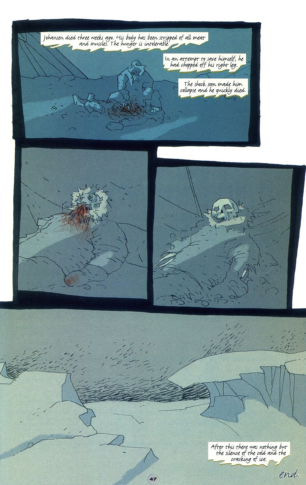
SW: "Ice." is totally Black Metal as hell, BTW.
JM: I love that it's not even a story, really, so much as punctuation. It's cymbals crashing and the curtains plunging to the stage. Here, Kristiansen -- so good at distinguishing faces before -- presents every single human figure as almost entirely identical, so as to underline the final message he's gifting us with: you are doomed. You will die, and because of this, you are not unique. If you skip enough meals, you will become like an animal, and sometime after that you will be nothing but meat. The ice doesn't care about your tears, the weather can't hear you cry. The sky is empty save for ice. This is where we all end up. And, this, logically enough, is where the comic ends.
But -- it's kind of fun! He did save some of his liveliest cartooning for this closing movement, which lends a subtly... maybe not comedic touch, but a sense of play that leaves the reader feeling rather galvanized. Like, hell yeah! Death!
SW: Going from "Ruins," I for some reason was really expecting a kind of Frankenstein/White Fang kind of story and that's so not what it is at all. It could be present day for all we know. It's just if we as humans are put into this level of extreme separation from society we can't last at all -- not as groups, not on our own. Ironically the Aguirre-referencing story missed the "here you are on the other side of the world and you are going to die alone because you can't live with people" aspect of it. Kristiansen really works at using the panel shape and layout to keep us so unsure of our footing, pacing-wise, and he finally lets up when everyone's gone. It's a fantastic contrast to the nice "when you're ready" kind of Neil Gaiman conception of death the book started off with. Instead it's dying bloody and alone. GUITAR SOLO.
MS: The segue between "Ruins" and "Ice" is amazing -- the last page of "Ruins" goes from this gorgeous pink-and-gold portrait of a beautiful young woman into a blue-tinted picture of a crumbling church, and then bang, five pages of rigorously blue comics about dying. It's such a well-orchestrated transition. At least in "Ruins," romance and art exist, however transiently. There's no time or space at all for those things by the time the comic ends. (Which, maybe, is why the comic ends.) What's most impressive about "Ice" is just how consistent the bleakness of the tone is: it doesn't let up or increase, it's just a slow march through the cold. "Love Story" and "Ruins" are both writerly pieces of scripting, whereas "Ice" has no characters, no dynamics, no dramatic tension: we know what's going to happen from the beginning, and then we're forced to watch it happen. Agonizing stuff.
MS: I think the Mignola influence might be heaviest here? It's definitely the most "dudes walking around doing things" comic of the issue. Which makes sense, given the outlook of the comic as a whole: human endeavor leads to a full and final end, so if a comic has to present people in action, it's going to have to present the only inevitable end to those actions.
JM: I'm just thinking now: did anyone else do the thing Kristiansen did up front this issue, where all of the pages of the comic are presented in a misty grey thumbnail format?
MS: No! I checked. So awesome.
JM: Because that's his overture, then. A sigh to himself. This comic is done, and so it can't be done any more. Every birth is a little death! Next issue: Superman!

More From ComicsAlliance


![Bill Sienkiewicz Provides FOC Variant Cover For ‘American Gods: Shadows’ #2 [Exclusive]](http://townsquare.media/site/622/files/2017/03/AMGODS0.png?w=980&q=75)


