![The Art of Coloring: Making Comics With Dave Stewart [Interview]](http://townsquare.media/site/622/files/2010/09/davestewart-batman01.jpg?w=980&q=75)
The Art of Coloring: Making Comics With Dave Stewart [Interview]

Open up a comic book and tell me the first thing you see. It isn't the story or the lettered; those elements of a comic book take time to read, digest, and comprehend. It's not the art, either. You can tell if art is dope or not at a glance, but you can't absorb any details without taking a break and really looking at a page. No, the first thing you see in a comic book is the color. You can tell not only whether it's stark black and white, greyscale, or color, but also recognize the mood, setting, or time period just by letting your eyes run over the colors.
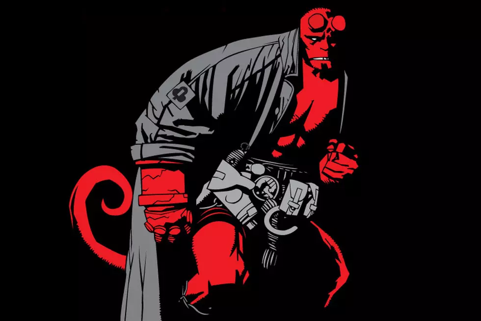
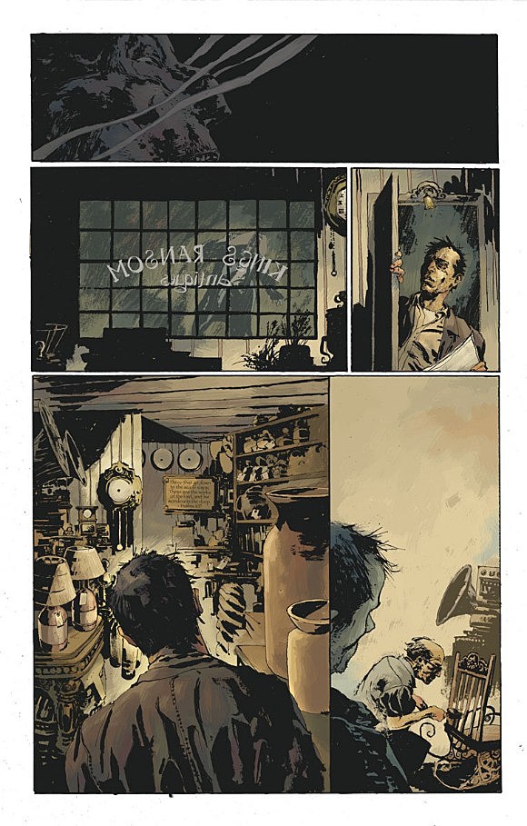
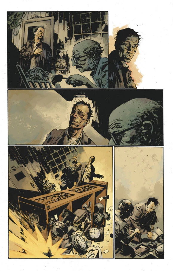
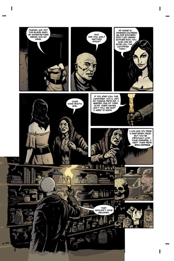
In an effort to shed some light on this integral but vastly underappreciated aspect of comics, we spoke to Dave Stewart, the legendary, six-time Eisner award-winning colorist of books all across the comics industry like "Batman," "Action Comics," "New Frontier," "Hellboy," and "BPRD."

"Daytripper" #6
 Dave Stewart: I wanted to be a penciller at first, but I did have an interest in coloring. I was experimenting with it in my Photoshop class in college (I don't think anyone was coloring comics in Photoshop yet). My instructors at school set up a design internship with Dark Horse Comics. During that internship, Matt Hollingsworth saw some full-size cutouts I was painting with dyes for the San Diego Comic Con, and suggested I trying out for a job as a guide painter. I didn't get that job, because I didn't know what I was doing, but was instead given the position of separator. A job on the computer interpreting those guides into vector graphics. One thing lead to another, the coloring thing just clicked.
CA: Judging by your profile on ComicbookDB, you broke in right around the time the major companies were making the switchover from hand coloring to computer coloring. Did you begin with old school coloring or have you been digital for your entire career?
DS: I just barely got a taste of painting guides [hand-colored shading keys made for the printer]. I worked for quite awhile interpreting those in a program called Tintprep. When Photoshop took over, I had a bit of a head start with the work I did in college. It was in Photoshop where I started coloring without guides. At one point I ended up in the service bureau, and I was scanning and color correcting painted covers and interiors. I was mesmerized by the blue line coloring. I think being that close to those paintings really had an effect on me. You had to dissect the images to make sure the color was accurate for print. I think it allowed me to inspect the details that went into painting, and eventually apply some of those ideas to the computer.
CA: Coloring started making great leaps forward in the '80s with the work of colorists like Lynn Varley, John Higgins, and Richmond Lewis. Are there any colorists who have inspired your work or changed the way you do things? Do you have any favorites from pre-computer and post-computer coloring?
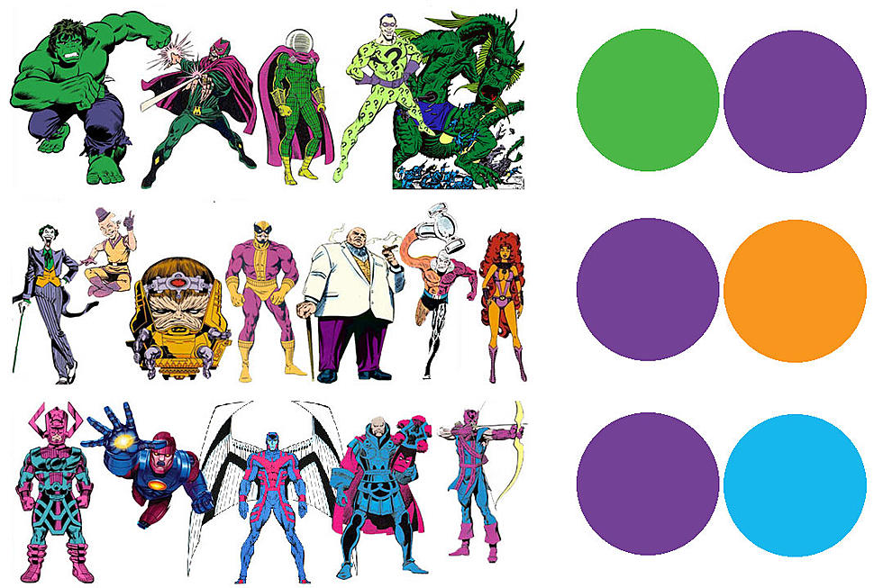
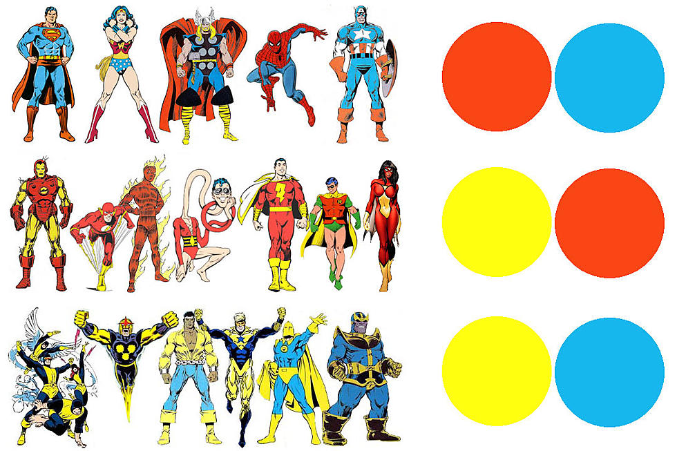
DS: I always liked the way Kirby colored himself. He had a really different approach that set him apart the other guys. He did a lot with a limited palette. I really took notice of coloring when I saw Steve Oliff's work on "Spawn." Lynn Varley really blew my mind with what she was doing on Frank [Miller]. Then along the way, Matt Hollingsworth [and] Dave McCaig were inspiring. Working with [Mike] Mignola has probably had the biggest influence. He's given me such a solid graphic base. I'm always trying to adjust and change, to keep things interesting so I always have something I'm soaking in. I just saw the movie "Seraphine," introducing me to her paintings. The colors in those are stunning.
 CA: What's your software lineup? You work in a range of styles that seem a far cry from the gradient-based Photoshop-heavy material that dominates the superhero titles and direct market. Is this just a different application of tools, or do you have your own software suite that works for you?
DS: Just Photoshop CS3 right now. I use the Cintiq monitor, which Is amazing. I just try to use it as a big paint set. I'd rather try to paint in an effect than let the computer do it. I try to hide the cold, technical side of the computer and let the warmth of the human hand take over. I have a couple of brushes I use, but nothing special. I used the same brush for the backgrounds on "New Frontier" that I used on "BPRD" in the beginning. Just different technique.
CA: Correct me if I'm wrong, but coloring is one of the last steps, if not the last step, in the production of a comic, after pencilling and inking and alongside lettering. How long does it take you to color an average 22-page comic? Can you walk us through the process of coloring a page, from line work to finished colors?
DS: Depends on the project, but I try to keep a project to 3 to 5 days. Those are long days, of course. I'll download the pages form the publisher FTP site, turning them over to my crack flatting team. Sometimes, I'll get a little help from them on dropping in colors if the scene is a repeat, and coloring the line art (clouds, water, etc). Depending on the artist/writer team, I'll contact them for notes or the script. For instance, Mike Mignola and I will go over the story in a fair amount of detail by phone. Guy Davis sends me JPGs of his line art that he marks up with story notes. It's an important part of the process to make sure the intention of the story is realized with the coloring. Then off to work. I'll usually block in in all the colors, and create a plan for the book. I'll jump into rendering as a second phase. Jpegs are sent to the team, and revisions are made if need be. I'll add the text from the letter for color if it is a Dark Horse book. A lot of companies don't let you color your captions boxes and sound effects anymore. I like to do that if I can, because I think it's an important part of the color design.
CA: You often work on projects for several companies simultaneously. How do you manage the workload? Do you dedicate certain days or weeks to one book to knock it out in one shot, or do you jump around from project to project to keep things interesting?
DS: It's one of the hardest parts of the job. There is a fine line between doing as many books as you can and as many as you should. I think I've screwed that up here and there. As books inevitably go off schedule it effects the other projects you have lined up. When you are doing 5-7 projects a month, it becomes a nightmare. It's finding the right breathing room to make everything work, that's hard to do.
I do try to knock out a book in one shot. It's a lot more productive to do that. It's nice to create some space around the end of the project. A pause that gives you enough distance so you can more critically critique and revise what you have done.
 CA: Poor colors can break a story, but great colors can make one. How much back and forth do you have with the artists and writers of the books you work on? Do you discuss palette and mood with your fellow creators, or do you approach the page according to your own judgment?
DS: It's important to connect with your collaborator. Even if that just means reading the script. It really varies though. Some artists have no input, and others really like to talk through the story. Either way works for me.
CA: How do you approach working for different artists? For instance, your "Action Comics" and "Batman" runs started the same month, one over Carlos Pacheco and the other over Andy Kubert. While the former involved an almost pastoral painterly take, the latter was very shiny and modern. Your work over Lee Bermejo on Lex Luthor was very rigid and angular, with harsh colors and splotches standing beside bright white highlights and strong blacks. Were these stylistic choices based on the character and subject material or the artist you were working with?
DS: It's based on all of that. Trying to do what is appropriate for the project and mesh in the best way possible with the art. Mostly I try to connect with the artist on what they think is appropriate under their art. Being the last [person] in the creative process, the colorist is hopefully supporting what the others have established. On "Joe the Barbarian," we went with two very distinct palette and rendering choices to differentiate the real and fantasy worlds of "Joe." Sean Murphy likes the simpler, less rendered, real world approach on his art more generally, but [he] saw that the story needed that different approach to separate the two environments. I think it works pretty effectively in that story.
CA: As a colorist, what's your approach to textures on backgrounds, skies and large expanses? With a lot of the artists you work with, like Mike Mignola and Duncan Fegredo, there's a lot of room left for embellishment at the color phase, and while the textures used to fill that space could be homogeneous, yours always seem more organic. How does that come about?
DS: For the most part it is just painted in. I just create a texture or shapes that I hope help lead the eye. The random painterly colors that I add just create a warmth and interest in those areas, hopefully without distraction from the main elements. Something most painters do, I think.
CA: Digital comics are clearly an important subject in the industry these days. Has the advent of comics that will 100% match the colors you lay down in Photoshop changed the way you color? Do you have to make any adjustments or avoid any specific pitfalls when it comes to coloring comics for print that you won't have to do for digital?
DS: I don't think I'll have to make any adjustments. I just love the way the pages look on the screens like the iPad. Much more true usually to the intention. How they look on everybody's home computer, who knows. I assume that's just a nightmare of differences and randomness.
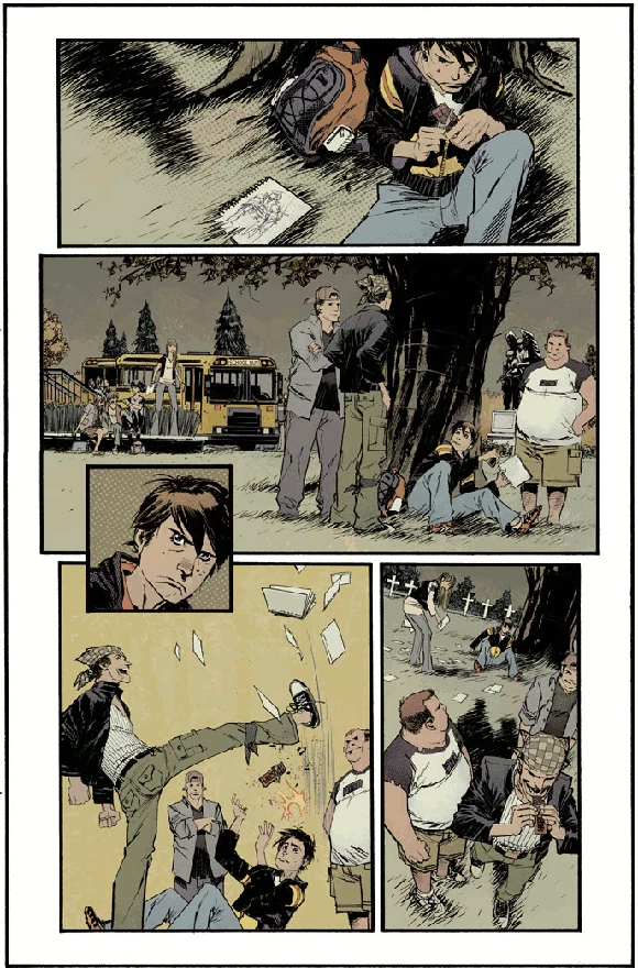
"Joe the Barbarian" #1
CA: Several books you've worked on are already on the iPhone and iPad, not to mention your work with Tim Sale on art for the TV show "Heroes." Are you pleased with the way your colors appear on-screen?
DS: I think the iPad is an amazing way to look at comics. It retains the format and enhances it with the ability to zoom into panels etc. The iPhone isn't good at all, you have to chop everything up and you lose the careful composition of a good comic page.
CA: You've won six Eisners over the past eight years, so clearly your fellow professionals and fans respect your work. For you personally, though, is there a project that you're particularly proud of?
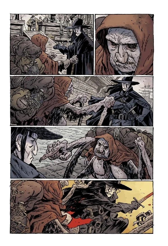
DS: Well, I think the work I've done with Mignola has been particularly satisfying. The upcoming "Screw-on Head" collection has some neat stuff in it. "New Frontier" turned out pretty good too. "Daytripper" has turned out good. I'm just lucky to be working with such talented people.
Check out more examples of the diverse color work of Dave Stewart below:

"Action Comics" #845
More From ComicsAlliance
![When Everything Is Pink, Nothing Is Pink: Sarah Stern On Color And Creativity [Interview]](http://townsquare.media/site/622/files/2017/03/Cindersong-feat.jpg?w=980&q=75)
![A Zombie Gangster Is On The Prowl In ‘Lobster Johnson: Garden Of Bones’ [Exclusive Preview]](http://townsquare.media/site/622/files/2017/01/LJOHNGB-PG-00.jpg?w=980&q=75)


![Hellboy Is Ocean Bound As He Sails ‘Into The Silent Sea’ [Preview]](http://townsquare.media/site/622/files/2016/10/hb_featured.jpg?w=980&q=75)
