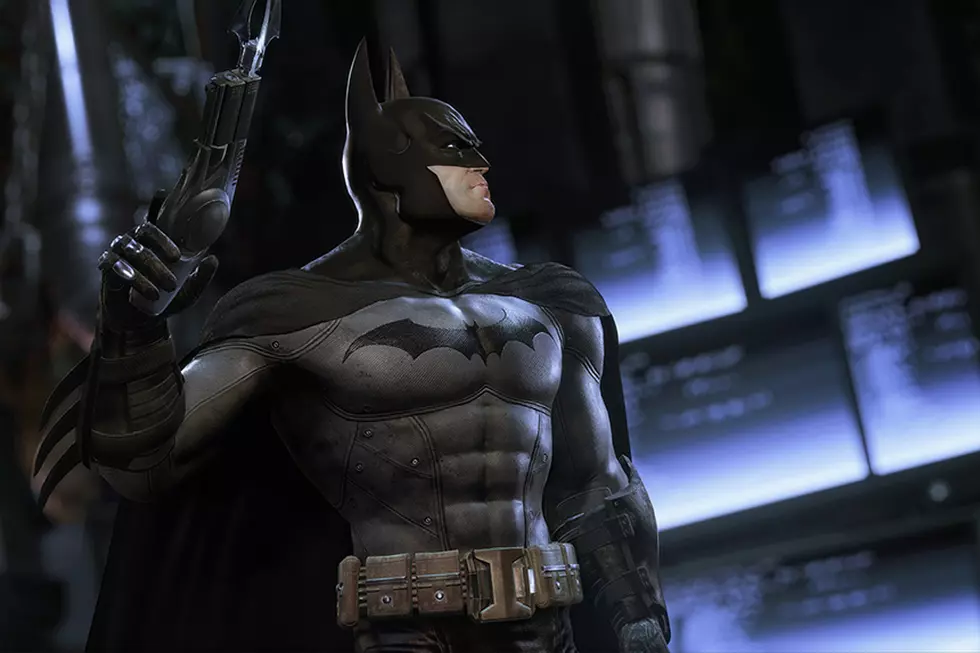
![Real-Life ‘Batman: Arkham City’ Costume is Truly Best Cosplay Ever [UPDATED]](http://townsquare.media/site/622/files/2011/10/me47.jpg?w=980&q=75)
Real-Life ‘Batman: Arkham City’ Costume is Truly Best Cosplay Ever [UPDATED]

As many players of Batman: Arkham City agree, the video game's version of Batman's costume is the best "realistic" imagining of the iconic superhero outfit ever committed to... well, if not to film, then to heavily photorealistic computer imagery. A slick synthesis of the classic blue-grey-yellow look of the Batman comics and the textured amor style of Batman Begins, the Arkham City costume is one of those perfect ideas that just seems too good to actually work in a live-action film. Or is it?
A group of artists decided the game costume had to be freed from its digital confines, so they put their heads together and achieved the unthinkable, a real-life Arkham City costume that's unquestionably the greatest Batman costume ever made."All of us agreed that this was the best movie suit never done as well as the entire game being the film we all wanted to see," wrote Lisa Alvarez aka Batprisss on The Effects Lab, a message board for special effects sculptors, makeup artists, mask makers and designers. Alvarez and her team are veteran special effects industry professionals who decided to form their own company, XworkZ studios, after many years of working for other outfits.
ComicsAlliance spoke with Alvarez, one of the lead designers on the project, who had this to say about her astonishing work:
This was a labour of love that came from years of reading comics and wishing that the character we loved as fans would show up on the screen. It took the incredible game design of Rocksteady studios to finally kick start the project and what you see is our prototype. We used all of our teams experience working on similar designs for major motion pictures, to come up with what we see as a starting point for the direction we think most fans would love to see the franchise go. We feel we have at least started to shed some light on the reality that the character as we know it, can be done true to the books, and doesn't always need to be dressed in black to succeed with the audience.
In a series of Effects Lab posts containing one incredible photograph after another, Alvarez explained the strategy and process behind the ambitious project.

...there were so many aspects to it, including the illusive blue and gray of the new city suit, that we wanted to tackle. Some of the goals on the suit were that we wanted the pieces to be accurate like they walked right off the screen. The whole suit would need to be proportioned to the point that all the pieces worked together to complete the image of the character design. This was tricky due to the fact that no human being in the world is the shape of that guy. Especially the cowl. Also the cross texture of the entire suit must be included and it has to run synced up on all panels as the game suit does, so that all lines intersect at an X throughout the entire suit.

We wanted to achieve the right colors and needed them to change dramatically from one light source to another, like the game suit does. Especially the new game where you see a brighter blue cowl in one light and then a seemingly black cowl in another. This went for the gray also as it needed to go dark and also reflect the greens that they used in the game. The whole suit is weathered to match the grittiness of the game suit and made to be worn. We wanted to follow the same basic design of the movie suits meaning separate sizeable torso, legs, etc... all mounted on an undersuit so that anyone could have it tailored to them the same way the movie pieces can be sized. The briefs were done separate so that the movement would be fluid and the entire muscle set-up should look one piece but move easily.

The cowl was really where we wanted to start. With the goals in mind that we wanted to do something with the color that we hadn't seen before. The first game was a much darker Black with tones of blue. The second is a much brighter blue that seems to go black. So we decided to go with two color formulas. The darker cowl was an easy one but the range we wanted from the second took some work. One of our team members specializes in DP work so we did many test shots on the color both film and photo. When you look at the pics it might seem that one is the darker cowl from Asylum and the other is the blue but ...that's all the same cowl in the pics.
The other detail was the one that's been haunting studios for years and that's movement. We wanted to be able to move the wearers head without the statue look and without making a helmet. I think the design of the mask really played into this naturally because I have seen all of the film cowls and I have never seen anything look or move like this cowl. With the way the mouth opening is, it really moves as you can see from the scream pic. The mask was sculpted with thickness in mind and wearability not just shape so that strategic areas are specific thicknesses. So when poured with a core in, the neck for example is thinner and the jaw lines are thicker etc... This helps how it holds to the face and where it will bend. And because the collar was not to be glued down like the film cowls, it was allowed to move, and the head can turn very easily. So without scallops the movement looked great similar to an action figure when you turn its head.
The size of the initial cowl made it ideal for a range of users between 22-23 inches plus. But when going to the higher end head size as you guys know you start to run into issues with how well it feels and looks. So we made a second cowl by just adjusting the master that fits a range of 23-24 plus inches. The look of the cowl really plays into this being necessary as the cowl itself goes long and narrow at the top. Which is what makes it look so cool. Also with the details, the temple design especially, should roll and fade with the light.


You can read much more about the making of this costume and see even more photographs at the original thread at The Effects Lab.
[Via io9]
More From ComicsAlliance