The 14 Best Title Cards From ‘Batman: The Animated Series’
It probably won't surprise anyone to find out that lately, I've been re-watching "Batman: The Animated Series" on DVD, and while I remember the high points of most of the stories, I'd almost forgotten how great the title cards were.
Aesthetically, they were one of the defining elements of the show's art deco / noir-inspired look, mimicking the title cards and trailers of classic films. 1939's "The Return of Doctor X," for example....

...could've easily passed for a title of a "Batman" episode.
Sadly, the title cards were left by the wayside when the show got its simplified redesign and weren't seen again on any of the DC Animated shows, which is a shame, because seeing them on "Superman" or "Justice League" would've been incredible. Even so, there were 84 of them produced for "Batman," and today, I've picked out 14 of my all-time favorites, courtesy of Toonzone's extensive gallery.

#14. Almost Got 'Im: One of the best episodes of the show, "Almost Got 'Im" focuses on a super-villain poker game where the participants talk about how they came very close to killing Batman, but the title card doesn't have a hint of Poison Ivy or Killer Croc. Instead, the shadowy figures in a smoky room wouldn't be out of place in any crime thriller from the '40s.

#13. Batgirl Returns: Aside from the awesome silhouette (which seriously should've been on the Batmobile's mudflaps), the monochromatic effect of Batgirl swinging in front of the moon is evocative of both the colored spotlights in the opening sequence of the 1966 Batman movie and -- along with the title -- the posters for "Batman Returns."
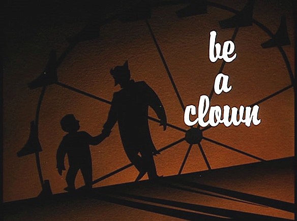
#12. Be A Clown: Given how dark the show was -- and by that i mean actually dark; it was drawn on black paper -- it's a given that it often boasted a great use of shadows. The distinctive silhouette of the Joker leading a child away to a Ferris wheel is every bit as creepy as it should be.

#11. The Terrible Trio: You can't tell from the screenshot, but in the episode, the words 'The Terrible Trio" are actually animated in the style of an old horror trailer. A neat effect for an episode about three guys in fright masks.

#10. Mad As a Hatter: This is one of the few title cards that wasn't done in the distinctive Bruce Timm style, and the classic storybook look of it works very well for the episode.

#9. Nothing to Fear: Another great use of shadows, the soft edges of the Scarecrow's silhouette does a great job evoking the fear gas that he uses in the episode.

#8. The Man Who Killed Batman: With all the praise the show gets for being an almost-perfect realization of Batman's darker, more serious side, it's easy to forget that the show was also frequently pretty hilarious. The image of Sid the Squid and his gigantic cartoon eyes would've been equally at home on the title card to a Looney Tunes short. If, you know, he didn't have the word "KILLED" in gigantic sans-serif letters hanging over him.

#7. Harlequinade: Given that the Harley Quinn episodes were the basis of the character's enduring popularity, it shouldn't be a surprise that they also had some of the best title cards. This one provided the definitive image of the Joker's lovelorn henchwench, and was even recycled by Timm for the cover of "Mad Love," the comic that told her origin.

#6. Joker's Favor: Have I mentioned how good the use of shadows on this show was? I have? Okay, good, because this one's just perfect, and it's a testament to how good the character designs were that even the Joker's shadow can be this menacing when it falls across a poor guy who had the bad luck to cross his path.

#5. Harley and Ivy: And speaking of great character designs, the evocative, minimalist pattern of this one is just perfect, blending the colors of the title characters.

#4. Riddler's Reform: "Batman: The Animated Series" was the last place I would've expected to see an homage to a classic Spider-Man story, but there's no getting around the fact that this is clearly evocative of Peter Parker's decision to quit in "Spider-Man No More!"

#3. The Strange Secret of Bruce Wayne: A great title, a great episode, and a great card. I think this is one of the only times the series was allowed to show an explicit reference to death in the haunting skull in a sweating Bruce Wayne's eye.

#2. Harley's Holiday: One of the most beloved episodes of the series, "Harley's Holiday" is also the only title card that didn't use black as its primary color, instead going with something that reflects both the lighthearted nature of the episode -- well, as lighthearted as you can be in a story of an abused woman being thrown back in an asylum after failing to acclimate to the outside world, anyway -- and echoing classic romantic comedies.
Also, it's worth noting that of all the variations on Harley's costume I've seen on cosplayers (and I've done my research on this one, I assure you), I've never seen anyone sporting her out-on-the-town dress and hat combo. It's fantastic, and makes for one of the best images from the show.
My favorite, though, is this one:

#1. Paging The Crime Doctor: I'll admit right up front that this might just be me, but I love this one. The combination of the insanely over-the-top title being rendered in a note-perfect nod to classic thrillers, the stylized shadowy figure of the Crime Doctor and the menacingly huge syringe between his fingers, it's all just beautifully stylish and sharply rendered.
Even if it doesn't boast a Harley Quinn cocktail dress.
More From ComicsAlliance