![Kaine on the Brain: Ryan Stegman’s ‘Scarlet Spider’ Sketchbook [Exclusive Art]](http://townsquare.media/site/622/files/2011/11/untitled-2-1321664499.jpg?w=980&q=75)
Kaine on the Brain: Ryan Stegman’s ‘Scarlet Spider’ Sketchbook [Exclusive Art]

For Marvel Comics readers of a certain generation, there is no story more infamous than Spider-Man's Clone Saga, a wildly protracted and hugely controversial 1990s event that outraged fans by, among other things, revealing that the Spidey whose adventures they'd followed for years was in fact a clone. Like many superhero comics of the era, the Clone Saga was endlessly confusing, bombastic and, naturally, is remembered more and more fondly as time goes on. Indeed, as anyone who's attended any Spider-Man discussion panels at any convention in the last 15 years will tell you, "When is the Spider-Man clone coming back?" is among the most frequently asked questions of Marvel staffers.
The success of Marvel's popular and well regarded Spider-Island event has made what was once unthinkable seem inescapably necessary: a brand new Scarlet Spider series starring one of the '90s clones, and nobody is happier about it than artist Ryan Stegman. He's moved steadily up the Marvel ranks for the last few years to earn this ongoing gig, and shares with us some notes from his sketchbook of Scarlet Spider designs.As revealed to many readers in the Point One one-shot released last month, the new Scarlet Spider is a man called Kaine. Created by the villain Jackal, Kaine is one of a series of clones based on the DNA of Peter Parker. Unlike the more famous Spider-clone known as Ben Reilly, who was a perfect duplicate of Parker, Kaine was a failure. His ceaseless genetic degeneration and various mutations made him hideous to behold and violent in the extreme. But Kaine redeemed himself during Spider-Island, when he helped Spider-Man save New York from crisis and cure himself of his many disfigurements and more dangerous powers. Now in possession of Peter Parker's "stealth suit," Kaine was last seen hitchhiking to Texas in a distinctly David Banner-like fashion.

Written by Christopher Yost, Scarlet Spider #1 goes on sale January 11, 2012. In preparation for the series, Ryan Stegman worked with editor Stephen Wacker to create an iconic look for Kaine's new idiom as a brooding, meaner version of Spider-Man. The process included many revisions, and the artist shared those and his commentary exclusively with ComicsAlliance.
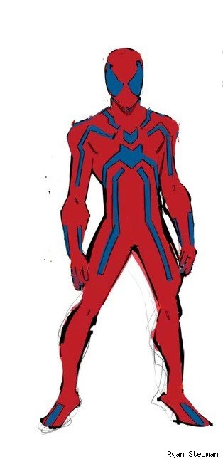
This was my first drawing of Kaine for the Point One special. I was trying to figure out what he would wear. I wanted it to be something nondescript because Kaine is trying to blend in. Also, if you notice on the facial drawing, I have a scar across his nose. For a while we were toying with the idea of leaving one scar that Kaine couldn't escape to remind him of the past. But this one was too much. So I did away with it.
This one was me throwing stuff against the wall. I had already come up with the black mask with red eyes and this was a variation on the idea. The whole time I tried to keep simplicity in mind, and this is about as simple as it gets. It just turned out to be not as cool as the one we chose!
This is a variation on the above costume, just blue instead of black. Thank goodness for the magic wand tool in Photoshop. I turned in the previous design and Steve wanted to see it in blue so I just threw this together. I don't like it... It's too "colorful". Kaine is dark and menacing. This is just slightly too happy. I blame Steve.
Again, this is a variation on the same one that has red with black. I still blame Steve.
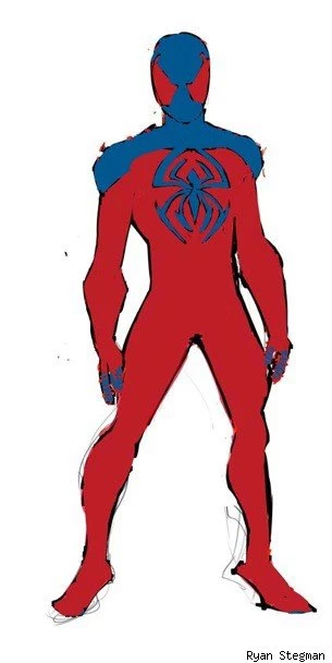
This is ultimately the same as the one we chose. But on his shoulders we have red triangles coming up and over. Those would have been from the spider logo on his back. I ultimately decided to do away with that aspect because I just wanted it simplified.
This is essentially the Amazing Spider-Man's stealth suit design, but in different colors. The idea was that Peter would give Kaine this costume after Spider Island, which he did. But it had to be changed because this costume looks too "Peter" to me. It works for him because it's kind of got a tech feel. But what does Kaine know about tech? Not a whole lot.
This is a reversal of the black and red costume below. It takes the idea of the stealth suit, but I think the logo is cooler and looks more Kaine. At this point I was trying to talk myself into black eyes on a red mask, but it's just not as cool as red eyes on a black mask. This is probably my 3rd favorite of the designs, and I'd have been happy to use it though.
This is the design that we settled on. It's clean, classic and simple. I have to give some credit to Skottie Young, who helped a lot with this design. Skottie is a design genius. He should probably design all of Marvel's characters. After we came up wit this look, I decided that the black part would be made of a sort of patent leather. When I render it out that way I think it looks pretty awesome and menacing. And awesome and menacing stuff is...Awesome.
This is my second favorite design. I would have been totally happy using this one. I still think it's cool. It's got all the things that I wanted. It really screams Kaine to me.
Just a blue version of what we ended up on. Pretty lame right?!
And a blue version of the one that I like above. I would not have been happy using this one. It's funny how much the color can mean to a character. But this just doesn't look like Kaine to me.
I like this one. I just felt that the logo was a bit hard to read. I toyed with the idea of making his arms all black in a few of the designs, but I didn't like it as much as the red. I was afraid that this logo didn't read as a spider. It's interesting, but it just wasn't quite what I wanted.
And a dark blue version of the final. STEVE'S FAULT.
Finally, this is the one we chose. I did a nicer tighter sketch in case other artists need to draw characters for variant covers or whatever. But when you put the front and back together, it's pretty badass, no? This guy looks tough and mean.


More From ComicsAlliance


![The Boys Are Back in Town With Marvel Legends’ New Guardians of the Galaxy Figures [Review]](http://townsquare.media/site/622/files/2017/03/IMG_2839.jpg?w=980&q=75)