Ask Chris #25: What Are Batman’s Worst Costumes?
Here at ComicsAlliance, we value our readership and are always open to what the masses of Internet readers have to say. That's why we've given Senior Writer Chris Sims the punishment pleasure of stepping into the grand tradition of the Answer Man as he responds to your reader questions!

Q: With the knowledge that Batman's costume is about to change again in mind, what are your LEAST favourite bat-costumes? -- Max_Barnard
A: That's right, everybody: I'm celebrating my 25th column by doing my favorite thing: Writing about Batman.
Despite the fact that he's been around since 1939, Batman hasn't really changed his costume all that much. Pointy ears, scalloped cape, bat-symbol on the chest, gloves, boots -- with the exception of a few minor tweaks here and there, it's essentially been the same costume for the past 70 years. That said...

...there have been some changes that are pretty significant.To give you an idea of where I'm coming from, my favorite version of Batman's costume is unquestionably the "Classic" version that he wore from 1964 to 1995, which is mostly associated with the yellow oval behind the bat-symbol. Someone once wrote in to the letter column talking about how it perfectly captured the colors of night in the city -- the dark blue of the sky, the grey of the clouds, and the yellow of the moonlight, a very Sailor Moonish turn of phrase -- and while that might be its major draw, it certainly doesn't hurt that it was the costume that Neal Adams and Jim Aparo (my favorite Batman artist) drew him in:
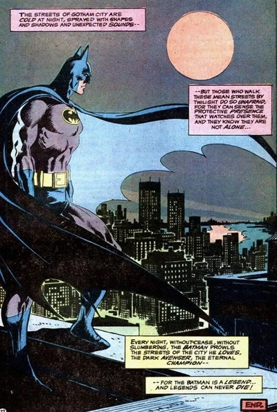
It's a great design, and the fact that Aparo and Marshall Rogers drew his cape as more of a cloak that hung over his shoulders rather than just trailing behind him (as opposed to Superman or Thor) really sells him as a different sort of character, while still making clearly identifiable as "super-hero." Plus, and this is a big selling point for me, it doesn't look like armor. I really like the idea that Batman is just a dude so good at fighting crime that he goes out and does it in a really tight sweatshirt. The Batman in the Nolan movies may not be wearing hockey pads, but Aparo's Batman didn't even need anything thicker than spandex to wreck Crime's jaw.
And then there's the oval. Never in the world of comics has a simple shape been quite so divisive. There are die-hards on both sides, and personally, I fall into the decidedly pro-oval (proval) faction, for the simple reason that I think it makes for a more distinctive emblem. I will admit though, that when I was younger, I was always seriously stoked whenever I'd see the plain bat show up, but I think that's because i associated it with Batman's look in Frank Miller's "Year One," of which -- and this will probably shock you -- I am something of a fan.
I think it's that way for a lot of people. The bat sans-oval represents Batman's more hardcore past, either through "Year One" or the brutal, gun-toting days of the Golden Age, which are often romanticized as being "the original Batman" by people who don't realize that they lasted all of about four issues. Seriously, if you want something that really symbolizes Batman's past, bring back the autogyro. That thing was rad.
By the same token, I think that for a lot of people, the oval-logo also represents a very distinctive time:

Talk about a dude who didn't need kevlar; Adam West's Batman didn't even need to do situps. (Rimshot)
Despite the fact that it was totally awesome -- and if you don't think "Batman" '66 was awesome, well, you're wrong -- the Adam West version was the subject of a huge backlash from a lot of die-hard fans who were laboring under the impression that it had forever tainted the gritty vigilante they loved. On one level, there's some truth to that -- 44 years later and you still can't find a news story about comics with "BIFF! POW!" in the headline -- but on the other hand, as someone who has read a lot of '50s and '60s Batman comics, I can tell you with no exaggeration that West and Ward were often of a lot less ridiculous than their four-color counterparts had been for the previous 20 years. Despite its popularity, the comics didn't take their cue from the show.
Some readers justify it by asking "well why would he have a target on his chest?" to which the proper response is "wait, that's your problem with the guy who dresses like a bat so that he can punch mental patients every night?" Once you're at that point, whether or not you've got a little color on your shirt starts to be a minor concern at best.
And yet, all those headlines and "Holy _____ , Batman!" jokes get laid at the feet of that poor little oval. In a lot of ways, it tends to be the signifier of a more "Kid Friendly" Batman, which explains its presence on stuff like the "DC Super Friends" and "Brave and the Bold" versions:

Even in the other animated series, there's a pattern. While "Batman: The Animated Series" started with the oval, the shift to darker stories for older kids (and, let's be honest, adults) in "The New Batman Adventures" and "Justice League" was accompanied with a redesign that dropped the oval, while "The Batman," a show about a younger Bruce Wayne with more colorful versions of his enemies, kept it.
It might seem like I'm devoting a lot of time to a single element of the costume (and I am), but it's actually a big deal, not just among Batman fans, but creators, too. When Brian Bolland recolored "The Killing Joke" for the hardcover, he went so far as to eliminate the oval completely:

It's hardly the biggest change -- you can tell just from those two panels how drastically different Bolland's new version is from the original -- but it's one that jumped out at me when I read it.
And yes: All of that just to say I like the oval, so stop picking on it.
But again, all that points to the fact that along with the all-black tights (no trunks) that he wore from '95 to '99, that's the major change in Batman's costume. Most of the other variations are either one-off silver age kookiness...

...or are pretty easy to write off as not being (and yes, I know how silly this sounds) the "real" Batman. But that doesn't mean that they're not bad, and for the worst suit that they actually did comics about, it's hard to beat the infamous Jean-Paul Valley "AzBats" costume that debuted on the cover of "Batman" #500, by future Marvel Editor-In-Chief Joe Quesada, with Aparo on interiors:

That thing is a hot mess, y'all.
I don't even think I need to list off everything goofy and/or terrible about it, but for me, the hat-rack shoulder-points, the golden football pads, even the inexplicable spikes on his calves all take a back seat to the absolute worst element: Thigh Pouches.
Thigh. Pouches. Unless the goal is to make Jean-Paul Valley's batman look like he's wearing a single garter like a new bride -- which I guess would confuse crooks and give him an important edge -- those things make no damn sense. The guy already has pouches in that ridiculous half-belt he's wearing. What does he need more pouches for? The anti-chafing cream that he needs because he's wearing thigh-pouches?!
And amazingly, while the rest of that costume went away quietly when Azrael was demoted to Junior Sidekick status and given a book nobody read for a hundred issues, the thigh pouches stayed around. Check out Stephanie Brown's Batgirl costume:

That is a costume being worn in comics coming out today. In the year 2010. And it is rocking the hell out of some thigh pouches. I've actually heard "Batgirl" is a highly enjoyable comic -- Evie and Aaron of Awesomed By Comics informed me that in the most recent issue, she and Supergirl team up to fight 24 Draculas, and that definitely does sound like something I'd enjoy -- but I've never read an issue because I just can't sign off on those terrible, terrible thigh pouches.
But like I said, the AzBats costume barely even counts as Batman; it wasn't Bruce Wayne, it didn't last long, and even then, we all knew it had about as much permanence as Fudgicle on a hot summer day. So if you really want to see some terrible Batman costumes, I'd recommend you find yourself a copy of 1995's "Batman: Knight Gallery."
Presumably released to coincide with Batman's costume change to the all-black/no trunks look that he sported up through "No Man's Land," "Knight Gallery" was essentially a pin-up book where a bunch of artists redesigned Batman's costume, presented in the form of Batman's costume design sketchbook. This is hilarious on a number of levels, chef among them being:
A) Batman sure does draw like a comic book artist in the Early '90s.
B) Batman spent a good amount of time drawing increasingly ludicrous costumes in his sketch diary.
C) He named his sketch diary "Knight Gallery."
Oh, Bruce. What are we going to do with you?
My pal Rachelle, whom ComicsAlliance readers will remember as the writer and singer of the Stolen Minks' "Batman (You're The Sex)," did an excellent writeup of the issue over at Living Between Wednesdays, but my (least) favorite has got to be this monstrosity:

As we say here in the South, that thing is uglier than homemade sin, but I have to respect the dedication involved in adding spikes to everything. Even his ears, which are themselves spikes, have smaller spikes on them. It is quite possibly the most '90s design of all time.
And for bonus hilarity, it comes with commentary from Bruce Wayne himself (courtesy of writer Doug Moench), who stops just short of "Holy crap, why did I draw this?" and instead starts ruminating on the nature of fascism. Fan. Tastic. And Rachelle has even more.
Interestingly enough, though, the first design in "Knight Gallery," from Tom Grummett, actually bears a lot of resemblance to the costume that's coming up in "Batman Inc.":

Which brings us to the new suit, and if I had to pick a least-favorite costume actually worn by Bruce Wayne, well, this one's definitely in the running.
The oval's back, which is a plus, but to me, the raised efect of it makes it look like Batman's got a ceramic ashtray hot-glued to his chest, and the lack of trunks to break up the costume under the belt makes him look less "super-hero" and more "janitor in a cape." I can understand the padded, armor-like gloves -- which look a lot like the video game version of Batman's costume in "Arkham Asylum," with the effect being similar to that of a mixed martial arts fighter -- but again, I like the idea of a Batman who doesn't need padded gloves to punch dudes out. Aparo's Batman would cold open-hand slap guys. Padding just gets in the way.
A bigger problem for me is the piping that runs down the side. There's been a recent trend to add seams and stitching to super-hero costumes that, by and large, I just can't stand. Power Girl's costume as drawn by Amanda Conner is a notable exception -- the seams down the front do a lot to break up the vast blank white space of her costume and accentuate her curves, which, as we all know, weren't being accentuated enough already -- but on characters like Superman and especially Captain America, it just doesn't work for me. I think it goes back to my feelings on attempts to bring more "realism" to comics, but the seams and stitching make them look less like super-heroes and more like actors in suits.
The end result is, at least with Batman's new costume, something that's too busy to be as iconic as what he was wearing the last time we saw him (or even what Dick Grayson's wearing now), and just doesn't seem like it does anything better than the suit that Neal Adams and Jim Aparo drew.
Of course, I'm basing that entire opinion on exactly two images, and I like how it looks on Yanick Paquette's interior art from "Batman Inc" #1 much better than on the cover above. I just don't get the point.
Then again...

It could've been worse.
And now, a few quick answers:
Q: I only get to my F(not so L)CS every month or so - unless I drop them an e-mail to specifically hold something for me,
the "new release" section can be pretty picked over by the time I get there. Can you recommend any other good places to check weekly for a "finger on the pulse" of the new releases and to flag anything particular good/fun/infamous worth checking out ? -- Brad, via email
A: When I need to look over the shipping list, I always check Midtown's New Release page. It's updated every Thursday for the following week, and they're a big enough store that they're usually getting everything that's coming out. I will say, though, as a former retailer, what your store is getting may differ widely from the list, owing to individual store orders, shortages, and even just what side of the country you're on. I used to get stuff weeks before or after friends who were retailers in California. It you regularly read certain comics, it's probably worth checking to see if they've got a subscription or pull list program, and if it's too far away, you could always look into online services like DCBS.
As for keeping your fingers on the pulse of upcoming titles, I'd highly recommend Douglas Wolk's "Don't Ask, Just Buy It!" column, where he runs down each week's titles the day before they come out. Those guys over at ComicsAlliance tend to know their stuff.
Q: Which are the best Enforcers appeareances? -- erkalbeleo
A: All of them. Every comic about Ox, Montana and Fancy Dan is so good as to be immeasurably better than every comic without them. I am, however, personally partial to "Daredevil" #357, by Karl Kesel and Cary Nord.
Q: Should I have a happy birthday? -- thechrishaley
A: Yes, Chris Haley. You should have the happiest of birthdays.
That's all for this week, but if you've got a question you'd like answered, put it on Twitter with the tag #AskChris or send an email to comicsalliance@gmail.com with [Ask Chris] in the subject line!
More From ComicsAlliance