Ask Chris #324: Strong As Iron, Homely As Sin
Q: I've always felt like Metamorpho could be a much bigger star, but he's just too ugly. And not like The Thing, who's ugly in universe; Metamorpho is a truly awful design. Are there characters who you think could be better if they didn't look horrendous? — @EvilKeaton
A: Whoa whoa whoa, my dude. It's all well and good to ask a question about good ideas for characters that were held back by bad designs, but you can't just roll up in here and disrespect Rex Mason like this! It's certainly true that he's never quite caught on the way he probably should've for how good his original appearances were, and there are plenty of reasons for that, but to chalk it up to a "truly awful design?" I have to disagree.
It might not be the best design to ever hit the comics page, but that affable ugliness is only part of what makes it work --- not just for the character, but as a visual signifier of one of the most interesting eras in comics.

It's interesting that you bring up the Thing as a character who's ugly "in universe" as opposed to being a bad design, because it's the perfect illustration of what's really going on with Metamorpho. His entire character --- his powers, the visuals, even his supporting cast and the way that he interacts with them --- are built around this really interesting idea of giving the DC Universe its first real post-Marvel hero.
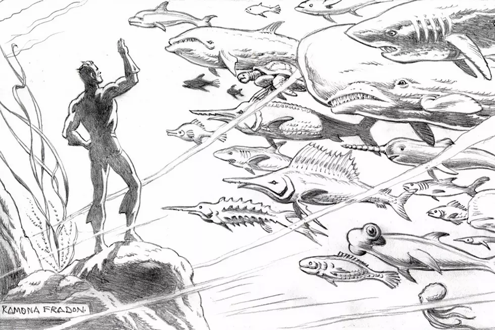
Don't get me wrong: DC definitely introduced its share of new characters between the dawn of the Marvel Universe in 1961 and Bob Haney and Ramona Fradon's introduction of Metamorpho in January of 1965, and there were even a couple that bore a pretty striking resemblance to their cross-town competition. Really, though, as much as the superficial similarities between DC's Doom Patrol and Marvel's X-Men --- two teams of outcasts led by a mastermind in a wheelchair --- have made people wonder who was eavesdropping on who while they were planing out the next issues over lunch, nobody who actually read those comics would mistake Stan Lee and Jack Kirby's work for Arnold Drake and Bruno Premiani's. Those books were being created simultaneously and went in pretty different directions, and never really feel like reactions to each other.

Metamorpho, on the other hand, was different.
I've written before about how the arc that runs through #14 and #15 of the sadly shortlived Silver Age series, in which Rexy Baby takes on an unstoppable galactic destroyer called the Thunderer whose arrival on Earth is heralded by a spacefaring Forerunner, is Haney and Trapiani's dead-on parody of the original Galactus saga in Fantastic Four. They even go as far as having a teenager deliver the deus ex machina that stops their cosmic foe, although unlike Lee and Kirby, they did it in the form of a guitar that was also a laser gun.

The thing is, that wasn't exactly an isolated incident. Looking back on it with the context of the era, when Fantastic Four was reaching virtuosic heights as the leading edge of what Lee's letters pages touted as the Marvel Age of Comics, it's very easy to read Metamorpho as a thorough and dedicated reaction to FF.
The big trick, of course, and the reason that the book reads like it's so far ahead of its time, is that it's taking those ideas and filtering through that uniquely Silver Age DC Comics lens that you get from Haney's work. It's unmistakably a product of the same company that was putting out stories of the Riddler's greatest deathtraps and putting Jimmy Olsen in the spotlight every month, but you can't deny that the influence of Fantastic Four is all over this thing.
You can see it in the way the cast is set up, with the soap operatic love triangle of Rex, Sapphire, and Java taken to the bizarre superhero extreme that you can only really get when one of the three characters is an unfrozen caveman, and in the introduction of Urania Blackwell, the Element Girl, as Haney's somewhat strange answer to Prince Namor.

You can see it in the house ads and the letters pages, too, loaded up with Haney's over-the-top hucksterism. But more than that, you can see it in Rex himself. His elemental abilities are visually represented on the page as shapeshifting, as he continually turns himself into a cobalt hammer or a magnesium torpedo, but in terms of how they function in the story, he's essentially every member of the FF wrapped up into one man.
He can turn into a blazing torch or an invisible mist, he can stretch out his legs like copper springs, and he can smash down walls and survive an atomic explosion. But when Haney and Fradon were figuring out how to make their ersatz Ben Grimm, they didn't just try to recreate his powers. They went with his driving tragedy, too.

There's a reason that the "Metamorpho" theme song off the weird little Songs and Stories of the Justice League of America album defined him as "strong as iron, homely as sin."
Rex Mason might've been a handsome man with a rich, beautiful, and relatively kindhearted girlfriend waiting for him at the end of each world-traveling adventure, but once he becomes the Element Man, all of that goes out the window. He loses it all, and part of that comes from the way that his body is changed, his square-jawed Silver Age looks giving way to the pallid, lumpy face that he'd have as Metamorpho.
He becomes a character who can hide behind a mask every now and then --- who wants to hide behind a mask until he can finally be turned back to normal --- but can never really get away from who he has become.

And for that to work, he has to be ugly. Or at least, he has to read as ugly, and his design doesn't stop with the face. He's got that weird asymmetrical look that's meant to underscore the 1,001 fabulous changes that are promised on the cover, with that weird purple section of his chest that's sometimes drawn as scales and sometimes as fur, and those legs that look like they might be slightly solidified mud, or maybe slime. There's some grossness to it --- there's a lot of grossness to it, in fact --- and while I don't agree that it's a bad design, I don't fault you for finding it off-putting, either.
But at the same time, I can't really fault that original look. It works perfectly well in that original story. The problem, such as it is, is that while Ramona Fradon, Jack Sparling, and Sal Trapiani are perfectly capable of ramping up that cartoony exaggeration to soften the grossness with big, friendly eyes and slapstick comedy setups --- something Jim Aparo tended to lean into whenever he drew Metamorpho -- there are later artists whose push towards realism doesn't work.
That, in turn, led to more recent interpretations that emphasized the constant flux of his powers, or the elemental turmoil that's being held together in the shape of a human, and those tend to bring all of those off-putting design elements into sharp focus in a way that having him as what's essentially a big multicolored action figure doesn't.
In that respect, I think the look does hold him back, but that's not really the fault of the design as much as it's a clash of prevailing aesthetics. One day, I'm sure the comics industry will once again be ready for a friendly-faced, hip-talking science mummy.

Luv ya, meatballs.
Ask Chris art by Erica Henderson. If you’ve got a question you’d like to see Chris tackle in a future column, just send it to @theisb on Twitter with the hashtag #AskChris.
More From ComicsAlliance