Think About The Futura: The Graphic Design And Visual Ephemera Of Batman ’89
There are a lot of reasons for Tim Burton’s Batman movie to have failed. Comic book movies were in a slump, with Howard the Duck and Superman IV: the Quest For Peace both (deservedly) bombing in previous years. The movie is a darker take on a character who is most widely known as being a campy do-gooder who fights brightly-colored visions where each blow landed was accompanied by an overlaid onomatopoeia. The director’s two film credits to date were a film starring Pee-Wee Herman and a goofy haunted house movie. The lead actor was a guy more known for roles like Gung Ho, Mr. Mom or the aforementioned goofy haunted house movie than serious, dramatic stuff like Clean & Sober. Your other lead actor is basically the only thing that you can sell, and even he’s a wild card lately, having gone from The Witches of Eastwick to Broadcast News to the mega-depressing Ironweed in the same year. Also, the movie had just started filming in October of 1988 and the studio, who at this point is understandably nervous, wants to start rolling out marketing around Christmastime.
So, how do you sell this movie? The answer is, in this case: "Simply."
Launched in late 1988 by the B.D. Fox agency -– who had also handled the campaigns for E.T.: The Extra-Terrestrial, the one true Robocop movie, and mankind’s crowning cinematic achievement, Bill & Ted’s Excellent Adventure – with a poster designed by the film’s production designer Anton Furst, the Batman campaign is a classic example of doing more with less. It’s sexy, sleek, mysterious and new. It’s regarded as one of the best movie campaigns ever, and for good reason. On the occasion of the film's 25th anniversary, let’s talk about why the campaign was so good.

First off, let’s talk about the color, in this case a gold and black pairing. It’s not a huge leap from Batman’s traditional yellow and black chest symbol to here, but the gold adds a sophistication to the palette that moves it from the primary-colored world of Adam West’s jovial Batman '66 (at this point, the most likely cultural touchpoint for most of the audience) to the serious world of bulletproof Batmobiles and dark avengers who dangles hoods off of buildings for kicks. Like the poster says, this is a serious, dark, Batman. A Batman with depth. A Dark, Dark Knight.
Another thing to note is the symbol itself, which is all sharp points and sexy curves. The masculine and feminine in one place. And there’s that depth to it, as well. It’s not the flat, easy-to-draw-and-color oval of the comics; this thing is designed. You feel like you could touch it and feel the raised symbol, that beveled edge, those sharp points. The word “iconic” gets tossed around a lot, but this is an icon, a talisman, a medallion. It’s “real” -- or at least, more real than a drawing on a page. And look at the way it’s cropped, like it’s too big to be held in by the frame of the picture plane. It adds a sense of dynamism that wouldn’t be there if it were all neatly contained within the borders of the poster.
For the date in the teaser and the main one-sheet, the designer’s using Futura Bold Condensed, which you might recognize from Watchmen. Again, this is serious, adult stuff. No funny business. Comics aren’t just for kids anymore and neither are comic book movies. The typeface also ties in with the art deco look of the movie, with Futura being a deco/Bauhaus-y typeface that’s fairly utilitarian. In the main poster, they’ve used an outline to define the type, which ensures that the huge Bat-symbol is still the most noticeable element on the page while still managing to satisfy the actors’ egos and sell the cast to moviegoers.
For the title, they’ve picked up and adapted the logo that the main Batman title was using around the same time. Here’s the top of a John Byrne/Terry Austin cover for Batman #401:
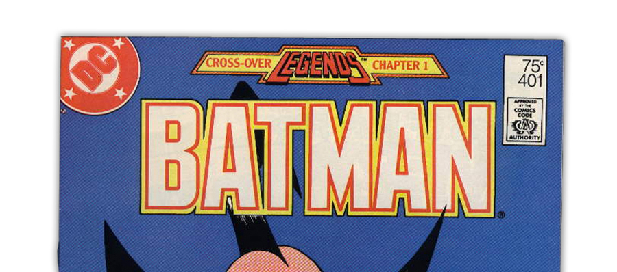
Again, they’ve added texture and lighting effects to the type and spaced it out quite a bit, but it’s basically the same treatment. The result is the movie poster version feels more concrete, like they’ve taken the comic book and elevated it, made it “real,” even though it’s really just paint and airbrush.
You add all this together and you manage to say a lot about this movie with very little. You also manage to assuage your clients’ fears as mentioned above by making this look like a sophisticated, serious picture that isn’t silly at all and is Very Serious Stuff That You Will Not Feel Embarrassed Walking Out Of.
And, most importantly, you’ve created a logo, a brand that can live all over the place. You know, like on action figures, or on the Official Comic Adaptation of the Warner Bros. Motion Picture that, if you’re keeping score at home, is a comic that features the movie version of the comic version of the masthead:

Or on a cereal box. Or a video game. Or trading cards. Or painters caps. Or little plastic Batman heads full of candy. Or t-shirts. Or or or…

You can see we’re back to the comics masthead’s spacing on the ancillary items, but look how it manages to all look of a piece, regardless of what it’s selling. If there’s a place it doesn’t work as well in these examples, it’s on the action figures, where the gold background sort of swallows up the gold outline of the logo. On the other pieces, that black background makes those gold colors pop; but man, kids don’t care. As long as the action figure comes with a knife, a gun and a hat, they’ll gobble the stuff up like it was Batman cereal.
As long as we’re discussing ancillary items, let’s take a look at the soundtracks for the film.
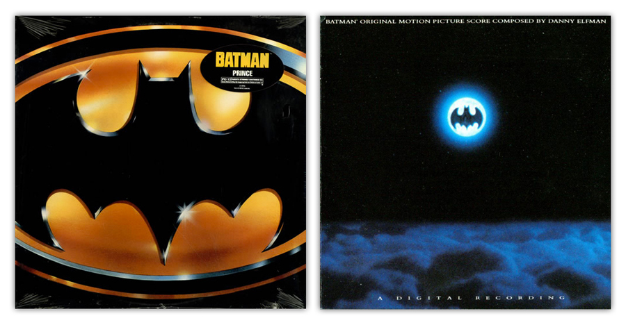
Batman is an interesting case because it has two utterly distinct soundtracks. One was a semi-concept album by Prince, who just happened to be under contract with Warner Bros. Records, and the other is former Oingo Boingo frontman-turned-film-composer Danny Elfman’s score. (I have no idea what movie Prince thought he was writing music for, or even if he knows who Batman is, but damn, it is a great/crazy record.) You can tell by the packaging which one Warners' thought they were going to sell more of with Prince’s funky-as-hell soundtrack getting the full Batman ‘89 logo treatment, with a sticker stuck to the shrink-wrap. (I don’t even think the CD version -- for our younger readers, CDs were IRL MP3s -- had the sticker on the front.) Elfman’s cover isn’t as lockstep as the other items we’ve seen, but it still manages to fit in the scheme of the film, using a breathtaking moment from the parade fight with the Joker to add a sophisticated air to his orchestral score.
Below is an early, unused concept from B.D. Fox, which is suuuper-deco and dramatic. The custom there really reminds you that this is the guy who did the Robocop poster. Stuff like this is really interesting, because you can see where this falls short. It’s pretty dramatic, but not nearly as dramatic as the selected poster, and the tagline “In the not too distant future, law will have no meaning, courts will have no power and justice will have no champion. And then he will return.” is way too wordy and not accurate. It’s certainly not as clever or succinct as Robocop’s “Part Man. Part Machine. All Cop.”
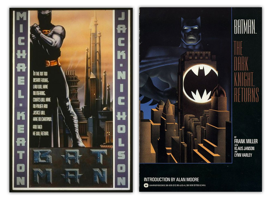
Next to it is the 1986 Warner Bros. trade paperback of Miller/Janson/Varley’s The Dark Knight Returns, which was most likely used as inspiration for this aborted poster (it’s also the same edition I first read sometime around 1989 after my best friend “liberated” it from the local library). The DKR cover manages to feel more epic, more deco, more iconic, merely by darkening the palette. You can see what they’re going for in the poster on the right, but it just feels too sci-fi and not moody enough. Back to the drawing board.
It’s also worth looking at how Warners handled the sequel, Batman Returns, which initially ran with this poster:
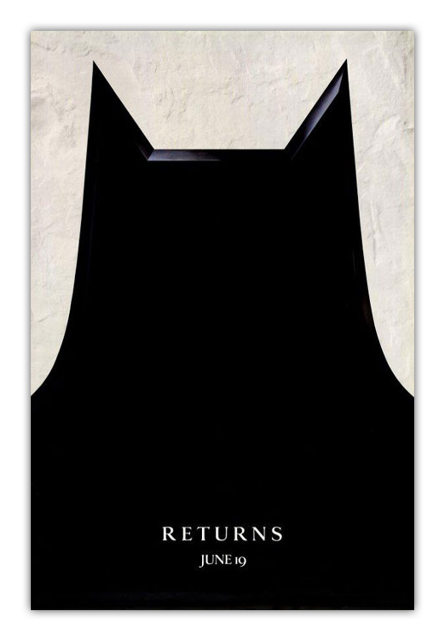
Pretty cool right? It continues the minimal aesthetic of the first poster while maintaining its own identity. Sadly, these posters were recalled because they were thought to be “too plain,” and this, more typical blockbuster-type character one-sheets and “floating heads” compositions.
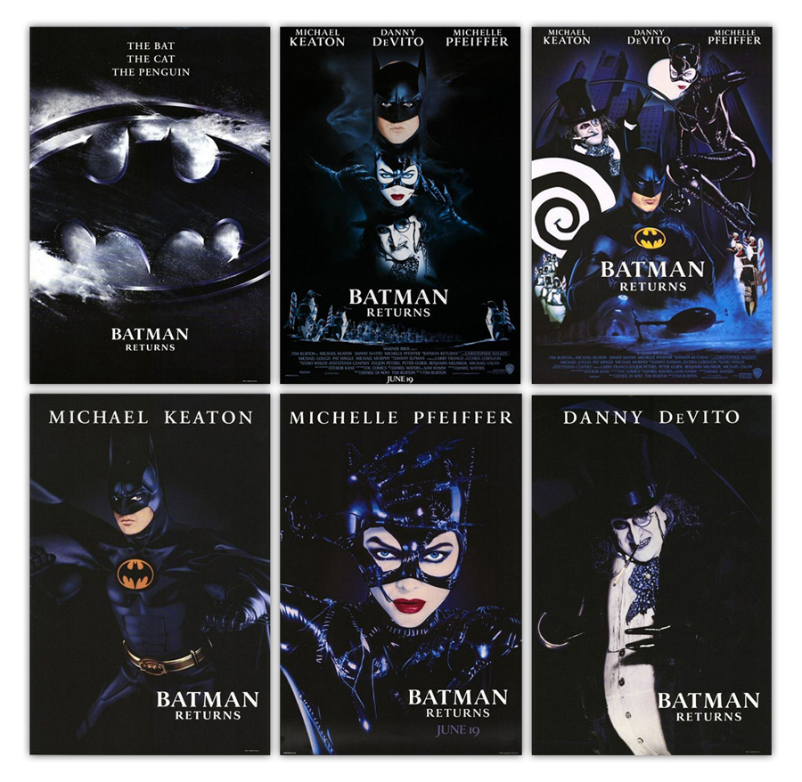
Other than the “The Bat. The Cat. The Penguin.” poster, which takes the first poster and adds in the white of the snow that permeates the sequel, it’s all pretty run-of-the-mill blockbuster poster stuff. Bummer.
Which brings me to the 2010 Blu-Ray release.

In theory, it’s just the 1988/1989 posters “updated,” but in practice, it feels like a dry run for the Man of Steel emblem poster. It has that same concrete background, the same lighting. It ups the bevel on the bat and adds in a granite-type texture, giving the emblem a stone feel as opposed to the gold look of the ‘89 posters. It’s not terrible, but it’s also not any sort of improvement over the original. The big disappointment is the type on this one. That is some straight up Krull business that has no place on the cover for a goth deco Batman movie. Like, those top bar things look like something Klingons would fight with during mating season or whatever. Just entirely wrong for this application. In case you missed it, I am not a fan of that typeface.
The 1989 Batman posters and subsequent advertising campaign remain one of the most successful campaigns in the history of film, in large part because of their simplicity and their ability to communicate effectively with little-to-no words words. It’s iconic, sexy and cool. It’s the movie campaign we need and the movie campaign we deserve.
More From ComicsAlliance