How To Fix the Problems in Batman’s New 52 Costume

When I reviewed Justice League #1-6 a few weeks ago, one of the things I mentioned was that I didn't like the costumes. It's not just limited to Justice League, either -- the post reboot DC Universe aesthetic has produced a ton of costumes that I just do not care for, and Batman sticks out as one of the worst. Maybe it's just that he's my favorite character, but the current costume just looks off to me, even when it's drawn well.
But never let it be said that I have nothing to offer but complaints. Today, I'm going in search of a solution, breaking down four problematic elements of the Caped Crusader's outfit to show exacty How To Fix Batman's Costume! Element #1: The Colors

I know this is going to sound crazy, but my main problem with Batman's current costume is that it's just too dark.
Okay, look, I realize that Batman is The Dark Knight and that the word "dark" is right there in the title of a movie that made a billion dollars, but he's also a character in a visual medium. Wen you're dealing with a figure that's being drawn exclusively in black and grey -- to the point where even the highlights are being done in grey these days -- "dark" really runs the risk of turning into "drab."
In a comic with the word "Batman" in the title, Batman should be a focal point of every panel that he's in. But when he's illustrated in such dark colors, in a setting that's also become increasingly dark and shadowy, that's difficult to pull off. When he's sharing the scene with more eye-catching characters like the Joker or the Riddler, it becomes less of a visual contrast between two interesting characters, and more that one character is just more fun to look at than the other. It can be done, and there are a lot of artists who have done a great job with it, but there's no reason to make it this difficult.
So why not add a little bit of color? It doesn't have to be a lot -- that darkness is a defining element of Batman's look -- but enough that he'll pop off the page. You can still do a weird figure of the night without going entirely monochromatic.

Take Bruce Timm's design from Batman: The Animated Series, for example. I don't think anyone would say that look was too bright or colorful, and it even used the same predominantly black and grey color scheme that we have now. But because it used brighter highlights, a lighter color for the interior of the cape, and a few splashes here and there, it makes for a much more striking visual when Batman emerges from the shadows and reveals himself.
Along those same lines...
Element #2: The Emblem
There are few things quite so divisive among Batman fans as the emblem on his chest. Personally, I'm a pro-oval man. Since 2000, Batman has sported the unadorned black Bat-symbol, going back to the oval briefly for Batman Incorporated, and then ditching it again with the New 52 relaunch. I don't dislike the plain Bat, but with the current costume, it has the same problem as the rest of the suit. It's a bland black-on-grey that's hard to see, and since it's gotten bigger and bigger over the years, it ends up blending in with his cape pretty often. And that's a problem.
I think the logo itself is an intrinsic part of Batman's suit. It's the element that identifies him visually as a super-hero and not just a crazy person in a bat costume, and it helps to unify his look with the rest of the Justice League when he's standing next to characters like Superman, Green Lantern and the Flash. Those characters all have logos that are designed with contrasting colors to make them visible to the reader.
Even other members of the Batman family are designed for it. The black-and-red color scheme from Batman Beyond and the Batwoman and Nightwing looks that it inspired are great examples of how that bright logo can really tie together a costume. The current style of going all black and grey is just too muted.
Especially when it occasionally blends in with...
Element #3: The Details
One of the design elements that's been running through a lot of DC's costumes since the new 52 -- and really, in most super-hero comics over the past ten years -- has been the addition of unnecessary lines and seams to costumes.
I will never understand the appeal of these. I think they're meant to evoke a level of realism that more closely resembles what it's possible to do in a live-action movie, but they just end up looking too busy. Comics aren't bound by the limitations of what you can do in other media; they're only bound by what it's possible to draw. The seams you see in a movie are evidence of those limits, so why bother with them when you don't have to?
An artist friend of mine was talking about the costume and mentioned that from a design standpoint, we're living in a time when one of the most popular objects in the world -- the iPhone -- is a rectangle with a little circle on it. For him, the addition of all those seams felt like a step backwards, something that already felt dated, and I have to agree.
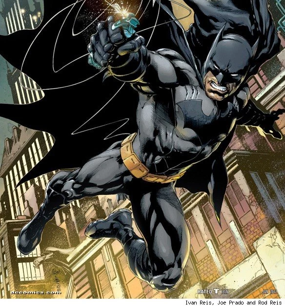
But beyond just personal taste, those pointless lines also lead to a lot of problems in terms of art. The busier and more complex the costume is, the more it lends itself to inconsistency and visual confusion. Jim Lee, Greg Capullo and Chris Burnham are all great artists, but in the six months since this costume made its debut, they've all drawn suits with three completely different sets of details. And in the panel above, it's hard to tell which lines are supposed to be seams, which are supposed to be battle damage, and which are just Lee's usual hefty amount of crosshatching.
So just get rid of those lines to simplify the costume.
There's actually one part of the costume where that's already been done:
Element #4: The Utility Belt

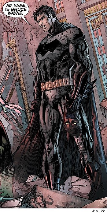
The Utility Belt is another of Batman's trademarks, and I actually really like the design they went with for the new costume. From 2000 to 2011, the costume used the bulkier "pouch" style Utility Belt, with the logic that Batman wouldn't be able to carry all of the crime-fighting equipment that he uses if he didn't actually have room for it on his belt.
Because that's where you want to make sure to keep things realistic: when drawing the belt worn by a billionaire who dresses up as a bat so that he can carry little metal boomerangs that he uses to fight murder clowns.
The new one, though, seems more inspired by the one seen in Batman Begins and The Dark Knight. It's more streamlined, and I like that a lot. Batman's a guy who owns a flying car and a robot dinosaur, so I'm pretty sure he could figure out a way to fit everything he needs into those tiny cartridges. The only thing I'd suggest for the belt itself is to continue in that direction and streamline things even more.
But as a design element, the Utility Belt performs a service that's way more valuable than carrying gas pellets and grappling hooks. Right now, Batman's just a big ol' slab of grey underneath his cape, and the Utility Belt is the only thing that breaks it up to help define his proportions. When it's removed in order to explain why Batman's not using all of his gadgets -- like it was in the recent "Court of Owls" storyline -- you lose that. The suit ends up looking more like gray coveralls, and Batman ends up looking like a janitor in a cape. Don't get me wrong, that's a noble profession, but I don't think it's the visual they're going for.
So while the belt itself is fine, I'd add something else to break up that big gray space.
There you have it: Four problematic elements of Batman's current costume. And now...
How To Fix It
Now, I'm not an artist myself, but fortunately, I was able to find a piece by a very talented young man who is. His Batman design addresses every single concern I had, and still manages to be iconic and undeniably true to the character. It's more colorful without being too bright; it's streamlined without any unnecessary seams or stitching; it's got something to break up the big grey blob, and there's a contrasting color used for the logo that makes it easy to spot and instantly identifiable.
The artist is Jose Luis Garcia-Lopez, and here's his take, from the 1982 DC Comics Style Guide:
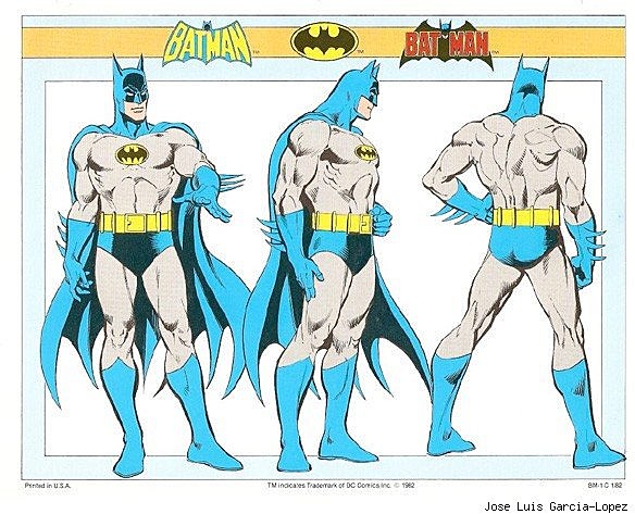
Call me crazy, but I think that look just might work.
More From ComicsAlliance