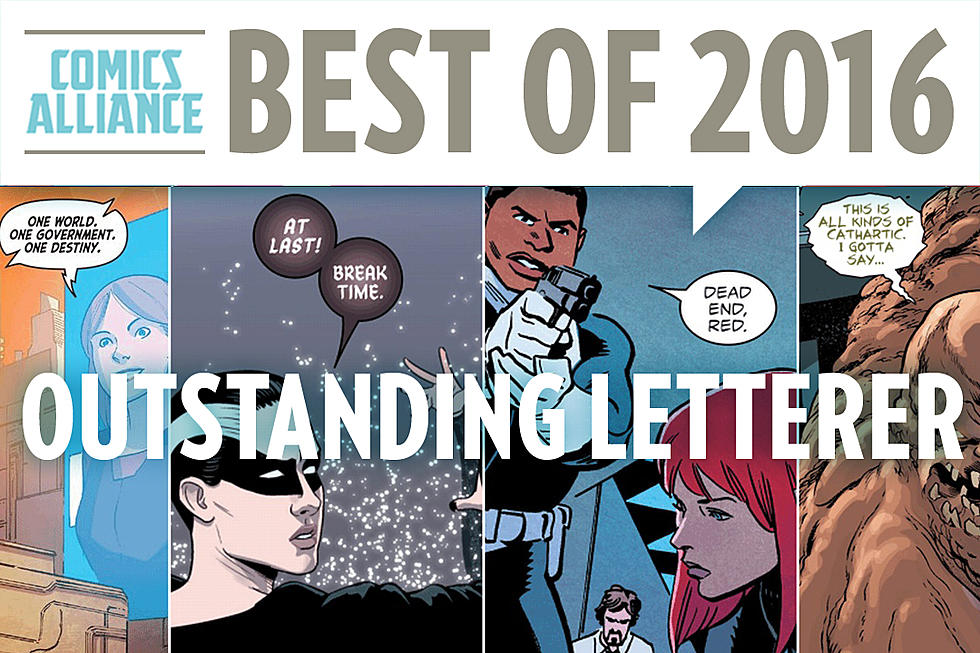
Ask Chris #180: Love Letters
Q: Lettering: who does it best and why? -- @awa64
A: Comic book lettering is up there with inking and coloring in the holy trinity of underrated comic book skills, but it's also one of those things that, once you start paying attention to it, you'll never be able to not notice it again. I'm not exaggerating even a little bit when I say that it's one of those things that can absolutely ruin a comic if it's done wrong, even if everything else is perfect. But to be honest, of those three elements, lettering is still probably the most underrated.
The thing is, when it's good, it can be absolutely gorgeous in its own right. And fortunately for us, there are a lot of people who do it very, very well.
Here's why lettering matters so much: The single most important thing about any comic book is whether someone can actually read it. That sounds like the simplest idea in the world, and it is, but it's worth keeping in mind if you ever set about making a comic of your own, because it can affect every single step of the process, and you get it a lot in those three aspects. You can have the best story and the best line art, but if the other stuff doesn't fall into place, nobody's going to be able to get to the point where they care about any of it. If the lettering doesn't work, your words stop being a story and just become words, laying there on the page divorced from their meaning. If the coloring is muddled, if things run together to the point where you can't distinguish them, or if they're soaked in eye-searing neon when they should be fading into the background, that pulls focus away from what those words and pictures are trying to do. It's distracting -- it puts a barrier between the reader and the story. And it's especially bad with lettering, because on one level lettering is already a barrier.
From a purely physical standpoint, lettering sits between the reader and the story. The standard practice, whether it's done by computers or goes all the way back to pasting cutouts on a bristol board, is to go in after the art's finished and put the balloons and dialogue on top of it, placing them over the art. When you look at it that way, it's very easy to see how it can become an obstacle, and when it's done poorly, that's exactly what it is. But when it's done well, it's a bridge. It's what allows you to enter this world, to follow along with the action, to get wrapped up in the story -- which is exactly why so many people don't notice it.
Generally speaking, when lettering works, it's nearly invisible. It exists to serve the art and the story, so most of the job is just not covering up anything crucial in the art and making sure the writer's words are right there on the page in a way that gets their meaning across clearly. The trick is when they step up and start adding to what they're doing, which is when you realize how important that job actually is. It's bundled up into a lot of skills, not just in the calligraphy of writing legible letters, but in balloon placement, in special effects that add to the story, and even on the art side in making sure that you leave enough room for the dialogue.
One guy who's really amazing at that is Joe Caramagna, probably best known currently for his work on Daredevil alongside Mark Waid and Chris Samnee. Daredevil's actually a great book to discuss on this front, because it's one where sounds and spoken words, things that are impossible to replicate in print, always play a pretty huge part. This always puts the emphasis on lettering, whether it's artists drawing in the sound effects as part of the art or just something as simple as figuring out how to represent super-hearing and whispering on the printed page. Caramagna -- who, incidentally, is also a pretty solid writer himself -- always rises to the occasion.
Most of the time, it's with that same idea of creating the invisible bridge between the reader and the story, but every now and then, he'll bust out a trick that reminds of just how good he is at his job. Case in point, the way the doors close on a speaking man in Daredevil #26:
I love that panel. It uses the medium to represent something in a way that could only happen in comic books. If comic book creators had signature moves like professional wrestlers, that would be one of Caramagna's -- he did something similar a few years ago in Zeb Wells and Chris Bachalo's "Shed," where Curt Connors' narrative captions were literally torn apart when his personality was destroyed by the Lizard, similar to what the also-fantastic Chris Eliopoulos does when Banner transforms in Indestructible Hulk:
So who's the heavyweight champion of the lettering world? Well, assuming that we're discounting Jazzy Josh Krach, who letters pretty much all of my own comics (and does a bang-up job with 'em), there are three that immediately spring to mind, and the first is the one that it's easiest to make a case for: Todd Klein.
Todd Klein is, mathematically speaking, the greatest comic book letterer of all time. So great, in fact, that of the twenty Eisner Awards that have been given out for lettering since they started in 1993, Klein has won sixteen. That's 80%, including a streak that lasted from 1997 to 2008. Dude is the Undertaker of lettering, and it's easy to see why. He's not only the guy who wrote the book on lettering -- specifically The DC Comics Guide To Lettering -- and he's not only a guy who's exceptionally good at what he does, but he's done it on a ton of high-profile projects like Kingdom Come, Tom Strong and Sandman.
That last one is a testament to just how good Klein is. It's one of his most visible contributions to storytelling, because there are multiple characters in that book who have distinctive patterns to their word balloons that reinforce their personalities. In those scenes where all of the Endless are hanging out together, each of them is lettered in a completely different style -- Dream himself even yammers on in those irregular black balloons with white lettering, which runs counter to the usual rules of illegibility but works beautifully because Klein knows how to pull it off. It gives the impression of a strange, ethereal, otherworldly voice, which is exactly what that book needed. It just wouldn't be the same with standard lettering, even if it was done well, and Klein did every issue.
My personal favorite Klein work, though, is another DC book he did for its entire run: Suicide Squad.
Love those sound effects.
The second guy I always go to when it comes to great letterers, someone I always get excited about when I notice his distinctive letters cropping up, is Tom Orzechowski.
I'd be willing to bet that more readers have seen Orzechowski's lettering than just about anyone else working in comics, if only because he's the dude who lettered every classic X-Men story you love. Every snikt and BAMF and "there was no quarter asked -- and none given" and "the focused totality of my psychic powers" and "JEAN!" from those comics was put there by Orzechowski, and they are all beautiful.
He's a master of balloon placement and perfect sound effects, and of hitting emotion and sound in the way that he presents the words on the page. It's difficult to explain why I like his lettering so much, other than to just say that I really, really like how he makes letters. Which is handy, because when you're lettering Chris Claremont's dialogue for 20 years...
...you're going to end up making a lot of them.
My all-time favorite, though, the guy I'd put forth as the G.O.A.T. when it comes to letterers, is John Workman, best known for lettering Walter Simonson's Thor:
I love literally everything about Workman's lettering. It doesn't hurt that Simonson's Thor is quite literally the greatest superhero comic ever published, but still, the lettering is gorgeous. The big round balloons, the different styles that he uses for his captions and scene transitions and story titles, but let's be honest, the real stars here are the four-syllable sound effects that you get when gods start smashing things with their hammers. No one has ever made "KRAKABABOOOOM!" look as good as Workman does, and it's breathtaking every time I go back and read those comics.
I've only been starstruck when meeting comic book creators a couple of times, but I flipped out when I met Workman at one of the first cons I ever went to. I even asked him to put a sound effect in my sketchbook:
The little exclamation point is my favorite part.
Those are my picks for the top, but honestly, it's just scratching the surface. There are plenty of other amazing letterers out there, from founding fathers like Ben Oda to consistently great creators like Stan Sakai, and Dave Gibbons, and even Dave Sim, though I've never read his comics. It's an incredibly underrated art form, something that makes everything else in your favorite comics possible by providing the bridge that leads to everything else.
And sometimes, people get hit so hard that there are five syllables. That's where the magic really happens.
Ask Chris art by Erica Henderson. If you’ve got a question you’d like to see Chris tackle in a future column, just send it to @theisb on Twitter with the hashtag #AskChris.
More From ComicsAlliance
![The ‘Riverdale’ Ongoing Series May In Fact Involve A Kumite [Preview]](http://townsquare.media/site/622/files/2017/03/RD01.jpg?w=980&q=75)


![Don’t Stop Her Now: The Infectious Enthusiasm Of Whitley & Charretier’s ‘The Unstoppable Wasp’ #1 [Review]](http://townsquare.media/site/622/files/2016/12/Unstoppable_Wasp_Featured.jpg?w=980&q=75)

![Meet Amy Rose For The First Time (Again) In ‘Sonic the Hedgehog’ #290 [Preview]](http://townsquare.media/site/622/files/2016/12/Sonic00.jpg?w=980&q=75)