Negative Space In Greg Smallwood’s ‘Moon Knight’
Greg Smallwood is one of the most fascinating artists to have emerged in the last five years. His breakout book Dream Thief showcased his innovative approach to page design, classic figure work, and the clever incorporation of sound effects and simple iconography into his layouts. He's not just a comic book artist; he's a sequential artist, designer, and storyteller, and in his fantastic second run on Moon Knight, he's been doing some very exciting things with negative space.
Negative space is a vital aspect of comic page design that you probably don't think about often, and that's by design. It's negative space after all, and in full-color superhero comics, you're following the action: the positive space of the characters and motion.
Negative space --- which doesn't always mean black or white --- is typically in the background and the periphery, the borders and the gutters. In Greg Smallwood's Moon Knight, it's everywhere.
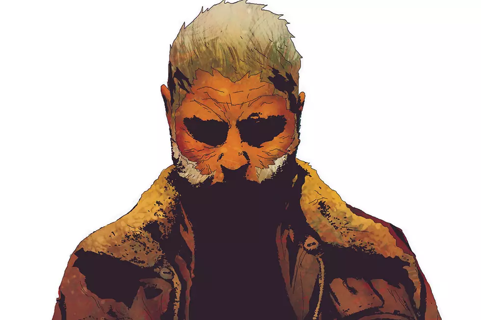
Moon Knight likes his whites, and he likes them crisp. Any time you've got a character dressed in a neutral color, negative space is going to be the focus, but Smallwood is taking advantage of this very simple design aspect like nobody else has. When he's not doing one of his few homages to Bill Sienkiewicz, he renders the character with very basic details, especially in the Mister Knight persona. Frequently leaving out contour lines and only applying a little texture (with an understated shading technique that reminds me of Warren-era Alex Toth), the character is defined by the blank spaces.
He's not the only one, either. In addition to Moon Knight, several other characters are dressed in white: his captors, compatriots, and fellow patients at the mental hospital are all wearing white scrubs, giving Smallwood a lot of negative space to play with inside the panels. What brings it together and makes it effective, though, is how it interacts with what's going on outside the panels.
Smallwood seems to prefer borderless panels against a white page overall, but in Moon Knight he's expanded the space considerably. It feels like a third of every issue is blank space, with Smallwood's minimalist panel layouts tumbling around in this inescapable lack. If it were done by somebody with lesser design sensibilities, we'd probably accuse them of being lazy, but Smallwood manipulates layout and reading order brilliantly: you're essentially following the negative space throughout the whole comic.
Jordie Bellaire's coloring and Cory Petit's lettering both play their parts in Moon Knight's unique look, with everything accentuating the movement of the negative space in a full-color superhero book. Again, Smallwood often does away with contour and border, and those are typically very important for a colorist. Working digitally in layers, though, Smallwood provides a gray-tone template for Bellaire to work from.
"Each element is on its own layer (line art, gray tone, clouds, blood) so Jordie doesn't have to waste time figuring out where the contour lines and borders are," Smallwood told ComicsAlliance. "Although I give her some notes here and there, I generally let her do her thing." That's probably great advice for anybody: just let Jordie Bellaire do her thing."
I was more surprised to find out that Smallwood doesn't provide any direction to VC's Cory Petit, as the lettering is essential to the layouts. If comics truly are "the invisible art," then word balloon placement is the almost forgotten art. When you read a comic, you're not just following the art, you're following the words, and if balloons are hung incorrectly, it can create a messy and confusing reading experience.
In Moon Knight, Petit always seems to put the balloons --- typically white --- just where they need to be to sustain movement. They traverse panels, lead you forward, and actively participate in the layout, all without any direction.
"I've never given him any notes," said Smallwood. "But he manages to always put the balloons exactly where I'd like to see them so his instincts align with mine. That or he's just psychic."
The spread below from Moon Knight #3 is a perfect example of art, color, and lettering coming together to complete the layout. The flow across the page is dictated almost entirely by the movement of negative space. You can practically play a game of connect-the-white-spots in zig-zags and arcs across the layout. Starting from Moon Knight's dialogue, across his arm, and into the mummy's bright white eye, which leads you down to Gena's clothes, to her dialogue balloon, which crosses over into the next panel, to the other mummy's eye, back to Moon Knight, and so on.
Altogether the Moon Knight artists have taken a very simple idea and got everything they can out of it. The utilization of all that negative space is not just a brilliant visual concept, it's also an exceptional thematic choice. Held in a mental institution and informed that his entire life is a fabrication, Marc Spector must reevaluate everything he thought he knew about Moon Knight, Khonshu, his other personalities, and himself.
Like the wide-open spaces surrounding the borderless panels, Spector is a blank slate, an empty page waiting for a new story to be written. And whenever Greg Smallwood is drawing that story, it's going to be a remarkable one.
More From ComicsAlliance

![Battle Lines Are Drawn In ‘Divinity III: Stalinverse’ Finale [Preview]](http://townsquare.media/site/622/files/2017/03/DIVINITY-III_004_FEATURED.jpg?w=980&q=75)


![All The Image Comics Announcements From Emerald City Comic Con [ECCC ’17]](http://townsquare.media/site/622/files/2017/03/Image-Featured.png?w=980&q=75)