Strip Panel Naked: The Direct Approach of Jeff Lemire’s ‘Royal City’
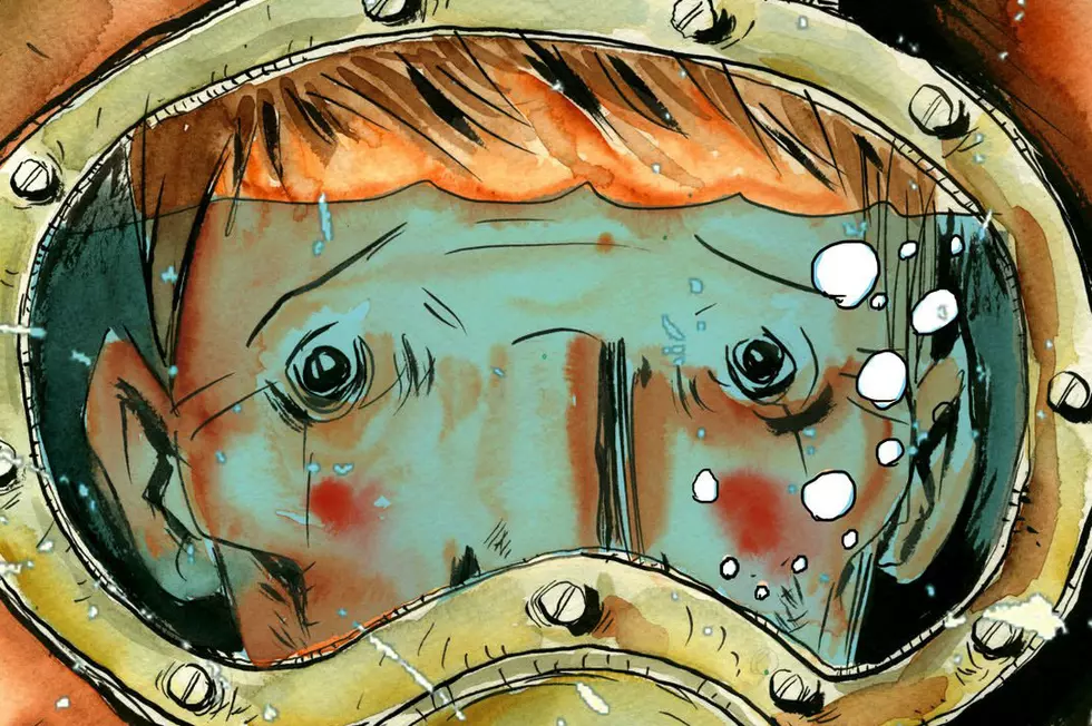
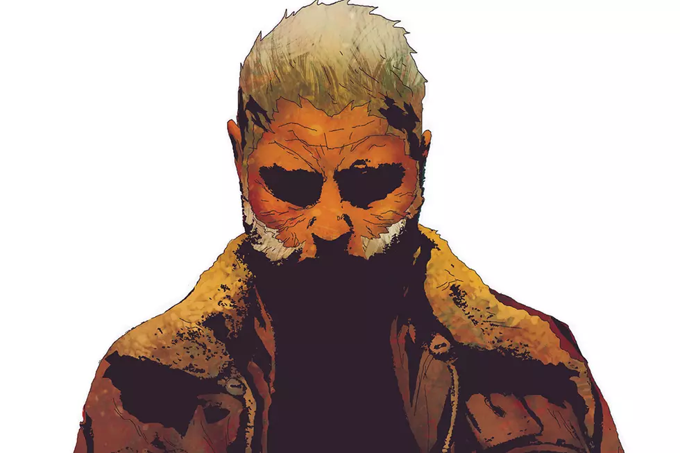
I've been a fan of Jeff Lemire ever since I first read The Essex Country Trilogy five or so years ago. Through a lot of the stories where he's been writer and artist, there's a very direct approach to framing that he rarely deviates from, particularly in work such as the current Image Comics series Royal City, where he takes a more down-to-earth tack.
It's hard to tell if this is something Lemire is doing purposefully to create this effect, or if it's just the style of his art. Either way, the effect it creates is perfect for the character-focused, humanising stories that Lemire typically tells.
There's a handful of great examples in Royal City that are worth exploring. Initially though, let's address that standard Lemire approach.
So, what you'll tend to see is camera placement (for lack of a better term) that is flat and head-on with the action. There are almost no low angle or high angle shots in the whole issue (and it's a long issue), but everything is told at eye-level.
What this does is give us the placement of a person just being stood in the scene watching it happen. There's almost no embedded visual understanding that goes with an eye-level shot; it's not forcing a particular emotion on us, it's just neutral. It means that when we're presented with these characters in Royal City, we aren't being led in a particular way, we just have to watch the scene unfold and then figure out where these characters sit in our moral range.
That, again, is a great feature of Lemire's work, as he's often playing with situations that aren't straight up right or wrong, good or bad.
It doesn't mean that Lemire can't start to imbue some layered texture to the imagery and camera positioning though. There's a particular page that stood out as being very clever in it's storytelling. It's dealing with a husband and wife, the wife sealing a deal to shut down the plant at which the husband works at. A good day for one, a bad day for the other -- again, that morally ambiguity comes in. Initially we're presented with a set of two images in parallel, the wife and husband surrounded by reference to their work, and than a second image of them staring at their future.
The differences speak volumes here. There is some obvious back and forth in the dialogue, but actually the presentation of these two characters says a lot about the underlying thoughts and feelings for this situation.
To begin, with the top two panels, we've got the husband framed within the doorway in the panel, kind of trapping him and restricting any depth to his panel. Whereas Tara has a bit more depth, a more open background, and her ad behind her. With the orange jacket for her, compared to the sickly greenish yellow tinge in the factory, one screams success, the other, almost claustrophobia.
For the panels below, you get a similar example. Once again, the husband is framed by something else, trapped further by the factory, the history of the town, the employees. The wife, meanwhile, is open, colorful, staring at what could be a huge deal for her. By turning their backs to us, Lemire has asked the audience to look at what they're looking at, understand it from their point-of-view. It's a masterful stroke that leaves us unable to really side with either. We're caught in the middle.
This will seemingly always be where Lemire's strength in storytelling sits. That basic approach isn't as easy as Lemire makes it seem, though, and it's actually doing a lot more than it might initially look like. He's managed to find a perfect balance of art and writing working together to tell you bits that the other won't. Where the words say one thing, often Lemire lets you really understand the relationship through the images. In a visual medium, you really can't ask for more.
In Strip Panel Naked, Hassan Otsmane-Elhaou looks at elements of the art of visual storytelling on the comics page.
More From ComicsAlliance


![All The Image Comics Announcements From Emerald City Comic Con [ECCC ’17]](http://townsquare.media/site/622/files/2017/03/Image-Featured.png?w=980&q=75)


