
ComicsAlliance’s ‘Jem’ Fans Take On Ross Campbell’s Truly Outrageous Redesigns

Released in 1985 by the same team that brought you G.I. Joe and Transformers, Jem and the Holograms was a cartoon that told the story of record executive Jerrica Benton, who used holograms to lead a double life as the lead singer of her own top act. The series has been enjoying a resurgence in popularity lately thanks to the release of a complete series box set and episodes being shown on the Hub.
Over the past few months, ComicsAlliance favorite Ross Campbell (Wet Moon, Shadoweyes, the upcoming Glory) has been giving the cast of Jem a shiny, cyberpunk makeover on his Tumblr, so today, ComicsAlliance's resident Jemologists Bethany Fong and Chris Sims are taking a look at the all-new, all-different glamour, glitter, fashion and fame that Campbell has given the cast!Chris: All right, Bethany, are you ready to have a look at some Jem redesigns?
Bethany: Yes! It's showtime, Synergy!
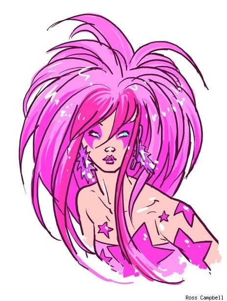
Chris: I have to say, there's a very good reason why Campbell's designs have been getting so much attention from the comics internet and not just people who are already way into Jem. There's a lot to like about what he's doing here, especially with Jem herself.
Bethany: I really love this translation; it's one of the redesigns in this series that actually doesn't stray too much from the source material. She is still definitely identifiable as Jem, but with some more modern Starlight-themed stagewear. Her Synergy earrings look like they're large, abstract mirrored acrylic stars, which effectively look both modern and retro. I also love how she has a matching pink headset that blends in with her face-framing layers -- perhaps this will allow her to do some dance moves with Danse!
Chris: For those of you who aren't aware: Yes. Jem knows a dancer who is named Danse. She also knows someone who shoots videos whose name is Video. Anyway, I really like that she looks almost otherworldly in terms of how sparkly and vibrant she is, and how the stars are just sort of attached to her skin. It's one of the things about the show that's always been weird to me: they have this crazy hologram projecting power that Jerrica uses to look like an ordinary girl in slightly more glamourous clothes -- even the pink hair is completely normal for that world. Campbell's Jem has hair that looks like it's made of lasers.
Bethany: Yes!
Chris: You definitely would not mistake her for a mild-mannered record exec.
Bethany: Her hair is in itself a show!
Chris: There's definitely an updated glam look to her, too. I was telling you earlier that I realized there was no way that Lady Gaga did not watch Jem as a kid, and Campbell's really completing the circle with this look. It's one step away from "Synergy! Project a meat dress!"
Bethany: Haha, yeah. I think what I find so shocking is that Jem doesn't have as many star-spangled ensembles, especially for a character who talks about being a superstar, who also owns a record company called Starlight Music and an orphanage called Starlight Manor. Campbell's look here definitely defines Jem's brand, so to speak.
Chris: It's a motif that he plays with through all of his designs, too. Let's have a look at the younger Benton sister, Kimber:

Chris: Again, the crazy "earring" she's got is a nice example of playing with the lowercase-h holograms. It's basically futurist Jem, which is a pretty awesome concept.
Bethany Which is especially emphasized with the ensemble itself - the physics of fabric would never be able to recreate this look without an adequate amount of spirit gum. Luckily, Kimber has Synergy to project this outfit full of impossible cutouts that looks spacey and almost robotic.
Chris: I like her Teenage Rebel hair, too. Those sideburn tendrils are exactly the sort of thing you'd expect from a girl who almost gets married to a stuntman because she thinks it'd be fun to have "a big party."
Bethany: Exactly! He gave Kimber a unique hairstyle that reflects her more rambunctious, rebellious edge that effectively differentiates her from her sister. And yet, the star accents make the Holograms in this series looked like a uniformed synth ensemble, rather than just a bunch of girls with pastel hair.
Chris: That's another great thing that Campbell's designs do: there's a lot of personality in the way that he draws the characters. Jem's smouldering but also removed and hidden behind that distracting mane, Kimber's more mischievous, and Aja looks super-confident and cocky.

Chris: More like Aja FIERCE. Of all of Campbell's redesigns, his Aja is my favorite. I love the dramatic slash of the bangs, the two-tone blue hair that looks like a firework, the fact that she's got a crazy Nightwing mask that clashes with everything else, and even the effects he's got on her hair that make it look sparkly and electric. It's awesome.
Bethany: Because there were two blue-haired characters on the show (the other being Stormer of The Misfits), I actually was never as fond of Aja's look in the show, especially since her hair wasn't particularly notable (aside from being blue). But here, I really love the asymmetrical bangs. They give her a confident edge that her original look failed to deliver.
Chris: I actually like Aja's original powder blue Nikki-Sixx-Circa-1987 hair helmet a lot, but you're right about this one giving her more personality. If Jem's aloof and Kimber's mischievous, Aja's definitely the cocky one. She actually looks like someone who plays lead guitar in a rock band.
Bethany: That's not to say that I didn't like Aja's original hair color - I actually loved that shade of blue, but her original cut just felt too stuffy. I think this hair redesign actually gives her movement. Aja's ensemble also features similar cutouts as seen in Kimber's redesign, except in more of a wavy blue motif, which again, adds movement to her stage gear.
Chris: It's definitely a step up, but my pick for biggest improvement is definitely Campbell's version of Shana:
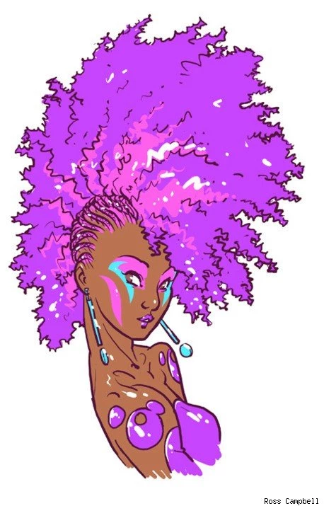
Chris: Shana's original design had hair that was this weird lavender pyramid that looked like Dilbert's boss. Virtually anything would be better than that, but Campbell goes awesomely over the top with it.
 Bethany: Shana was another character that I always felt was more matronly, despite having purple hair, and it was primarily because of that awful triangle hair. This hairstyle actually better reflects the modern chic edge that the Holograms need in their guitarist-fashion designer double-threat.
Chris: Triple-threat! She was also the original drummer!
Bethany: Yes! Drummer, guitarist, fashion designer. Though who really needs a fashion designer when you have Synergy on your side (or in this case, Ross Campbell).
Chris: But yeah, that was another thing that was always weird about Jem. Shana is supposed to be a fashion designer responsible for the look of the group -- even though you'd think that would be something their computer did, since it was glam enough to make itself a virtual reality headband to look like an asphyxiated Alex Van Halen -- and she dressed like my grandmother.
Bethany: Yeah, like in the "In Stitches" episode where Shana had to design outfits for the rock fashion show contest in Italy, and [SPOILER ALERT] after The Misfits stole Shana's designs and her clothing for the Holograms, they suddenly remember that they have an infinite wardrobe courtesy of Synergy. Synergy then projects outfits onto The Holograms that were supposedly based off of Shana's designs but look infinitely better than Shana's original designs. With Synergy, Shana never really has to sew ever again!
Chris: I'll admit that I'm not crazy about the braids on the sides, but I really love the two-tone effect that basically gives her a mohawk within a larger mohawk. It's a Double Mohawk, all the way. Plus, I really like the sort of drops-of-liquid-latex accents to her outfit.
Bethany: I like how each of the holograms have those accents - Jem has stars, Kimber has bone-like accents, Aja has waves, and Shana has bubbles.
Chris: I think Kimber's are actually sort of like planets orbiting around the star that she's got in her back. Campbell's actually doing something really subtle and clever with that, making each of their outfits represent their role, or something about the characters. Jem's the star, Kimber's the one who "orbits" around her big sister, Shana's got the bubbly personality. And Raya has hair.

Chris: So, so much hair.
Bethany: What I find so interesting about Raya's redesign is that it has an additional air of toughness, from the headband to the floating spiked hair bauble.
Chris: I didn't even notice the headband, but you're right! She's got Fighting Spirit! It's an interesting change, but an understandable one since Raya's basically a blank slate on the cartoon. She shows up, her mom tells her that "no lady wants to be a drummer!" and then she joins the Holograms. For some reason, this takes two episodes.
Bethany: In this case, the liquid latex/Synergy-projected fabric looks more like armor in this redesign. I think that this portrays the newest addition of The Holograms as a more confident member of the group.
Chris: She does look more like an anime character who's about to fight a giant robot, doesn't she? Even those gigantic hoop earrings have spikes that look like they're about to shoot laser beams.
Bethany: Ha, yeah, I totally see that! In the show, she's way more insecure and timid about joining The Holograms, but here, she's portrayed as a tough-as-nails drummer.
Chris: Making her seem more combative is a nice touch that ties in with what she does in the band, too. I mean, you don't just play the drums, you beat them with sticks. It's a nice reaction to her original barely-there personality to make her way more confrontational right out of the gate. I could totally see this version throwing down with Roxy and Pizzazz.
Bethany: Yes! Eric Raymond wouldn't dare attempt to bribe this Raya!
Chris: I think my ideal redesign of Eric Raymond would just be Cobra Commander. But anyway, there's one more member of the Holograms before we move on. Some would even say... the most important member.
Bethany: SYNERGY!

Chris: To be honest, the original Synergy might be the worst design on the entire show, even taking Shana's pyramid of hair into account. She looks like someone's mom in purple Jane Fonda VHS tape workout gear, which, now that I think of it, is actually pretty close to what she is. This one, however, reminds me of Girl One from Top Ten.
 Bethany: Hey, I like Jane Fonda Synergy! I do like how this redesign actually portrays Synergy as an entity that's both digital and holographic.
Chris: There's a nice bit of Adam Warren influence with the hair, too -- it reminds of that Dirty Pair series where Kei and Yuri had crazy cyberpunk implants that could turn their hair into viewscreens or laser knives. Because really, isn't that what Jem has been missing all these years?
Bethany: I don't know - I really do dig this redesign and how it's more aligned with Synergy's power, but I would actually kind of love it if this revamped version of the Holograms still had to summon purple workout gear Synergy.
Chris: Like, if Jerrica's dad built his supercomputer back in 1985 and just never bothered to update it because he was an old dude who had no idea what kids these days were into?
Bethany: Yes, exactly. Or just never bothered to update it because he's dead.
Chris: Okay, I'll admit that's a pretty hilarious idea. I still like Campbell's more, although I've always thought it was interesting that Synergy had her own logo that was never incorporate anywhere else in the show. You'd think instead of the one that she's got, she'd have something that looked like the Jemstar earrings.
Bethany: Agreed - the Jemstar shape should definitely be her emblem.
Chris: Instead, she's stuck with something that looks like the logo to a filmstrip that you'd watch in a third grade science class. But that ain't Ross Campbell's fault, and I like how he accented it with the big pink triangles that, subtextual meaning aside, echo being pieces of Jem's star.
Bethany: What I love is that her entity is comprised of the signature hair colors of each member of The Holograms.
Chris: Oh man, you're right. Congratulations, Ross Campbell: You have blown my mind. Let's see if he can keep up the streak with his redesign of Jem and Jerrica's mutual boyfriend, Rio:

Chris: You know, I'm not even kidding when I say that Rio really should look more like the hero of a Final Fantasy game.
Bethany: Ha, yes! To be honest, this is the only redesign that actually feels a bit dated. I really love his jacket, but I have mixed feelings about Rio's hair.
Chris: I think we all have mixed feelings about Rio's hair.
Bethany: While I do like that his revamped hair and overall style coordinates better with Jem's stage look, I kind of liked that he was just a normal dude with purple hair in his original incarnation. Though I do like the idea that as The Holograms' road manager, he looks like he's an actual member of their entourage. I just think that this hairstyle reads a bit more like a Jem groupie, however. It just makes him look a bit younger.
Chris: That's actually one of the things I like about this. Rio was not exactly well-defined as a character. He might as well have been a big empty void with LOVE INTEREST stenciled on it. Even his actual job -- at one point he's referred to as the road manager, and then they call him an engineer and I think they mean he's their sound guy, but then they refer to him as being an engineer again in order to explain how he knows how to fly an airplane. It is all over the map. The only thing we really know about this guy is that he hates deception, despises liars, and is perfectly fine with dating two girls at once without ever mentioning this to either of them. We call that "The Archie."
Bethany: That's the thing though - Rio is in a relationship with Jerrica, but clearly also adores Jem (whom he is unaware is Jerrica in disguise). Rio's original look allowed him to kind of look like a physical middle ground between Jerrica's identity as herself and as Jem - his original look was fairly normal with the exception of his purple hair, which just happened to look good with Jerrica's civilian identity AND with Jem's more outrageous persona.
Chris: Well, keep in mind that as of right now, Campbell hasn't done his version of Jerrica. Maybe she'd fit in with this Rio better than the original.
Bethany: Ha, exactly! Perhaps Ross Campbell can revamp Jerrica as well, and then we can reevaluate Rio?
Chris: I will say that I think his wispy hair and the more brooding attitude he has on display make him a better love interest for the series. He almost looks suspicious the way that Campbell's got him drawn, and my favorite moments with Rio and Jem are the ones in the early episodes where they really play up the love triangle by having him get a little creeped out by the fact that this new artist was coming onto him as though she was already his girlfriend. Like the Holograms, he's got an attitude that the regular Rio never really got a chance to show.
Bethany: You only say that because you're always brooding, Chris Sims!
Chris: One of the many skills I learned from Batman. Okay, the only skill, but whatever. Ready to move on to the bad guys?
Bethany: Ross Campbell redesigns of The Misfits? GIMME! GIMME! GIMME!

Chris: For those of you who may not know, the Holograms' rivals in the cutthroat world of music were the Misfits, not to be confused with the real-life band of the same name. These Misfits were a trio of (alleged) punk rock girls who attempted to chop the charts through a combination of wild antics, catchy songs and actual federal crimes. They were later joined by a fourth member, Jetta, which meant that they were a punk band with a keyboard and a saxophone but no drums.
Bethany: They never alleged that they're punk rock.
Chris: I'm pretty sure Jerrica refers to them as punks at least once.
Bethany: Yeah, but I think she meant it more as a synonym for hooligans
Chris: I think there was definitely meant to be a punk aesthetic to them, glam though it may be. They're all zebra stripes and fishnets!
Bethany: I don't know - The Misfits usually seemed more like a mix of glam rock with a tinge of punk, if anything. Anyway!
Chris: First up, Misfits leader Phyllis Gabor, AKA Pizzazz!

Chris: I love this one. It's up there with Aja for being my favorite of Campbell's redesigns, just by virtue of being so well done. I love that the upswept hair that's done in that lurid green makes her the visual inverse of Jem, and the way that the pink streaks merge with the facepaint is really clever.
Bethany: First of all, it's important to note that unlike Jem and the Holograms, The Misfits lack a super-computer that can project holographic clothing onto them. Regardless, Pizzazz's hair in this redesign is probably the most truly outrageous 'do in this entire set, oddly enough. She has the hair of a toxic Troll doll, and yet it WORKS for her.
Chris: It's also worth noting that Campbell's version of Pizzazz is way more sexy than her original version. The original Pizzazz was sort of gaunt and shrill when compared to the others, and there are scenes where she makes these goofy attempts to seduce people that usually end with her targets reacting with actual revulsion, which I always thought was a pretty harsh way to set her up as a contrast. Here, she's actually as attractive as Jem, but as you said, it's without the help of Synergy's holograms. It's something that I think would help underscore the key conflict that Jerrica has with herself over "cheating" to become more glamourous.
Bethany: Exactly. Plus, this look has that abstract beauty to it - you simply can't look away from her.
Chris: Would you say it has... Pizzazz?
Bethany: As for the makeup, what I love about all of the makeup in these redesigns is that the makeup isn't as arbitrarily applied as it is in the original designs. The makeup is almost pulled from the hair onto the face and vice versa. It's outlandish, but it's stylistically applied. And yes. Yes, I would.
Chris: We've talked about the theming Campbell's done with the accents on his designs before, and we'll get to it again. Moving on to Roxy!

Chris: Again, I love this. As great as he did with the Holograms, he knocked the Misfits right out of the park. I love the fact that Roxy's hair makes her look like some kind of demonic anime wolf, and that sneer she's got. The only thing that could make this better is if she was trying unsuccessfully to read a book.
Bethany: Originally, Pizzazz and Roxy had almost identical haircuts, except in chartreuse and white, respectively, which is why I love how Campbell actually gave them appropriately different, yet coordinating hairstyles.
Chris: I should probably explain that Roxy can't read, a fact that came to light when her bandmate Stormer turned to her at the beginning of one episode and flat-out said "Aren't you going to tell them how you can't read?" I just love how predatory she looks. She's definitely the most confrontational Misfit, and the painted flame on her arm does a nice job of underscoring that temper. There are so many simple touches that are done so well with Campbell's stuff here.
Bethany: I love how Roxy's voluminous hair looks both wild and soft, which I think really does reflect her inner conflicts - she's a brash personality but she's still vulnerable to what Pizzazz thinks of her. Likewise, I love how the sharp jagged neon makeup and the matching plexiglass earrings look against the softness of her hair.
Chris: The differences in the hair between the two bands are a real striking contrast, too. The Holograms are all waves and cascades and arcs and swirls, and the Misfits just look like they have explosions on their heads. All right, our final entry, our mutual favorite Misfit, Stormer!

Chris: Ross Campbell's Stormer has definitely read every issue of Sandman.
Bethany: Although Stormer's original wavy blue hair was my favorite hairstyle in the entire series, I really love this amplified mass of ringlet curls and face-framing layers. There's this visible balance of chaos and sensibility in this 'do, which is what gives this look so much appeal (Universal Appeal, even!)
Chris: One of my favorite things about this redesign is that it actually gives Stormer a reason for her name by expanding her lightning bolt motif. The original design she only had one tiny one on her cheek opposite what appears to be an incomplete Arashikage logo, but here there's a whole set of them, starting with a pretty kickass Aladdin Sane homage across her left eye. Which makes sense -- she's the sensitive songwriter behind a glam band, of course she's into David Bowie.
Bethany: The neon turquoise Jedi braid, however, I could do without.
Chris: Yeah, I thought the exact same thing. It's in my notes as "Padawan Rat-tail." But I do like how the rest of her hair is arranged so that it's something she's almost hiding behind, as opposed to the other Misfits, as well as the fact that she has softer, more rounded features. It makes perfect sense for her character, since she was the more sweet, kindhearted Misfit who was led astray by Pizzazz. She even cuts an album with Kimber at one point.
Bethany: Regardless of the overwhelming volume of her hair, her curls and soft layers in her hair do make her look softer and less sharp-edged as Roxy and Pizzazz
Chris: She also seems more shy and apprehensive than the others -- Pizzazz is looking right at us, Roxy's got that sidelong sneer, and Stormer looks like she's planning to run for the exit at any minute.
Bethany: I think that definitely adds to how Stormer's look is the perfect balance between her sweet sensitive side and her yearning to feel like she belongs in The Misfits. I also really like that Campbell kept Stormer's signature orange flower in her hair, though I was kind of hoping for an orange hairbow...
Chris: Of course you were. Any final thoughts?
Bethany: Judging from these redesigns, Synergy could definitely use an upgrade, complete with an installation of Campbell's design sensibilities. These redesigns really were truly outrageous - great work, Ross Campbell!
Chris: For something that he did as fan-art for fun, Campbell obviously put a lot of thought into his redesigns. He's accented the characters' personalities, and in some cases even rebuilt them from the ground up just through visual touches, like with Raya. It's a great take that plays up the futurism and sci-fi to a franchise that always had those elements, but never really did anything with them. Admittedly, I'm a guy who could probably read relaunches of Jem all day and be perfectly happy about it, but Campbell's take is definitely one I want to see more of.
More From ComicsAlliance
![Jerrica And Rio Finally Talk It Out In ‘Jem And The Holograms’ #25 [Preview]](http://townsquare.media/site/622/files/2017/03/Jem000.png?w=980&q=75)
![The Holograms And Misfits Travel To Another World In ‘Jem And The Holograms: Infinite’ [ECCC ’17]](http://townsquare.media/site/622/files/2017/03/jem_featured.jpg?w=980&q=75)
![Comics’ Sexiest Female Characters (From A Queer Perspective) [Love & Sex Week]](http://townsquare.media/site/622/files/2017/02/hg_featured.jpg?w=980&q=75)

![Fantastic Five: Best Musical Acts [Music Week]](http://townsquare.media/site/622/files/2017/01/music-fives.jpg?w=980&q=75)


