coloring

When Everything Is Pink: Sarah Stern On Color And Creativity
Sarah Stern is an up-and-coming talent in the world of comics. She primarily provides color art for comics like Goldie Vance and Brave Chef Brianna, but she's also created storyboards for animation, and recently created a webcomic, Cindersong, which she writes, illustrates, and colors herself. ComicsAlliance had the chance to talk to Stern at Emerald City Comicon, where we nerded out about how the heck colorists create magic on the page, and talked about fantasy worldbuilding and making friends in the comics world.
Strip Panel Naked: The Craw County Red Of 'Southern Bastards'
The latest issue of Southern Bastards was released last week, and we’re finally able to get back into the world of Craw County. Reading Southern Bastards always brings one thing to mind; it’s something you tend to find on every cover, and the whole interior of the book is drenched in it: red. Artist Jason Latour links so much of this story with red, and turn any page and you can see how heavy an influence it has on the palette.
Color Is Literally Magic In Chris Bachalo's 'Doctor Strange'
The most recent volume of Doctor Strange by Jason Aaron and Chris Bachalo has provided an updated and fresh take on the classic character, casting him more as a man of action than ever before, and setting him against impossible odds. While the stories have been exciting, one aspect of Doctor Strange that’s especially interesting is Bachalo’s use of color to portray the world of magic, and perhaps more importantly, the effects of its absence.
Superhero Color Theory: Secondary Characters
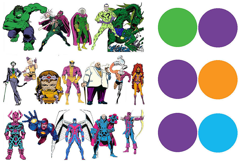
Last time in Superhero Color Theory we explained why our main heroes look the way they do. Now it's time to look at the secondary colors and how they often, but not always, signal the presence of a bad guy. Obviously it makes the most sense visually, that to stand apart from a primary colored (red/blue/yellow) hero, you want a secondary colored (purple/green/orange) one. But what do these colors tell us about what type of character the heroes are encountering?
Superhero Color Theory, Part I: The Primary Heroes
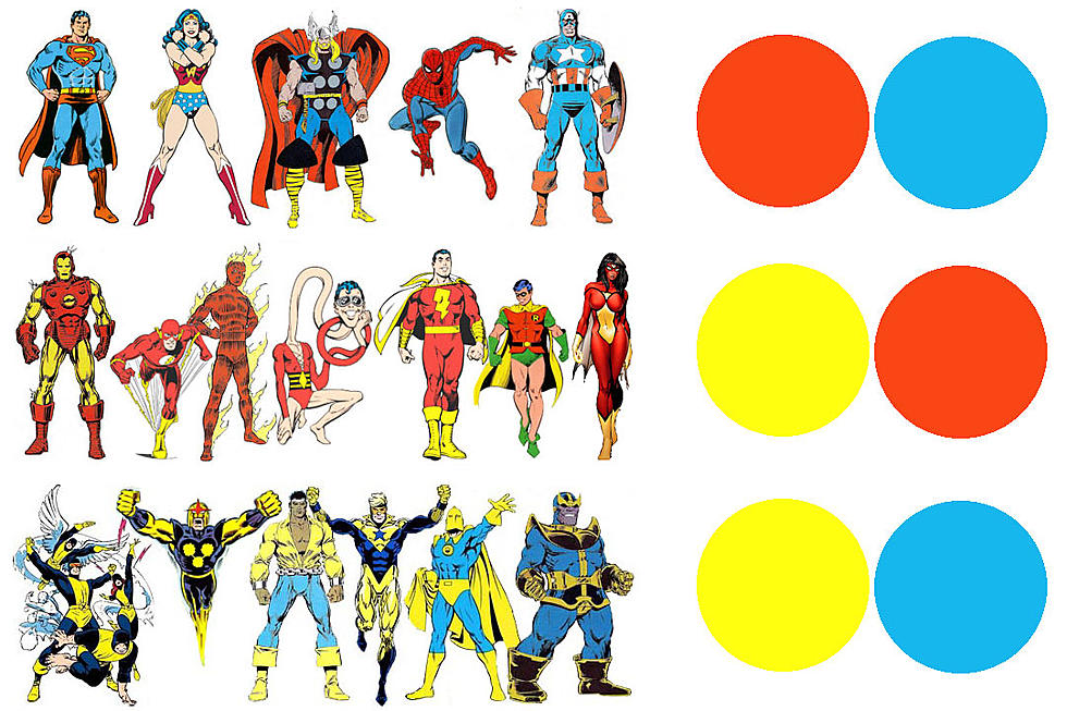
Take a look at the biggest names in superheroes and you probably realize that you're looking at a sea of red, blue, yellow. There are some greens, whites, blacks, etc, but the most iconic superheroes are the red and blue, with yellow accents. It's no accident that the easiest colors to render in the four-color printing process became the choice for bold heroes. But what does it mean for characterization of these heroes? What does it tell us about those characters?
Matt and Sharlene Kindt Go Below the Surface of 'Dept H'
Following the end of his widely acclaimed Dark Horse series Mind MGMT, creator Matt Kindt decided to try something completely different for his next project --- a claustrophobic thriller set in 'real time'. Each issue of the upcoming Dept H is set during a 24-hour period in an underwater science lab that is slowly flooding. As the series moves on, time quickly runs out for the people inside as they try to work out who sabotaged the base --- and try to stay alive. A spy series that starts as a murder mystery and quickly tightens into a tense race against time, the series sees Matt Kindt joined by his wife, watercolor artist Sharlene Kindt, on colors. Having worked on sections of MIND MGMT, this new series marks her first ongoing comics work for a major publisher. To explore the depths of Dept H further, ComicsAlliance spoke to both Matt and Sharlene Kindt about their work. We also have an exclusive reveal of their cover for issue #3.
Decoding #TheDress with Color Artist Nathan Fairbairn
The Dress. For a little while there, in between one story and the next, the dress was all anyone seemed to be talking about --- or more specifically, a picture of a dress. Some people swore that the dress in the picture was white and gold; others felt certain it was blue and black. Color, which we tend to think of as a matter of fact, is really a matter of perception --- but, "it all depends how you look at it" is an unsatisfying answer to a question that nearly tore the internet in two. Thankfully there are people whose whole business is color, among them the talented artists who color our comics, applying color theory to create space, time, mood, and emotion on the page. One such artist is Nathan Fairbairn, whose projects include Multiversity and Wonder Woman: The Trial of Diana Prince. Fairbairn was as confounded by the mysteries of The Dress as anyone, but as an expert in his field he had a better idea than most of us on how they might be decoded.
Colorist Nathan Fairbairn Explains 'Pax Americana' Process
I'm sure more than one comic came out this week, but you wouldn't know that form my Twitter feed, where all anyone is talking about is Pax Americana, the latest chapter of Multiversity by Grant Morrison, Frank Quitely and Nathan Fairbairn. Using the old Charlton Comics characters that inspired Dave Gibbons and Alan "The Original Writer" Moore's classic graphic novel Watchmen, Pax Americana tells a story that is in turn inspired by Watchmen, creating a meticulously structured comic with layers so dense that it's blowing minds all across the comics scene. And one of the most important parts about the comic is color. That's true of any comic printed in color, of course, but in this particular issue, color becomes a major theme, creating a backdrop for the story that's tied into ideas about spiral dynamics, something that's verbosely explained by the Question about three quarters of the way through the book. If that sounds complicated, well, it is, and our own David Uzumeri is hard at work on annotations explaining it all. Until then, we're fortunate enough that Fairbairn has taken to his Tumblr to break down his coloring process and how he worked with Quitely to create the incredible visuals of Pax Americana.
Is A Recolored Comic Still The Same Comic?
  This week, Marvel posted a few preview pages from its newly "remastered" first issue of Miracleman. Before the images were even officially released Wednesday, fans had gotten a hold of the new images and posted comparisons to the original black-and-white versions from the magazine Warrior, Eclipse Comics' original issues, and recolored versions from the original Eclipse collected editi

Load More Articles