Ask Chris #194: Building A Better Superhero Costume
Q: What do you think is the essence of making a great iconic costume? -- @thenoirguy
A: With comics being a visual medium and all, especially one that's dominated by a genre marked by its own goofy language of symbolism and iconography, I think about superhero costumes pretty often. I mean, I cannot count the number of times I have written the words "Batman's Batman-Shaped Kneepads" over the past three years, but that said, I'll admit that I might not be the best person to answer this question. As Erica Henderson (artist of Subatomic Party Girls and the Ask Chris logo above) pointed out, I'm not an artist. Then she went ahead and answered the question, telling me that "It's pretty simple, iconic is something that's quick and easy to recognize. that's why nobody talks about Cable's costume."
Listen, Erica, I don't know what circles you run in, but I talk about Cable's costume a lot.

Admittedly, Cable might not be the best character to bring up for this conversation. I mean, his look is definitely memorable, but that's less because of anything it says about the character and more because it represents every design element that marked an entire era. Metal arm, glowing eye, pouches, gigantic gun, more lines on his face than Archie has in his hair, they're all there. But, well, Erica's got a point. It might be evocative, but from a character standpoint, it's not really iconic.
If we can be allowed to link all this up to art history for a second, Erica had more to say on the subject, too:
If we take the word "icon" back it refers to religious art. Back then they were pretty much just drawing everyone with the same face (not unlike some comic artists), but you add some basic things and you can start easily recognizing characters with symbols. Those people have halos? They must be holy. That halo'd woman has a baby? Mary. And we can guess who the baby is pretty fast. You got a green guy with arrows? Green Arrow. Purple guy with arrows? Hawkeye. Loincloth guy with arrows? St. Sebastian.

But regardless being able to recognize something quickly is what does it, even when the outfit seems complicated because of extra stuff, like Spawn. He's covered in dumb nonsense but still: black and white, reverse Gene Simmons face, big red cape, chains. Done. It's part of why a lot of these New 52 costumes are less respected because they took something iconic and then added a lot of noodley junk on top.
My friend Jesse puts it this way- If a kid can't draw it, it's not a good superhero costume. If you gave a kid a pen and said draw original Harley Quinn and then the new Harley Quinn, they're going to need to think less about the first one because it's simple bold shapes. The more junk you add, the less iconic it becomes.
She's not wrong, but I think that in terms of superhero costumes, simplicity is only part of the equation. If that was all superhero costumes needed to be great, then a lot of the best costumes in comics just would not work. Take Spider-Man, for instance:

There's nothing about this costume that should work. It's covered in unnecessary lines that are such a pain to draw that in the '80s, Mike Zeck just basically said the hell with it and gave him a new one that was just a plain black body suit with a big white Spider on it. It disguises the face and makes the character's reactions impossible to read unless you cheat by having the eyes of his mask widen and narrow like they're his actual face, which virtually everyone does. It's got two different Spider-Man logos on it, one for the front and one for the back. And, maybe weirdest of all, it actually covers up important things, the web-shooters and Spidey's oft-forgotten utility belt, while having a design that looks like a belt. Seriously, there are few things I love more than when Spider-Man busts out his Spider-Signal, because he always has to sit there lifting up his shirt like a dope and then tucking it back in.
Looking at all those individual elements, it sounds terrible. And yet, it's one of the single best costumes in superhero comics. Top five, easy.
Part of that, I think, is just that Steve Ditko was a genius at making things that shouldn't work turn out to be incredible -- just the very concept of "teenage mope gets radioactive spider powers" sounds awful until you see it in action -- but again, I don't think that's it. Part of it might be familiarity, too, in that we're just used to seeing it and associate it with some of the best stories in comics history. I honestly have no idea why it works as well as it does, but it does.
The thing is, while simplicity and iconography are great, I think the best costumes, the ones that realy endure, are the ones that make the effort of telling you something about the character, even if they're doing it in a very simple way. That's one of the reasons I've often been so frustrated by Wonder Woman because, as I mentioned last week, the visuals of her costume don't tell you anything about her until you remember she was created during World War II. It's "iconic" in that it's been around forever, but as far as being revealing, that stops with the tiara and the bracelets.
But then, look at Superman, for instance, probably the most "iconic" and enduring costume in all of comics:

It's had its changes over the years, but the basic idea has remained the same, and a lot of that initial imagery that's been repurposed for superheroes has its traditions in the circus strongman. The trunks, the cape, all that iconography was brought over with Superman, along with the big bright colors and the big "badge" on the chest that makes him pretty easy to identify as what's basically a big policeman. What's really revealing about this costume, though, is what it doesn't have. Superman's head and face are exposed so that there's nothing between the reader and his friendly smile and occasional wink (or, in more recent years, his scowl and tears or glowing red evil heat vision eyes). He has the cape, but it's not really covering anything, so it's just there for show -- it looks good while he's flying. Same with the belt: He's wearing tights, so it's not really holding anything up, and it's not like he's carrying anything with it, so clearly he doesn't need accessories to handle his business.
Even more revealing, though, is his lack of gloves. He's someone who doesn't need any extra protection if he needs to lift something up or punch something or stick his hands into a fire. He's not worried about leaving fingerprints. Superman is a guy whose hand you can shake.
As a quick aside, you can contrast that Superman with the current model, whose costume makes no friggin' sense. It's armor. Superman wears armor. The implication would be that he needs armor, which is the exact thing Superman doesn't need -- and that's on top of all the "noodley junk" that's been thrown in because they were embarrassed to have him wearing trunks. Seriously, there's a reason that when artists were given the choice in the Adventures of Superman anthology, they overwhelmingly chose to draw the classic suit. Or, as I like to call it, the good one.
Now, given his status as the first and most influential superhero, Superman's costume more or less forms the baseline. I'm pretty sure I've mentioned it before, but it's always goofy as hell to me when people in the Marvel Universe refer to superheroes as "capes," because who wears a cape in Marvel comics? Thor and Dr. Strange. Shouldn't they call them "masks?" But anyway. Because Superman forms the basis of that tradition and the foundation of the language of superhero comics, it's a lot easier to look at other heroes with how they contrast to that. Spider-Man, for example, has those same heroic colors, but the full face mask automatically makes him way more secretive about his identity and less open about things.
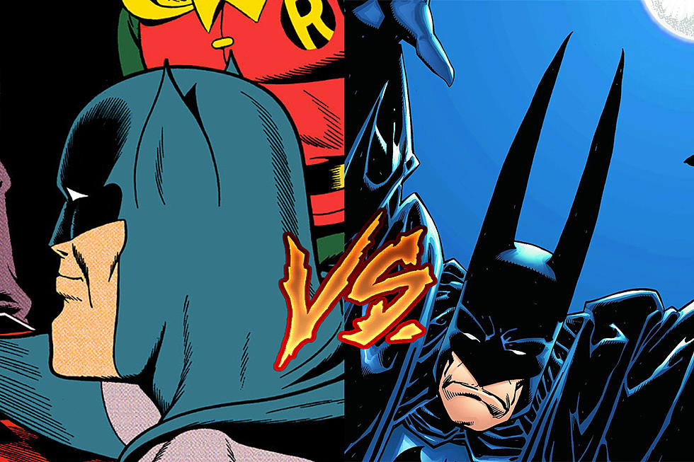
But, you know, the obvious contrast is with Batman.
If you scroll up a bit, you can see the Jose Luis Garcia-Lopez model sheet that goes along with the Superman one, from the DC Comics Style Guide, which was used both for the comics and for licensing, showcasing the most iconic of the iconic costumes. And while I love that Batman costume and think it's pretty much perfect, we might as well look at a little something different.
Here's Dave Johnson's concept art for the "New Gotham" arc that launched in 2000, a soft reboot of the Batman titles in the wake of the year-long "No Man's Land."

I picked this one for a couple reasons. One, it's completely rad. I remember seeing these designs in Wizard circa 1999 and just obsessing over how cool they were, especially his take on the Animated Series-style grappling hook and Batarangs. Second, because Batman's design has changed a lot more than Superman's. There are subtle variations in both, but Batman's tend to be more extreme, swapping out colors for monochrome and eventually getting to the extreme of Batman's Batman Shaped Kneepads that we have now. Johnson's design, on the other hand, was influenced by Batman: The Animated Series, returning the dark blue and grey color scheme, while ditching the yellow oval, and the changes that it did make reflected some key points about the character.
First, Batman is very protected, even if he's just wearing tights instead of body armor. He's got gloves and boots, with the contrasting shininess that makes them look like thick leather. Second, and more importantly, the cape.
Again, I find it pretty hard to find a fault with Garcia-Lopez's design, but I've always preferred the Marshall Rogers-type idea of Batman's cape functioning as a cloak -- sitting on his shoulders and joining up below the cowl. It visually reinforces the idea that he's using it for protection, giving him a subtle hint of human vulnerability even when he's standing there with it thrown back, all scowly and super jacked.
The accessories do the job, too. Again, I prefer the superheroic style of the classic boots and the "capsule" utility belt of the '70s and '80s (because c'mon, if we accept that there is Batman, we can accept that he can fit a boomerang into a little compartment that looks like a pencil), but I like what Johnson does here. The bulkier utility belt implies that he's actually carrying stuff around in there, stuff that we see him using pretty regularly because he needs to, and the treads on the boots are there because this guy does a lot of running and climbing. Compare that to Superman -- the last thing that dude needs is a pair of boots with a good set of treads, because he flies everywhere.
The costume reinforces the character. It's not just a matter of looking cool, although it definitely does. It's a matter of using that imagery to reinforce and build on what you already know.
There's one more key element to an iconic superhero costume, and that is the silhouette. It has as much to do with the body as it does the costume, but they compliment each other. To go back to those examples that we've already talked about, you've got Superman: cape flapping in the breeze, hands on hips, feet pointed down because he's floating in mid-air, boom. Instantly recognizable. With Batman, it's the ears and the scalloped cape -- everything else can change, but if you don't have those two pointy ears, he's not Batman. With Spider-Man, it might seem like the costume's not doing anything, but the lack of a cape or any additional elements to his silhouette is actually what makes him so great. You can recognize a Spider-Man pose instantly, because they all have those spindly, angular legs -- the knees pulled up and the arms akimbo, or that famous Todd McFarlane crouch. That's the silhouette of a dude who skitters, slightly off-putting in the way that spiders are. Even when he's swinging around on his webs, he's usually got the knees pulled up impossibly high, reinforcing that slightly creepy idea.
Which brings us, in a roundabout sort of way, to the last thing I wanted to mention: Team Costumes.

I love those Frank Quitely New X-Men costumes so, so much, because they have that perfect mixture of unity and individuality.
Let's be real here: The X-Men have never had good costumes. I mean, there are individual X-Men with good costumes -- the Phoenix costume is one of my all-time favorites, and most of the "All-New X-Men" era suits by Dave Cockrum are pretty solid -- but when it comes to looking like a team, they always fall flat on their collective mutant face. The original Kirby-designed uniforms are, and I say this as a die-hard Kirby fan, pretty godawful, and since then they've just been a weird mishmash. Unless a team is made up of solo characters, like the Avengers or Justice League, there should be a unifying theme to them. Which is exactly what Morrison and Quitely gave them.
They're great uniforms, because they allow for so much individuality while still being identified as a single unit. Cyclops always has his jacket zipped all the way up so that the X is always prominent, Wolverine's is never zipped up (and I don't think he wears a shirt under there either). Phoenix usually goes without the jacket, instead wearing the uniform shirt to maintain a cohesive look. White Queen is the biggest deviation, but she keeps the X motif -- only the X is bare skin to reinforce the idea of a show-off who can turn to diamond. It all really works. It's not my favorite look for them as individuals (Wolverine's purple suit from the Darwyn Cooke Wolverine/Doop book is the best he has ever looked, hands down), but as a team? They never looked better.
The only other team that did uniform costumes that well was the '90s Legion of Super-Heroes, where everyone's costume was based around the same basic template (the color-blocked "sandwich" design), but with each one slightly modified to indicate powers. For Impulse, the middle line was staggered to form a big lightning bolt, Triad had different colors on either side of the center that would form the basis for her other two bodies, Sensor had... well, Sensor was a giant snake with little robot T-Rex arms, so it didn't quite work for her. But it was well done, especially when it came to updating costumes that had been around since 1958.
I think we can all agree that creating an iconic costume for a giant talking snake is a slightly more difficult matter.
Ask Chris art by Erica Henderson. If you’ve got a question you’d like to see Chris tackle in a future column, just send it to @theisb on Twitter with the hashtag #AskChris.
More From ComicsAlliance