Best Sequential Art Ever (This Week): J. Bone And Tony Cliff
The comic book, animation, illustration, pinup, mashup, fan art and design communities are generating amazing artwork of myriad styles and tastes, all of which ends up on the Internet and filtered into ComicsAlliance’s Best Art Ever (This Week). These images convey senses of mood and character — not to mention artistic skill — but comic books are specifically a medium of sequential narratives, and great sequential art has to be both beautiful (totally subjective!) and clear in its storytelling (not so subjective!). The words and the pictures need to work together to tell the story and create whatever tone, emotion and indeed world the story requires. The contributions of every person on a creative team, from the writer to the artist(s) to the letterers, are necessary to achieving a great page of sequential storytelling.
It is the special nature of comic books that we’re celebrating in this all-new recurring feature: Best Sequential Art Ever (This Week).
The Saviors #1 [Pages 4-5]
Story: James Robinson
Art and Letters: J. Bone
Available: Comics shops (print) / Image (DRM-free download) / ComiXology (iOS + Android + Web + Etc.)
This spread is a great example of how to open a story with a quick bit of work given to the setting that firmly establishes the basics that a reader needs to know. There's a lot going on, but J. Bone pulls it off and the eye always goes where it needs to go. Technically this could have been pulled off on two separate non-spread pages but the wide panel showing the town really gives a sense of not just the town itself but also the space around the town. Tomas is facing to the right throughout the entire page other than the last panel, which helps guide the reader onwards through the rest of the panel. Panel 6, the last panel in the middle row of panels, has the sheriff's car pointing to the bottom left which pushes the eye to the beginning of the bottom row. This is a solid spread that does everything it needs to do and looks good doing it.
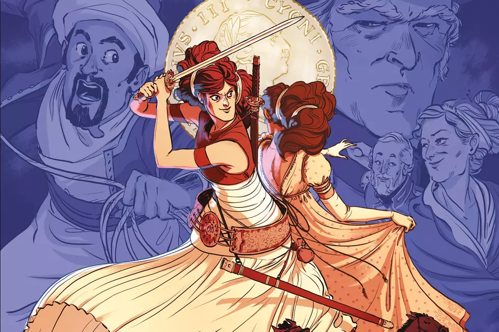
Delilah Dirk and the Turkish Lieutenant [Page 98]
Story, Art and Letters: Tony Cliff
Available: Comics shops (print) / Free Online Comic
Sassy lady protaganists are my jam so it's unsurprising that I really enjoy Delilah Dirk. Tony Cliff is an excellent storyteller who keeps the action constantly moving. But most importantly for a book about a sassy lady, he pulls off excellent body language and facial expressions. This page is a perfect example of that. Delilah goes from loud, brash action to sudden silent shock all in a few panels and the transition works perfectly. The font used for the balloons throughout the book is not the best comic balloon font ever but the lettering on this page is pretty perfect. In particular the flow from Salim's interrupted balloon in panel 3 into Delilah's shouting int he next panel is great. The rest of the page is silent but the facial expressions really sell the confusion. Finally, ending on Delilah looking towards the upper right of the last panel automatically leads the reader's eye to the top of the next page, where it should go naturally.
More From ComicsAlliance
![How Conner And Palmiotti Reinvigorated Harley And Reimagined ‘The Jetsons’ [Interview]](http://townsquare.media/site/622/files/2017/03/Harley-Featured.png?w=980&q=75)
![The Bully Gets His Day In ‘Biff To The Future’ #1 [Exclusive Preview]](http://townsquare.media/site/622/files/2017/01/BTTF_BifftotheFuture_Featured.jpg?w=980&q=75)
![Kevin Does A Favor For A Fan In ‘Life With Kevin’ #3 [Preview]](http://townsquare.media/site/622/files/2016/12/LifeWithKevin_Featured.jpg?w=980&q=75)
![Big City Living: Dan Parent Talks About ‘Life With Kevin’ [Pride Week]](http://townsquare.media/site/622/files/2016/06/Kevin-Featured.jpg?w=980&q=75)
![Take a New York Minute With Dan Parent’s ‘Life with Kevin’ #1 [Preview]](http://townsquare.media/site/622/files/2016/06/LifeWithKevin_featured.jpg?w=980&q=75)