
‘100 Bullets’ Cover Artist Dave Johnson Picks ‘Wins and Fails’ of Comics Cover Design

The celebrated cover artist of 100 Bullets, PunisherMAX, Detective Comics and many, many more great series, Dave Johnson knows what he's talking about when it comes to creating great comic book cover illustrations. Followers of Johnson's Twitter feed have been treated recently to the artist's variously provocative and fascinating insights into what he thinks makes or breaks a fine piece of cover art, showcasing with visual aids some "wins" and "fails" of the week's new comics. Response has been such that Johnson's actually created a new blog where he intends to go more in-depth, and in some cases has already edited some covers to demonstrate his points. The blog has only a couple of posts so far, but you can check out a helpful compilation of Johnson's previous Twitter activity after the cut.Crucially, Johnson is not criticizing the draftsmanship of his peers but rather focusing on the artistry of cover creation specifically. "What makes a good cover? One word. Design," he wrote on Twitter. "So many artists forget this. Thinking that if they just draw some cool characters, [it's a] job done." He added, " Keep it simple. Even if a lot is going on in the cover, design it so the eye has places to rest. Also by doing this you channel the viewers eye to the really important things you want them to know. Some detail is more important than other detail. Pick your battles. Service the story, not your pocket book. And by that I mean drawing easy to re-sale pin-up covers. You're better than that Same thing with color. If you have a team book, and all the characters have every color in the rainbow, try to knock some of those colors back to focus on one or two important things. Not every character needs star treatment."
The subject strikes us as, well, subjective of course. But we'll leave it to Johnson, whose work we regularly feature in Best Art Ever (This Week), to make his case for what makes a winning cover and what makes a cover failure.
A list of #Johnsoncoverfails
- Your main character just standing or running in an action/sexy pose is lame. Where's the subtext? The mystery?
- Your character standing on the corner of a building. Lame! Bonus points for gargoyle. We've all done it to death. Stop it.
- Trying to show off by drawing everything and the kitchen sink. Looks like shit on the stands.
- Tracing other famous covers and making them zombies w/o crediting the original artist. Total dick move.
- Too many colors. Figure out a way to simplify. If not, it ends up looking like mush on the stands next to everything else.
- [In response to a question about "plain old cover porn":] As long as it has some sense of design and maybe a hint of a story. Otherwise it's just a pinup.
- Too many covers seem to be what I call "inside panel". Meaning they look like a regular panel, with no thought/design.
Some examples of #Johnsoncoverfails (Johnson's remarks in italics)

OK, let's look at this cover. It's drawn well, But WTF is it saying? Lazy. Also, is the girl behind her evil? Or are they friends? And it appears she has no lower body.
How about this? Is it a comic or a rock group publicity photo? It's boy bandrific.

OMG! Is this a parody of something? Way to keep those gay rumors at bay. Crotch shots are GO!
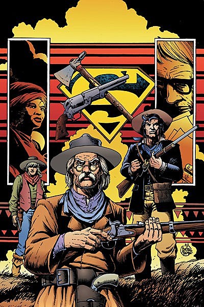
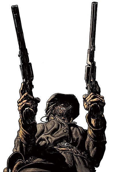
The layout is kind all over the place. The color isn't helping either. And not sure why the gun and the tomahawk aren't centered over the Supes shield. Seems kinda obvious.

Ok, I get that you're doing a movie poster parody and you love Adam Hughes city [backgrounds] but the problem here is cropping. The characters are the focus, not the BG. Leaves me cold.
Speaking of cropping, this cover is cropped TOO close. It took me a while to figure out what was going on. My first thought was the artist was trying to do a Mucha decorative vibe. But wait, it's a fence. All in all, it lacks tension.

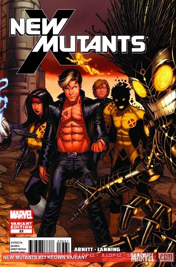
This is why I stay away from team book covers. It's usually a lose-lose. The problem with this one is depth of character. Everybody is on a middle plane. Pushing two characters forward would have helped. Keeping them dark also. Like I said, team books are the worst. To many focus points, too much competing color. It really is the enemy of good design. Not that it's impossible. The old timers did it well. Kirby, Buscema, Romita and Kane were masters of it.

So much is wrong with this cover. First, let me say that the logo treatment is solid. But after that it all goes downhill. Let's start with the design. So much boring deadspace. The diner looks wrong. Should have used better [reference]. Maybe it's a story point but shouldn't there be a parking lot in front? But we get grass instead. Now let's move to the rip. It's hard to tell if the rip is through the illustration or the diner itself. Confusing. Also, having both elements the same tone and hue is a big no-no. Every part blends together when the opposite should be happening. I would have made the diner normal looking with normal coloring and had the face coming out covered in deep red blood for shock value. Instead it looks like Kool-Aid.
Ok. Here's a personal cover fail. Editorial asked me to bang one out super quick. Not much to say, it's just stupid.
Naturally, Johnson's remarks have not been appreciated by all his followers, with some suggesting that to criticize his peers' work in this way is unprofessional and that the sales success of many creators or titles he identifies as "fails" renders his criticism invalid. Johnson addressed concerns, writing, "Bottom line is this. Everybody fails at one time or another. Doesn't make them bad. I do it all the time. I guess calling attention to it makes some fans mad because of who knows what. Bottom line, it's my opinion. Get over it."
But it's not all bad news. Johnson has been just as eager to share covers he feels exemplify his philosophy of good design.
Some examples of #Johnsoncoverwins (Johnson's remarks in italics)

This cover by @jock4twenty should win him an Eisner. If not there is no justice in this world.
Here's another one that got me excited. Beautiful. Engaging. Great Colors. Simple.
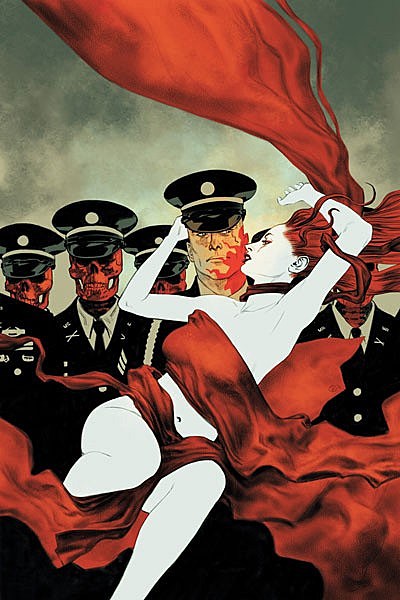
This is so well done it hurts.There's a lot going on but he creates a nice negative space to give the eye a rest.
Also, all the covers from this related to one another. Impressive. J.H. [Williams] is fantastic.
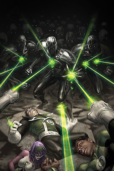
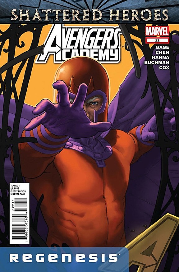
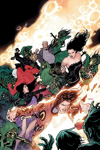
I love how the color of everything is knocked down to allow the green beams stand out. Smart.
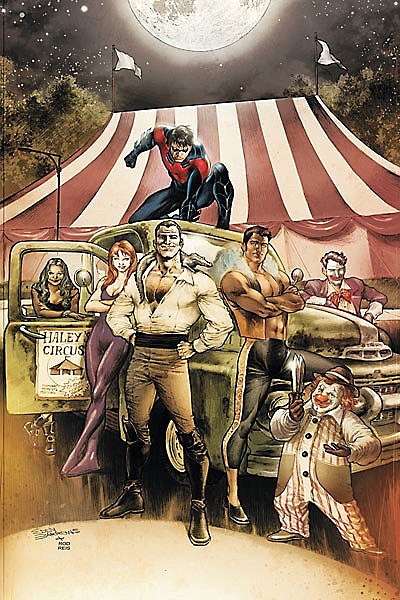
Same thing here. My eye goes right to Nightwing. Smart color.

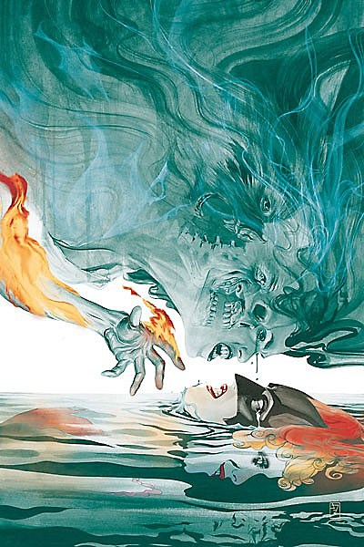
The color on this is also nice. The yellow filter brings it all together. And her expression is great.
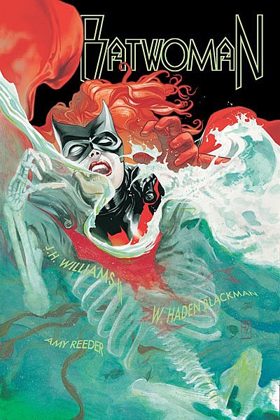
I'd buy this book because I'd be afraid not to. Hope the logo doesn't ruin it. Simple is good. Once again, simple color for design sake. Adding a [background] would have ruined it. Unless it was at 25%. Maybe.
Here's an example of a lot going on but it's clear at the same time. Drawing and color are top notch.

Love it! What an eye popping cover! This will jump off the stands like no other.
This is a fun/well designed/drawn cover. Kudos.
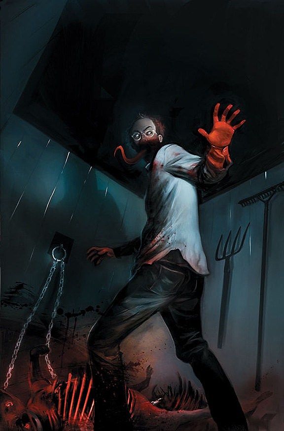
Once again, simple color that pushes your eyes to important things. Creepy. Love it.
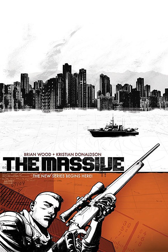
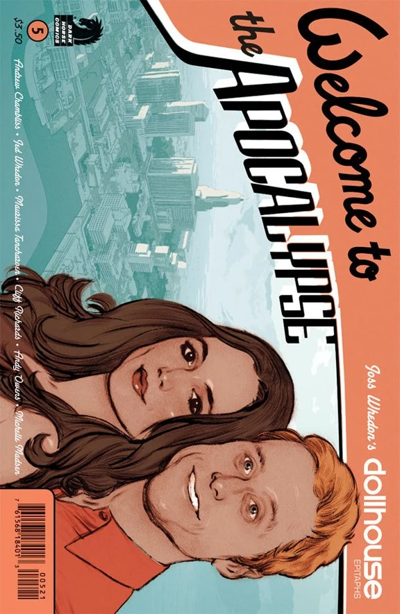
I'm a sucker for book design. Probably why I like this. Doesn't feel like a standard comic book.
Andrew Robinson is one of the most under rated artist in this industry. And that makes me sad.

Of course it goes without saying that @artofmmignola is a master of design and simplicity. He makes it look easy.
More From ComicsAlliance


![Duck Season? Merc Season? It’s ‘Deadpool the Duck’ #1 [Preview]](http://townsquare.media/site/622/files/2016/11/Deadpool_the_Duck_Featured.jpg?w=980&q=75)


