Duet On ‘Solo’, Part Nine: Scott Hampton

Published between 2004 and 2006, Solo was a DC Comics anthology series with an innovative twist: each issue was created from the ground up by a single cartoonist and collaborators of his own choosing. Edited by DC's head art director Mark Chiarello (Wednesday Comics, DC: The New Frontier), the series offered artists a platform to control their visions completely in the form of original stories, unfettered access to DC's library of characters, and without regard to continuity or other publishing concerns that affect the creation of a typical DC superhero book. Although Solo spotlighted the work of such talented and popular creators as Darwyn Cooke, Tim Sale, Paul Pope and Michael Allred, the series was cancelled after just 12 issues.
Even in a time when the superhero comics were experimenting wildly with structure and style, Solo stood apart and remains one of the best and most interesting mainstream series to emerge from the early years of this century. In this installment of Duet on Solo, writers Sean Witzke and Matt Seneca take an extremely close look at the ninth issue of Solo, created by Scott Hampton.Sean Witzke: Full disclosure: in the bio section of this comic, Scott Hampton says that he's "addicted to all things relating to Green Day's American Idiot," which is an album and Broadway musical about the Iraq War and "the state of America" in 2004, which to me is like saying he's a big fan of McDonald's commercials about Vietnam atrocities or something. Also, it's by Green Day, who are awful. As such I have no choice but to treat this witness as hostile and react to this comic accordingly.

Matt Seneca: Well, my hero Aaron Cometbus just wrote a pretty eye-opening novelette about his tour experiences with American Idiot-era Green Day (check it out, people), so I vote we focus our attentions and vitriol on the substance of the comic itself.

MS: Scott Hampton's a painted comics guy who had a few minor star turns in the '90s, kind of an odd man out among the Solo cast insofar as nothing he's done ever met with much critical success, though like everyone else involved in this series, he can draw very well. I want to hold onto that as a positive aspect that remains throughout, because even if there's pretty much nothing in here that's redeemed by its story, looking nice is a viertu that not a lot of current-day DC comics have.
SW: Representationally Hampton's great and clear; I always know what characters are feeling and there's always really good geographic sense. But I think his pages also feel very static and sterile, and that effect only gets worse when his pages get more stylized and he applies the painted effect to some of these stories. And the writing is all over the place from just uninteresting and plodding to actively shrill and distasteful. There is a satire of the comics industry here that could be used as proof that comics doesn't deserve to satirize itself.
MS: His cartooning is kind of a perfect example for the idea that just because there's nothing wrong with something doesn't mean it's necessarily a success. I think the reason it feels stiff -- even though I think Hampton is pretty adept at moving characters across the page and implying motion in single images -- is the painted color he uses. There's a feeling of fluidity to the spaces he covers with paint, of real motion, and then when it's blocked in by solid, more conventionally drawn black ink lines, it feels as though that motion is being bound -- blocked off. That's my guess, at least, because I can't really nail down anything else he's doing "wrong." These are drawings that focus the eye around their central figures and amplify facial expressions and gestures for effect. It's good stuff that just doesn't work. It's probably the same old problem with photo-referenced art, where the characters feel like they're standing in front of green screens and the action isn't based in its surroundings. It's impossible to take seriously. Or maybe it's the stories themselves -- there's nothing even approaching a sympathetic character or a well-drawn one.
SW: Or a plot line that doesn't just slam the tone and telegraph the climax by the end of the first page, or, even worse, have no tone or satisfying conclusion.
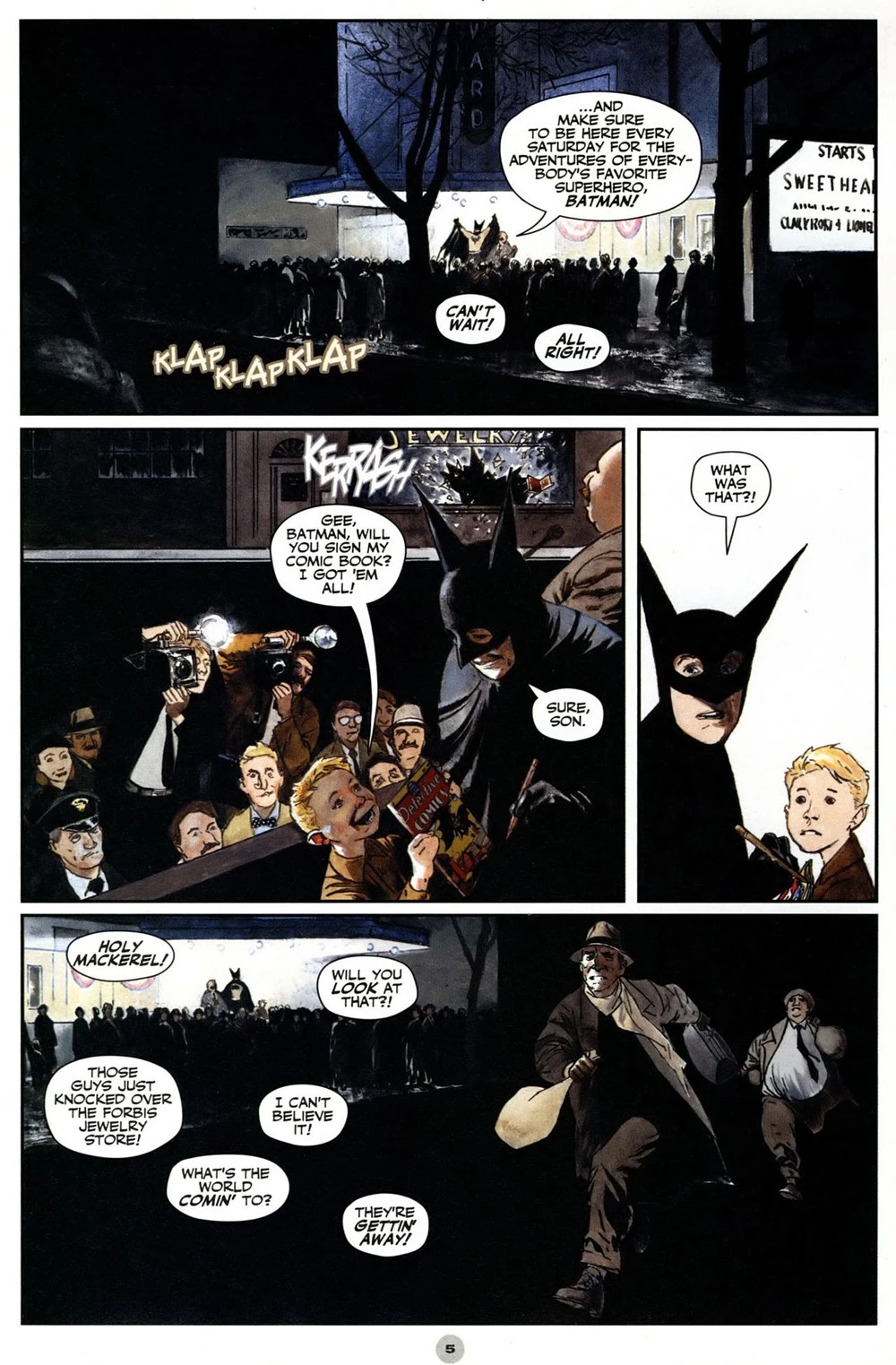
SW: I'd say the most unobjectionable thing in the issue (besides the "how I draw a comics page" section, which was interesting) is the tacitly required Batman story -- which is also the least visually interesting thing in that it's fairly murky and really not about anything but some kind of dramatic irony that the actor playing Batman gets to meet Batman?
MS: I think there are some good visual bits in the Batman comic, mostly in the Edward Hopper backgrounds and at the points where you can see that Hampton is really laying a lot of paint down, but the sense of texture only extends so far, especially when it's covered over by slick computer lettering. The story's pretty hokey; I feel like I've read it before somewhere, like it was either a ripoff or got ripped off by someone else? Or maybe it just isn't so original -- "coward takes credit for a brave man's actions" is hardly very original, and it never really gets at the dramatic potential of that equation, either.
SW: He does get some really gorgeous blue and purple tones in there. There's a Superman story about George Reeves meeting Superman, right? I might be imagining that. It is the plot of Hero starring Dustin Hoffman.
MS: I'm thinking of that I Love Lucy episode where Little Ricky thinks Reeves is actually Superman and he ends up on a 50th floor balcony or something, expecting to take off and fly. Also pretty stupid. Maybe this story is some kind of oblique reference to the 1940s Batman serial, with the hideous costumes?
SW: Yeah, the serials, it's definitely that costume.

SW: The requisite "autobio" story here is a found love letter that Hampton adapts, with visuals of a man getting on and off a subway in heavy black and white. It's very short and the letter is the kind of thing you'd have had to read hundreds of times if you've ever had a 20th century English class. The slice-of-life thing (that never pays off unless it's in the hands of a master) is set in 1982 and it's real, which are the only things that differentiate it from the hundreds of other things like this.
MS: I have two distinct points on why this story fails. 1: this is where Hampton's photo-referencing emerges as the clear problem with his art. The backgrounds and bodies in this comic are all rendered with a nice, thick, expressionistic brush line, the kind of mark-making that you can really dig into without paying attention to its figurative quality. But the faces and hands and a few other things are clearly being ripped from photographic imagery -- models, probably -- and are rendered with a completely different type of marks, much smaller and more careful. It's really off-putting.
And 2: the computer lettering I mentioned as a distraction earlier just totally sinks the conceptual conceit of this story. If Hampton had stripped the (ungrammatical, poorly spelled) writing from the original letter and a few minutes' work on a computer, the heartfelt found-art quality of it that he so clearly cherishes might have come across! As it is, with the hiccups of language and tone rendered in a flat, uniform script, I think it almost feels cruel -- like the writer of what's clearly a pretty soul-bearing letter is being made fun of for their limited ability with written English.
Final note: I remembered this story as being explicitly about a male-male relationship, which made it kind of interesting to me, but upon rereading, it's not. Oh well.
SW: Then it would have at least been some kind of idea beyond "I found a thing." I mean, we've all read stories where someone finds something like this and draws it out as a metaphor for something larger, but here it's just "look a thing."
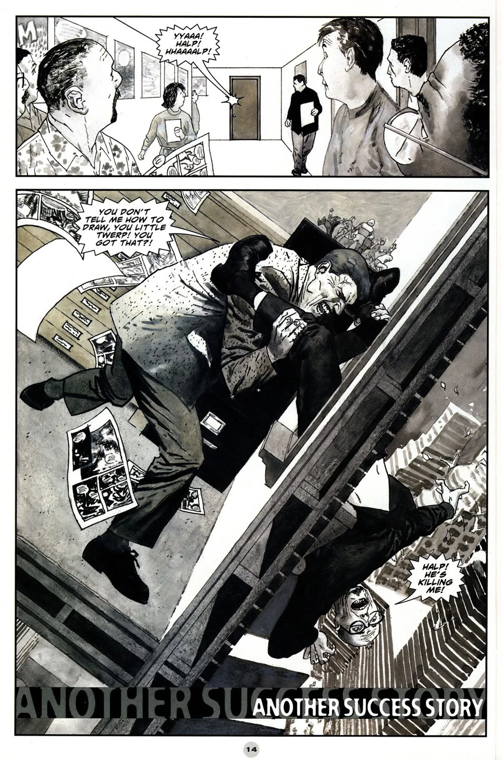

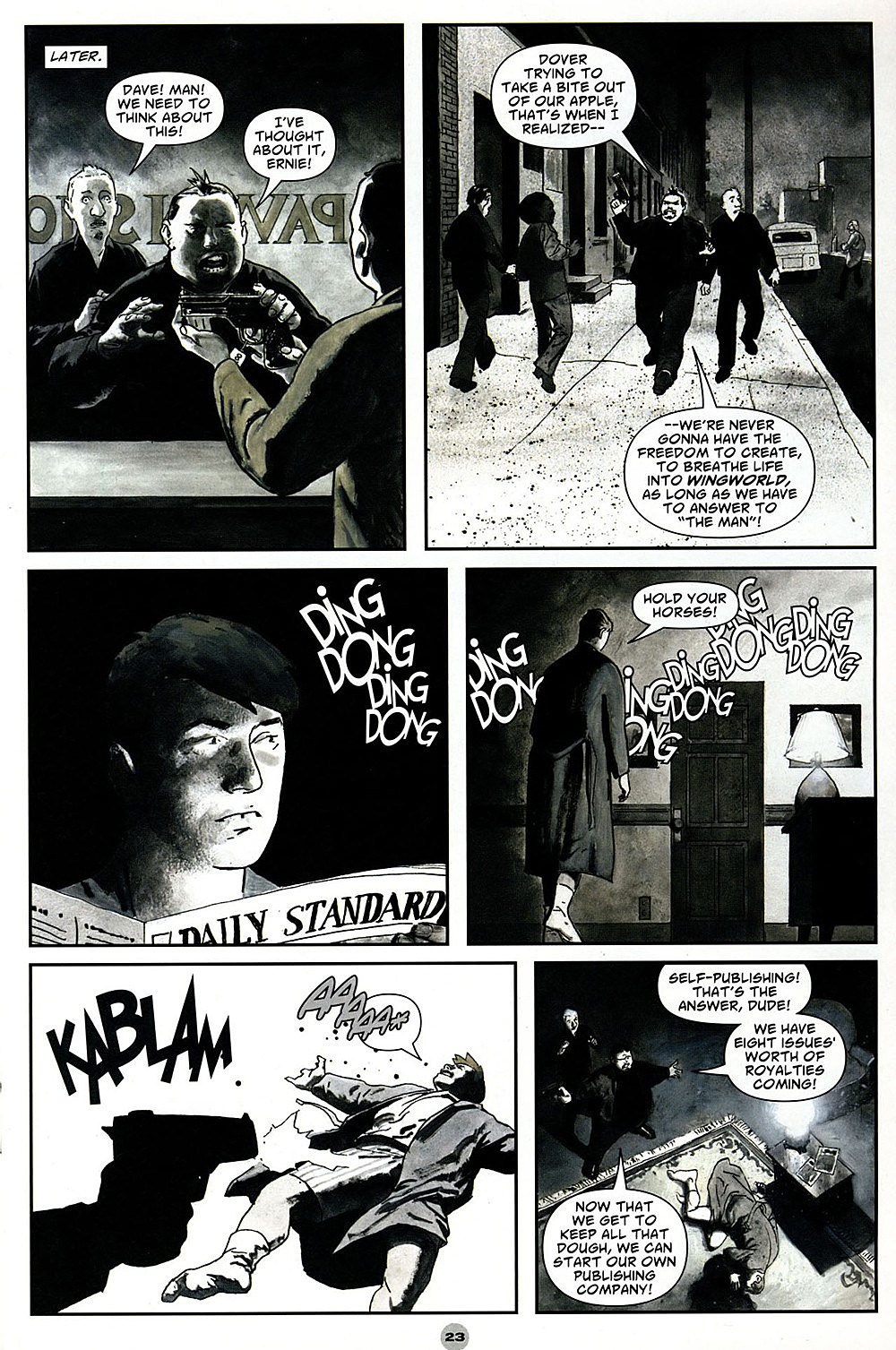
MS: The third story is a look at the predatory practices of the superhero comics world that's too goofy to be cutting and too crotchety to be funny. There are stories you'll recognize -- Jim Steranko dangling his editor out the window, Bob Kane outsourcing both writing and art of his comic to other people (that one was done better in an Alex Toth Creepy story from the '60s) -- but those aren't presented as taking place in a climate of moral outrage, just as things that kinda happen, in a world full of people with silly names ("Baldo Smudge?" a writer-artist team named "Uriah and Heep?") and sillier haircuts. Well, at least that last part is appropriately realistic. And there are some great drawings in there, too, when the more oddly cartooned characters are offstage and some kind of landscape is backing up the figures.
SW: It's an Alfred Hitchcock Presents tone that Hampton just can't execute and it ends up being this excretory faux-expose thing. He presents it as "You would never know what happens to make these comics!" and it's like, that's where you went with it? In the comics industry, where there are guys lying about military service and Al Columbia torching the pages of his million-dollar first job, and you went with that? It's like the plot of the last ten minutes of Chasing Amy, but with murder.

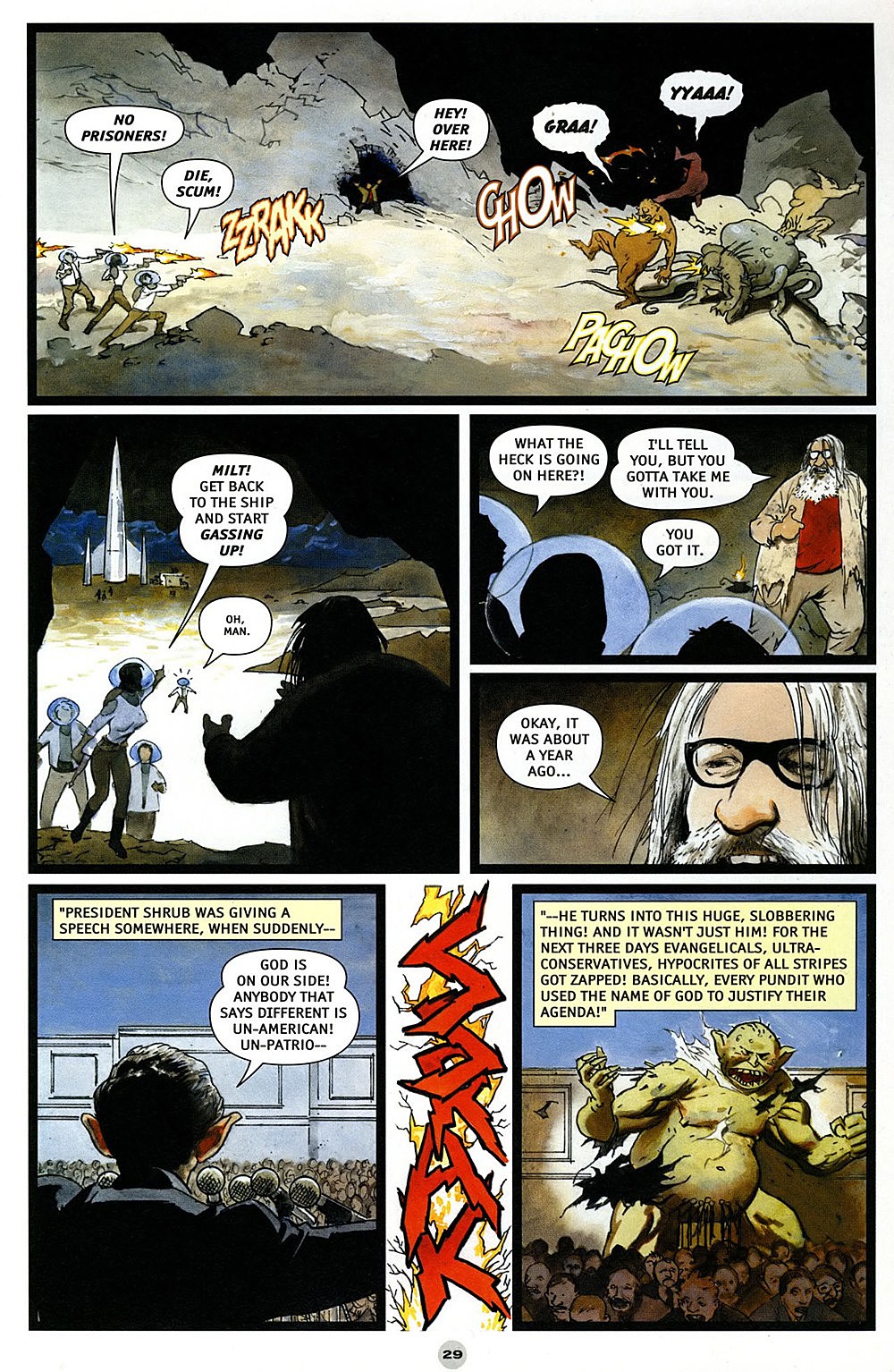
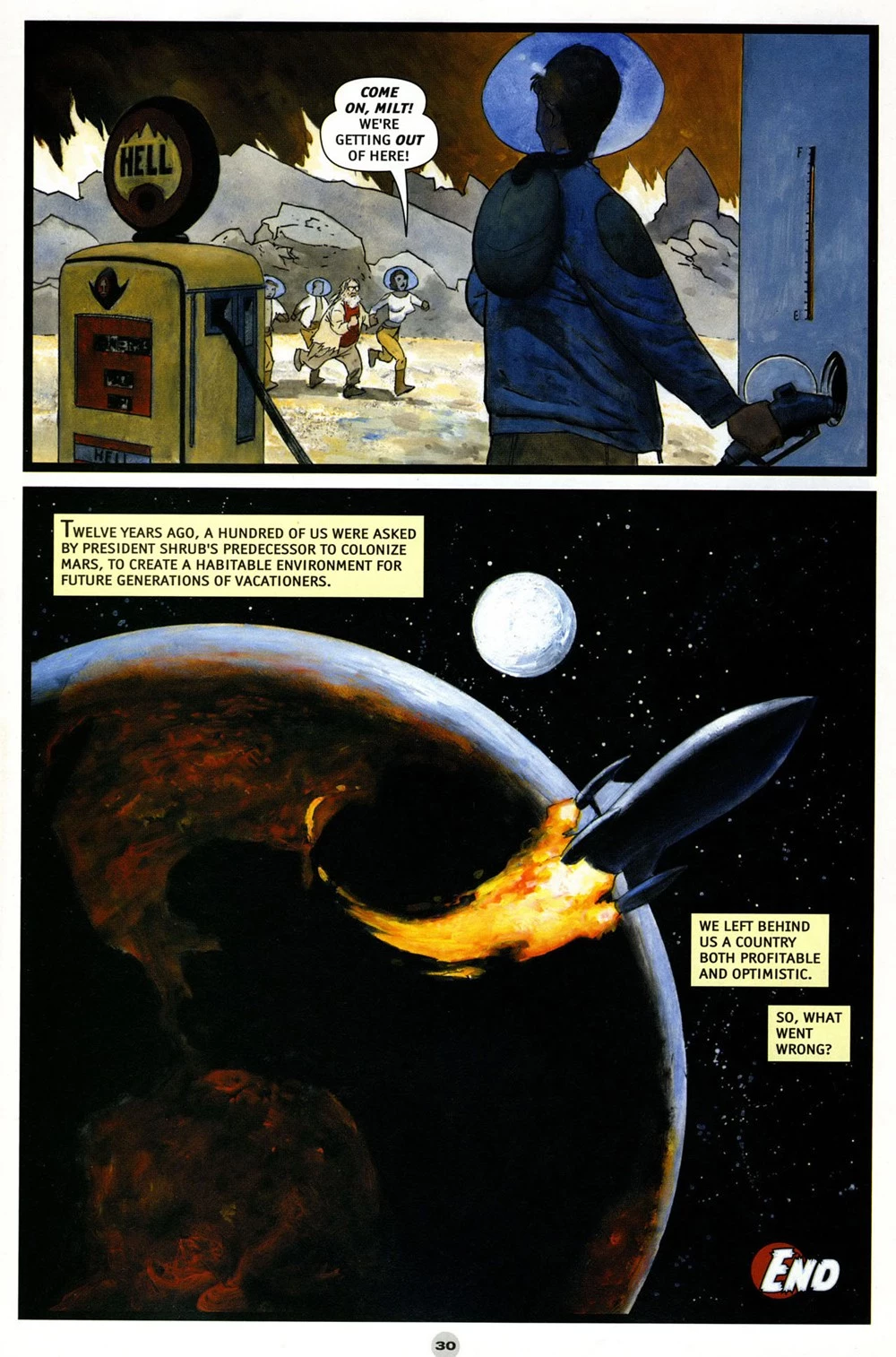
MS: At least comic book industry satire is a strain of storytelling that does have some riches to give up someday -- Hampton's is more or less noble failure -- but EC Comics parodies starring cartoony paintings of Bill Gaines in outer space? Is it the single worst Solo story of all?
SW: It definitely is, and surprisingly it's not about someone's childhood experiences with comics. This space thing, it's the American Idiot of comics stories. It makes someone who rattles off overheard NPR slogans sound deep. It's like the author learned about politics from corporate punk albums or something.
MS: I feel like 50 years from now there'll be a semi-interesting reading of this story to do, the way we can really draw out broader conclusions on cultures gone by from the super racist comics of the World War II era, but now it's just too close. I usually get a kick out of any kind of protest art from the George W. Bush era, just because I remember being fully convinced the world was going to end during that time period, but that doesn't change the basic fact of this story's incompetence.
SW: Like "Duck and Cover!" educational film strips, or Will Eisner and young Hergé drawing black people.
MS: Yeah, though now that you mention those examples the President with big ears doesn't exactly sound good up against even that competition.
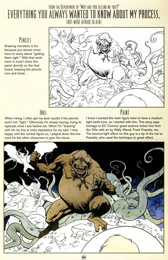
SW: I think even the heaviest criticism could be held against it. I mean, Hampton's drawings and pacing, those are pretty good. But this thing is bad, stupid, and ugly. And then he shows you how he made it, like it's a masterpiece.
MS: I can appreciate the "behind the scenes" segment up to a point, just as I can with any such thing -- how comics get made is a topic of interest for me -- but it seems a little weird that Hampton chose to spotlight how he did this story of everything in the comic. Not only is it the worst one on a qualitative level, it's also the most conventionally produced, a pencils-inks-color thing that doesn't really stand out on a process level from anything else being done in mainstream comics. Especially when there are comics in here done in paint and pencil -- two media that look fantastic on the page but are difficult to harness and control -- it's a pretty uninspired choice.
SW: It is like the DVD of Kim and Kourtney Take Manhattan having a bonus documentary disc featuring two hours of process interviews about how they only used the RED camera or something.
MS: Let's round this out with the pencilled story which takes the classic "retell an old fable approach" to filling up the remaining pages of a book. It's got the same problems with photo-referencing as the "Dear James" comic that precedes it, but they're more harmful here since it's a more character-based piece of storytelling, with ill-matched figures and backgrounds in just about every panel.
SW: There is a real lack of energy to that, with the making-of, and the painted portrait, and then that story. It feels like Hampton was straining to fill this issue, right?
MS: Oh yeah, I think so. I should point out that it's for an admirable reason, though -- Hampton wrote and drew the whole comic himself, which I think he deserves props for. It might have read marginally better if he had farmed some of these stories out, but I support his effort to make his Solo issue the product of an individual creator.
SW: You really can't fault how much work he put in here, but you can just make lists of faults of the results. There's some nice spot color usage in that last story. I do think he kind of loses the clarity of geography and relations of characters in space. I think car chases -- or any car action -- in comics are hard unless you're Frank Miller or Jean-Claude Mézières.
MS: Michel Vaillant, you ever seen that comic? French auto-racing stuff, oh my god.
SW: No, I'm going to have to look for more of that. I love that kind of stuff.
MS: I think the car chase is especially difficult to pull of in such a fundamentally indistinct medium as pencil, which is great for atmosphere but really tough to convey actual action with. There's some pretty good tonal stuff in this story, washes of fog or darkness looming in, but it ends up just obscuring what's going on. The spot color is sweet, you're right, but it's not employed to any actual narrative purpose that I can discern, just to break up the black and white of the pages.
SW: It's a "I saw Schindler's List last night" effect. The story itself, can you even say much beyond it's exactly that haunted car story, no variation? And it ends on a very pretentious quote.
MS: It's kinda cool when computerized gray tones come in on the backgrounds when the car actually crashes at the end.

SW: Is Scott Hampton's work the worst of the Solo series?
MS: I feel bad saying so because he really can draw and his heart seems to be in the right place... but yeah.
SW: Well, then I guess you're safe for now, Neil Gaiman.
More From ComicsAlliance
![Bill Sienkiewicz Provides FOC Variant Cover For ‘American Gods: Shadows’ #2 [Exclusive]](http://townsquare.media/site/622/files/2017/03/AMGODS0.png?w=980&q=75)
![David Mack Paints Mad Sweeney For ‘American Gods’ #3 [Exclusive]](http://townsquare.media/site/622/files/2017/02/AGODSSH-3-Featured.jpg?w=980&q=75)

![Solo Is Not Necessarily The Best There Is At What He Does In New ‘Solo’ Series [Preview]](http://townsquare.media/site/622/files/2016/09/Solo_1_Featured.jpg?w=980&q=75)