Image Comics’ ‘Change’ is a Triumph of Controlled Chaos

Change is the new book from Image Comics by the team of Ales Kot, Sloane Leong, Morgan Jeske, and Ed Brisson. It is the story of loosely associated individuals working against a Lovecraftian apocalypse that threatens to overtake Los Angeles and turn it into New Atlantis. It is also about the notion that these characters would rather face down a giant monster than deal with the horrors in their own existence.
Change is a virtuoso book that hurls itself at every risk it can take with every tool the medium has to offer at its disposal. There is a tension that becomes apparent by the second issue that balances like a knife edge across the Niagara with the Change team happily riding their unicycle back and forth across it. At any moment Change threatens to spin off into incomprehensible chaos -- but it is through the almost meticulous focus of its creators that it not only stays together, but becomes greater than the sum of its parts. This is a comic about pushing out past your perceived capabilities because there is only two directions, forward or down. And that goes both for the story and its creators.

The four-issue miniseries is written by Ales Kot, whose previous work, Wild Children -- which I enjoyed -- wasn't half as ambitious or half as heart-crunching as what he's doing in Change. There is a section in Change #2 that was telegraphed in the first two pages of the issue #1, and it is very hard to describe how it creeps up on the reader. In the second issue we are in full blown, "it is on" mode. Cars are blowing up. Deranged mad men are cackling out best laid plans. Apocalyptic spaceships are lumbering toward Earth. We are two steps past what would be best described as "on the brink." And as a reader we are placed ground-level for all of this, so the effect is immediate disorientation. Kot keeps throwing thing after thing at you and eventually you hit your breaking point... and you float. It's this sweet spot right before the drop. Then quietly, this aching love story plays through into that breathless air. You see this couple meet, fall in love, and then fall apart with similar grace on both sides. It is an absolutely sublime moment. It's functionally similar to that famous bell scene in Tarkovsky's Andrei Rublev where you go through the entire process of building this bell. You are buried alive under a wave of mundane details -- the drama of simply digging a hole. And the sheer weight of all of that serves to elevate you to an ecstatic state at the climax of the bell's completion -- and descend you to the depths of melancholy the artist experiences when his miracle work is complete, leaving him in its shadows.
In Change the actual drop happens in the scene right after the one I described, where the boy who has become old hangs up his telephone and says, "I couldn't save you." Those four words explode like a bomb backwards and forward through the comic's narrative. Suddenly every page in the first two issues is orbiting around this singular moment and you understand the fractal brilliance that has been constructed here. Stop this review. Go back and read every panel of that book with those four words playing underneath it. It is an insane experience like when you found out Watchmen was symmetrical.

Morgan Jeske handles the art for Change. A talented writer in his own right, Jeske's webcomic Disappearing Town over on Study Group Comics elucidates very well just why he and Kot would end up working together on a project like this. Jeske's line is perfect for Change. It has within it a wild kinetic energy; the spirit of the overarching Change narrative. It is a line that is unstable and at any moment threatens to fly off of the page in any direction. It is at once as dynamic as it is personal. Jeske's line calls attention to its own vitality, its own history, its own progressions and modulations. You can see shades of Moebius, Darrow, and Paul Pope -- and then something that strives to move past those influences. You can see Jeske's art learning its own language as it goes along, changing through each new challenge it places in front of it.
Beyond simply his line, the strange perspectives and impressionistic qualities of Jeske's figure work speak to an artist that is not simply trying to stay within the safe expectations of form that the comics medium can sometimes settle into. There has always been in comics the notion that body shape itself reflects the psychic. Posture, shape, and movement tell us about who these characters are, how they sound, and what they do. Jeske plays with those elements from panel to panel which has the effective terror of rolling through fun house mirrors. Characters warp and change contextually to the moment they are depicted within, which only serves to underline what is going on on a given page with Leong's coloring, Kot's writing, and Brisson's lettering.
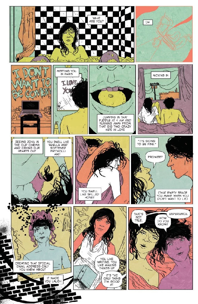
Past his figure work are Jeske's storytelling chops themselves, which might be his greatest strengths. The way Jeske plays with time on his page is really interesting to read. It plays like Vera Chitylova's film Daisies: thing A, thing B, thing C, thing D. It would, I imagine, make Eisenstein proud. And then other times there are these almost scat-Crepax panel banks in the corners of pages. The effect is a stuttering of time within the page that is very pleasing to experience.
I should also say something about Ed Brisson because without him, there's no words on the page. And for something like lettering, that never really has had any kind of critical evaluation in comics, there are a lot of ways to mess up "words on the page." And when you consider the insane range of words and images that Brisson is working around. it is pretty impressive how he holds it together. In some ways he's like a good referee. You know he's doing his job because of how often you simply forget he's there. Incidentally, Brisson -- and this is a running theme with the Change team -- also makes his own comics.
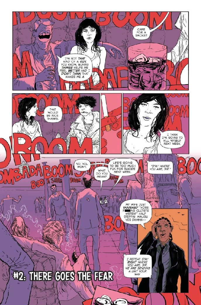
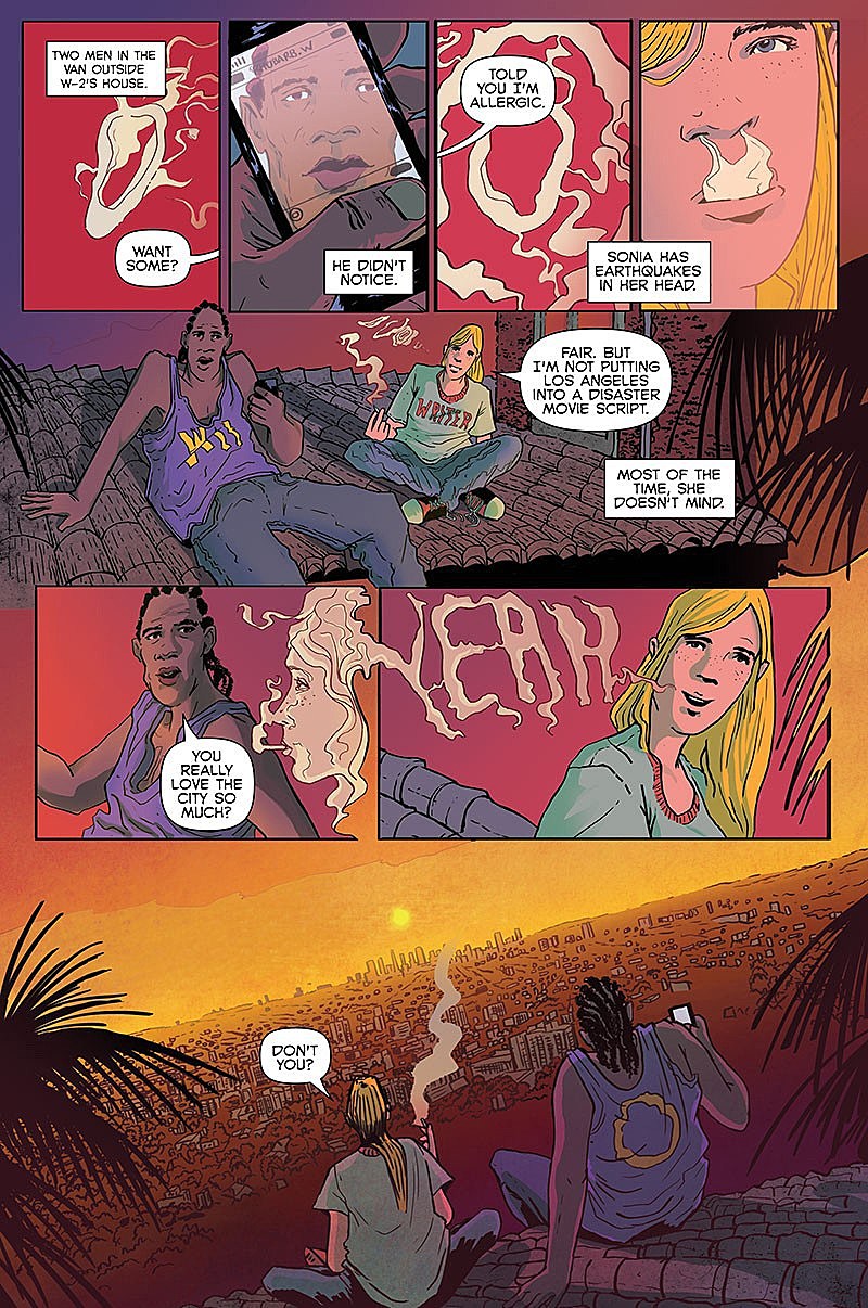
And then we get to Sloane Leong, the colorist for Change. As good as everyone else is on this book, Leong is the absolute star. If there were only her colors it would be enough to make this a must-see. Leong, who makes a wide range of comics (including a completely terrifying backup for the also excellent Prophet from Image), has herself serious storytelling skills, and that absolutely comes across in the colors in a way that it is hard to find much precedent for. It is stunning to watch the progression of her colors just within a single page. For example: panel A will have three colors; panel B will have two of the colors from panel A as well as a new third color; and then panel C will bring back the color from panel A, but with the new introduced color from panel B. It's all done to accentuate and characterize the elements that Kot and Jeske are working with. She's creating characterization and tone from panel to panel.
(The dumbed down version of this is how in Hollywood films you'll see them chuck blue filters into a film to create a coldness, and then a sort of amber filter to create warmth -- so they're playing with warm vs. cool -- but if you rewind back to those old films from the '70s like Easy Rider, King of Marvin Gardens, and Five Easy Pieces -- you can see more complex color games at play.)
They are using the full palette with the same kind of fearless experimentation that Leong is imprinting on these Change pages. Every color in the toolkit in its time and place shaping mood and character from scene to scene. We should see more of this in comics. But it is a risk to take because the danger in doing it is that you lose the coherence of the visuals. That is doubled up in Change, where there is so much time-shifting going on within panels and story. If Leong screws up the color relations at any moment, the whole thing could collapse. One missed color here and you lose the eye and the whole thing grinds to a halt. Which is probably why you don't see many colorists taking these risks. But Leong does. And she absolutely is pushing the limits of what the colorist can contribute on a project. It is stunning.
(click images to enlarge)

Change is at its core four people completely locked into the mission and theme of the project they are working on -- each pushing the other to try to do something more than maybe what they thought they had the capabilities to accomplish. And yet with all of that, this book is extremely cohesive. What I just described with the creators is also what is going on with the characters. There is a meticulous way in which this book reaches out beyond itself, and simultaneously back into itself. It all just connects up and is better than the sum of its parts -- which is I'm told, how collaborative art is supposed to work. This is ridiculously planned chaos. With three issues on sale now and one left to go, Change is definitely a project worth taking taking the time to be a part in.
Change #1-3 are on sale now in finer comics shops and digitally from ComiXology.
More From ComicsAlliance
![Reinvention Is Vital: Tom Muller Goes All In On Comics Design [Interview]](http://townsquare.media/site/622/files/2017/03/muller-feat.jpg?w=980&q=75)


![The Science Experiment: How Graham & Roy’s ‘Prophet’ Revival Smashes Expectations [Sci-Fi Week]](http://townsquare.media/site/622/files/2016/09/prophet-featured-2.png?w=980&q=75)