
Honoring Jack Kirby In Keith Giffen’s ‘Masters of the Universe: Origin of Hordak’
From the moment Keith Giffen took over as the writer of DC's new Masters of the Universe comics, I've been keeping my fingers crossed hoping he'd take over the art chores as well. Giffen has had a long career -- almost 40 years in the comics business. He's gone through several creative iterations, but one mode that was there at the beginning and keeps coming back is his all-out Jack Kirby drawing style. As a penciller, he's DC Comics' equivalent to Marvel's John Romita Jr. Both are bold Kirbyesque stylists at publishers that favor photoreference, and whose work evokes a generation prior to their own. I wish DC utilized Giffen as well as Marvel utilizes Romita. Perhaps that's because DC values Giffen the writer more than Giffen the artist?

Giffen's recent pencilling work has been confined to the fringes of DC's publishing line. Creatively that can be a comfortable place to be, away from the prying eyes of increased corporate oversight. He's done fill-in issues on The Outsiders and Legion of Super-Heroes and a run on the doomed-to-failure O.M.A.C. series with DC Co-Publisher Dan DiDio as a co-writer. O.M.A.C. was my favorite title of DC's initial New 52 relaunch, but being based on a Jack Kirby character that's more obscure than Kamandi and Devil Dinosaur combined probably didn't help when it came time for DC to trim its first wave of underperforming titles. The fact that it was written by fanrage magnet DiDio made for marketplace kryptonite. You could've lined the interior of the book with 20-dollar bills and nobody would've bought it. I come at Giffen's work a little differently than most. I spent the majority of my comics career working in fake Kirby mode. Don't ask me why, I just felt the inexorable pull of that type of representation, that visual vocabulary. I enjoy reading the work of other Kirby fakers and feel a certain kinship with them. People used to tell me that my work on Gødland reminded them of Giffen's 1970's work on The Defenders, so I checked it out. I saw what they meant. We both had the gestural freedom, but lacked the structural integrity of the real thing. Each of us made skewed, wonky Kirby, which can actually be a lot of fun.

Some of Giffen's early collaborators' natural strengths worked against his. Whether by design, instruction, or default, inkers like Klaus Janson would soften the Kirbyesque harshness of his pencils. When a Kirby-attuned inker like Mike Royer got a hold of the pencils, it was often difficult to tell them from the real thing.

Giffen and I only worked together once, and it was tangential. Gødland co-creator Joe Casey recruited him to draw an alternate cover for our 13th issue. The closest Giffen and I came to collaboration was him drawing that cover based on my character designs, and me trying as best as I could to match the greatness of his cover with my interior art. Giffen has found an excellent interpreter in Scott Koblish. He gets the Kirby vibe and gives the inks a little bit of texture, which is desperately needed in comics printed on glossy paper. Masters of the Universe: The Origin of Hordak #1 is the art team's latest collaboration. It's essentially Mattel's He-Man through the lens of Jack Kirby's New Gods.

It makes sense that you'd link Masters of the Universe and Kirby's Fourth World universes. Exposure to the MotU toys at an early age primed me so that when I later discovered Jack Kirby's cosmic space barbarian epic, I was an instant fan. Gary Goddard, the director of the 1987 live action MotU movie has even acknowledged the film's indebtedness to Kirby's vision. When DC was tasked with making the first proper MotU comic back in the '80s, one of the first things they did was find a Mobius Chair for Zodac to sit in.

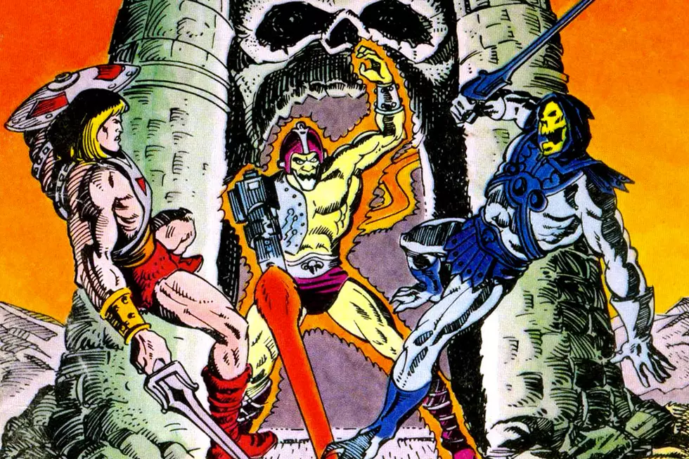
If I'm reading this new comic correctly, Zodac and Hordak are brothers. I'm not sure if this is something we should know already or if it's a shocking revelation like you'd find in Kirby's New Gods prequel "The Pact," a comic that his heavily referenced and sampled in MotU:Hordak. The revelation makes sense. It feels right. If it had been "Zodak" and Hordak it probably would've been too obvious. Aside from their not-quite rhyming names, they also have in common that they are both enigmatic spoiler (in the classic sense) characters from "someplace else."
Hordak's Evil Horde (sporting a name that evokes Kirby's unfinished non-graphic novel The Horde) were a new set of characters introduced a number of years into the Masters of the Universe toy line's original run. They were a compelling (looking) group of characters that were created to shake up and freshen up the sagging toy line. Hordak was an improvement on Skeletor, a demonic Dracula. Grizzlor was Beast Man done right, with faux fur instead of hard plastic. Leech was a messed up looking toy. His suction-cup-instead-of-a-face design is a terrifyingly surreal touch. It's suction was powerful, the button in the back created a vacuum that made him cling to walls better than the suction darts of the era. Many such characters started in the R & D department of Mattel. "We've got this new technology now figure out a toy for it."
The Evil Horde roll-out followed the same storytelling principle that got us all worked up for the introduction of the Emperor in Return of the Jedi. "You mean there's somebody even meaner than Skeletor? Somebody who taught him every dirty trick he knows?" These narratives get their power not from the degree of craft employed, but from the degree to which the reader commits to the story. You're not going to find a more committed imagination than an 11-year-old Tom Scioli, so these half-stories were writ large on 100-foot obelisks of stone as far as I was concerned. That said, I haven't given them much thought in the years since Kirby's myth cycle displaced them in my imaginationscape. Let's look at the first page of Masters of the Universe: Origin of Hordak.

This opening splash is interesting in the context of this overly-literal photo ref age of superheroes, this is pure, non-figurative, almost non-representational Kirbyana. There are meteors, circuitry, tubes, explosions and technology, but nothing resolves into anything recognizable. Is that a hand? No. Is that an escape pod? No. Space Coffin? Maybe.

Pages two and three form an invitingly Kirbyesque double-page spread, although it suffers a little in comparison with The King of comics, feeling a little bit empty and hastily-sketched. It's still a striking image. Note the hand from "The Pact."

It isn't until page four that readers see a recognizable character -- someone we can follow -- and once we start following him we don't stop until the very end. The character is a Giffen-ized version of Zodac. In a recognizeably Giffenian flourish, Zodac's upper lip is part of his helmet.

On page five he's climbing through the blazing techno-rubble on the way to confront the title character. What is Hordak, anyway? Space Vampire? Wizard? I like Kirby wizards and their focus on the pyrotechnic section of their spellbook. This is a moment-to-moment comic in a '70s vein, like Kamandi, where we're witnessing a slice of the character's life unfold almost in real time. It's immediate, it's fun, but if you don't stick the landing, the whole thing falls apart.

Color also plays a major role in the issue. Look at those fields of purple, matching the color of the prose, though I wish the purple was less washed out, less gauzy, less faded into the background. The idea behind washing it out is to make it read as literal explosive light, but I think that undercuts the power of the classic Kirby crackle. It's not a literal light source, but a crackling, sizzling extra-dimensional colorful phenomenon. It should be as incarnate a manifestation as the characters themselves, IMHO. It needs to be bolder, closer to the picture plane so we can really revel in that crackle. I've dealt with the same issue myself. Modern colorists are trained to aim for photorealism, but that runs counter to the goals of a stylist like Giffen. His work is made to be colored in a New Jersey sweatshop full of old ladies hand cutting rubyliths. The digital sound effects don't help either. Give me hand-drawn sound effects, or no sound effects.
 Hordak's techno-castle in the issue is great, its form suggested by energetic slashes of ink and spots of opaqueing white. Panels one and two are from The Demon issues #1 and 2 (maybe the best one-two punch of Kirby's career). Leech makes his appearance, I did not recognize him at first, instead thinking he was the serpent hand puppet that came with the Fright Zone playset. This is a raw, elemental redesign of the character. It is way freakier than the toy.

A coloring error renders Leech with Hordak's colors.

The double page spread is the basic unit of a comic, whether a cartoonist is aware of it or not. This one works beautifully with a field of violet and white. It reminds me of yet another Kirby comic, Spirit World. Like page one, it's a dance of shapes, with vague hints of descriptive form.

Hordak under Giffen's pencil looks like Jack Kirby's The Demon. The genealogy of Etrigan is clearly traced back to Hal Foster's Prince Valiant.

It has been suggested that the creature from the early movie Hexen might be somewhere in the mix. Giffen's Hordak brings the Demon closer to that cinematic model.

Hordak's face is close to being a Kirby face, but not quite, there's another design strategy paired with it. He's got a pinched, high sitting, turned up nose. When Kirby does a pinched high-sitting nose it's usually not quite as pinched. It's closer to the nose on Dick Briefer's Frankenstein. Of course this is probably due to the design of the Hordak action figure which does have that nose. It's the nose of a bat.

On those two panels, are we to infer that Hordak is somehow the spiritual father to Batman? I sure hope so. This resonates with the Apokoliptik bat demon, Barbatos, from Batman: The Return of Bruce Wayne. I lament the missed opportunity that Grant Morrison never got to do that story where Batman dies and ascends to become part of the pantheon of New Gods. It makes me wonder what would've happened if the Young Gods of Supertown met Batman instead of Superman back at the beginning, in Forever People #1. The abrupt non-ending to this story is its Achilles heel and the Achilles heel of the '70s comics it recalls. I suppose Zodac will eventually reassemble his disintegrated (Captain) atoms Dr. Manhattan style and return as the Metron-like aloof god of science we know from the He-Man cartoon. If this story had a "better" button, or if we had a clearer indication that we'd be getting another Giffen-drawn Hordak comic 30 days from now it might not be as much of a letdown. Giffen and DiDio's O.M.A.C. fizzled out rather than having a great ending. That's the ultimate act of trust you put in a creator. Is this story building toward something meaningful or is it just an endless vamp, filling up space and time waiting for the next set of hands to come in? Add this to the list of reasons why I should stop reading corporate superhero comics.
At the bottom of the last page there is a teaser: "Need a bigger Hordak fix?" Not necessarily, but I could use another Giffen fix. Keep the pencil churning.
More From ComicsAlliance


![Super7 ReAnimates Alien and Predator, Masters More of the Universe [Toy Fair 2017]](http://townsquare.media/site/622/files/2017/02/IMG_2000.jpg?w=980&q=75)
