‘Man Of Steel’ Conceptual Artists Reveal Alternate Costume Designs And Inspirations

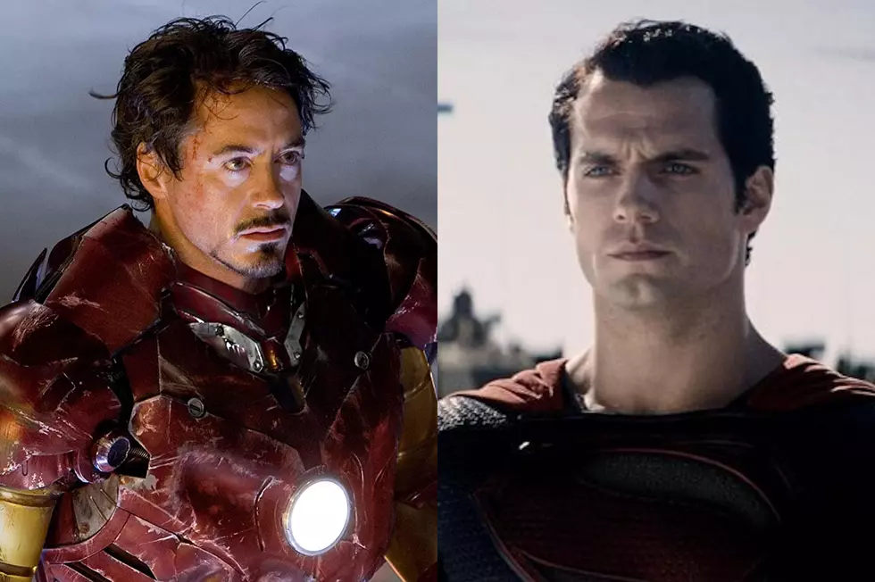
While some viewers argue the Superman depicted in Man of Steel behaves in such a way as to be unrecognizable from the hero from the DC Comics stories originated by Jerry Siegel and Joe Shuster, what's less debatable is that actor Henry Cavill, in costume, is the living embodiment of the great superhero, a fact that's obvious even at a glance. But as Film Sketchr's Maurice S. Mitchell learned in his interview with Man of Steel conceptual artist Warren Manser, alternate designs reveal things could have gone quite differently.
Not only were Superman's classic red trunks not necessarily sacred, neither was the character's signature palette of red, blue and yellow. From Manser's interview with Film Sketchr:
[Man of Steel director] Zack Snyder was 'hands on' in the process and provided us with great direction. We discussed the specifications and manufacturing techniques we needed to accomplish, and I even created some visual diagrams to aid in communicating the plan.
From there I worked with vendors, costumers, 3D artists, and fabricators to help realize the final product. What I really like about the approach was that we employed both traditional and modern fabrication methods. Incredible hand crafted quality merged with digitally created costume elements, and I was right there in the middle of it. I couldn't have been happier.
Snyder is said to have looked at over one-thousand variations of Superman's costume before choosing to do away with the red briefs that have been much maligned in contemporary culture. The work Manser's published online includes a couple "underpants" looks, including one with a "veiny" appearance reminiscent of the Green Lantern Corps uniform's from 2011's Green Lantern film.


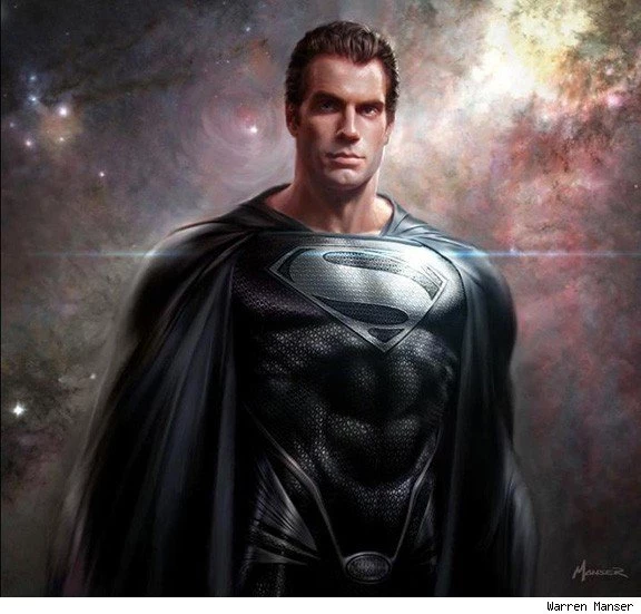

Man of Steel further deviates from the classic costume by omitting the yellow S-shield from Superman's cape, but Manser's work reveals what seems to be a test of that element.

Film Sketchr also has a fascinating interview with Phillip Boutte, Jr., who worked on concepts for the Kryptonian garb seen in the film. The brief from costume designer Michael Wilkinson was "Neo-Medieval," which is a good description for what we see in the film. Some illustration fans have also noted the Heavy Metal sensibility to the Krypton sequence, particularly in the Moebius-style outfits worn by Kryptonian councilors.
Boutte:
The initial point of inspiration, believe it or not, were the Skeksis from the movie "The Dark Crystal". We wanted to capture their pompous attitude.At one point, I remember asking the question of whether or not the Tribunal members were wearing their clothes or if their clothes were wearing them. The concept that ended up being the basis for all of them was very simple. We looked at traditional Renaissance forms of dress and turned them "inside out" creating an almost skeletal silhouette. What do those big puffy shoulders look like on the inside? How does this tie back into the architecture of their world?
Some of Boutte's work, including an unused, even more fearsome version of Faora, like a cross between HR Giger and Gozer from Ghostbusters:


And finally, Mitchell spoke to designer Peter Rubin, who worked closely with Man of Steel production designer Alex McDowell on the art nouveau elements we see in Kryptonian technology and glyphs. I was most gratified to read this because ever since I saw the film I wanted to hear about the thinking that went into making Krypton this kind of Heavy Metal/art nouveau design hybrid, which I think was especially pronounced in the sort of 3D-animated "book" Jor-El uses to give Clark a Kryptonian history lesson on the scout ship.
It's very impressive how Rubin was able to reflect all of these influences and references into a single glyph, the redesigned S-shield. Rubin said he'd been drawing in some form or another his entire life:
We started by throwing open the door to almost anything. I must have created more than thirty very different shields. The only rule was that it had to fit in with Alex's preferred aesthetic. No straight lines, only graceful curves. Even the exterior frame is curved, although we came close to breaking the rule for that for a bit. There are probably some who would have preferred a radical departure from the past, but I regarded it as my particular challenge to make this version both something new, and a loving homage to the image of Superman I've carried in my head my whole life. I was extremely lucky, in that Zack and Alex instinctively saw exactly what I saw in it.

If you're fond of design, illustration and insights into the creative processes behind them, be sure to check out the interviews at Film Sketchr; it's a great blog, and there's much, much more to see and read there about Man of Steel.
More From ComicsAlliance