
Then and Now: The Amazing Evolution of Rafael Albuquerque

One of the nicest things about reading comics is getting to watch an artist evolve his style and hit his stride after a few years of work. John Romita, Jr., Francis Manapul, and Frank Miller have all made shocking and impressive changes in their styles over the years. With the benefit of history, we can look and see that growth, and personally, that makes me appreciate comics art even more. Rafael Albuquerque is a good example -- he went from okay to great. Here's how.


I first noticed Albuquerque's art during his run on Keith Giffen and John Rogers's revamp and relaunch of Blue Beetle. His work there was nice. It fit with the style and tone prior artist Cully Hamner established, and was well-suited to a series starring teenagers. The proportions, cartooning, and clothes all worked very well, but weren't quite mind-blowing. He was functional, rather than flashy.
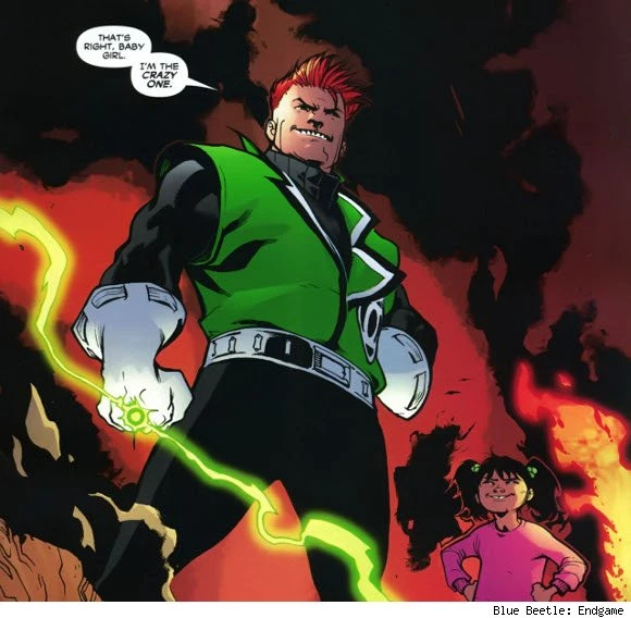
There's a lot to be said for functional, though. Some artists can barely master basic panel to panel storytelling, but Albuquerque never had any problem with the basics. He showed an aptitude for facial expressions and clothes, and as his run on Blue Beetle went on, he just got better and better.
By the end of the run, he kicked out a few really solid action scenes, and managed to blend the fantastic and mundane in interesting and effective ways. He was talented, but not quite so talented that I'd pick up a book just based off his name alone. He was dependable, rather than an attraction.

After Blue Beetle, Albuquerque started doing several different cover projects for both Marvel and DC, in addition to interior art. His covers for Superman/Batman #62 and #63 were good, but the real turning point in my eyes was his cover for Mark Waid and Horacio Domingues's Incorruptible #5, featuring Max Damage's sidekick Jailbait. Expertly designed, and with a wonderful sense of personality, this cover leapt out at me while scanning through the solicitations. The hair is fantastically drawn, and Jailbait's face is on point, too. I made a mental note. "Maybe there's more to this Albuquerque guy than I thought."

A while later, Scott Snyder and Rafael Albuquerque's American Vampire #1 dropped, and Albuquerque's art took a quantum leap. His dependableness had disappeared, and now had me going, "Wow, wait, is this the same guy?" Let's start with the cover.

It's bold, distinctive, and well designed. The use of just deep red, white, black, and some light shades of grey makes for a great look, and a comic that doesn't really look like most other comics on the stands. There's an economy of craft at work here. This first issue could have easily been an orgy of color and explosive action, as is common in cape comics, but instead, it's positively understated.
It's also crystal clear, in regards to storytelling. The top evokes the Old West, with its cowboy hats and train, but more than that, it hints at a heist. We're dealing with crime here, but the lower half suggests something else. The woman's wearing the distinctive headdress of a flapper, and the two blood trails on her neck tell us exactly what type of company she has been keeping. This is sharp, sharp work.

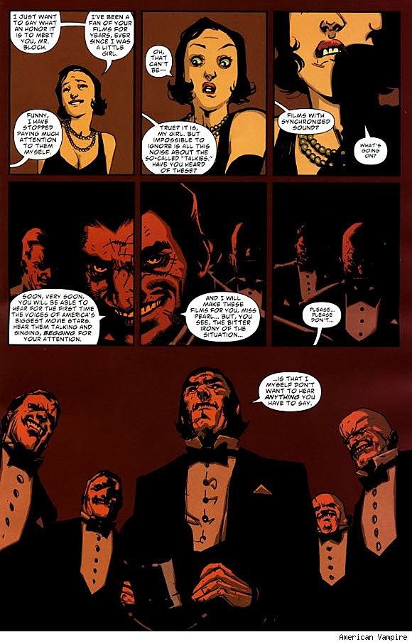
Inside is no different. With the assistance of color art by Dave McCaig and letters by Steve Wands, Albuquerque managed to continue upping his game. His style was more cartoony, more expressive, and in a way, much more real. The body language of Albuquerque's characters was much more clear now, lending characters genuine weight, and his acting was right in that sweet spot, where characters overact just a little to exaggerate their emotions, but not so much that it looks like an old timey silent film.

He displayed an impressive command of the basic building blocks of comics, too--panels, gutters, and layouts. He utilized slow zooms, shadows, spot blacks, and varying distances to great effect. Just based on his performance in this issue alone, Albuquerque transformed himself from a guy who was just good into a powerhouse. He brought great art to the table, and Dave McCaig's colors pushed him over the edge into amazing.
But wait, there's more.
American Vampire #1 has two stories. The first story, written by Scott Snyder, takes place in 1925. The second story, written by Stephen King, takes place in 1880. Nine times out of ten, a flashback sequence in a comic means either an ugly sepia filter laid over normal art or a hokey attempt at throwback art, Albuquerque did his peers one better.
He adjusted his style to fit the story, with more of a dependency on shading and washes than the clean pencils and inks of the first story. The result is a Western that looks and feels dusty and dirty. Skinner Sweet, one of the few characters to appear in both eras, becomes even filthier and more menacing.

You can look at the different styles in American Vampire and tell that it's clearly the same artist, but the fact that Albuquerque can flex using different styles like he does is impressive. Most artists work in one style, or minor variations on that one style, for the majority of their career. Artists like Jim Lee and Frank Cho have spectacular alternate styles -- watercolors in the case of Lee and painted artwork for Cho -- that may not be as commercially successful, so we only see them rarely. Albuquerque took a chance with his art and it paid off huge. He's a must-see at this point. And do you want to know the scariest part about this guy?
Judging by his work with Dean White in Uncanny X-Force #5.1, he's still getting better.

More From ComicsAlliance


