
Dream Job: Artist J.H. Williams III Talks ‘Sandman: Overture’ [Interview]
Among its many other honors, Vertigo’s The Sandman has the distinction of being the portal through which a huge number of readers got their first look at a theretofore mysterious and unseen artifact: an actual comic book script. Available in numerous editions and formats now but Initially published in 1991 as a supplemental feature in the Dream Country paperback, writer Neil Gaiman’s script for the Shakespearean “A Midsummer Night’s Dream” chapter revealed the writer’s deference to his artistic collaborator Charles Vess. Gaiman’s words expressed a deep understanding of comics as a visual medium and Vess’ strengths as a master illustrator, with panel descriptions reading less like mechanical instructions in a script and more like helpful suggestions in a letter. The process, overseen by Sandman editor and Vertigo imprint founder Karen Berger, was a resounding success, winning the issue (#19 in The Sandman’s original run) a World Fantasy Award.
Throughout the history of The Sandman, Gaiman has maintained this close collaboration with artists; always challenging them with his variously dark, funny, intimate and horrific visions, but always building in opportunities for strong storytelling and the delightful idiosyncrasies that define the best comic books and comic book artists. Some of them include P. Craig Russell, Chris Bachalo, Milo Manara, Sam Kieth, Dave McKean, Marc Hempel, Matt Wagner, Jill Thompson and Bill Sienkiewicz. Even the great Japanese illustrator Yoshitaka Amano was drawn to the Sandman’s realm of the Dreaming (albeit not in the form of a comic but an award-winning illustrated novel, The Dream Hunters).
Gaiman understands how much of The Sandman’s -- of all great comic books’ -- power comes from the image, so it was honestly not a surprise to hear that Gaiman’s collaborator for The Sandman: Overture, a 25th anniversary celebration of the enduringly popular series, would be the great JH Williams III. It was, however, a surprise to see just how far Overture exceeded expectations.

Williams has been an experimenter as far back as I’ve been following him, since the late ‘90s superhero-esque Chase, which he co-created. It was in those pages as well as in comics associated with Starman (another Sandman-esque title in its employment of bold artistic choices) that I first noticed Williams’ fondness for interesting page layouts and recurring design elements. He would later take what you could have called those “quirks” to euphoric highs in the superhero-mysticism mashup Promethea, which is so gorgeous that it’s being reprinted in an oversized landscape format to more properly showcase Williams’ images. From there it was an extended stay in Gotham City (surely the most artist-friendly of comic book locales outside of Mister X's Somnopolis), where he not only became something of a comics scene hero for his role in establishing DC Comics’ Batwoman as the first openly gay superheroine with her own title, but also drew some uncommonly beautiful comics.
Batwoman demonstrates how thoughtfully Williams approaches his work. The typically nonlinear narrative is inexorably linked to Williams’ idiosyncrasies as a storyteller, often dictating that neighboring panels be constructed with different shapes and rendered in distinctly different styles depending on who’s in them and where or when they take place. Even characters within panels were sometimes depicted in contrasting ways, such as last year’s team-up with Wonder Woman, who was illustrated in a kind of ligne claire style even as she interacted directly with Batwoman, who Williams always presented in a tightly rendered and ink-washed, almost painterly fashion. All of it was wrapped up in lush, intricately designed two-page spreads that guide the reader’s eye past wonderful icons, emblems and other visceral images like lightning bolts, floating bubbles and musical notes). In every case, Williams made what for another artist might be a fanciful indulgence an authentic emotional beat in the reading experience.
The mark Williams made with Batwoman was indelible and I knew he would not wish to repeat himself with Sandman; beyond an artist's natural inclination to try new things, it just wouldn’t make sense on a storytelling level. But while I knew Gaiman's unique talents would help make Overture an uncommonly well drawn comic, Batwoman worked so well that I wondered if Williams could really top himself and adapt his hugely dramatic two-page action spreads and bold design instincts for something as relatively quiet as Gaiman’s Sandman.
To put it simply: he found a way.
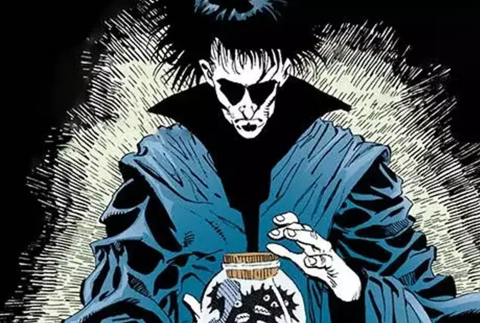
Overture #1 went on sale earlier this week, and with it Williams has very possibly exceeded his past work. The surprisingly epic story of what happened immediately before The Sandman #1 in 1989, it’s an issue that defies expectations on multiple levels, introducing readers to a whole new dimension of this most beloved comic book saga that began 25 years ago, where the dream king is pulled to the other side of the universe in a true cosmic adventure before the imprisonment that begins The Sandman proper. And as you can see from the images populating this post, the aptly named Overture reintroduces us to an artist who was already at the top of his game.
I had the opportunity to ask JH Williams III some questions about his work on The Sandman: Overture. We spoke about history as a reader of the dream king’s adventures, his collaboration with Neil Gaiman, his favorite former Sandman artists, and whether androids do dream of electric Sandmen.

ComicsAlliance: What were you up to when The Sandman #1 came out? Had your career really begun yet?
JH Williams III: My career definitely hadn’t really started at that point, not when Sandman was first coming onto the scene. I was trying to get into comics but it took me a while after high school to get any attention -- deservedly so; I wasn’t very good. [laughs]
CA: Were you a big fan of The Sandman at the time?
JHW3: I came to it right away. At the time, I read tons of superhero comics but I was always eager to find something new. Sandman came along at that point, when unusual and unique comics were becoming more prevalent and more easily accessible [through the growing direct market of comic book stores]. When it came along, it was exactly what I was looking for.
CA: I imagine that Sandman: Overture is not the typical assembly line comic book where a script will show up one day and you just get to work. What kind of discussions did you have with Neil Gaiman before beginning work in earnest?
JHW3: It was pretty simplistic, actually. Neil and I had our ideas of what makes a “cosmic” comic. Some of the things he was interested in were some of the same things I was interested in. We both really love a lot of the cosmic comics that were coming out in the 1970s. When someone mentions “cosmic comics” to me, my mind immediately goes to some of that stuff. Neil seems to be very much engaged in some of the same ideas but of course through the lens of what makes a Sandman story. I can safely tell you that the Sandman is going to be yanked across the universe and we’re going to see the hint of something that shows what Sandman is like on a grander, universal scale and less of such an earthly one. I think that’ll be pretty fascinating. And pretty epic, actually.
CA: The book is a new look for you. Before you began, was there any discussion about specific creative goals you wanted to achieve with your technique or style?
JHW3: As far as pushing my process forward or trying something different than what I’ve done before, I don’t really try to push that mentality onto a writer I might be working with. It has to be more of an organic thing. Once I see the story starting to form and see what scenes are about, I can see different ways to push things and do something cool with it.

CA: With Batwoman you innovated that very expressive two-page spread approach with very deliberate design elements, lots of drama... I was wondering how you were going to continue that in a Sandman context. But when you turn to the Corinthian spread in Overture #1, with all the images within the different teeth in his eye sockets. It’s different but it’s recognizably JH Williams.
JHW3: You know, I wanted to approach this whole series with a dual mindset, from a visual standpoint. This is a series that’s for all and intents and purposes a prequel to one of the most famous comic series the industry has ever seen. At the same time, it’s following after all of that. So I ask myself what things I can do visually, or tidbits of things that can be done, that will harken back to stories longtime Sandman fans will recognize; they’ll understand what the iconography means. But at the same time, for those who haven’t read Sandman before, for those for whom this will be their first taste of it, the images can act as something that hints at something sinister to come [in the chronological narrative].
The Corinthian is a good example of that. That two-page spread where the images are in his teeth, it’s a cool little nod to people who know everything about the Corinthian, but for readers who are first introduced to him here, they’re not going to quite understand why I did that until later. And I think that’s kind of a cool thing to play with. It’s an interesting challenge for me, visually, to know that I’m on something that needs to be about the here and now but still takes place before issue #1 of a very famous 25-year-old series.

CA: I see what you mean because even at just a glance, the teeth imagery takes you back to the serial killer story [in A Doll’s House]. It’s extremely dramatic but the layout is looser than your other work; there are no straight lines on the page.
JHW3: From a design standpoint, I try to approach each project by making sure I’m taking all the points of the story into consideration for what I do visually. Even stylistic changes that might take place within the drawing styles. That all really relies on the power of the Sandman.
CA: That manifests in a major way in this issue with the big four-page spread of all the Sandmen from across the universe. Some are illustrated in different styles while some -- and maybe this is just an illusion? -- seem to be illustrated in different mediums and tools altogether.
JHW3: I definitely wanted to make it feel that each of these Sandmen steps out from their own other world or dimension. It was important to sell the idea of their uniqueness by changing their art styles because we’re not going to get much exposure to them. The way something is drawn immediately impacts the way a reader feels about it. I took that approach to each of these characters. It gives the reader an immediate impression of what that character is like but in a very abstract way, which is kind of cool.
As far as the different mediums, some of that is definitely true. There’s some stuff that’s hand-painted, some stuff done in washes, some stuff that’s only pencil that’s been colored [by Dave Stewart].

CA: You must have lots of Sandmen design sketches lying around the house.
JHW3: There aren’t any. All those decisions, I made them at the time, doing the artwork on the spread. Whenever I do that kind of thing where I approach a character with a certain style in mind, the decision is often made on the fly; what my gut tells me is right with that particular character. That’s pretty much how I treated this spread. I knew there were certain styles I wanted to try to bring into play, but where they were going to apply wasn’t overly thought out. I just kind of... did it.
CA: That’s very surprising. Who are your favorites on the page? I want to hear more about a lot of them. Like the Robot Sandman!
JHW3: I like the robot one! Neil had a couple suggestions in the script of possible Sandmen. A couple of those didn’t get to appear in this spread but they’ll get to appear when we return to the scene. The robot one was intriguing because when people think of different versions of Morpheus, the lord of dreams, people always think in organic terms. What’s Morpheus like for machine life?
CA: Do Androids Dream of Electric Sheep?
JHW3: Exactly! I thought that was interesting. So I really like that one.
CA: Who else is a favorite?
JHW3: I love the giant cat, I thought that was a lot of fun. The two others that stand out to me are the green-skinned Sandman with the four arms -- the way he’s dressed reminds me of an old pulpy space adventure hero -- and the character next to him, who looks like he has a crescent shaped head. He reminds me of something you might find in an illustrative fantasy book of some kind.

CA: The crescent moon guy also reminds me of a Sandman cover by Dave McKean [it was 1992's issue #39]. I seem to remember a guy with a crescent head sitting with his head resting in his hands Do you remember that one?
JHW3: Yes, I do!
CA: Is this that guy!?
JHW3: Who knows, it could be! It’s one of those subconscious things. The imagery from the original series is so powerful and strong, different things can live inside the back of your mind and you never realize something is coming out. Like that character reminding you of that particular cover -- he reminded me of it, too. Once I saw that character as I was drawing him I thought, “Oh, this reminds me of that same cover!” which I thought was kind of funny. It’s cool.
CA: And the painted Sandmen?
JHW3: Of course I really liked toying with the painted ones, too. I think the Picasso Sandman is really fascinating. That came out really, really interesting to me. One of the things that occurred to me was, if we’re going to be showing what Morpheus is like on all these different worlds, and their views of him, that could be taken to the furthest extreme in terms of how they look, stylistically. Like going towards painted stuff such as abstract things or modern art perspectives like Picasso -- what would that look like on the page?
CA: What you were just saying about Dave McKean reminds me of something important. The Sandman series has -- no pun intended -- a very illustrious history of artists.
JHW3: Oh, yeah.
CA: Do you have some favorite Sandman artists or stories?
JHW3: My favorite story is dear to me because it was the first story in Sandman that kind of said, “OK, this series is going to do things you were never expecting.” That was probably “The Dream of a Thousand Cats.” That was so brilliant.
CA: Kelley Jones!
JHW3: Yeah! Kelley’s art on that and Neil’s story in particular were so... you just didn’t see that sort of thing coming when you were reading the series up to that point. It sent a signal to me about how far the series could go in terms of unique types of story presentations.

JHW3: As far as favorite illustrators, of course I can’t help but love the P. Craig Russell stuff but my favorite of the longer-term stories is probably the Marc Hempel stuff. I think what he did on [The Kindly Ones] was amazing. Those images really stay and resonate with me. When I think of Sandman, I can’t help but think of those images of his because there’s something powerfully graphic about them.
CA: They were drawn in a kind of charcoal style. You could see the roughness.
JHW3: Yeah, the work he did on that was so interesting. There were these sharp angles and shapes but like you said, if you look at the line edge there was this roughness to it at the same time. I thought that was very interesting, being able to capture that roughness but remain extremely graphic.
CA: How much more do you have to do on Overture before you can put it to bed? [no pun intended]
JHW3: There’s still a lot of work to be done. We’re working heavily at it. It’s a daunting process. The intensity of the work is definitely akin to when I was doing Promethea. Some of the stuff takes a while!
The Sandman: Overture #1 is on sale now in comic book stores and digitally from Vertigo.
More From ComicsAlliance


![Bill Sienkiewicz Provides FOC Variant Cover For ‘American Gods: Shadows’ #2 [Exclusive]](http://townsquare.media/site/622/files/2017/03/AMGODS0.png?w=980&q=75)

