![The Making Of Francis Manapul’s Excellent ‘The Flash’ Teaser [Art]](http://townsquare.media/site/622/files/2011/10/untitled-2-1317924261.jpg?w=980&q=75)
The Making Of Francis Manapul’s Excellent ‘The Flash’ Teaser [Art]

It's essentially a unanimous verdict among the ComicsAlliance staff that The Flash, co-written and illustrated by Francis Manapul, is the most visually amazing of all the titles in DC Comics' New 52 initiative. Manapul's uncommon talent for page design and movement were highlighted in our roundtable reviews, Chris Sims' Flash-centric review, and in David Brothers' latest Digital ComicsAlliance, in which he spotlighted The Flash among his picks for the best three books of the New 52.
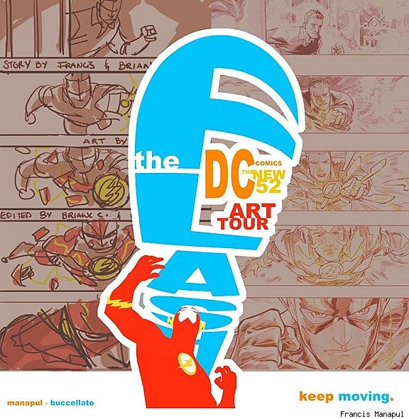
Naturally, DC Comics is also well aware of Manapul's gifts, as evidenced in a new post to the publisher's The Source blog detailing step-by-step the artist's process of creating a striking teaser image for The Flash that also doubles as a flyer for The New 52 Art Tour. Click after the cut to see those images, read Manapul's commentary, and learn more information about the New 52 Art Tour.As part of its promotional push for the New 52, DC Comics has been coordinating with comics retailers around North America on The New 52 Art Tour, whereby comics stores host a kind of gallery showing of behind-the-scenes material from various titles of the publisher's new superhero line. For the tour, DC created presentations of the process including script pages, pencils, inks, colors and lettering to show readers what goes into creating New 52 titles including Batwoman, Wonder Woman, Green Lantern, Action Comics, Swamp Thing, and of course The Flash.
Manapul's Flash art was on display last month at Toronto Cartoonist Workshop in Ontario, Canada, and the next stop on DC's New 52 art tour will be Fat Jack's Comicrypt in Philadelphia, Pennsylvania, where fans can check out the Action Comics work of Rags Morales and his collaborators. You can check out the full schedule at The Source.
Below is Francis Manapul's process art for a particularly stroking Flash teaser, along with artist commentary. Be sure to follow Manapul's Tumblr blog, where he occasionally rolls out new artwork before it's seen anywhere else.
Francis Manapul:
I don't really have a design background. But I am a fan of bold and graphic images. Something about a simple well thought out composition just speaks to me, more so than a detailed drawing. If you've been following any of the new images released for The Flash, I'm sure you've noticed that I've started playing around with my composition and even started dabbling with typography. However when it came to designing this, it really was just dumb luck.
I'm a huge, HUGE, Will Eisner fan. He was an absolute genius. Inspired by him I wanted to create pages that not only told a story, but also worked as a title page. So playing around with the composition, and typography I started with a layout.

After the layout stage, I illustrated the page using traditional mediums (brushes, ink, and watercolor).

I wanted to incorporate "the Flash" typography with the illustration of the plane, and I knew it was easier to do digitally. It was also a safer route in case it didn't work. Luckily, I like to think it did. I colored the Flash simply because I needed to see what color for the text would compliment his red costume.

This is when dumb luck struck. Ever so often I would turn off the line work layer to pick out the color and make adjustments. Most of the time it looks weird. But this time I found myself saying "hey that kinda looks cooler than the finished version".

From there I put the hand lettering I had done back in. Then inspiration struck!

I cleaned up the coloring, added some standard font types (I don't have many, just the presets in Photoshop) but they work just as well I think, and voila! I get to pretend I'm a graphic designer!

I was asked to try and make the piece work for the DC Comics-The New 52 Art Tour, so I simply just added some process work in the background. Easy, peasy.
More From ComicsAlliance