
The Greatest Comic Book Cover Blurbs Ever

A few months ago, I received an email from a ComicsAlliance reader who was wondering why super-hero comics didn't have cover blurbs anymore. I've been thinking it over ever since, and I've got to admit that I'm stumped. Somewhere in the past two decades, loading up a comic book cover with boxes full of hype fell out of fashion.
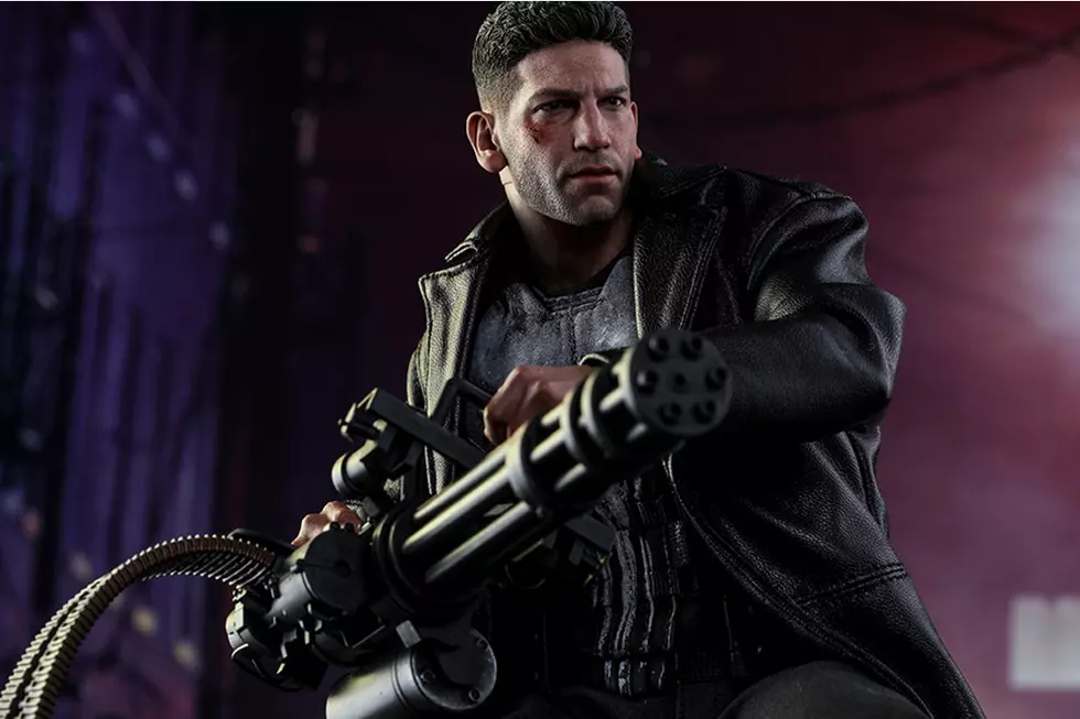
And that's a shame, because they can be amazing. So much so, in fact, that we decided to take a look through the Grand Comics Database and offer up a salute to the grand and glorious (and increasingly lost) art of the cover blurb with our picks for The Greatest Cover Blurbs Ever!Punisher War Journal #19:
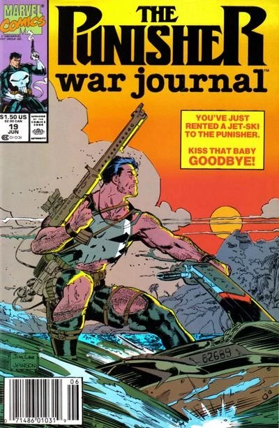
First up, we have one that I've written about before: The infamously, insanely over the top cover to the comic that deals with the Punisher and his extremely surprising fear of water. Even before you get to the caption, there's so much to love about this cover, mainly because the idea of the Punisher on a jetski is and will always be hilarious. Throw in the ridiculously gigantic gun he's toting, which he apparently intends to fire one-handed from a jetski, and you've got something amazing already. Truly, it is Jim Lee's finest work.
But it's that caption that pushes it right over the top, and I am endlessly fascinated by it. The way it's phrased is almost an accusation to the reader, one that forces you just by reading it to imagine that you're an employee of a Marvel Universe jetski rental franchise, and then totally sick burns you for not realizing that renting a jetski to the Punisher was a catastrophically bad idea, while also informing the reader that the Punisher is the kind of dude who will straight up wreck a jetski as a matter of course, and this is something we should all know about him. Seriously, this thing has more layers than Heart of Darkness. At at least twice as many jetskis.
Thunderstrike #5:

Along the same lines is another great artifact of the '90s from the Hypothetical Burns school of advertisement. I'm not really sure who in the Marvel Universe was insisting that heroes were dead at a time where when Spider-Man alone was starring in four monthly titles, but this cover wants you to know that person is wrong.
Really, though, it's the awesome attempt at edginess that sells this one. Society stinks, man. Says so right on this comic, and also on your Trapper Keeper, where it's been written with a sharpie right next to a drawing of Metallica's logo.
Plus, this one's a great example of how a cover blurb can be functional: All that text distracts you from the fact that holy crap, Thunderstrike's hand is way too huge.
Uncanny X-Men #303
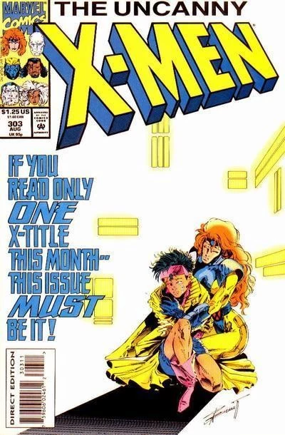
While we're on the subject of the '90s, there is no cover that quite sums up the excesses of that decade like this one. I got this one when I was a kid, and even at age 11, I thought it was nuts. "If you buy one comic this year" has been done to death, but getting as specific as "if you buy one X-title this month," in a story that's actually meant to be serious and tragic? I can't decide if that's hubris or humility.
Animal Man #19:
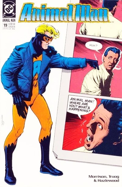
Despite their reputation, comics in the '90s weren't all about jetskis and X-titles. It was also a time that featured some pretty incredible innovation, and the pages of Animal Man -- a book that launched the career of superstar writer Grant Morrison -- were among the best. Brian Bolland's covers are always pretty great, but seeing him play with the format in the same way that happened in the comic is just awesome.
The Amazing Spider-Man #112:
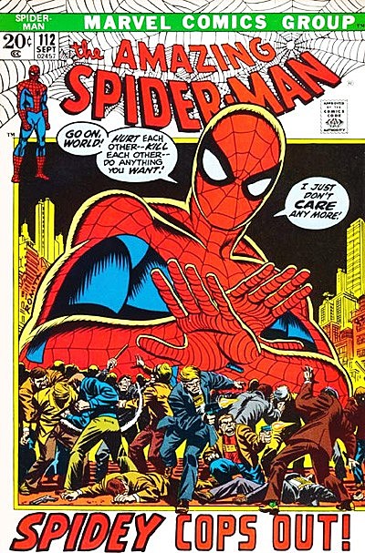
As fun as the '90s were, though, the greatest era for cover blurbs was the Bronze Age of the '70s and early '80s, when melodrama reigned supreme and gigantic spider-men loomed over riots and committing the unforgivable sin of just not giving a dang. In fact, now that I think of it, there's a similar cover on an issue of Teen Titans where Aqualad (of all people) is punching out Robin for what he deemed to be a similar attitude. Apparently copping out! was the pressing issue for the youth of the day.
Uncanny X-Men #142:
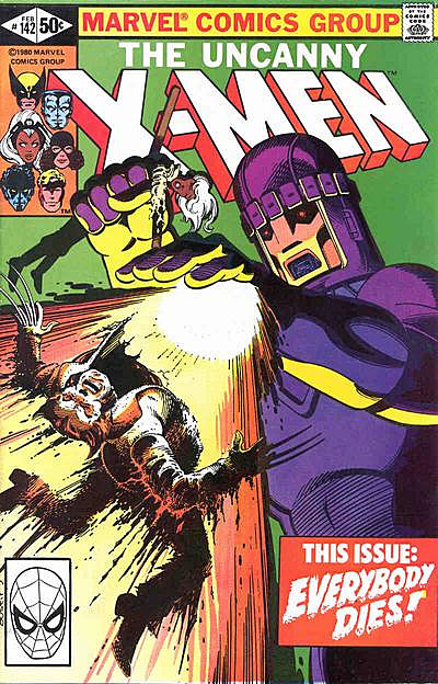
You know, there's really something to be said for simplicity in your cover blurb, especially if it's in an issue that actually delivers on a promise like "Everybody Dies" (in an alternate future timeline, at least.)
The Amazing Spider-Man #121:
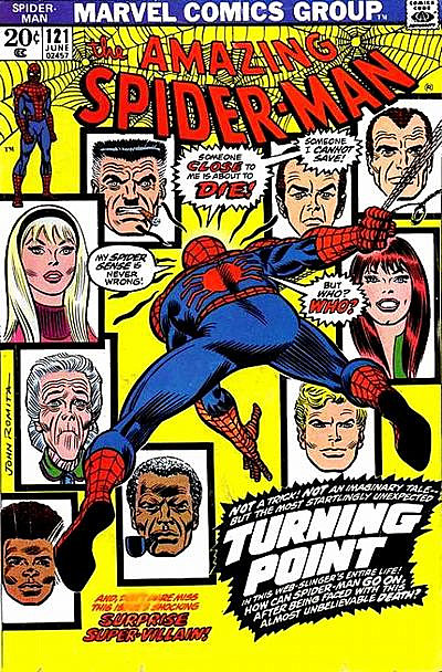
If you want to talk about comics that deliver on their promises, though, look no further than Amazing Spider-Man #121. It might be one of the most over-the-top blurbs of all time -- right down to the announcement that it's both startingly unexpected and unbelievable -- but one of those characters did die, Spider-Man couldn't save her, and it was a pretty big turning point.
Plus, there's the classic hype billing this one as "Not an imaginary tale," which I have to assume means that this actually happened.
Star Wars #2
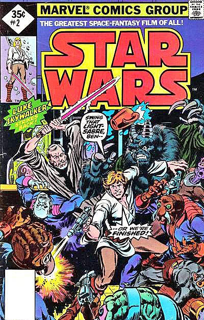
The first few issues of Marvel's Star Wars comic are usually billed as an adaptation of the movie, but I prefer to think of their covers as an adaptation of a Star Wars movie that's way, way better than the one we actually got. Seriously, I don't care how much you like Star Wars, you can't tell me it wouldn't have been improved by having a scene where Luke Skywalker and Obi-Wan Kenobi had to blast their way through an army of alien monsters while shouting that dialogue.
And spelling it "light-sabre" is just classier.
Power Man #48:

Admit it: You are now looking for an excuse to call someone "ballet britches."
Tomb of Dracula #14:
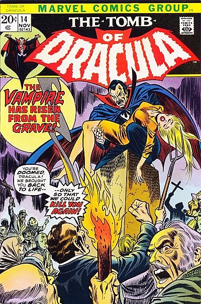
I'm sure that we can all agree that Dracula is awesome -- and if we can't, you can see yourself out -- but the magic of this cover comes from those dudes in the crowd. Hating someone is one thing, but hating someone so much that you kill them, then magically find a way to bring them back to life so that you can kill them again, when they are already dead to begin with?! That is some hard-core hating.
New Gods #2:
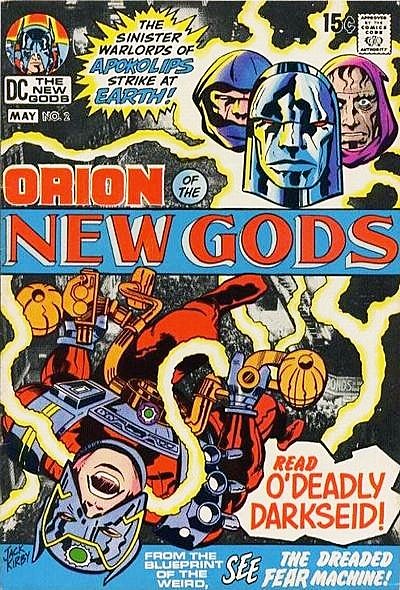
The undisputed king of the cover blurb is, of course, Jack Kirby. The covers of his comics are so wildly over the top that they'd be completely ludicrous if they weren't completely backed up by what happened in the stories themselves. New Gods in particular is a favorite, with its promise of sinister warlords, blueprints of the weird, and The Dreaded Fear Machine, and those aren't even the focus of the story!
There's so much happening on the covers that Kirby had to move one of his best lines to the interiors: "Tales of the New Gods as they really are," which implies that there's some rival publication out there telling stories of the New Gods that are just malicious rumors.
OMAC #3:

The entire point of a comic book cover is to get someone interested in buying the comic to see what it's all about, and this Kirby classic does that better than just about anything else. Honestly, if you can see a promise of a dude in a mohawk with a flying chair -- which I want to point out explodes six pages after it's introduced -- fighting one hundred thousand foes and not want to read about it, then this whole comic book thing might not be for you.
The Demon #13
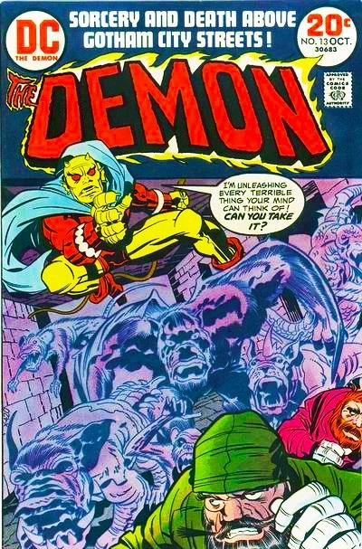
Kirby's best cover blurb, however, comes from The Demon. The great thing about this one is that while it's ostensibly the Demon yelling that threat at the guy in the foreground -- whose name is Baron Von Evilstein, because subtlety is for chumps -- the one who's actually unleashing every terrible thing his mind can think of is Kirby himself. So it's not just a challenge from one character to another, but from the guy making the comic to the people reading it. Can you take it?!
Fantastic Four #102:
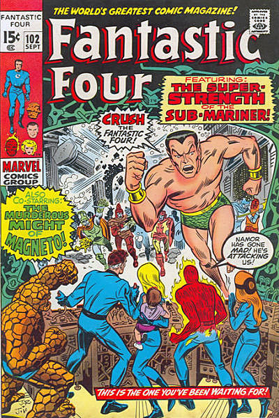
With that in mind, it should be no surprise that Fantastic Four, the comic Kirby drew for over a hundred issues with scripts by the patron saint of self promotion himself, Stan Lee, would have the most consistently great track record with cover blurbs. This one in particular -- drawn by the legendary John Romita -- boasts so much text that I'm on the verge of referring to it as being "slathered."
Super-Strength! Murderous Might! Crush the Fantastic Four! Namor's gone mad! There's so much going on that by the time I get down to being told it's the one I've been waiting for that I'm not sure! I don't remember waiting for it, but I sure as hell am now
Fantastic Four #238:
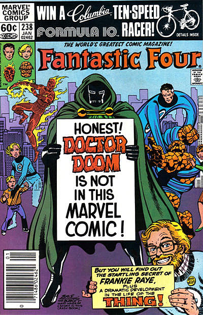
I honestly can't decide which is better: Dr. Doom announcing his own non-presence in the form of a piece of science project poster board that he apparently carries around with him, or writer/artist John Byrne himself showing up to cheerfully try his hand at getting people to want to read about Frankie Raye.
Oh, who am I kidding? We all know I'm just after that ten-speed!
So with all those, what ranks as the best cover blurb ever? As much as I want to go with the Punisher's jetski, my vote goes for this one:
Batman #184:
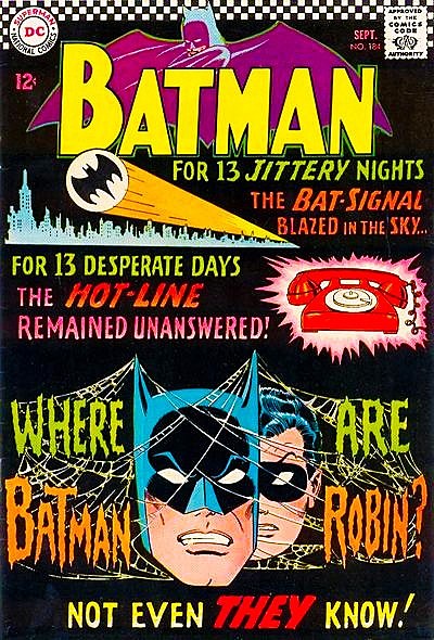
Everything else on this list is a nice example of how the captions can work with the art, but for this issue of Batman, they decided to go for a cover that's almost all blurb! And the end result is such a great effect: The black background makes the letters pop, the repetition mimics the cliffhangers of the TV show (which was a brand new success at the time), and the cobwebs and #13 even give it an air of spookiness.
Sure, the actual story isn't that great, and it definitely doesn't life up to the hype, but let's be honest: After a cover like that, what could?
More From ComicsAlliance


![Super7 ReAnimates Alien and Predator, Masters More of the Universe [Toy Fair 2017]](http://townsquare.media/site/622/files/2017/02/IMG_2000.jpg?w=980&q=75)
