The Artist’s Spider-Man: The Foundational Weirdness of Steve Ditko
Over the past half a century, many artists have put their own spin on the hero who came to be Marvel's best known and best-loved character, Spider-Man. With this series, ComicsAlliance takes a look at the artists who made the character their own, and had the biggest influence on those that followed.
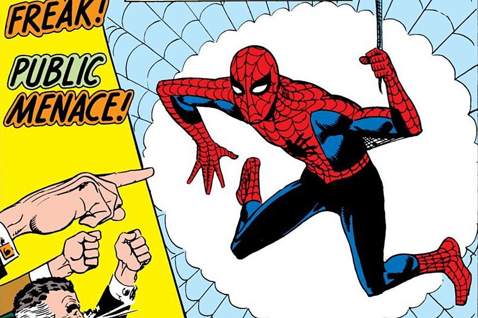
It's not that hard to define co-creator Steve Ditko's contribution to the design of Spider-Man. Just look at any drawing of the character. Ditko is responsible for basically all of the basics: The luchador mask, the big eyes, the webbing motif in the red areas, the contortions, the webs under his arms, the movement within a panel, the whole deal.
It's worth noting, though, that Ditko wasn't the first artist to draw Spidey. Before asking Ditko to draw him, writer Stan Lee asked Jack Kirby to draw the character, but he rejected Kirby's drawings because they looked "too heroic." Kirby's early designs seem to be lost to time; a design that was circulated a few years ago is almost certainly apocryphal. Many reports state that his designs were similar to the Red Circle Comics character that he and Joe Simon created, The Fly.
Lee didn't want a typical champion; he wanted Marvel's new hero to look fallible, so Ditko's lanky, awkward teen won out.
(That's one version of the story, at least. Kirby claimed at one time that Spider-Man was, in fact, his and collaborator Joe Simon's idea, and that Martin Goodman decided that the character was just too close to The Fly. Either way, Kirby actually ended up drawing the covers to Amazing Fantasy #15, Spider-Man's first appearance, and Amazing Spider-Man #1, with Ditko inking.)
Awkwardness was a key component of Ditko's Spidey. It's easy to overlook because Ditko co-created him, but Ditko's Spider-Man was weird. He appeared on-panel in impossible, contorted positions. Peter Parker wore huge glasses and bad sweater-vests.
And it wasn't just him. Aunt May looked like she would crumble into dust any second. Doc Ock looked like a goblin. J. Jonah Jameson had a full-on Hitler mustache, and the Osborns had hair that looked like an optical illusion. Ditko was unafraid to make characters in his superhero comic look a little repulsive, an idea future artists would tamp down on or full-on reject for quite a few years after Ditko left the book.
Ditko's Spider-Man was also a clear underdog. Though he'd get more muscular in the decades to come, Ditko's Spider-Man vacillated between being an athletic, but still fairly small superhero, and being an out-and-out beanpole. He was visibly smaller than most of the other kids he went to high school with, let alone the villains he fought and the other superheroes he occasionally rubbed elbows with.
In the early stories --- for which Ditko was eventually credited as co-writer --- Spidey was depicted as a hero who had to overcome a lot of odds to succeed. Ditko and Lee figured out numerous situations in which he had to use a combination of ingenuity, luck and force of will to overcome. But even without the narration captions and the dialogue, it was easy to tell from the art alone that this guy was out of his league fighting Kraven the Hunter, or having to rescue himself from being pinned under heavy machinery.
Yes, the answer to the trivia question, "Which artist co-created Spider-Man?" is Steve Ditko. But his version of the character was no prototype. He was the idiosyncratic creation of an idiosyncratic and fascinating creator. That's worth remembering.
More From ComicsAlliance