
Comics Alliance Best of 2015: Outstanding Colorist of 2015
Our judges have adjudicated; our readers have voted. We’re proud to present to you the outstanding colorist of 2015 — and four great runners up.
Runner-Up: Dave Stewart
Consistency can be important in comics, especially when you’re working as a colorist. But Dave Stewart, who has been the core of Mike Mignola’s ‘Mignolaverse’ series of comics (including Hellboy, BPRD, and the like), has proven that consistency works best when you... don’t keep to it. Everyone has an idea of what a Dave Stewart comic looks like, but what’s noticeable is just how often he’s chosen to move away from the expected and do something completely different.
Stewart doesn’t get the credit he deserves for being a shapeshifter, not only handling the heavily-shadowed and tense Mignola comics, but also the simple, hard, bright colors of Bizarro over at DC, or the wild fantasy of Rumble. He can do so much with a comics page, and has proven, year-on-year, that his key consistency is his refusal to be anything but predictable. [Steve Morris]

Runner-Up: Matt Hollingsworth
Five years ago, nobody could name a favorite colorist; now, the mere presence of some names on a book — including all of this year's nominees — can be enough to make you want to buy that book.
It's really saying something, then, that the understated and versatile work of Matt Hollingsworth stands out among his peers. In 2015, Hollingsworth provided mood and tones to some of the most fascinating comics on the stands, and always in different ways. Pastels like grimy ultraviolet in Tokyo Ghost; the psychedelic nature horror in Wytches; 1970s heist movie in Hawkeye; lushness faded by war in We Stand On Guard. There are probably more that I'm forgetting: it's tough to keep track of good colorists, because they get so much work. But it's a real testament to their contribution that we're now actually trying to, and Hollingsworth is particularly worth following. [John Parker]

Runner-Up: Rico Renzi
A lot of comic books made waves in 2015 for their premise, humour, or deft a character redesign. Behind a lot of them was colourist Rico Renzi. For years, Renzi has quietly been building a resume all over comics with series like Stumptown, Loose Ends, FBP, and The Perhapanauts, just to name a few. However, this year Renzi started getting serious attention and accolades for the deftness with which he brings energy and tone to series with his work.
Liked the colourful villains and locales in Howard the Duck? Renzi helped bring them to life. The Unbeatable Squirrel Girl’s splash? He’s part of that. And very significantly, Renzi brought the vivid, neon colours to Spider-Gwen. Three of Marvel’s biggest notable series of the last year featured Rico Renzi’s work, and that’s impossible to ignore. It'll be worth watching which titles he brings his skills to in 2016. [James Leask]

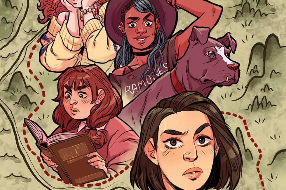
Runner-Up: Paulina Ganucheau
Paulina Ganucheau isn’t afraid of color. So many superhero books are so self-serious that bright colors — once the hallmark of the genre — have become taboo in some circles. Ganucheau is one artist who is working hard to bring color back to comics, and in 2015 she brought her style to superhero stories with the groundbreaking Zodiac Starforce, which she both pencils and colors.
Ganucheau’s bold reds, soft pinks, and bright yellows are perfect for a book aimed (inclusively, though not exclusively) at young girls. They’re perfect for a story influence by the Magical Girl genre of anime and manga. But more than that, they’re perfect for comics, and for superhero comics in particular, even if superhero comics have forgotten. To read Paulina Ganucheau’s comics is to be reminded. [Elle Collins]

Winner: Jordie Bellaire
Jordie Bellaire’s been arguably the best colorist working in comics for years, and recent accolades like the 2014 Eisner for Best Colorist have only drawn more attention to her incredible work ethic and vibrant colors. No matter the comic or genre, Bellaire's work possesses an unmistakable vibrancy and symbolism that is hard to match by just about anyone else.
This past year has shown arguably some of her best work to date, with the incredible palette of Autumnlands, the subtle character work in They’re Not Like Us, and the stark, grim colors of Injection, all showing off both her incredible ability and breathtaking versatility. No matter what penciller she’s collaborating with, Bellaire deftly demonstrates how a colorist can transform a pencil-and-ink drawing into something even more spectacular, all without drawing attention away from the artist’s original work. [Ziah Grace]


More From ComicsAlliance


![All The Image Comics Announcements From Emerald City Comic Con [ECCC ’17]](http://townsquare.media/site/622/files/2017/03/Image-Featured.png?w=980&q=75)


![Eat Nuts And Kick Butts: The ‘Unbeatable Squirrel Girl’ Mixtape [Music Week]](http://townsquare.media/site/622/files/2017/01/USG-Featured.png?w=980&q=75)
![A Zombie Gangster Is On The Prowl In ‘Lobster Johnson: Garden Of Bones’ [Exclusive Preview]](http://townsquare.media/site/622/files/2017/01/LJOHNGB-PG-00.jpg?w=980&q=75)