![Marvel’s ‘Season One’ Graphic Novel Trade Dress [Design]](http://townsquare.media/site/622/files/2011/09/untitled-2-1315452981.jpg?w=980&q=75)
Marvel’s ‘Season One’ Graphic Novel Trade Dress [Design]

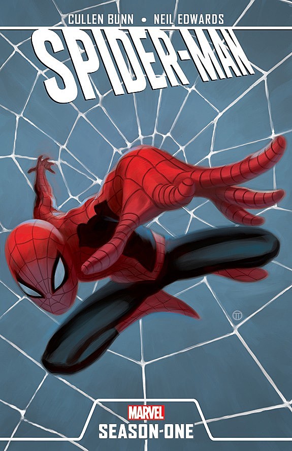
Following discussion of hand-lettering with Moebius, logo criticism with DC's New 52 and X-Men brand identity with Jared K. Fletcher, your ComicsAlliance design course continues with the logos and trade dress of Marvel Comics' "Season One" line of graphic novels.
Perhaps taking a cue from DC Comics' All-Star line, which was also ostensibly designed to appeal to a broader audience than that of the publisher's existing line, the "Season One" logos are white and angled in a sort of "flying" fashion. On his Guttersniper blog, Dylan Todd identifies the main font as Gothic Narrow, which as he notes will be familiar to readers of comics writer (and graphic designer) Jonathan Hickman's work. You can check out the full-size cover images, featuring the illustrations of Julian Totino, after the cut.


More From ComicsAlliance


![SUPERMAG: Jim Rugg’s Ambitious and Eclectic Comics, Illustration and Design Magazine [Interview]](http://townsquare.media/site/622/files/2013/04/untitled-4.jpg?w=980&q=75)


![Matthew Olin Constructs Superheroes From Typography [Art]](http://townsquare.media/site/622/files/2012/07/matthewolinmain.jpeg?w=980&q=75)