In honor of the caped crusaders of the convention scene, ComicsAlliance has created Best Cosplay Ever (This Week), an ongoing collection of some of the most impeccable, creative, and clever costumes that we’ve discovered and assembled into a super-showcase of pure fan-devoted talent.
This week's selection of the best cosplay ever includes Symmetra, Chirrut, Katana, Vision, and more!
The 1989 Avengers West Coast Annual featured an unusual short story by Mark Waid and then-newcomer Amanda Conner called "Rate The Hunks," in which Wasp and She-Hulk offered their expert assessment on the sex appeal of their male Avengers colleagues. Almost thirty years later, we've assembled our own experts to repeat the exercise, with an updated twist.
We asked you to vote for the best comics, creators, and more in 2016, and over the last few weeks we’ve been sharing the results. Now you can check out all the winners in one place!
Check out the best superhero comics in 2016, including our critics' picks, and the comics you voted the runners up and winner in this category! This is the very best of 2016!
Tom King and Gabriel Hernandez Walta's The Vision features a lot of quotation and repetition. Dialogue and scenes are reprised a few pages or issues later; objects that make a quick appearance in issue #1 play a vital role in the climax; dialogue is lifted directly from comics published nearly 50 years ago, and from plays published more than four centuries ago.
These aren’t unusual techniques. They’re just examples of structurally sound storytelling, of how to make a book feel like an extension of the histories, real and fictional, of the world that it exists within.
Gabriel Hernandez Walta might be the most understated artist working on a big-two book. With each issue of The Vision, written by Tom King and with colors by Jordie Bellaire, Walta gave readers a masterclass in visual storytelling.
One of the elements that makes this book so strong is how Walta decides to use the locations and backgrounds to frame characters, which then informs so much of the story happening on the page. There’s an example in the fourth issue that really encapsulates the clever work going into the book.
When Kotobukiya hits on all cylinders, there are few collectible companies that can match them pound for pound. Whether it's the Fine Art, ArtFX or Bishoujo lines, there's always something new and impressive to be awed by when visiting Koto's booth. Sometimes the successful pieces are outnumbered by some questionable collectibles, but at this week's New York Comic Con, Koto delivered a handful of strong pieces that will get 2017 off to a good start for collectors.
Avengers Academy is a hit mobile game where your favorite Marvel Comics characters are inexplicably reimagined as teenagers attending high school, and I am addicted to it. I’m not the only one, as the charming character designs and spot-on characterization of the students has millions of people playing. So why isn’t there an Avengers Academy comic?
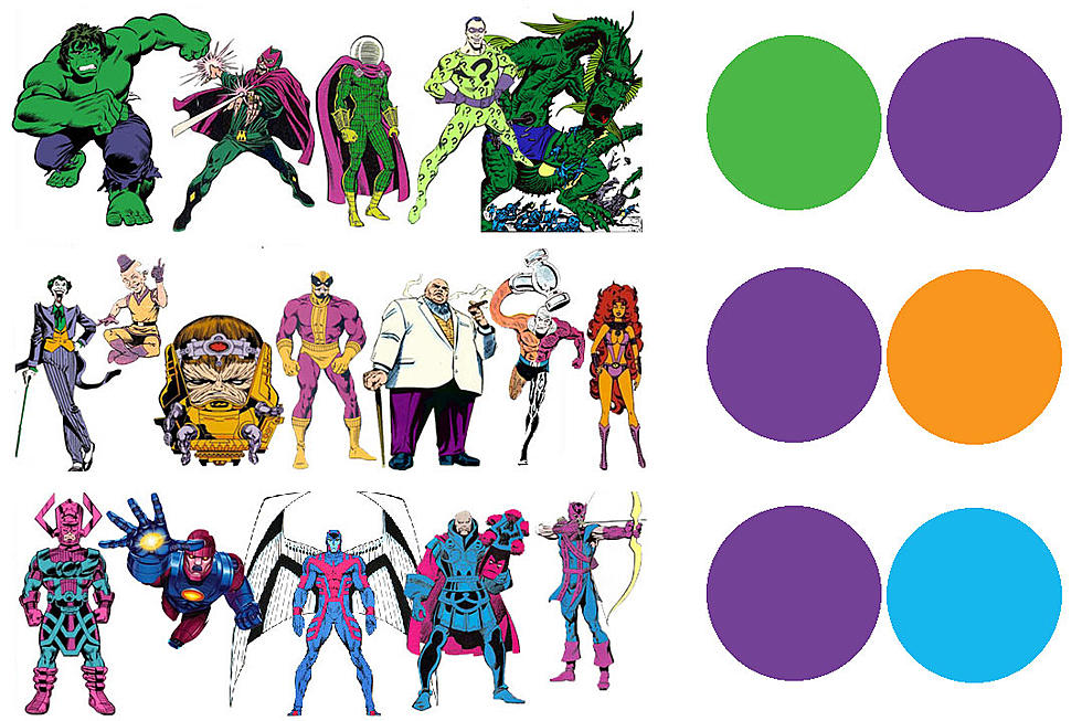
Last time in Superhero Color Theory we explained why our main heroes look the way they do. Now it's time to look at the secondary colors and how they often, but not always, signal the presence of a bad guy. Obviously it makes the most sense visually, that to stand apart from a primary colored (red/blue/yellow) hero, you want a secondary colored (purple/green/orange) one. But what do these colors tell us about what type of character the heroes are encountering?