Best Comic Book Covers Ever (This Month) – June 2012

A great comic book cover is both an advertisement and a work of art. It is both a statement and an invitation. Sometimes a great cover conveys character, sometimes mood, sometimes moment. Great covers can pastiche the classics or pay tribute to the past, or they can strive to show us something new. Great covers always show us a glimpse of somewhere else, on a canvas no bigger than a window pane. In Best Comic Book Covers Ever (This Month), we look back at some of the most eye-catching, original and exceptional covers of the month that was.
I'm going to keep this feature light this month, partly because I don't want to lean too heavily on the usual names, and partly because it wasn't a very strong month. However, the best covers in June would stack up against the best from any previous month, and there were still several bold, beautiful and original visions on the stands, including Scalped #59, Honey West #6, and Rafel Grampa's variant cover for The Massive #1.
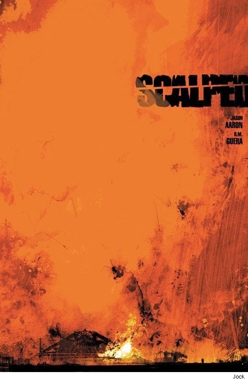
Scalped #59 (DC Vertigo); cover by Jock
I haven't seen many covers bolder than this simple painted-in-oils-style image of a blazing fire. The orange glow consumes the cover, and the burning building is almost a footnote. That's a confident approach. As this is the title's penultimate issue, I doubt they're expecting to pick up any new readers with this cover, but it's great to see RM Guera using freedom from sales concerns (Scalped will conclude with issue #60) to do something exciting and different.

Fairest #4 (DC Vertigo); cover by Adam Hughes
I'm smitten with this lavish pastiche of an Orientalist harem painting. I'm so used to Hughes's cheesecake that I didn't immediately recognize this smoldering Lothario as his handiwork.

Cobra #14 (IDW); cover by Antonio Fuso
There's a touch of Jamie Hewlett in this Fuso action shot, which means once again IDW and Fuso are infusing their G.I. Joe covers with a vibrancy that I don't expect to see on this line. Fuso has been one of my favorite discoveries this year.

X-Factor #238 (Marvel); cover by David Yardin
Speaking of unlikely influences; comic cover artists seem to thrive on a steady diet of Alfons Mucha pastiches, and it gets a little tired, especially since so few of them come close to emulating Mucha's finesse. I don't remember the last time I saw a Piet Mondrian pastiche, perhaps because there's not a lot to play with in Mondrian's Neoplastic blocks and lines, though in a sense he's a perfect fit for comics precisely because he works in "panels." Yardin exploits that synergy to great pop art effect on this cover.

Deadpool #56 (Marvel); cover by Dave Johnson
A more familiar cover influence is at play here. This isn't the first time an artist has riffed on Steranko's brilliant '60s building blocks from the cover of Nick Fury: Agent of S.H.I.E.L.D. #1. But of course, only Deadpool would stumble off his blocks and break his face.

Dark Horse Presents #13 (Dark Horse); cover by Phil Noto
There's a Phil Noto double bill this month, and that's not counting the cursed Northstar wedding variant that I wrote about previously. This DHP cover featuring Ghost is a beautiful example of Noto's gift for elegance, and the coloring is effectively luminous.

Hit-Girl #1 (Marvel Icon); variant cover by Phil Noto
Noto's other cover is less refined but ripe with wit. Anyone who follows Noto's Tumblr knows he has an affection for Game of Thrones. I feel like someone had to do this iron throne gag at some point, so I'm glad it was Noto.

Into The Volcano (Scholastic); cover by Don Wood
This is a very unorthodox approach that may owe something to Don Wood's pedigree as a children's book illustrator, unconfined by any expectations about graphic novel cover designs. Perhaps the point is to emphasize that this is a comic and not a picture book, but the result is a striking slice of action.

Honey West #6 (Moonstone); cover by Franchesco
I think this cover would be stronger without the inset sketch element; just the stylized black figure against a bright red background. I think that stylized figure tells me enough about glam PI Honey West to get my attention, and besides, that's some of the best Art Deco gun smoke I've ever seen.

New York Mon Amour (Fantagraphics); cover by Jacques Tardi
Red is the color of love, right? And it says "Amour" right there in the title. But romance is not the vibe evoked by this menacing red sky over Tardi's exquisitely rendered New York street. This cover tells you that this is not a love story.

Batman and Robin #10 (DC); cover by Patrick Gleason
I think this cover makes a very smart choice. When a comic brings all the current Robins together, there must be a temptation to do a flat, obvious ensemble shot. This Dutched cover is the farthest thing from that. It's a dynamic approach that makes great use of the characters' color schemes and gets everyone in the frame.

Silk Spectre #1 (DC); cover by Amanda Conner
A very stylish character collage.

Batwoman #10 (DC); cover by JH Williams III
The color contrasts and linework here echo Paolo Rivera's Doré-themed Daredevil #10 cover from a few months back, and I wonder if that was a deliberate influence. Of course, the style and composition are very different and very consistent with the book's style, and it remains very effective. Both covers evoke a nightmarish sense of suffocation.

Saga #4 (Image); cover by Fiona Staples
I think this is my favourite Fiona Staples cover yet. Just perfect execution.

Uncanny X-Men #14 (Marvel); cover by Stuart Immonen
I almost didn't run this cover because I couldn't find a clean version. I don't mind running covers with logos on them if the logo is well placed or relatively unobtrusive, but a cover with a barcode, a digital comics promotion and a terrible AvX banner stripped across the top, that's too much. I cut off the AvX strip, because let's not think about that when we don't have to. What's left is still a gorgeous drawing by Stuart Immonen. It deserves a much prettier frame than Marvel is giving it.

Casanova: Avaritia #4 (Marvel Icon); cover by Gabriel Bá
I can never find clean versions of Casanova covers either, but Casanova covers are built to carry all that furniture the way James Bond openers are built around credits. Presumably Bá makes it work because he and Fraction have a higher level of control over the book's presentation.

The Massive #1 (Dark Horse); variant cover by Rafael Grampa
Grampa draws the most beautiful jellyfish I've ever seen.
More From ComicsAlliance