![Cover Artist Trevor Hutchison On Designing Galactic Propaganda For ‘The Omega Men’ [Interview]](http://townsquare.media/site/622/files/2016/03/Omega-Men-10-cover4.jpeg?w=630&h=963&zc=1&s=0&a=t&q=89&w=980&q=75)
Cover Artist Trevor Hutchison On Designing Galactic Propaganda For ‘The Omega Men’ [Interview]
Since its first issue at the beginning of DC's DCYou initative, Tom King and Barnaby Bagenda's The Omega Men has been one of the most exciting and unique comics to exist as part of a larger superhero universe. A tense political thriller on a galactic scale, it follows the terrorist/freedom fighter team The Omega Men on their quest to depose the corrupt government of the Vega system
While Omega Men stands out for its gripping storytelling and Bagenda's inventive use of the nine-panel grid format, it also has some of the most striking covers on comics stands at the moment, courtesy of cover artist Trevor Hutchison. ComicsAlliance caught up with Hutchison to talk all about designing The Omega Men's unique covers --- plus DC has provided an exclusive look at his cover for #10,above!
ComicsAlliance: How were you first approached to come onto The Omega Men as the cover artist?
Trevor Hutchison: [The creative team] had seen my propaganda-style work on IDW’s “All Hail Megatron” Transformers series and got in touch with me about the possibility of similar propaganda-inspired covers for a new Omega Men series. They were looking for something a bit different and the idea of defaced propaganda posters provided opportunity for visual interest whilst reinforcing the theme of the series.
CA: Did you have any familiarity with the characters before this series?
TH: I’m embarrassed to say none at all! I was very much brought in as an outsider, but perhaps that's an advantage on a project like this when the creators are looking to take a fresh approach to a series. I had to ask a lot of dumb questions.
CA: What was the collaborative process between yourself, editorial and the creative team when putting together individual covers?
TH: It was actually a highly collaborative effort. We treated it more like a graphic design brief than a commissioned piece of artwork. At the start of each issue we’d all look at the themes and/or localities of the issue and pitch concepts that would work with our "vandalized propaganda” theme. We’d pick the strongest idea and I’d go away and work on a draft which to be submitted for team feedback. Sometimes that would be close to the final cover design and other times we evolved it further to get the desired visual clarity and impact.
![omegacovers[5] (1)](http://townsquare.media/site/622/files/2016/03/omegacovers5-1.jpg)
Click to enlarge[/caption]
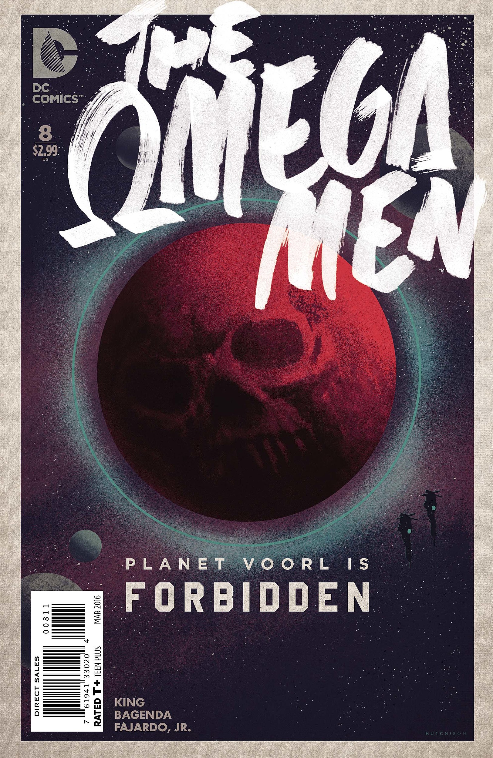
CA: How far ahead were you aware of where the story was going? Did you know about how Voorl was going to shake everything up when you designed the cover for #8?
TH: Tom provided an issue breakdown before I got started which gave a great insight into the overall themes and plot points that would be explored. #8 was an interesting one because we actually reworked it close to publication to make it more menacing.
CA: What was it like when it was announced The Omega Men was ending, and then again it was announced it was guaranteed its twelve issues? How far ahead were you at that time?
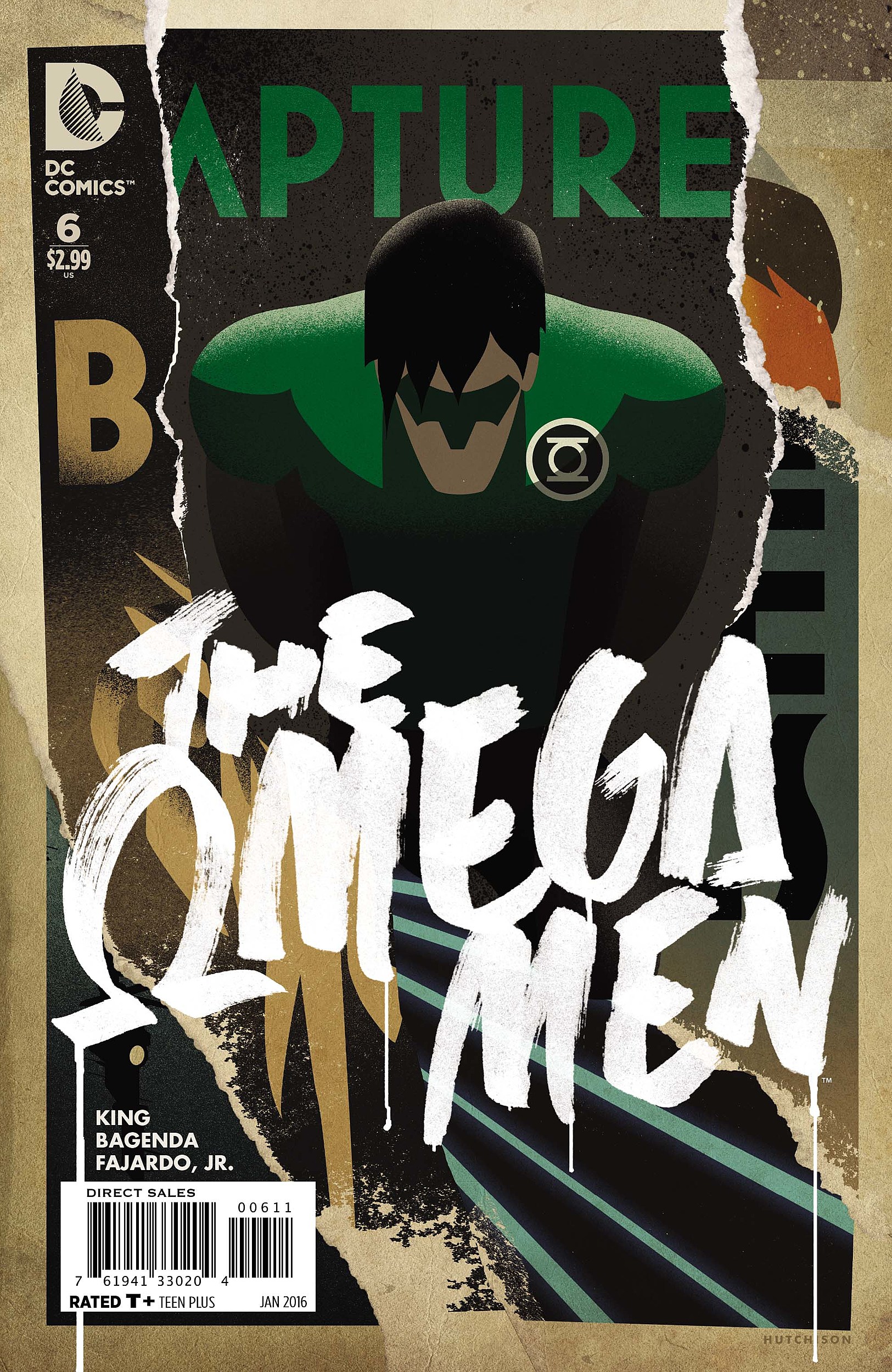
TH: When the premature end was announced I was disappointed, particularly for the creative team and the readers knowing that there was a larger story at play that wouldn’t get its intended resolution. But on a personal level I was also slightly relieved as my wife was expecting our first child and I wasn’t sure if looking after a newborn, working as a graphic designer and illustrating The Omega Men covers were going to be compatible! When Omega Men got the reprieve we ended up doing some cover and schedule shuffling: The cover for issue #7 became the cover for issue #12, and we had to quickly come up with a whole new issue #7 cover. I haven't slept since last September.
CA: The Omega Men covers are often a mix of propaganda posters, or tourism ads for the planets in the Vega System. Were there any specific reference points you kept handy when designing the covers.
TH: I have a graphic design background and a love for vintage advertising posters, particularly of Art Deco era. I have many books filled with these designs which served as the main inspiration. Soviet propaganda posters, World War II posters of the Works Progress Administration, and mid-century advertising of Dorothy and Otis Shepard where particularly inspiring. Because the cover artwork was designed ahead of Barnaby’s interiors, I also dug up some images from the the original '80s Omega Men series, particularly for the various worlds.
CA: Less than half the covers actually feature any of the lead characters, was that an intentional choice?
TH: Yes, and perhaps a risky one. We were really shooting for visual impact and wanted these things to jump of the shelves. I spent some time in my local comic book stores looking at the covers and thinking about how to do things differently. A dynamically posed superhero is overwhelmingly the norm. We really wanted the audience to see The Omega Men covers and think “What is that?”. A restricted color palette, border frame and heavy use of symbolism over action poses were part of that.
CA: The trade dress instantly makes every cover look like an act of rebellion on the part of The Omega Men. What’s the process like for creating a logo like that?
Where practical I created real elements that where scanned and added digitally to give the appearance of defaced ‘pristine’ designs. I had a lot of fun with marker pens and paint to get the right look. I also used torn paper and blood textures. No injuries were sustained --- it was actually soy sauce!
CA: What’s next for you now The Omega Men covers are complete? Where can we look forward to seeing your work elsewhere this year?
TH: I was thinking of doing some posters for my kid’s nursery. They’ll probably feature less blood and vandalism and more cute animals doing cute stuff.
The Omega Men #10 is available at comic stores and digitally on March 30. You can find more of Trevor's work as a graphic designer at www.trevorhutchison.com
More From ComicsAlliance
![DC Unveils Covers And Solicitations For June’s Bat-Books [Exclusive]](http://townsquare.media/site/622/files/2017/03/Batbooks.png?w=980&q=75)

![Cornelius Gets A Power Ring In ‘Planet Of The Apes/Green Lantern’ #1 [Preview]](http://townsquare.media/site/622/files/2017/01/PlanetApes_GreenLantern_001_Featured.jpg?w=980&q=75)

![The Bat And The Cat Have A Chat In Tom King And Mitch Gerads’ ‘Batman’ #14 [Exclusive Preview]](http://townsquare.media/site/622/files/2017/01/BM_14_0.jpg?w=980&q=75)