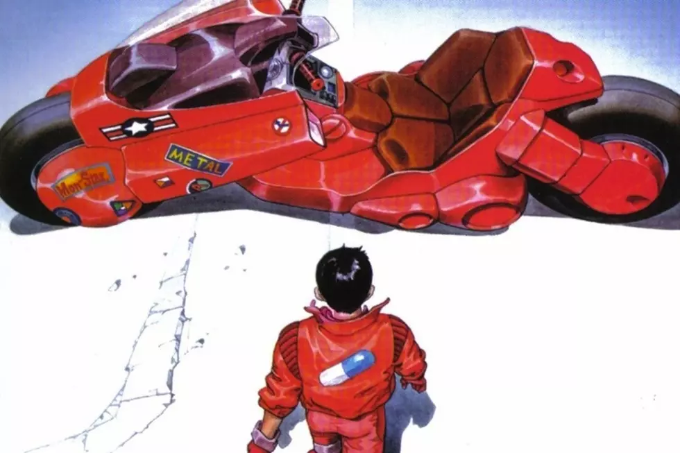
Katsuhiro Otomo and the Perfect Panels of ‘Akira’

Like Moebius, Katsuhiro Otomo is a creator's creator. He's perhaps best known for the animated version of Akira, his beautiful feature film about the perils of power, but before it was a movie Akira was a manga, and Otomo's work on it is astounding. Akira is incredibly detailed, sprawling, funny, violent, and wonderful. It's everything the movie was meant to be, and considering how well the movie has aged, that's saying a lot. The cartoonist Zack Soto has chosen to follow in the footsteps of quenched consciousness by creating Otomblr, a shrine dedicated to Otomo's art. That means that now's as good a time as any to tell you what makes Otomo so great.(A brief-ish aside before we begin: there are two versions of Akira out there. For a shining period in the late '80s and early '90s, Marvel published an English translation of Akira via their Epic imprint, which featured colors by Steve Oliff and a translation by Jo Duffy. Years later, Dark Horse published Akira in black and white with a new translation. The current versions, the ones you will most likely find, are the black and white volumes published by Kodansha, which utilize the Dark Horse translation. The scene spread throughout this post is from Akira Book 2, which can be had for less than twenty dollars online.)
Panels are how information is delivered in a comic. So-called iconic poses, conversations, fight scenes, and everything else in comics are depicted as a single frame, one moment, from that scene. The story (usually) takes place within the panels, so panels serve as both a focus ("This is the most important part of this scene") and a suggestion ("The previous panel flows into this one, and you have to fill in the blanks in between.").
Panel-to-panel progression is closely related to storytelling. Skilled progression will create the story in your head, and turn still pictures into animation. Picking that perfect moment for a panel may well be the most important job a cartoonist has. A talented artist who draws the action half a second too late will create a book full of awkward poses and ugly action. A talented artist who nails that moment, though, can make something fantastic.
Katsuhiro Otomo's good at a lot of things -- pacing, plotting, destruction, terror -- but today? Today, he's good at storytelling. Otomo is a master of the perfect panel. There are five pages, a small portion of a larger scene, in this post. Let's dig into each of them in order.

Tetsuo, seated in the first panel, notices Kei, who just entered the room and is backlit by the light in the hallway. She's noticeably silent, and catches Tetsuo by surprise as she begins to do something. The storytelling perfection comes in how panels two through four are laid out.
Panel sizes suggest how much attention we're supposed to give each moment. We're meant to drink in the first panel. It's huge, maybe a hair under half a page, and filled with nonessential details. There's a book that has clearly just been dropped on the ground, a few file folders, and a monitor. Panel two is smaller, but still significant, as it gets an entire row to itself. We're supposed to be looking at Kei. This could be due to her sudden appearance, the hard look on her face, or even the light wind blowing her hair.
In contrast, panel three is tiny. It's a reaction panel. Tetsuo has stopped mocking her and paused. He's paying attention. The question mark in the word balloon and tiny size suggest that this is a burst. There's no conscious thought, just a wrinkled eyebrow and narrowed focus. Then, when we flick back to Kei, we see that she's hunkered down in a panel that's twice as big as the one next to it.
Functionally, the camera serves as our eyes, and panels two through four work are the comic book equivalent of a sudden shift in focus. We're looking at Kei, and then Tetsuo's grunt of attention shifts us to him, and the look on his face forces our attention to snap back to the right. Not only that--look at panels two and four, and use the latch on the door as your frame of reference. They form one large view into this room. Kei has moved vertically, not horizontally, and the presence of the latch proves that to be true. She dropped down, a movement which mirrors the way our eyes are moving while we read the page.

This page takes slightly more work to decipher than the last, particularly the gun in panel 1. It's teleporting in, hence the shine and sound effect. The top three panels read left to right, and then top to bottom, making the gun panel one, Kei firing panel two, and Tetsuo's exclamation of surprise panel three.
What's crucial on this page are the speed lines and they way Otomo uses them to direct your eye. Panel one is absolutely still. It's a pregnant pause before the action, that moment right before potential energy turns to kinetic. In panel two, however, speed lines are rushing away from Kei; she's the source of the action, of the motion, and the speed lines push us down and to the left, directly towards panel three. Three, obviously, features speed lines going headlong at Tetsuo's face as his eyes widen in surprise.
Panel four's speed lines show where Tetsuo was hit, rather than his current location, and the table, the chair, and Tetsuo are all flying away it. Panel five shows Kei in motion, as the horizontal speed lines suggest, aided by the lingering smoke from her gun.
Panel six switches us to Kei's point of view, lunging left as Tetsuo falls to his right, and we catch Tetsuo as he's realizing how much trouble he's in. Our eyes naturally go left to right while reading panel five, and then from right to left in panel six, mirroring our perception of Kei's movement and Kei's perception of Tetsuo's.
If they were moving in another direction, this wouldn't work so smoothly. In fact, it would feel disjointed and unnatural. Kei and Tetsuo's motions follow both the natural motion of our eyes (which read the page in a Z, meaning left to right and then top to bottom), which results in less work for our brains to do. It makes sense, even if we don't consciously realize why.
And in panel seven, Kei's two shots hit near simultaneously, and suddenly the speed lines stop, as we see one specific moment in time from the same point of view as panel six. This big panel is a breather, but still remains true to the Z that your eyes follow, though slower this time.

Otomo follows the same rules on this page, and panels one through three provide a further respite from the intensity. Tetsuo's stunned posture and sudden resolve are the equivalent of a deep breath, someone steeling themselves for what comes next. Kei has paused, too, as smoke rises off her spent handgun. Nothing lasts forever, though, and panel four kicks off the action again.
The crux here is the transition between panels five and six. Like panel seven on the previous page, panel six features a halt to the action, though for different reasons. 2.7 was a moment in time given special attention. In 3.6, the cessation of speed lines is meant to show that Kei stopped the debris instantly. The panel depicts a stillness.
Otomo has an interesting and subtle rule that he's followed thus far, and will follow until the end of this specific scene. Tetsuo is always positioned to our left, while Kei is on our right. Even panel 1.1, where Tetsuo is more or less centered, is weighted to our left. If you backtrack to panels 2.5 and 2.6, this remains true.
Maintaining those positions adds to the subtle impact of the scene. By keeping the two characters separated by a gulf of space, our eyes are forced to go back and forth like a tennis match. These two have an antagonistic relationship, and by portraying them this way, it comes across as a head-to-head battle in every possible way.
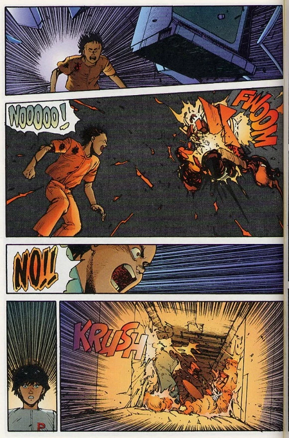
The debris changes direction and rockets back at Tetsuo, who reacts in a panic. The speed lines behave as usual, but there are a couple things worth pointing out. The sheer size of the monitor in the panel one gives it more significance than the other debris. it's clear that it's coming directly for Tetsuo's head. The explosion in panel two begins on the left and exits on the right, as the sound effect suggests. Tetsuo is pushing out, and stopping the debris in its tracks yet again.
Panels four and five are notable, too. Kei is small in panel four, maybe half as tall as the panel, and the speed lines dominate the panel. The lines stop just behind her head, which means that the focal point is right behind her skull--so that's not necessarily the best place to be standing. Panel five is our first look outside of the room since the brief confrontation began three pages ago, and it's utter chaos. The debris hits the far wall, and the wall to the room is buckling under the unseen pressure.

Another reason to keep Kei and Tetsuo on opposing sides has to do with space. They were in a small room, and while the camera in comics is capable of anything, a steady point of view can get across a lot. The constant left-right switches and close-in shots made the previous pages fairly claustrophobic. The only things that existed, that mattered, in that room was Tetsuo and Kei. The panels confined us to their confrontation. Now that we're out of the room, anything goes.
Panel one, which features Kei lightly touching down after somehow dodging Tetsuo's blast, is large. There's wreckage in the hallway, and the purple tone suggests that the lights have failed. We're completely free of the hard left/right rule, too, which leaves Otomo free to experiment with the pacing more.
Look at panels three through six. Tetsuo flinging the blood off his arm gets three entire panels and some fairly serious sound effects. "Kpow" is usually reserved for gunshots or punches, not liquid hitting concrete. It heightens the strength of the scene and shows us exactly how serious things have gotten. That fling of his arm, while we only see the beginning and end of it, is a big deal. Finally, panel eight shows Tetsuo being large and in charge. He's confident, he dominates the pane as we sit at his feet.
In Search Of The Perfect Panel
None of what I've discussed could be described as flashy. There are no Photoshop tricks, after-images, or anything like that. There's not even a particularly obsessive attention to detail. This is just straight up comics, the kind of story that uses an incredibly nuanced understanding of what makes comics go to give a fight scene some serious punch.
Otomo takes the basics of comics art and executes them so well that he elevates a scene that could've been seen in any comic into something divine. Akira in particular is full of this sort of thing, and if you haven't read it, you should seek it out. In the meantime, visit Otomblr for a close look at his artwork over the course of his career, from pinups to panels to full pages. You're guaranteed to find something amazing.
More From ComicsAlliance