
ComicsAlliance Design Critique: The New DC Comics Logo

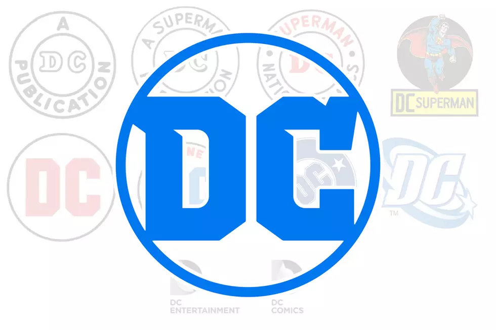
Last Friday, news leaked that DC Comics had filed paperwork to register a new trademark. As with any news regarding change in comics, the tiny, black and white logo that accompanied said paperwork was greeted with a mixture of surprise and blind fanboy indignation. (Mostly the latter, as was the case throughout history) As the news continues to develop, it looks like the DC "spin" logo, launched in 2005, is on its way out to make room for this new logo.
As a professional graphic designer, part of my job is to pick things apart in my work and the work of others, to try to figure out what works, what doesn't and what's just downright weird about whatever piece is in front of me. Critiques are a part of the creative process. So let's take a look at this new DC logo and see how it stands up.In the corporate world, updating a logo every five years or so is not at all uncommon. Sometimes, the refreshes are a simple color palette change, updating typography or streamlining an existing mark. Apple has had, more or less, the same logo since 1977. Starbucks has taken their mermaid mark and improved on it over decades. Occasionally, when a company wants to be seen in a completely different light or when their focus shifts from a specific sector to a more broad brand focus, they will undergo a complete identity revamp. Some of these, like the recent Belkin logo update, are a great success, updating the brand and moving it in a new direction. Others, like the recent Gap attempt at a rebrand are, well, unmitigated disasters.

In comics, the closest parallel to a logo refresh would be a "soft reboot" (Image's Prophet and Glory titles, Marvel's Venom and Daredevil, arguably much of DC's New 52 relaunch) where small tweaks are put in place to give a title more longevity, whereas a logo revamp resembles a "total reboot." (Hawkman, Hawkman, Marvel's abandoned newuniversal project, and, finally, Hawkman.) It appears DC has opted for a hard reboot here.
The first thing that strikes me is how clean this logo is. I realize that that's partly because we're seeing here in black and white, but it's definitely more fresh and modern-feeling than the "Spin Logo" is in 2012.* I also appreciate that it could animate interestingly before a movie and will look pretty fetching on an e-reader/iDevice homescreen, instantly recognizable in a grid of apps logos. It definitely seems designed with that usage in mind, which is a bold move as comics move more and more into the digital realm.
I'm not convinced that the "page turning" implication in the "D" is working as well as it could, as it reads more like a peeling sticker. And the opening in the "C" is too small of a channel to really work well, but I definitely like the suggestion of uncovering, of discovery. I wonder if it still reads as a "D" with the corner pointed just a little, as that would definitely sell the "turning page" idea more than the completely-rounded corner does. But it's a decent enough concept that stumbles a little in execution.
(*Personal aside: I never warmed up to the "Spin" logo. Yeah, I get that it's sort of a millennial take on the "Bullet" logo created by design legend Milton Glaser, but man, it looks so very of its time, doesn't it? Pointy and gradienty and shooshy and overly-fussed-with. It looks like a sports team logo or a toothpaste logo or a logo for kids shoes or something. But man, all these nostalgics pining for the return of "the Bullet": Give it up. Things end. There will never be another season of Firefly. There will never be a Veronica Mars movie. That Princess Leia in her Hoth snowsuit action figure that you lost in the backyard of the house you lived in in elementary school? She is gone. The Bullet will never grace the covers of a DC comic ever again and that is okay. Sic transit gloria.)
I've read some criticism that the logo doesn't "say" comics. And no, it doesn't carry with it any of the classic comics iconography, but I'm not sure it needs to. Take a look at how it stands up compared to some other publisher's marks:

Not bad, right? In fact, I'd go so far as to say that it's one of the more progressive-looking logos on that grid.
THE BAD
The first thing that really does not work for me is the type. Yes, it's Hoefler & Frere-Jones' Gotham, which, hardy-har-har-Batman, but it's just kind of there. It's a handsome enough font, (though it's getting used on everything lately) and it works okay when it's used in the comics logo, but even then, it feels like an afterthought tucked under there. And once you get to the DC Entertainment version of the logo:
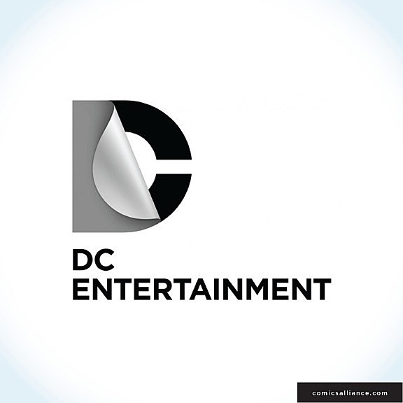
Oh brother, that's gonna falling over on itself, isn't it? Maybe it'll look better animated?
Also, as stated everywhere, it's a fairly antiseptic logo. It doesn't scream "comics," but then again, neither do any of the other comics publisher's logos in the sector. Most comics iconography (Ben-Day dots, Kirby-esque figures) are too steeped in nostalgia to mean anything to the vast majority of people. Personally, I eat that stuff up, but take a kid who loves Ben 10 and playing Arkham City, and it means nothing to them. It's 2012. Comics are a totally different beast nowadays.
And finally, regarding the "it's not 'comics' enough" argument: Comics are one thing on the super-long list of possible uses on the trademark application, along with "clothing, footwear, headgear," "snack foods made from meat" and "preparations for destroying vermin." DC Comics/Entertainment does not just produce comics. They're a intellectual property and licensing company in addition to having a publishing wing. They need a logo that will work across a lot of different products.
Finally, it's a corporate logo that had to get approved by a fairly large group of people. These conditions do not make for the most exciting, boundary-pushing work.
Things the logo also sort of looks like: A ripped condom being removed from a wrapper. A large sticker being pulled off of a toilet seat cover.
So, in conclusion, it's not The Best Logo Ever. It's also not The Worst Thing Ever. For all its faults, the new DC corporate logo is clean, modern and will work nicely in digital applications as well as across a wide variety of products. For what it is, it works. And in design, that's what matters.
Dylan Todd is a graphic designer currently employed at an advertising and design firm in Las Vegas. He's done design work for Adam WarRock, Let's Be Friends Again, and the Las Vegas Valley Comic Book Festival. He is currently the art director for the indie sensation Sacrifice from Sam Humphries and Dalton Rose. He has a bunch of Tumblrs, including Guttersniper, which focuses on the intersection of comics and design. He is pretty confident that he has earned his beard.
More From ComicsAlliance





![SUPERMAG: Jim Rugg’s Ambitious and Eclectic Comics, Illustration and Design Magazine [Interview]](http://townsquare.media/site/622/files/2013/04/untitled-4.jpg?w=980&q=75)
