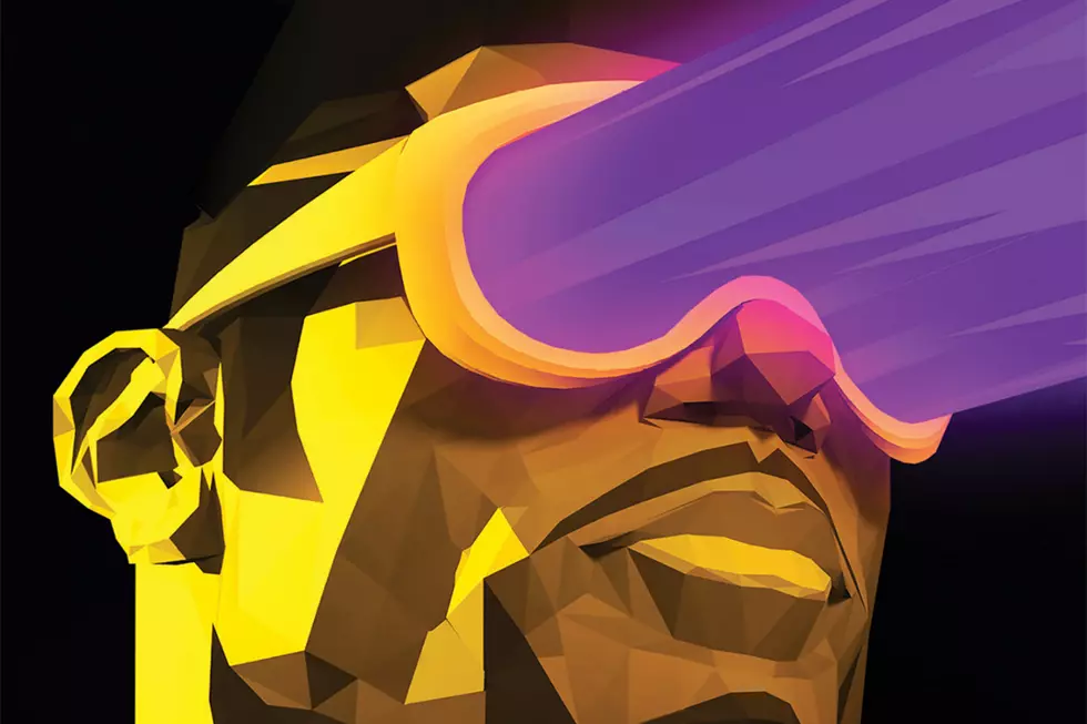
Duet On ‘Solo’, Part Ten: Damion Scott

Published between 2004 and 2006, Solo was a DC Comics anthology series with an innovative twist: each issue was created from the ground up by a single cartoonist and collaborators of his own choosing. Edited by DC's head art director Mark Chiarello (Wednesday Comics, DC: The New Frontier), the series offered artists a platform to control their visions completely in the form of original stories, unfettered access to DC's library of characters, and without regard to continuity or other publishing concerns that affect the creation of a typical DC superhero book. Although Solo spotlighted the work of such talented and popular creators as Darwyn Cooke, Tim Sale, Paul Pope and Michael Allred, the series was cancelled after just 12 issues.
Even in a time when the superhero comics were experimenting wildly with structure and style, Solo stood apart and remains one of the best and most interesting mainstream series to emerge from the early years of this century. In this installment of Duet on Solo, writers Sean Witzke and Matt Seneca take an extremely close look at the tenth issue of Solo, created by Damion Scott.

Sean Witzke: I think Daimon Scott is probably the most radical artist to work on the Solo series. Even Teddy Kristiansen and Brendan McCarthy have very well-respected entries in the DC Comics catalogue, though they are on the fringes. Scott's doing wild-style graffiti pages for the most part here, and his DC history is in a wildly different style (which he returns to in this issue) for some Batman-spinoff books.
Matt Seneca: Interestingly enough, though, Scott is the only Solo artist to have had a long, sustained run on a mainline DC ongoing series -- 37 issues on Batgirl in the late '90s and early 2000s. In those comics, and on the Spectacular Spider-Man work he did for Marvel after them, he manages to bring his more boldly graphic approach in line with the house superhero styles just enough so that it doesn't jar too badly. In Solo, it's all about free rein, the dominance of powerful imagery over comics conventionalities or even narrative cohesion. The comic definitely does what its creator wants it to do, but it makes for a pretty befuddling read as a result. This is by far the strangest issue of Solo.
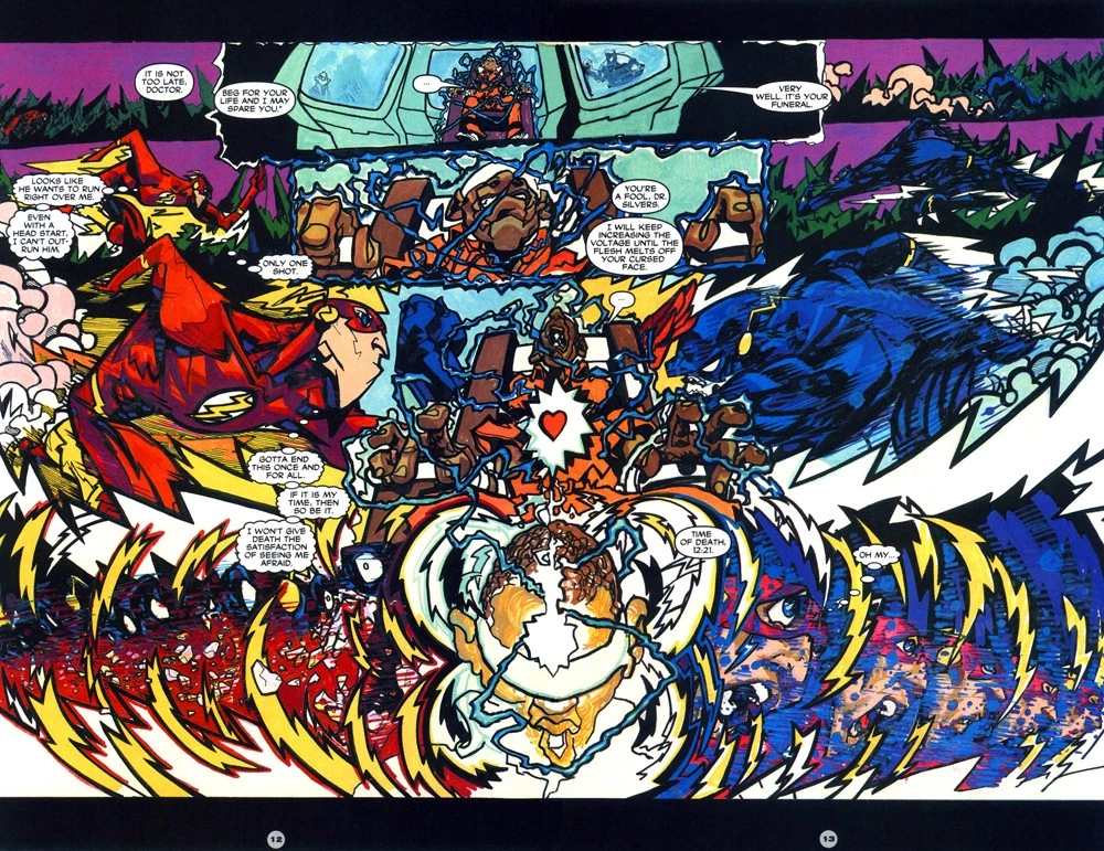
SW: It is one of the most endearing as well. Like Corey Lewis' love letter to comics in Sharknife, this issue begins with Scott talking about how much he loves graffiti and hip-hop. I don't think that the issue ever matches the utter blast of unchecked wild-style Flash story. While the actual story makes little sense, the full-bore approach sets up a kind of comic that the rest of the issue just isn't concerned with topping. But the way the layouts bend in that Flash story truly make it a comic worth seeking out and admiring, I think.
MS: Yeah, it's got a near-total aesthetic purity that's really admirable -- of course the context of corporate comics makes it even more so, but across the board it's rare to find a cartoonist so sure of what he or she is doing and able to pull it off with such aplomb. I say "near" total purity because of the story's computer lettering, which might be a necessary concession to graphic clarity, but it looks pretty weird on top of Scott's marker-colored, hyperkinetic scrawling.
SW: It would have been fantastic to see this exact same comic but with his own lettering and dialogue. He's a graffiti writer, why would you slap that guy with lettering? Paul Pope said that with his Marvel/DC work, they need to be able to publish it in another language at the drop of a hat, hence the traditional lettering, but it's just stupid to do that to a guy like Scott who draws letters as an inherent part of his style. In that first story, even the static panels of people sitting and talking have this truly singular approach.
SW: Flash stories in Solo are kind of like Batman stories, they end up taking on connotations, but the guys who do Flash stories really seem to want to push the design aspect of their storytelling.
MS: I'd say part of that's the influence of Flash co-creator Carmine Infantino -- really an unsung hero of design-oriented formalism in comics -- and another part is just that the idea of a protagonist who moves faster than the human eye can see almost demands a different approach than comics typically take. Scott's definitely making a huge break not just with industry standards of draftsmanship, but also storytelling -- multiple drawings of the title characters speed across huge single panels, much of the action takes place deep in the backgrounds, with centimeter-tall figures clashing in tiny explosions, and the narrative itself is either defiant of the usual "wrap everything up neatly" approach or unable to adhere to it. Either way, it's a bewildering piece of work that nonetheless has a really high reread quotient thanks to the great drawings on every page.
SW: With the Flash, the Death Flash/Black Racer figure, and the army of Harryhausen skeletons, this is the most visually compelling of Scott's Solo stories. The later portions are more conventional narratives for '00s-era superhero comics. With respect to narrative complexity, this story is really just cross-cutting between the Flash and the "real life" section of the doctor being executed, but in the context of the issue overall -- which is completely straightforward narratively, almost to a fan-script level -- Scott kind of spoils the reader by leading with his strongest piece.

MS: I actually like the next piece, "Superman Is," the best, because it's the most cohesive thing in the comic, the one that feels most like a success at everything it's trying to be. A large part of that is because it's not trying to be a story, or even a comic, really. Instead, it's six pin-ups and a two-page spread comic that all star the Man of Steel as an inspirational icon rather than a character. It's Superman as a graffiti tag, basically, one that codes for basic awesomeness and being-a-good-person-ness, in a series of drawings that feature some of Scott's strongest compositions and color work. The graphics here are a lot simpler than in the Flash story, but that's a strength: it gives them a much greater readability and allows the eye to really take in the qualities of Scott's mark-making without being assaulted by metric tons of it all at once.
SW: The PEACE/EQUALITY two page spread/mural is probably my favorite piece in the book that doesn't feature any skeletons. It is the number one thing in here I think could work as a wall piece. I think the other ones, I feel like they are a little too simplified for me when you see just how extreme Scott can get with the stylization in this story (and to lesser extent in the Tim Drake/Cassandra Cain story later). It feels less intense to me, and the "Superman as symbol" thing is something I'm pretty sick of seeing done just with keywords these days. That might be the weird Superman evangelist fringe thing developing in comics bloggers who really like All-Star Superman, though.
MS: I think the best Superman drawing in the comic isn't in this story at all, but on the back cover in the form of a black and white sketch study for the front cover. It's really intense, and you can see how well Scott understands light and shade. His more conventional art chops are on display without losing the freehand, scrawled quality of the rest of his art.
SW: The Tim Drake Robin sketch (I guess it's an unused cover?) following the Superman portfolio section is also really fantastic and shows how much Scott understands how to fully explicate characters in single images and still give the drawing a freehand quality.

SW: What did you think of the Brian Stelfreeze-assisted story? I always love to see Stelfreeze show up in a comic but as an inker you sometimes -- like Bill Sienkiewicz -- just wish he had drawn the thing himself, or is that just me? Scott and Stelfreeze work well together but Scott's old style just plain isn't as fun to look at as his new style.
MS: I think it's interesting as a kind of "exercise comic." When you think about cool hypothetical penciler/inker combinations, Scott/Stelfreeze is a pretty compelling one, and I think it's also one that works well in practice. But yeah, it does sort of pale in comparison with the rest of the issue, especially given the really lightweight story. Still, it's neat to see Stelfreeze smooth out all the abruptness and rough edges in Scott's style. It's a really great inking job from a basic craft perspective. I'm also a huge fan of Stelfreeze's colors on pretty much anything so, you know, nice to see them show up here. Apparently Stelfreeze, along with Walt Simonson, was one of the guys whose issue of Solo was completed and ready to go when the series got canned, so it's nice he got at least a little walk-on part in the book as published.
SW: The latter half of this comic consists of two stories of the least compelling era of post-Brubaker/Rucka/Dixon Batman comics, and I think the third generation sidekick cast of Spoiler/Robin, Tim Drake, and Cassandra Cain are hard characters for almost anyone to make interesting. I feel like Scott's handicapping himself -- but then again those are the characters he spent the most time with.

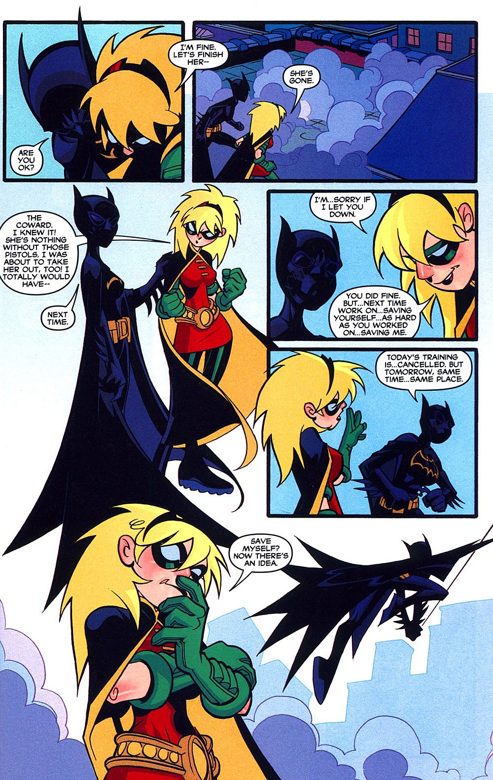
MS: I know a few hardcore Tim Drake/Batman: The Animated Series fans who'd press you on the point of that character's appeal, but whatever. I do think of Scott as kind of the quintessential artist for -- maybe not the Batman character during that era per se, but all that weird supporting cast that didn't quite fit. The guys doing Robin around that time, Rick Mays and Freddie Williams and them, seemed to be taking cues from Scott's work on the character and mixing in a little more DC house style. Scott basically owned that version of Batgirl and he did a lot of covers -- he really put his stamp on a whole little corner of the DCU, which at least on paper is quite impressive. I agree that the second half of this comic lags because of the material it's working with, but it wouldn't feel like a full representation of Scott as an artist without those guys running around Gotham City for a few pages.
SW: I think we'd be remiss in not noting between these stories/pieces that Scott is writing directly to the reader -- in his own hand -- explanations and motivations behind these stories. It's probably the most charming aspect of the issue; he wanted to draw in the old style for Robin fans and he's excited to collaborate with Stelfreeze, and he did the final story just because he thought the characters interacted well when he was working on them. It's something you kind of wish that more Solo contributors had interest in doing.
MS: Actually, this is the only issue of Solo to feature only stories about DC Comics characters, isn't it? I wonder if that was the price Scott had to pay for getting such unconventional material through his editors, or if he really just prefers working on that stuff. He certainly spent the greatest balance of his career working with superheroes, of all the Solo artists. In that way, from a purely script vantage point, this is actually the "safest" issue of Solo, which is bizarre to think about considering people hated this comic when it came out. I remember some reviews so vehement they walked right up to the racism line, and I'm sure Dan DiDio [then DC Comics' Executive Editor] and whoever else had a "what the hell are we publishing?" moment with it, too, when they finally saw the thing.
SW: Which is odd because now this is one that people still think of as an underrated classic, probably because it was so reviled. And comics fans -- especially the audience that Solo catered to, people who would buy Solo books from pros who came up in the '80s -- probably still hate graffiti. Which, yeah, this is comics, of course they do. Comics people hate everything that comes from love of drawing, right? Ugh. Brandon Graham has this great point that if another art form respects comics, comics will never take it seriously, starting with graffiti. All you have to do is look at graffiti drawn in any mainstream comic background.

MS: Yep. It's interesting, this thing was almost destined from the outset to become a cult classic. A superhero comic whose commitment to marks made on the page is the most fundamental thing about it, more so than telling competent genre stories or working with characters or "creating IP" (shudder) -- this thing is basically the closest corporate comics have come to producing a legitimate art comic in the past decade. And what's especially worth noting is that it doesn't come out of the Gary Panter-influenced art school milieu or anything, it just kind of ends up closer to that stuff than anything else because of how obvious it is that its artist really loves drawing pictures.
SW: It comes from a non-comics art tradition. I think it's a mistake to lump it with art school comics because that really doesn't do justice to the tradition it springs out of. They may both just share the intent and love of doing it, but this is an entirely different animal.
MS: Not the best issue of Solo, but the purest, in both its commitment to superheroes and artistic freedom. One of the ones worth remembering, for sure.
SW: Most courageous on the publishing front, I think.
MS: Definitely. Next stop: cancellation!

More From ComicsAlliance
![A New Team Bands Together In ‘Black Panther & The Crew’ #1 By Coates, Harvey, And Guice [Preview]](http://townsquare.media/site/622/files/2017/03/Black_Panther_The_Crew_1_Featured.jpg?w=980&q=75)

![Lion Forge Comics Announces New Superhero Universe And Young Reader Imprint [NYCC 2016]](http://townsquare.media/site/622/files/2016/10/Lion-Forge-Feat.jpg?w=980&q=75)
![Solo Is Not Necessarily The Best There Is At What He Does In New ‘Solo’ Series [Preview]](http://townsquare.media/site/622/files/2016/09/Solo_1_Featured.jpg?w=980&q=75)