Greg Pak’s Creator Commentary and Exclusive Extras for ‘Vision Machine’

This week, Greg Pak (Incredible Hulk) and R.B. Silva (Jimmy Olsen) finish out their creator-owned series Vision Machine, but as we've mentioned before, you won't find it on the shelves at your local comic book store, only online. All three issues of Vision Machine -- and a collected edition -- were released digitally on VisionMachine.net and on comiXology, which means that if you haven't already, you can download and read the entire comic for free. It was also released under a creative commons license, meaning that readers are free to share, distribute, and remix the comic themselves, all for free and all legally.
Set in the near future, Vision Machine tells the story of a new piece of technology that allows its users to not only create and share content just by looking through the lenses of a pair of high-tech glasses, but to edit and change what people see just by thinking about it. I spoke to Pak about that aspect of the book back in October, but today, with the end of the series and a trip to the Slamdance Film Festival in Vision Machine's near future, ComicsAlliance went back to him for an exclusive look at the process of creating the story, the last-minute changes that were made, and how it almost involved an alien invasion!Greg Pak: I'd done creator-owned comics work prior to "Vision Machine" -- the "Citizen" story with Bernard Chang for the Secret Identities anthology and a couple of "Rio Chino" tales for the "Outlaw Territory" anthologies. But this was the longest and most challenging creator-owned piece I'd tackled. So every step of the way, I was learning a huge amount.

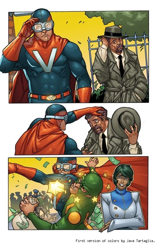
GP: One of the things I'd had trouble with as a comics creator was developing the language and ability to talk coherently about color choices with colorists. I'd spent a lot of time watching my editors talking to colorists, so I'd learned a huge amount. But I had a ton to learn, and poor Java [Tartaglia] was the patient recipient of some of my early fumblings. So here are a few pages that show how the first page of the book came together. As I recall, I made several dumb mistakes that wasted Java's time. First, I forgot to provide him with the character designs and concept art that Takeshi Miyazawa had created.

GP: So Java didn't know what colors the characters were supposed to be wearing -- he didn't know there was already something of a plan in place for that. So in his first pass on the page, he just colored it in way that looked cool And it does look cool! But the Visionary and Liz are off model, due to no fault of Java's.
GP: So in the second pass, we've gotten Java the right color reference. And I've given him the added injunction to create a kind of old comic book page feel for the panels with the Visionary, with Liz colored "normally" in the bottom right.
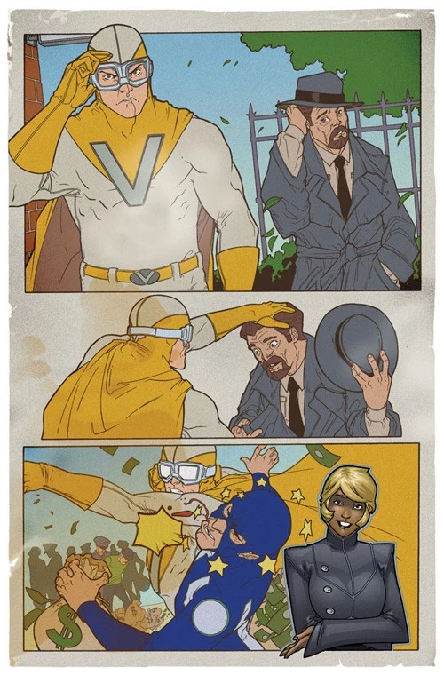
GP: But I realized that Liz needed even more separation from the old school pages to make the page really pop. So I asked Java to try a sepia wash over the Visionary material. Which he did, and which looks awesome.

GP: And then letterer Charles Pritchett created that awesome VISIONARY logo with the purposefully shifted colors to really convey that old school printing feel and the page came together.

CA: I noticed that the original version had a hand-drawn logo from Silva for that panel.
GP: Yeah, RB loved the way we were using text in the story and I think he'd have loved to have hand drawn all those kinds of elements. But we left most of that to the letterer, just because it would give us more flexibility later on down the line, just in case the crazy writer decided to tweak something. But it was great to have a penciller who was so aware of that kind of thing. He drew the pages knowing where the text would fit in, which makes everything work so nicely.
It's interesting -- this was actually a pretty tough page to start everyone off on, because it's so stylized and demanding in terms of conception and effects. But jumping into the deep end like that can be a fun way to galvanize everyone. Successfully tackling a big challenge right off the bat probably gave us all a nice boost.
CA: You also said there were some last-minute changes to the opening sequence.
GP: If you compare the original art for the opening sequence to the opening sequence in the finished comic, you can see we added a page and tweaked the art here and there to introduce our characters better.

CA: It looks like you wanted to spend a little more time with Liz Evers.
GP: Yes, and to get a better introduction of our trio of film grad heroes. RB did glorious work throughout. But as we were nearing completion of issue #1, I realized that my script had crammed things just a bit too tight in the opening pages.
In one of her books, Maxine Hong Kingston talks about the idea that if you stare at anyone's face in closeup long enough on the silver screen, you'll eventually fall in love. I think the principle can apply to comics as well. Giving the readers a moment to really absorb a character is pretty key. Particularly when you've got three talky, wisecracking characters as your leads. I realized after reading and re-reading the intro that I never gave readers the chance to gaze into our character's faces and kind of get to know them. We were just off to the races with hijinks and jokes, mostly in medium shot.
Again, all my fault. The original script just didn't give enough room. So I made the big crazy decision to add a page and have RB redraw some panels

CA: In revising these pages, you also get the chance to establish them visually as well, in a way that really leads to what happens with them. In the page that was added in, Buddy and Dave are both looking up to what's going on with the announcement, while Jane's actually down on the ground getting directly involved with what they're shooting. Was that your decision as far as scripting it, or did you just tell RB to expand the original panels, and that's what you ended up with?
GP: Yeah, I realized I needed to give them a moment to just live in their bodies and express their character a bit more. Giving Jane that panel was particularly important to me -- she's the dreamer, the true visionary of the group. Before, we're just hearing her talk about her work without seeing her doing anything. Now she's actually involved with her work, checking out the play of light on the water. Putting her in action makes her more compelling and believable. And it makes us take her more seriously, I think.
And I felt I needed that kind of hero shot of Buddy because he's such a joker throughout the first part of the book that I thought we needed a moment where he's not making faces.
CA: I noticed that the re-drawn panels on the next page show a far more serious version of Buddy than the originals.

 GP: Heh. You and I were working on the same thought at the same time. EXACTLY! As the story progresses, it develops a romantic subplot that actually becomes very important. My hope was that giving both Buddy and Jane these less jokey intros would make that romantic subplot work better. Just because we were getting to know them a bit better as human beings from the beginning.
Of course, the success of all of this is due to RB's absolutely gorgeous work here.

 GP: Here's another film reference for ya. I remember having discussions about which part of a film is best to shoot first. One of the adages that was kicking around was that it's best to shoot the middle first, then the end, and then the beginning. That way your actors are able to learn about their characters while you shoot the middle. So they can nail the ending. And then they have all of the knowledge and experience to go back and set up the characters in the beginning with the subtlety that can really make things sing. We ended up with a fun chance to do that in comics.
The penciller is really the actor in comics. He or she is delivering those performances, making the characters come alive. RB did a fantastic job right out of the gate. But he was also getting better and better with every page he turned in. So drawing this expanded intro so late in the game let him bring all that time he'd been inhabiting these characters to bear. And he delivered simply gorgeous images here, with just the right tone.
Thinking back on it, I'm realizing he drew these images after he'd drawn Buddy's breakdown and pieta moment with Jane in issue #2. So he knew where these characters were going. I've never talked about this with him, but I'm guessing that gave him a bit more to work with in terms of emotion and character in drawing them in the new opening.
 CA: How far along in the process was it when you redid these pages?
GP: I don't have the exact dates in front of me, but I'm pretty sure this was September 2010, the month before we debuted the first issue at the New York Comicon. It was a big scramble to get the book done in time, but the whole team came together and made it happen. Big thumbs up to Shon Bury of Space Goat Productions. Shon manages almost all the artists who worked on the book and has helped coordinate everything along the way. Java's colors also make these opening pages sing.
CA: If this sequence was expanded, was there anything else that you had to cut out to make room?
GP: Nope! The nice thing about releasing the individual issues digitally was that we didn't have a page count restriction due to the number of pages we could print in a physical comic book. I knew that it might bite us later on down the line in terms of schedule for the subsequent issues, but I also felt we had to nail this opening.
Oh, about Java's colors again: Looking at the pages, I'm realizing that the new opening gave Java a little more room to breathe and work his magic. He's doing the same kinds of things he'd been doing before with the colors, with slightly blurred and lightened backgrounds. But the new panels let those effects really come through the way they wanted to. They really convey the slightly dreamy feel of the gauzy neon and light and water in Times Square that's just a beautiful background for introing the characters.
CA: Are there any other sequences from the series that really stick out for you? I was pretty fond of Jane cyber-murdering buddy over and over again in the third issue. It's such a serious thing for their relationship and as an illustration of the power she's gotten, but it's played with this Chuck Jones aesthetic that makes it pretty hilarious at the same time.

GP: Yeah, the cybermurdering was pretty fun. RB did some great little things on that page like putting a "J" on the car Jane's driving and a "B" on Buddy's letter jacket in the zombie panel. Java also took the hint, coloring the car with Jane's signature red and yellow.
CA: I imagine it was a pretty fun one to work on for everyone involved.
GP: I loved the way the whole team delivered the vignettes of -- Whoops. Sorry. SPOILER ALERT!
I loved the way the whole team delivered the vignettes of people around the country being affected by the President flipping the kill switch. The girl on the boat in particular worked nicely, I thought.

GP: I also love all the little moments with Buddy and Jane connecting or not connecting in the virtual world.

GP: RB and Java really brought out the excitement but also the kind of longing in those moments. Java's colors are particularly nice in the sequence in the desert in issue #3. He washes out the backgrounds in a way that feels totally natural but also a little eerie.
Oh, there was also one funny translation thing. In issue one, Dave's dad talks about illegal aliens coming into the US from Texas. Something literally got lost in translation and RB drew this awesome image of a space alien. Lizardy, with a long, whipping tail.
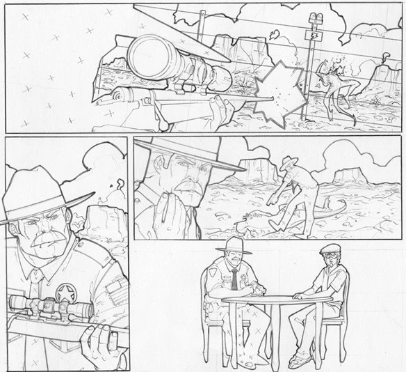
GP: I loved it. Just great RB art. And I've been known to add stuff to a story because the artist did something awesome and unexpected... but that might have been a bridge too far.
CA: Well, it is a science fiction story.
GP: Yeah! Gaiman put dinosaurs in 1602! Why not? Regrets, I've had a few.
As a serious answer: Looking back on it, one sequence that I really love is when Buddy starts to learn about the amazing potential and even monetary benefit that the iEye and its network can provide to users.
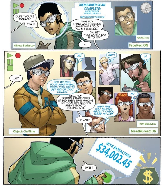
GP: I sort of love that bit because it was a way to imagine a system that actually works for everyone. And although things, of course, soon go horribly wrong in the story, I actually think we could create some semblance of that utopia in the real world.
CA: We talked about that before, as it being a sort of perfect dream world for creators. I imagine that's especially true for you, with your background in film.
GP: Yes. As an independent filmmaker, particularly if you're working in documentary, it can be an insanely time consuming and soul destroying task to track down all the licenses and permissions necessary to tell your story. How amazing would it be if the whole thing were streamlined and centralized and you could just buy affordable licenses for the copyrighted material you'd like to excerpt as quickly as you buy anything else online? And what if there were an universally accepted and seamlessly integrated system of micropayments that allowed folks to effortlessly pay and receive payments for the material they consume or distribute online?
These are not impossible dreams. Very smart people are working on these things right now. And as much as Vision Machine is a kind of cautionary tale, it's also an exercise in dreaming about an achievable and truly awesome digital future.
Vision Machine is available to download in its entirety right now through comiXology or in PDF format from VisionMachine.net, although if you'd like to make it into a different format, Pak tells me "you're more than welcome!" As for what's next for the book, Pak and Silva will be distributing printed trade paperbacks of the series at conventions and film festivals this year -- including an upcoming appearance on January 22nd at the Slamdance Film Festival Filmmaker Summit -- and just like the digital versions, they're going to be given out for free.
It's a pretty bold move, and one that once again ties into the book's themes of how freely distributed digital information is changing media. But more than that -- and more importantly -- it's also a very good comic.
More From ComicsAlliance
![Marvel’s Merry Mutants Undergo A RessurXion In ‘X-Men Prime’ #1 [Preview]](http://townsquare.media/site/622/files/2017/03/X-Men_0.png?w=980&q=75)


![DC Reveals Art And New Details For ‘Kamandi Challenge’ Tribute To Kirby [NYCC 2016]](http://townsquare.media/site/622/files/2016/10/Kamandi00.jpg?w=980&q=75)