Jack Kirby and Jim Steranko Homages Abound in Brubaker’s ‘Captain America’

Ed Brubaker's run on "Captain America" has been notable for its hard super-spy aethestic a la James Bond or Jason Bourne, but recently artist Butch Guice has started to change the tone of book with homages to a couple of classic Captain America artists. The murky spy style has been getting injections of Jim Steranko and Jack Kirby's lines, creating an interesting blend of pop-art, spy noir, and bombastic superheroics. Kirby tended to draw really dynamic, and sometimes improbable, action poses when drawing a fight scene. A right hook might make a man pop directly up into the air, while a dropkick may make someone spin in a circle. Faces tended to be rectangular, with lantern jaws for the men and prominent cheekbones for the women. They not necessarily expressive in a realistic way, but they were exciting and cartoony. Shouting characters had their mouths wide open and their eyes wild, while thoughtful ones had raised brows and perhaps a finger on their chin.
Everything, from emotion to action, was exaggerated to an almost ridiculous extent in Kirby's work, which was a huge part of it was so artistically and commercially successful. You can't look at Kirby's work and not be a little amazed and drawn in. These panels from "Captain America - Bicentennial Battles" are a good indicator of Kirby's style, and the panel of a surprised Cap is about as perfect a panel of shocked surprise you'll see in comics.


 In paying homage to Kirby, Guice has adopted several of his mannerisms. Characters are often off-balance when in action, as if they were running against or alongside a heavy wind. The square faces are straight out of Kirby's work, and so is the way Iron Hand Hauptmann's face gets an entire panel to itself to show his pain. His features are squished, off-center, ugly, and pretty clearly in pain, though that kind of face isn't one someone could ever actually hope to make in real life.
Guice also borrowed the outlandish type of action scene that Kirby was known for, which is a different way of saying that the movements don't actually make sense. When he's sprinting toward the foreground, Bucky's caught in mid-stride. He looks like he's about to fall over if he takes another step, but as far as action poses go, it's pretty great. Bucky's uppercut sends a villain tipping over sideways, head over heels, which isn't actually how an uppercut works. But, again--it looks exciting, doesn't it?


 Steranko, on the other hand, used the entire comics page as his canvas, where his panel layout, backgrounds, and even characters were all subordinate to storytelling. If he wanted to zoom in on an eyeball during a tense scene, he would. If he wanted to turn shadows into living, breathing works of art, he'd do that, too.
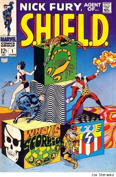
Rather than simply being a series of nine panels to a page, or one big splash page, Steranko would work in several different styles and layouts. Characters would be laid over the entire page, stretching across panels and into the bleed. Like Kirby, Steranko's characters tended to be rendered according to their actions first, and attention to realism was a low priority. Running characters were all legs, action poses were all arms, and gunfights were always dynamic and shot from several angles. If you take a look at these panels from "Nick Fury, Agent of SHIELD" and "Captain America," you see how Steranko's style works so well in comics.


 Traditional comics layouts tend to be very rigid and square, using column, rows, or both, to lead the eye across the page in a certain way. When you see a page with nine panels arranged in three rows and three columns, you know to go left to right and top to bottom. When you start putting panels in strange places, like laid on top of other panels or off on their own in a corner, you change how the page reads. When used properly, this can be massively effective in telling a story and increasing the impact of one specific moment.
And more than anything, Guice borrows his layout style from Steranko. When you see Bucky and Falcon leaping across the page in Guice's "Captain America," or Bucky doing gymnastics in front of an abstract background, those are are straight out of Steranko's work. We find even more nods to his work on a page where Falcon sees Bucky being thrown through a storefront; an image of Falcon overlaps the top two panels, looking down on the action both in the narrative and on the physical page. Further down, we see a cut-out of Falcon's eye set behind his flying figure, another trick to show his personal focus while simultaneously showing him in flight.


Kirby and Steranko didn't worry about whether it was realistic. If it made a comic exciting, they did it. Guice integrating those ideals into his "Captain America" work makes for an interesting blend of Brubaker's spy noir tone and classic comics art.
What do you think? Do Guice's homages break the mood or do they make the book even better?
More From ComicsAlliance


![Super7 ReAnimates Alien and Predator, Masters More of the Universe [Toy Fair 2017]](http://townsquare.media/site/622/files/2017/02/IMG_2000.jpg?w=980&q=75)

![The Wild, Tear-Filled World of Heartbreak: The Best Romance Comic Covers Ever [Love & Sex Week]](http://townsquare.media/site/622/files/2017/02/featured1.png?w=980&q=75)