Strip Panel Naked: Playing with Panel Gutters In ‘Moon Knight’ #7
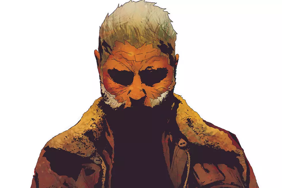
Jeff Lemire’s current run on Moon Knight has been interesting, and it’s clear that he’s going all out to tell a unique version of that character and story. But what’s immediately catches your attention across both arcs of this new run is the art --- first with Greg Smallwood and now Francesco Francavilla and James Stokoe. Among a lot of superhero/”big two” books, it’s been consistently inventive visually, and the current run is no different.
The thing I wanted to specifically talk about with the latest issue, Moon Knight #7, is the panel borders --- but bear with me. Both Stokoe and Francavilla are making really subtle modifications to how they outline their frames, and it all comes down to a way of controlling the reader’s pace and understanding.
The first technique is shifting the space between panel borders. Here on one of Stokoe’s pages you can see how he changes it a few times. Initially you have this thin sliver between panels one and two, which, as the borders are meant to do, separates the visuals. Here is one image, here is another.
When you hit panel three, it stacks right against the previous panel, which creates this impression of it cutting off the moment. Rather than having panel two sit as its own image, it acts like a quick cut to snap you into panel three, where Marc is getting shot at. By removing the gutter there, Stokoe increases the speed at which those actions happen after one another. The effect is doubled down with by the fact that panel two is really narrow, and Marc’s face is cut off by the edge of the panel, so before we have chance to fully see him turn, we’re getting shot at.
On an earlier page, we see Stokoe again playing with the frames. The spaceship is crashing, and as it lands, the panel dimensions shift, and the sides slant. We don’t see much of this in the previous pages --- everything is boxed with straight lines, no matter the panel size --- but here the sheer force of the impact has dislodged this panel from the page. You can see at the top edge, how it feels like it’s coming off the page, falling away from the other panels.
Stokoe brings both of those effects together in this page, where the villain attacks Marc. The panel edges start to slant, which pulls your eye down, and work to minimize that third panel and pull the action tighter. The gutters still exist, so these sit as three separate actions, but as panels two and tree fall directly onto panel four, that final impactful moment comes much quicker and hits much harder.
There’s a final example from Francavilla’s side, but it’s from the last page of the comic. Here’s a link to see the page and the example of what I’m talking about, but there is a spoiler!
We have, in essence, five panels on this page, though panels one and five both blend into each other, and two, three, and four sit on top of those two images. Those three overlaid panels also overlap. The structure of the page is completely lost, as gutters don’t really exist anymore, and the page becomes one whole image, rather than five separate ones. By doing this, Francavilla is creating a page of impact, of Marc looking at all these images and it become one full moment for him, just as in Stokoe’s work earlier. By removing the gutters themselves, the whole thing collides in this horrific cliffhanger.
These effects aren’t working alone, obviously, but in conjunction with panel layouts and the art inside the frames, working together to build a whole. Gutters are probably one of the least sexy things in comics, and something as a reader you’ll likely ignore or take for granted. That’s where artists can start to play around with your perceptions, though, and create different ways of pulling you through a page, and through a story.
In Strip Panel Naked, Hassan Otsmane-Elhaou looks at the various elements of the art of visual storytelling on the comics page.
More From ComicsAlliance


![All The Image Comics Announcements From Emerald City Comic Con [ECCC ’17]](http://townsquare.media/site/622/files/2017/03/Image-Featured.png?w=980&q=75)