Nathan Fairbairn

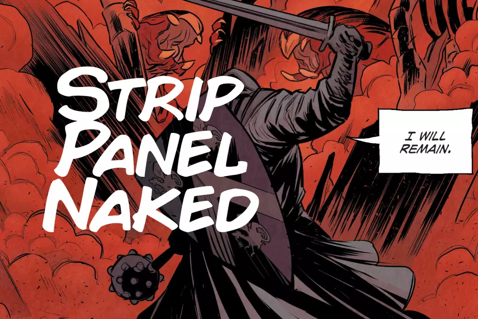
Strip Panel Naked: Center Focus In 'Lake of Fire'
I love Lake of Fire, by Matt Smith and Nathan Fairbairn. I mean, I really love it. It's an incredibly well told story from a formal point of view, and both Smith and Fairbairn bring a lot to that book. It wrapped up this past week, which means it's as good a time as any to take a look at one element it repeatedly uses throughout its final issue; center focus.
If You Love 'Star Trek', Try These Comics Next
This year we're celebrating fifty years of Star Trek, and as part of the celebrations there's not only a brand new film in cinemas now, but Bryan Fuller is also working on a new television series titled Star Trek: Discovery, due out next year. Star Trek's vision of the future can represent the very best of who we can be as a species, but often it shows how easily it is to become corrupt. We've selected five of the best independent sci-fi comics to check out after seeing Star Trek: Beyond in the cinema. Love that? Try this!
The Art of Color: Nathan Fairbairn and Lighting for Location
While there are many different qualities that a colorist brings to a comic book, one of the most beneficial and subtle effects is the effect a good colorist can have on the line art, shaping a good artist into a great artist and a great artist's work into something transcendent. Unless you're consistently comparing the black & white original pages to the finished color versions, it can occasionally be difficult to accurately assess what a colorist is really doing to change the work. Thankfully, Nathan Fairbairn is not only one of the best collaborators in the comics industry, he also dedicates time to showing the color theory and thinking that goes into his process on his Tumblr; an indispensible resource for anyone interested in learning more about colorists and comics coloring.
25 Greatest Animated Comic Book Covers
Comic covers are meant to get their message across in a single striking image, with the implication of movement provided only by the reader's imagination. We see the single frozen moment; our brain tells the story. Yet some talented digital artists have discovered that there's some fun to be had in animating these images and providing just a little more movement to the moment. We've collected some of our favorite examples of animated comic covers from the past few years, from an endlessly recursive Batman to a lolling Hobbes; from a struggling Spider-Man to a spinning Justice League.
Decoding #TheDress with Color Artist Nathan Fairbairn
The Dress. For a little while there, in between one story and the next, the dress was all anyone seemed to be talking about --- or more specifically, a picture of a dress. Some people swore that the dress in the picture was white and gold; others felt certain it was blue and black. Color, which we tend to think of as a matter of fact, is really a matter of perception --- but, "it all depends how you look at it" is an unsatisfying answer to a question that nearly tore the internet in two. Thankfully there are people whose whole business is color, among them the talented artists who color our comics, applying color theory to create space, time, mood, and emotion on the page. One such artist is Nathan Fairbairn, whose projects include Multiversity and Wonder Woman: The Trial of Diana Prince. Fairbairn was as confounded by the mysteries of The Dress as anyone, but as an expert in his field he had a better idea than most of us on how they might be decoded.
Nameless #1 Variants by Hickman, Fox And Moore
If you've been wanting to read a comic that emphasizes a "long-withheld sneering contempt for our miserable species, with its self-serving, sentimental, suicidal self-delusions and its greedy, willful ignorance," then folks, I have got some good news for you. We are only a few short weeks away from the release of Nameless, the new six-issue Image Comics series from Grant Morrison, Chris Burnham and Nathan Fairbairn, described by Morrison as a straight-up horror comic about the worst that humanity has to offer. To celebrate that fact -- uh, the release, I mean, not the thing about greedy ignorance and suicidal self-delusions -- Burnham revealed three variant covers for the first issue today, featuring the art of Tony Moore, Nathan Fox, and Jonathan Hickman. A fourth variant has also been commissioned, but they're keeping that secret for now.
Behind The Scenes On Art Revisions For 'Absolute Batman Inc.'
Writer Grant Morrison undertook a major magnum opus with Batman Incorporated. As the culmination of his seven-year-run on the character, working in collaboration with artists including Cameron Stewart, Frazer Irving, Yanick Paquette, and Chris Burnham, he offered up perhaps hs definitive deconstruction of the character of Batman through the creation of a global Batman franchise. Yet as series colorist Nathan Fairbairn tells us, Batman Incorporated experienced an unusual road bump in the form of a line-wide reboot that potentially undermined the thesis behind the whole series. Writing exclusively for ComicsAlliance, Fairbairn reveals how some pages were re-drawn for the book's Absolute collection, which arrived in stores this week.
The Multiversity Annotations, Part 5: "Just Clever Enough."
The fourth issue of Multiversity, Thunderworld Adventures, with art by Cameron Stewart, colors by Nathan Fairbairn and letters by Steve Wands, was initially described by Morrison as taking the All Star Superman approach to Captain Marvel. Set on Earth-5 — previously Earth-S in the pre-Crisis on Infinite Earths DC Multiverse — it's far more evocative of the original Fawcett Comics incarnations of these characters than any versions that have been in the DC Universe since. Lighthearted and fun, with gorgeous art by Stewart and Fairbairn and a lettering style from Wands evocative of the neo-C.C. Beck take Jeff Smith took in his recent Monster Society of Evil prestige miniseries, it's the anti-Pax Americana in tone, subject matter and symbolism, while maintaining a consistency of message and intent.
Grant Morrison's 'The Multiversity 'Annotations, Part 4
The fourth issue of the series, Pax Americana with art by Frank Quitely, colors by Nathan Fairbairn and letters by Rob Leigh, is probably the most widely anticipated of the series, and certainly the most-hyped. It's Morrison's attempt to update and revise the structure of Watchmen, but applied to the original Charlton characters, as that Alan Moore & Dave Gibbons work was originally intended to in its first pitch. While Watchmen followed a strict nine-panel grid structure (some panels would be bisected or extended, but that was the general latticework on which everything hung), Pax Americana goes for eight, resembling not only harmonic octaves of music and colors of the rainbow that make up much of the multiversal structure Morrison is working with but also the "Algorithm 8" that allows President Harley to perceive the underpinning structure of the universe and use it to his advantage. That algorithm is, of course, the eight-panel grid (and the 8-shape made by one's eyes while reading the page) that forms the comic book universe he lives in. The book moves backwards in eight color-coded sections, which I'll denote, that correspond to the evolutionary stages of humanity/a single person espoused by Don Beck and Chris Cowan's spiral dynamics, or, more specifically, Ken Wilber's later integral theory, which incorporated it. I'd never heard of it before this book, and from all research I've done there's a reason for that; it seems to be widely accepted as bunk pseudoscience by any academic institution, which makes it a perfect evolution of the original Question and Rorschach's stark black-and-white Randian Objectivism, while also tying into not only Pax's obsession with the number eight but its role in the Multiversity series as a whole, both due to the nature of music in octaves which makes up the structure of the DC multiverse as well as the colors of the rainbow that form the Source Wall. This is a long one, so with no further ado...

Load More Articles