Best Comic Book Covers Ever (These Months) – November/December 2012

A great comic book cover is both an advertisement and a work of art. It is both a statement and an invitation. Sometimes a great cover conveys character, sometimes mood, sometimes moment. Great covers can pastiche the classics or pay tribute to the past, or they can strive to show us something new. Great covers always show us a glimpse of somewhere else, on a canvas no bigger than a window pane. In Best Comic Book Covers Ever (This Month), we look back at some of the most eye-catching, original and exceptional covers of the month that was.
I'm late for November and early for December, but I've decided to combine the two months to leave the way clear for next week's review of the year -- and because November was a bit rubbish for covers. We see out 2012 with some brilliant horror, a touch of greatness, and what may be the go-to color scheme of the year: black, white and red.
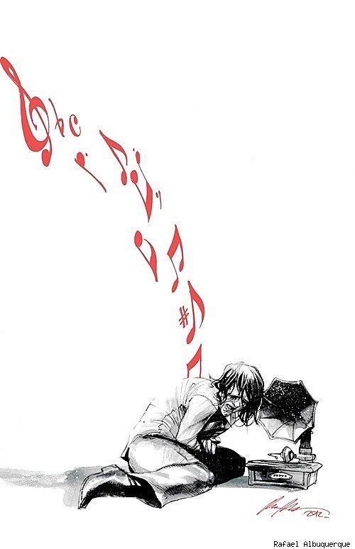
American Vampire #33 (DC Vertigo), cover by Rafael Albuquerque
Have I mentioned the striking appeal of black, white and red covers before? Oh, only every month. This time I have a veritable feast of black, white and red, starting with this lovely, starkly emotional piece from Rafael Albuquerque. Red is the color of blood and viscera; here it represents the raw pain of memory evoked by music. The cover surely would not have worked so well in any other color combination.

Hawkeye #6 (Marvel), cover by David Aja
The red here is part of David Aja's overall design scheme for the series, which began with a purple phase and moved in to a red phase with a set of covers that largely evoke sex and violence. Here red gives us a striking mood for a hero shot that's a long way from the generic standard.

Thunderbolts #1 (Marvel), cover by Julian Totino Tedesco
A cover artist friend was recently telling me how important the "team shot" cover is as a sales device. Quite simply, readers don't remember who is in a book if you don't lay it out for them once in a while. For the first issue of a team book it's basically essential -- but that doesn't mean it needs to be boring or obvious. Tedesco has done a great job here of making a hugely unlikely team look like they belong together.

The Victories #5 (Dark Horse), cover by Michael Avon Oeming
One more black, white and red cover, and the red has a lot of work to do here; it shapes the figure, provides a power signature, leads the eye, evokes blood and violence, and draws together the disparate elements of the figure and the handprint. Superbly deft work.

Bleach Vol. 52 (Viz), cover by Tite Kubo
Black, white and beige? There's red here as well, of course (and a whole bushel of mid-tones), but I wish I could find Bleach covers without the garish cover furniture, because Tite Kubo consistently creates my favorite manga covers; cool, composed and distinctive.

GI Joe #19 (IDW), variant cover by James Biggie
All right, enough red; this simple black and white cover is easily one of my favorites this week. This "rock poster" variant is a hugely appealing exploitation of a simple, familiar character design.

Avengers Arena #1 (Marvel), variant cover by Skottie Young
Skottie Young has been a busy man with his "young" variants for the Marvel NOW line. I've picked this one as my favorite. It can't be easy to make the morbid premise of Avengers Arena seem charming, but Young has done a fine, funny, subversive job of it here.

Green Hornet #32 (Dynamite), cover by Phil Hester
It's all about shapes with Phil Hester. He's a master at throwing shapes.

The Sixth Gun #27 (Oni), cover by Brian Hurtt
An argument could be made that covers should only be assessed with all the indicia in place, but that's not my priority. I generally prefer to see the art unencumbered. However, Sixth Gun is a series that consciously and consistently builds its covers around the logo, and I think this example works particularly well. The dynamism, scale and color palette are all enhanced rather than weighed down by the logo. (The barcode, on the other hand, is not an aesthetic triumph.)

Iron or, The War After (Archaia), cover art by SM Vidaurri
A cover that nicely evokes the classic style of embossed hardbacks from the Victorian first golden age of children's literature. It's an apt choice for a book that uses comics to explore a similarly old-fashioned (in the best way) fantasy setting in lavish, gorgeous style.

Deadpool #2 (Marvel), cover by Geof Darrow
It was tough to decide which of the two fantastic animal variants I liked more for this issue of Deadpool. The Gurihiru cover is a winner as well, but Darrow has the edge. Maybe it's the flamingo on the elephant's tusk? Or the bear spittle?

All-New X-Men #1 (Marvel), variant cover by Paolo Rivera
I'm still skeptical about All-New X-Men's "retro meets modern" concept, but this cover may have sold me on the idea. This is a really well executed character portrait from Rivera, and it appeals to my fan instincts in a way that makes me want to explore the story.

Hellblazer #298 (DC Vertigo), cover by Simon Bisley
I haven't seen the cover to the final issue of Hellblazer yet (issue #300), but I can't imagine a better tombstone for the series than this image, which captures the series' themes of death, magic and trickery and its icons of cigarettes and trenchcoats with definitive wit and style. A great, great image.
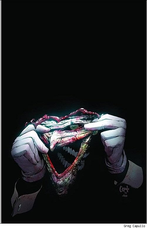
Batman #15 (DC), cover by Greg Capullo
On the subject of horror and dark humor; Capullo pulls off a simple but brilliant trick here, placing Joker's face and Joker's... "face" at different angles to create a memorable first impression and a disquieting second impression. But this isn't the most striking detached face image you'll see this month. Oh no. That award goes to...

Colder #1 (Dark Horse), cover by Juan Ferreyra
When I look at this cover part of me wants to stand up and applaud, and part of me wants to have a long sit down and a stiff drink. This is easily one of the most horrific comic book cover I've ever seen. Utterly distressing, but unexpectedly compelling. I want to look away, but I keep coming back. And shivering. Well done, Juan Ferreyra, you evil genius.

Sharaz-De (Archaia), cover by Sergio Toppi
And if you need a mental palate cleanser after that, who better than the late great master of composition, Sergio Toppi? I am unspeakably happy that Archaia has brought some of his work into print in English, because Toppi belongs in my personal all-time top five great comic artists. This cover should give you some idea why that is. He carved beauty out of every page he drew.
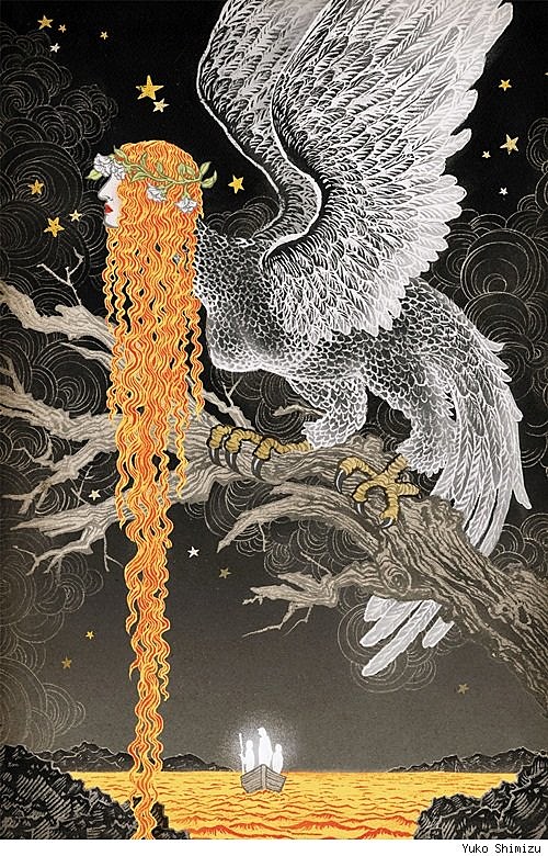
The Unwritten #44 (DC Vertigo), cover by Yuko Shimizu
If your palate still doesn't feel quite clean, here's another work of majestic beauty to help you along. This stunning piece of mythology-making may be one of Shimizu's best pieces this year, and she certainly wasn't slacking in 2012.
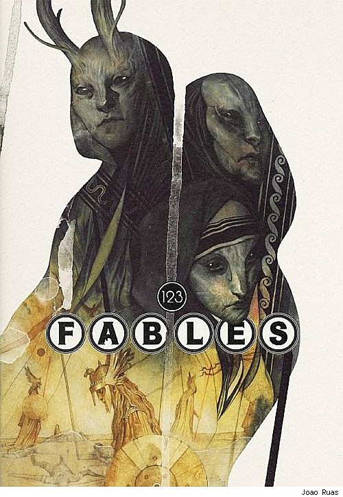
Fables #123 (DC Vertigo), cover by Joao Ruas
Speaking of mythology; I'm so far behind on Fables that I can only guess at what I'm seeing here, but it feels like a Northern European take on Guillermo Del Toro's Pan's Labyrinth monsters. Norns and Valkyries, maybe? It's certainly beautifully composed, and enticing enough to make me want to catch up on the series.

Uncanny Avengers #2 (Marvel), variant cover by Milo Manara
Oh, Milo Manara. You're certainly a fella who knows what he likes. But you do it so well that I find I like it too.
More From ComicsAlliance