Frank Santoro Explains the Comic Book Panel Grid and ‘Giving Up the Center’

In a must-read feature for comics artists and graphic designers both aspiring and professional, cartoonist Frank Santoro details the basic panel grids available to comic book illustrators around the world. The "Cold Heat" creator and "Strange Tales II" contributor concludes that the grid patterns used most in North American comics are ideal for storytelling, but leave something to be desired in terms of aesthetic harmony.
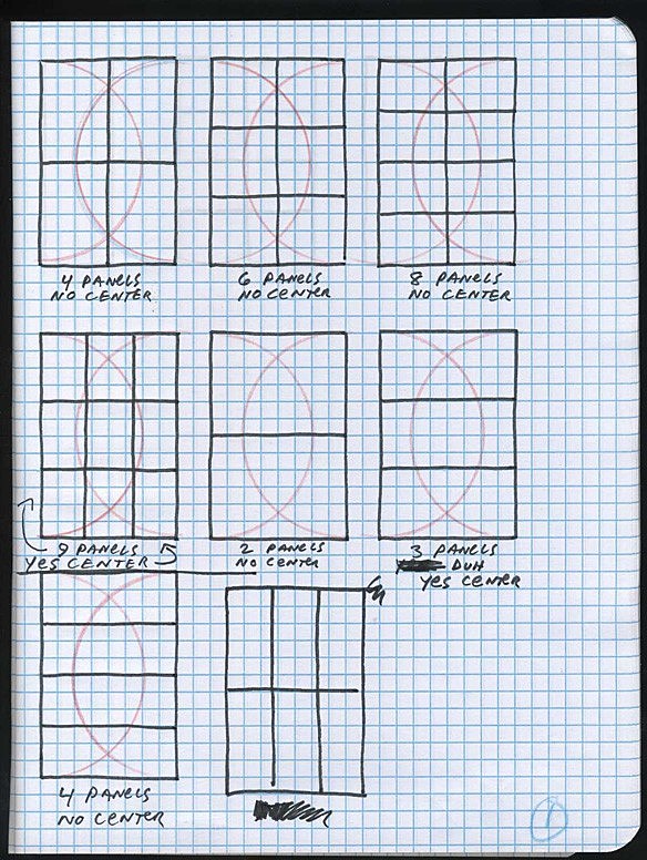
I employ the fixed grid often in my own work. but recently, I've been frustrated that using the fixed 6 panel grid takes away the center of the 6.75 x 10 inch NA comic book. I like the rhythm of the sequencing – but often, I dislike the fracturing of the page and the spread. I get around this by moving the readers eye about the page and spread by isolating certain panels and grouping others. It's like a chess game. Pathways. The movement of a knight – the "L" shaped paths, two squares either forward, backward, left, or right and then left or right one square – is something I think about alot. Thinking ahead. Seeing the whole board at once. Simultaneity.
Head over to Comics Comics to see more examples of grids and to read Santoro's thoughts on how North American artists have, perhaps subconsciously, managed to tweak the standard presentations in an effort to "find the center."
More From ComicsAlliance